Create a Reporting Dashboard and Widgets for Empower
Updated
Reporting Dashboards in Empower provide valuable insights by monitoring content performance. Ensure that any Reporting Dashboard that will be used in Empower is shared with the appropriate Primary User Groups.
Note that this article is only for the central brand team core Sprinklr admins. Empower users will not have access to your Sprinklr environment. |
Create a Reporting Dashboard
Click the New Tab icon
and select Reporting under the Social Core Cloud.
Hover over the Options icon
and select Create.
Enter a Name for the Dashboard and select the Starter Dashboard Type. Add tags per your needs.
Click Save to create the Reporting Dashboard.
Create a Reporting Widget
Click the New Tab icon
and select Reporting under the Social Core Cloud.
From a Reporting Dashboard, click Add Widget in the top right corner or in the middle of the page (if no widgets have been added).
Select the Type of widget and enter a Name to display at the top of the widget.
Select the Visualization Type.
Fill out remaining preferences for your widget (these fields depend on Type and Visualization Type selected in Steps 3-4).
Click Save to add your widget to the Dashboard. Scroll to the bottom of the Dashboard to view the newly created widget. Rearrange by dragging and dropping the widget into a preferred slot.
Type of Widgets
Term | Description |
Social Analytics or Outbound Analytics | Outbound engagement and audience activities demographics. This widget will display what is going on for engagement and interaction on your page. |
Inbound Analytics | Receiving an inbound message. You can assign it to an individual, mark it as resolved, assign it to a queue, and so on. |
Benchmarking | Aggregate, compare, and share social activity including comments, shares, likes, and even response times. |
Paid | This is a premium feature. |
Listening | Fetches keyword-based searches from sources across the social web. Enables you to view messages from millions of sources in one place, making monitoring and analysis simple. |
WEB | Contains a specified domain to collect and measure all of the variable tags you have assigned to your Web Analytics Profile. |
Audience Activity | Filter profile based on Profile Lists, Custom Properties, Tags, and others.You can also add tags and properties to the profile using custom fields. |
Outbound Message | Outbound message engagement and activities demographics. |
Advocacy | Advocacy provides a single space for employees and consumers to share out approved brand content to their social following to increase the brand awareness and market share. |
SAM | Local repository of all asset types that you need for publishing to social media channels. |
Social DMP | Grow your online audience and support interaction with customers by digital monitoring. |
Visualization Types
Term | Description |
Column | Column charts display vertical bars going across the chart horizontally. You can select the values of X-Axis and Y-Axis from the drop down list. |
Bar | Bar charts shows a comparison between different categories. You can select the values of X-Axis and Y-Axis from the drop down list. |
Pie | Pie charts display data in 'pie-slice' format with varying slice sizes telling you how much of one data element exists. The bigger the slice, the more of that particular data was gathered. You can select the Wedge or Value from the drop down list. |
Stacked Column | Stacked Column is used to break down and compare parts of a whole. Each bar represents a whole, and segments in the bar represent different parts or categories of that whole. You can select X-Axis, Y-Axis and Series from the drop down list. |
Stacked Bar | Stacked Bar is used to break down and compare parts of a whole. Each bar represents a whole, and segments in the bar represent different parts or categories of that whole. You can select Y-Axis, X-Axis (X1) and X-Axis (X2) from the drop down list. |
Line | Line graph displays information as a series of data points connected by straight line segments. You can select X-Axis, Y-Axis and Series from the drop down list. |
Spline | Spline graph draws a fitted curved line to join the data points.You can select X-Axis, Y-Axis and Series from the drop down list. |
Area | Area graphs are used to display the development of quantitative values over an interval or time period. They are most commonly used to show trends, rather then convey specific values. |
Area Spline | Area Spline graph is like area graph but the data points are connected by smooth curves instead of straight lines. |
Bubble | Bubble Chart is a multi-variable graph. You can use this to compare and show the relationships between labeled/categorized circles, by the use of positioning and proportions. |
Dual Axis | Dual axis chart illustrates the relationship between two different variables. |
Combination | You can combine two or more charts to emphasize different kinds of information in a chart. |
Table | Tables work best when the data presentation is used to look up or compare individual values, requires precise values, or values involve multiple units of measure. |
Counter | Counter graph allows you to see how many of a particular event happened in a short amount of time especially when there are gaps between occurrences of events. |
Funnel | Funnel charts are used to represent stages in a sales process and show the amount of potential revenue for each stage. |
Summary Table | The summary table summarizes statistical information about data in table form. |
Post Card | You can view the selected post in postcard format. |
Text | In text widget you can add your text and customize the text according to your requirement. |
Title | Title widget helps you to customize your dashboard by adding a title, subtitle and image. |
Grouped Summary | The Grouped summary table summarizes statistical information about group of datas in table form. |
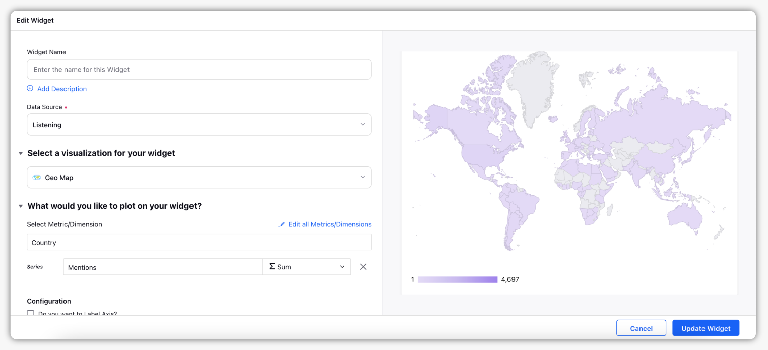
Geo Map | Identify patterns and trends in data that are specific to location or region using these Geo Maps.
|