18.2 Key Changes in User Experience
Updated
Usability is the key focus for Sprinklr this year, and we continue our efforts toward making Sprinklr simpler, better, and consistent. There are some exciting major changes in the 18.2 release, where users will experience a change in platform appearance and behavior.
Launchpad Changes
We are delighted to announce we have rebranded our four product suites as follows:
Sprinklr Service → Sprinklr Service
Sprinklr Insights → Sprinklr Insights
Sprinklr Marketing and Advertising → Sprinklr Marketing
Social Engagement and Sales → Sprinklr Social
These changes will reflect majorly in the launchpad and across the platform. Please note that these are label changes, and there are no changes with respect to other capabilities and features within every product.
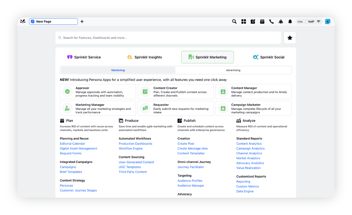
Please note that Sprinklr Marketing and Sprinklr Marketing (Ads) are now available as sub-tabs under the Sprinklr Marketing tab.
Sprinklr Social
Single click (Mouse) actions instead of double click across the Distributed platform
In accordance with accessibility guidelines for web applications, Distributed users will now be able to perform actions like opening assets in the assets board, or opening the detail pane for a message or case with a single click instead of a double click as needed earlier.
Sprinklr Insights
Listening | Introducing Alert 2.0 with Some Usability Upgrades
We have redesigned the alert configuration workflow and made some usability upgrades for quick setup and more robust alerting.
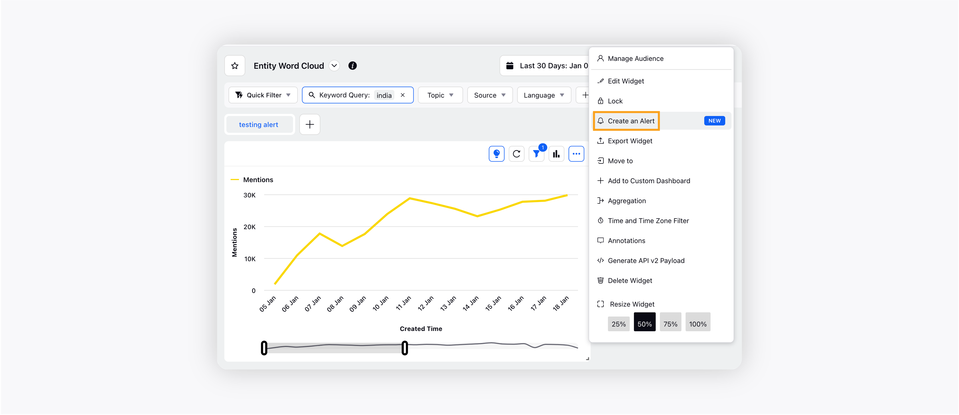
Alert from widget
You can configure alerts directly from any reporting widget by automatically capturing the widget configurations to help set up alerts in a quick and easy way.
Alert configuration form
We have revamped the alert configuration form for both Smart Alerts and Volumetric Alerts.
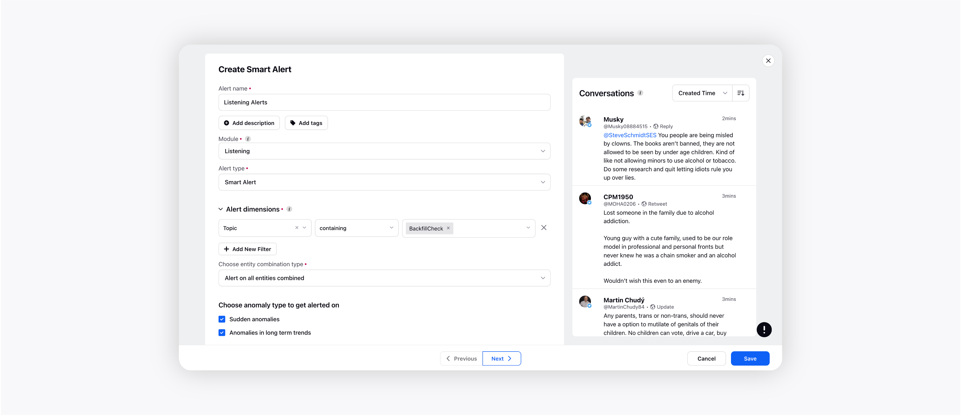
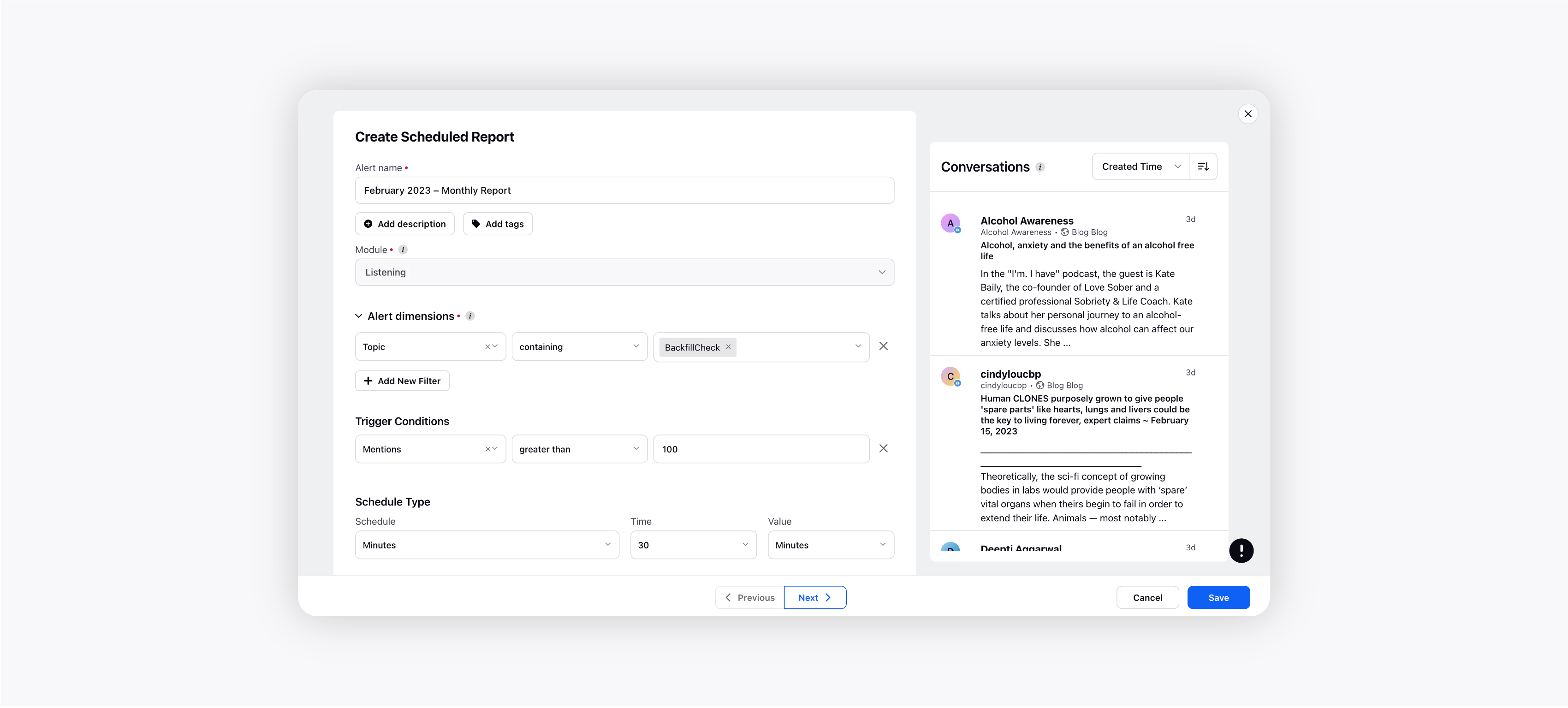
You can now see the conversation preview while creating an alert. The Preview screen will be auto-populated when the alert dimensions filters are added in the alert configuration form. The screen will show the conversations being powered by the chosen filters and the users can add more filters to tune to only relevant conversations that they need to get alerted on.
We have also revamped the alerts record manager window in order to enhance the user experience.
The Scheduled Reports configuration form has also been revamped with added preview support.
Introducing verbiage changes in the Alert emails to deliver faster insights to the users and make the mails more consumable.
Added alert notification frequency to the alert forms. You can now choose the number of alerts you want to receive at an hourly/daily/weekly/monthly level to avoid multiple alerts in case of an inflated crisis event. This will help save your inbox from being cluttered and spammed.
Smart Alerts
The Smart Alerts will now be supported on long term trend anomalies. This would cover spikes/dips in trends aggregated over a Daily (24 hours) and Weekly (7 days) basis.
Introduced algorithm updates in the volume threshold for Smart Alert time series. The threshold will now be uniquely calculated by the algorithm for each time series. This will ensure that you do not miss out on alerts in trend shifts where the volumes are too low and also do not get spammed where the volumes are too high.
Introduced logic changes in Smart Alerts to cater to latency issues. Retrospective alerts after 48 hours on instances where alerts were not triggered due to latency in data capturing.
Volumetric Alerts
You can easily switch to Scheduled Report from the Volumetric Alert configuration screen. This will help users get alerted on a certain number of threshold breaches before they switch to a summary report that presents a high-level summary of the associated trends at regular intervals.
Added plain text format mail template within Volumetric Alerts. Best suited for CXO reporting. The mail format will consist of truncated posts containing the keywords which captured these messages to pass the context of trends in the most consumable format to CXOs.
Introducing Volumetric Alerts covering "Irregular activity from last time range" based on the following metrics –
% increment/decrement in the volume of mentions from the last time range.
Absolute value increment/decrement of the volume of mentions from the last time range.
Breach of the Average star rating from a pre-defined 'safe range' and the ability to generate further alerts at increment/decrement in the metric value.
Breach of the Average Experience score rating from a pre-defined 'safe range' and the ability to generate further alerts at increment/decrement in the metric value.
Note: We will be merging the Product Insights and Location Insights modules into the Listening module as they are all powered by the same Data source. On addition of relevant dimensions of the PI and LI module, the corresponding metrics will populate in the dropdown to choose from, for the user.
Listening | Revamped Listening Dashboard Homepage
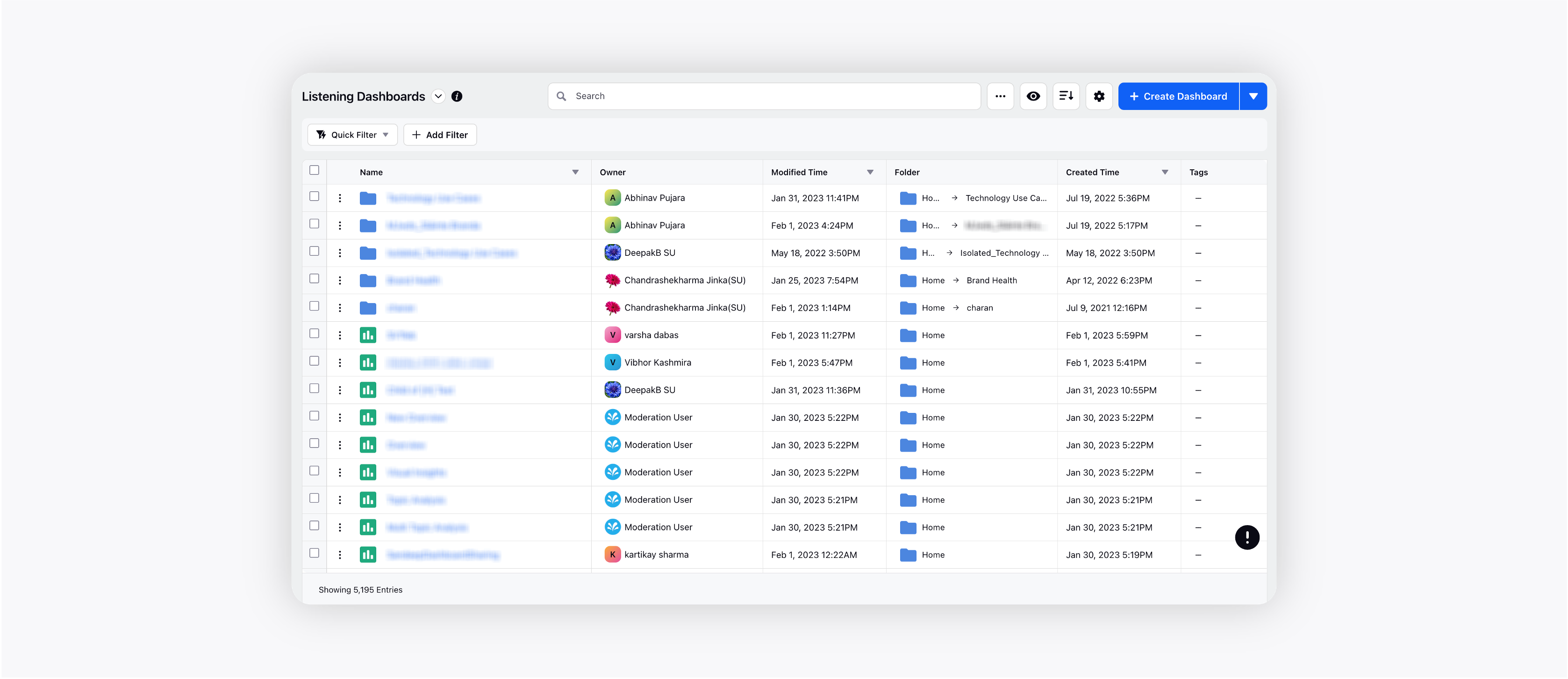
We have revamped the Dashboard homepage in order to make it more intuitive and simplified for users. You can now quickly access the dashboards and perform basic actions right from your dashboard homepage.
Dashboard Landing Page with improved search, filter, and sort capabilities will enable users to find the required dashboards faster.
Easily switch your view from List to Grid and group the dashboards as per Owner, Type, and Tags.
Efficiently manage multiple dashboards with bulk actions for sharing, adding to folders, and deleting with a single click.
Listening | Introducing Visual Listening Governance
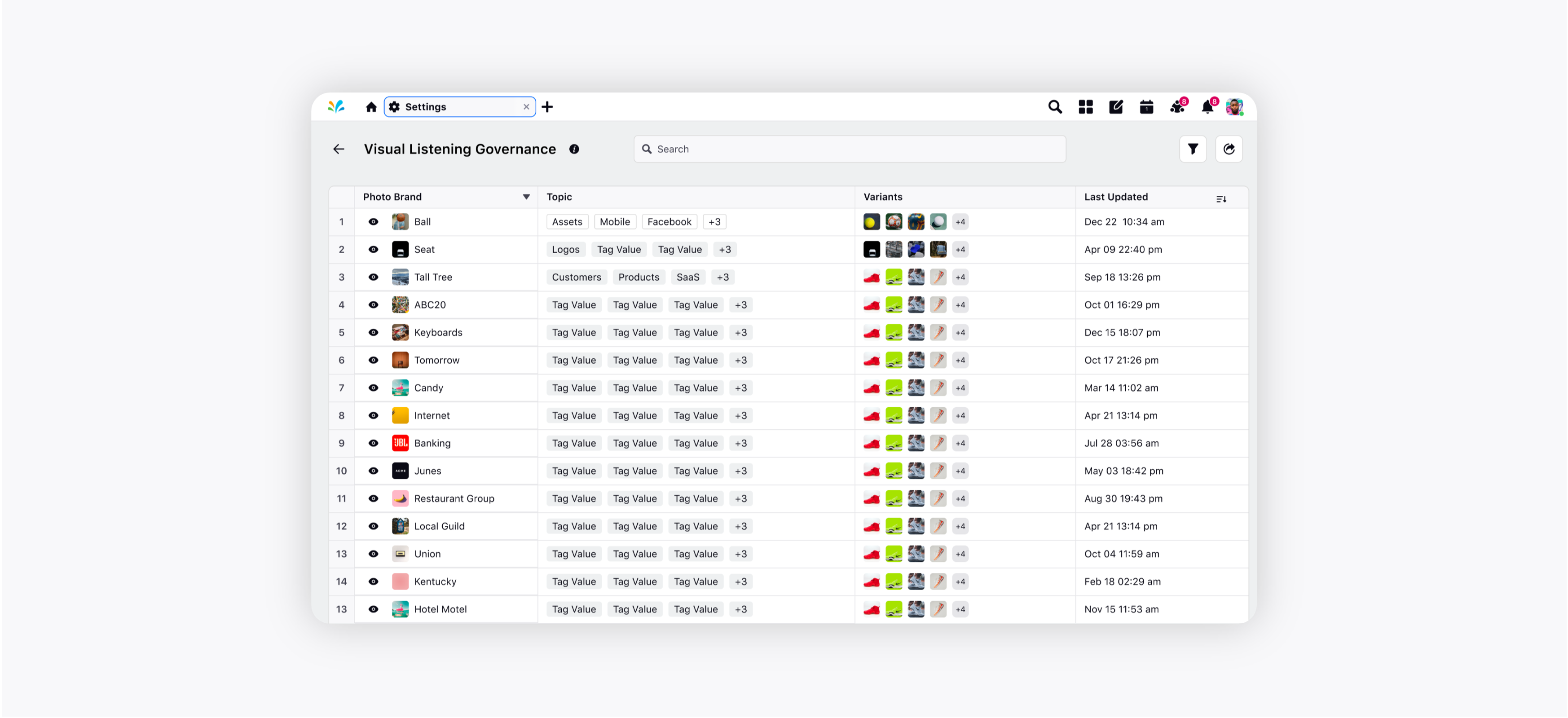
The updated Visual Listening Governance record manager enables you to identify the logos on which a photo brand is trained and topics where a photo brand is being used without going through each topic. You will be able to perform search within the photo brand & topic name, sort and filter to navigate effortlessly through the list. You can further expand the logos in the third pane by clicking on the eye icon.
Record Manger will have the following –
Photo Brand: Brand name for which logo is trained
Variants: Logo variants (Main) on which model is trained
Topic: Topics in which a Photo Brand is used to perform listening
Last Updated: Date and time when the model was last updated
Sprinklr Service
Care Console | Attachment’s Tab in Third Pane
Agents can now go through all the attachments in the case conversation in a single place instead of scrolling through the entire conversation. The Attachments tab in the Case Third Pane will display all the attachments, e.g., photos, videos, and documents, to simplify the agent experience.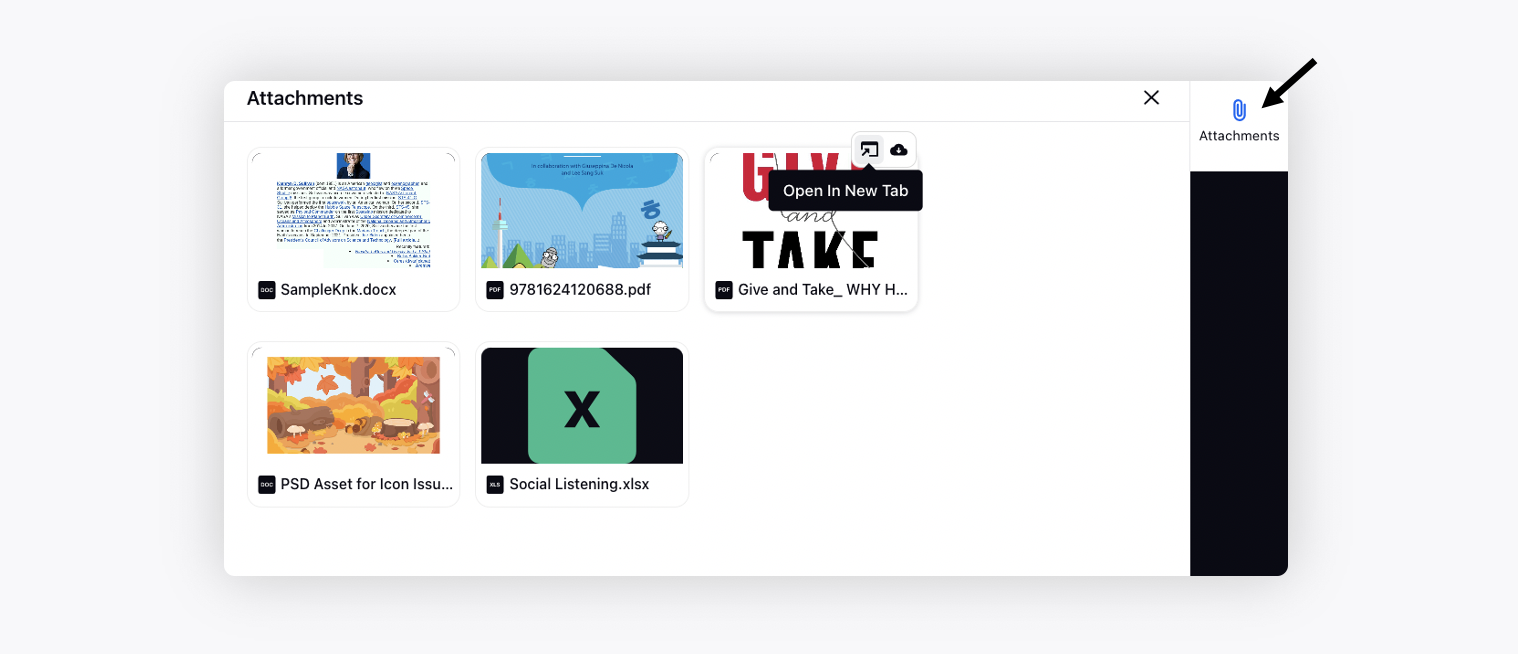
Knowledge Base | Improved Third Pane
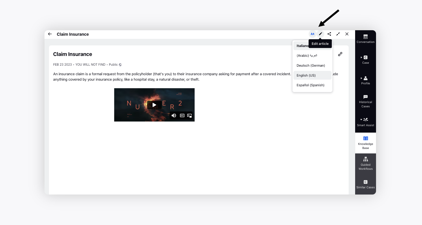
Within the Smart Assist third pane of Agent Console and Care Console, you can now filter the list of knowledge base articles by category and maximize the third pane view. You can also easily switch between available translations of an article and navigate to the editor directly from the third pane for better collaboration.
