Card Template
Updated
A card template is ideal for providing users with buttons that allow them to take various actions. Each card can include an image, text, or a combination of both, followed by a series of actionable buttons. The Digital Asset Manager can be used to create a card template, enhancing user interaction by streamlining the process of guiding customers to desired actions.

Key Benefits of Using Card Templates in Live Chat
Enhanced User Engagement: Card templates provide visually appealing elements that capture user attention, encouraging interaction and making the chat experience more dynamic.
Actionable Options: By including buttons for different actions, card templates enable users to make choices quickly, streamlining their decision-making process.
Visual Clarity: The combination of images and text helps convey information clearly and effectively, making it easier for users to understand their options.
Customizable Content: You can tailor card templates to align with your brand and messaging, allowing for a more cohesive and personalized customer experience.
Increased Efficiency: With predefined actions and responses, card templates can reduce the time agents spend answering repetitive queries, allowing them to focus on more complex customer needs.
Use case and example
Card templates are particularly useful in scenarios where quick decision-making is essential.
For instance, consider a retail company using Sprinklr Live Chat to assist customers with their online shopping experience. When a customer initiates a chat, they are presented with a card template that includes options like "View Latest Offers," "Check Order Status," and "Contact Support." Each option is accompanied by an image and a brief description, making it easy for the customer to understand and select the desired action. This streamlined approach not only improves customer satisfaction but also reduces the workload on support agents by automating common queries.
To Create a Card Template in Asset Manager
Click the Digital Asset Management under the Integrate section of your sprinklr home page.
In the top right corner of Asset Management, click Create Asset and select Omni Chat Templates from the dropdown.
On the Create New Asset window, enter a Name and optional Description for your asset under the Basic Details section.
Under the Asset Specific section, select Card from the Template Type dropdown and Sprinklr Live Chat from the Channel dropdown. For more information, see Card Template — Field Descriptions.
Under Asset Details, select Campaigns, Sub Campaigns, Status, Available from, Visible from, Expires on, Tags, Restricted, Brands, Persona, Customer Journey Stage, Automated Tags, and Information.
Under Asset Sharing, select Workspace(s) and Users/Users Group(s) you want to share this asset with. You can also check the box alongside Visible in all workspaces to share the asset within all workspaces.
Next, enter the Properties per your needs.
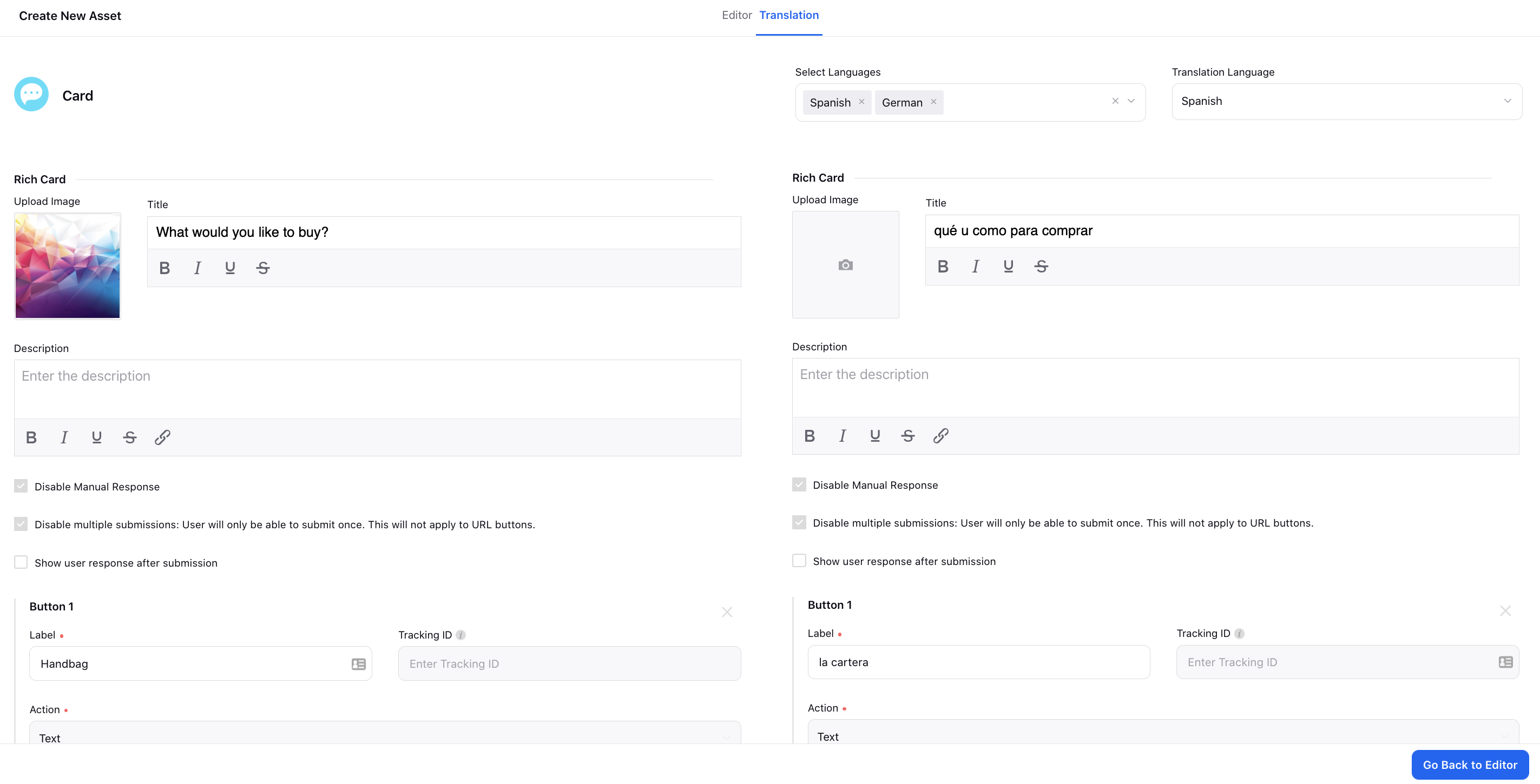
Switch to the Translation tab if you wish to translate your form into other languages. Select all the languages to translate the form into from the Select Languages dropdown. Next, select the Translation Language to open the editor for that particular language. You can view the form in your base language in the left pane and add the translated text in the right pane.
Note: To learn more about getting the Translation capability enabled in your environment, please work with your Success Manager.
Click Save in the bottom right corner.
Card Template — Field Descriptions
Term | Description |
Upload Image | Select the desired image from DAM or Media Valet, or Upload a new image. |
Title | Provide a title to your card template. You can bold, italicize, underline, and strikethrough the text. |
Description | Enter the description. You can bold, italicize, underline, strikethrough, and hyperlink the text. |
Hide Attachment Option | If you check the box, your customers will not be able to send any attachments before/after selecting a response from this template until you (brand) send a message again. |
Disable Manual Response | If you check the box, your customers will not be able to send any message before/after selecting a response from this template until you (brand) send a message again. |
Disable multiple submissions: User will only be able to submit once. This will not apply to URL buttons. | Check the box to make the card buttons disabled for clicking if already clicked once. So, the users will not be able to click any button other than the URL button if they have already made the selection once. The options will be greyed out once clicked as shown in the GIF below. |
Show user response after submission | Selected button in the asset will be highlighted. |
Button 1 | Buttons contain action properties that define the type of action set on user click operation. Under Button 1, enter the following details: Image: Upload or select the image to be used in the button. Choose a square image with a minimum size of 18x18 pixels from DAM, Media Valet, or upload a new one. Label: Enter a label for button 1. The label of the button should not exceed 20 characters. If required, you can get the text on the buttons left-aligned. To get this done, you are required to raise a support ticket at tickets@sprinklr.com. Tracking ID: This ID will be used in the button click reporting. Action: Select action as External Action, Text, URL, Phone call, Link Account, Sprinklr Audio Call, Sprinklr Video Call, New Conversation.
|
Add New Button | Click to add a new button to your card template. A card asset can have a minimum of 1 and a maximum of 10 buttons. You can get the buttons of a card template disbaled based on agent availability, business hours, and agent skills. To get this capability enabled, reach out to support at tickets@sprinklr.com. |
Button stacking direction | It allows you to specify how buttons are arranged within a layout. You can choose between three stacking directions: Row, Grid, or Column. When selecting the Grid option, you have further customization options by specifying the number of columns. This can be set to either "Automatic," where the system determines the optimal number of columns based on the available space, or you can manually select a number from 1 to 4 columns. This flexibility enables you to tailor the button layout according to your design preferences and the available space on the interface. |
Screen Reader Label | You can configure a custom label for card assets to enhance accessibility for users. By default, the asset is identified as a "form," and the screen reader announces it as "You have received a form." However, if you prefer a more specific label, such as "Registration Details Form," you can customize it accordingly. |
