Create reports for your Journeys
Updated
In this article, you will learn how to create reports and get insights about the customer interactions with your journey messages.
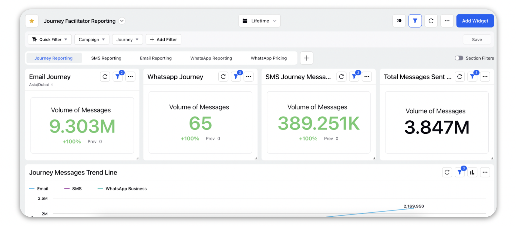
Sprinklr’s Blueprint Dashboard for Journeys
Sprinklr's default Blueprint Journey Dashboard has various dedicated sections for all the Social Networks that are supported with the Journey. If you do not have a Journey Reporting Dashboard set up in your Sprinklr environment, you can get in touch with Success Manager or any other Sprinklr Point of contact to get it deployed.
Create your own Widgets
To analyze your Journey performance you can also create your own widgets in any reporting dashboard.
Learn about creating a widget here.
1. Email Marketing Journeys
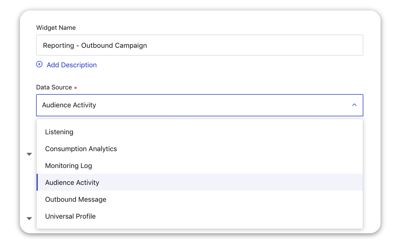
On the Add Widget window, enter a name for your widget and select Audience Activity as the Data Source.
Select the desired Visualization for your widget.
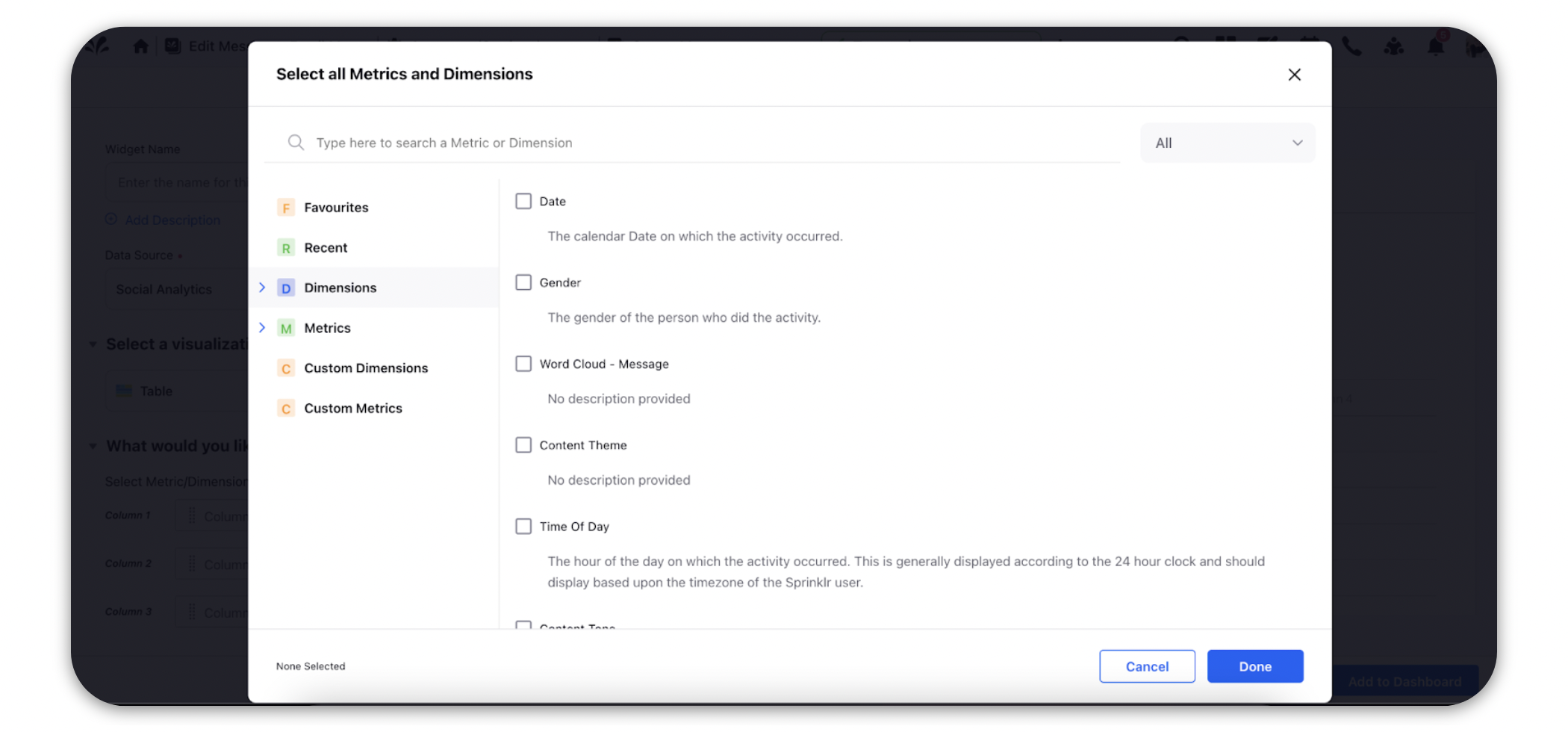
Under the What would you like to plot on your widget? section, select a Metric or a Dimension in the given Column fields.
Click the fields and type the Metric or Dimension name in the search bar in the pop-up window.
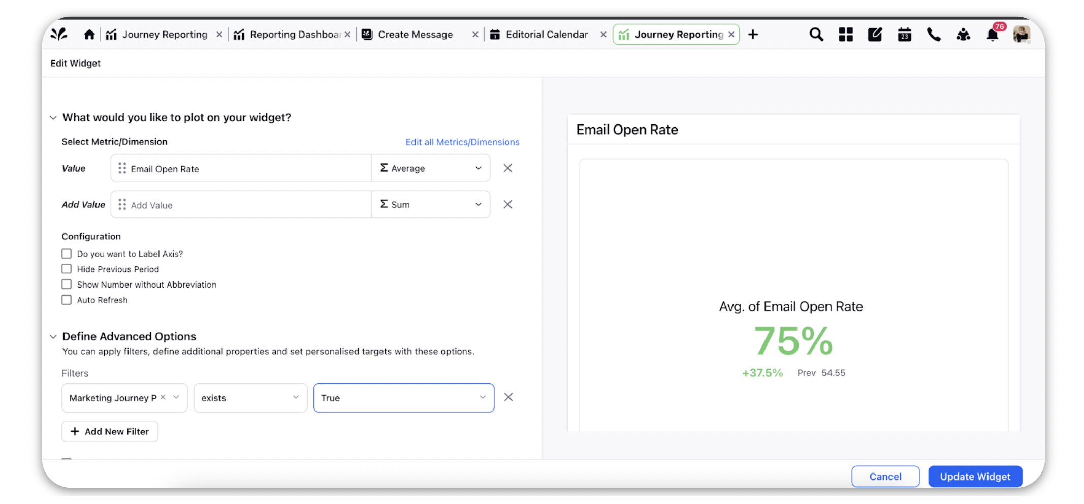
To report on how your audience is interacting with your emails, you can select Activity Type as the dimension and Activity Count as the metric. Learn more about the Email Marketing Activity Types in this article.
In the Filter section under the Define Advanced Options apply the filter of Marketing Journey Post and set the value as True. This will help you plot all the messages that have been sent through Journeys.
You can also drill down to the next level and study the behavior of each audience profile by using the Audience Activity Actor as the dimension.
Once you select metrics and dimensions, you will be able to see a preview of the visualization on the right side pane.
Click Add to Dashboard in the bottom right corner to add the reporting widget to your dashboard.
You can apply your filters on the dashboard level as well with the help of the ‘Marketing Journey Post’ dimension and get results for specific Journeys.
![]() Note: It is mandatory to have at least one metric in a widget to plot the visualization.
Note: It is mandatory to have at least one metric in a widget to plot the visualization.
2. WhatsApp Journeys
On the Add Widget window, enter a name for your widget and select Inbound Analytics as the Data Source.
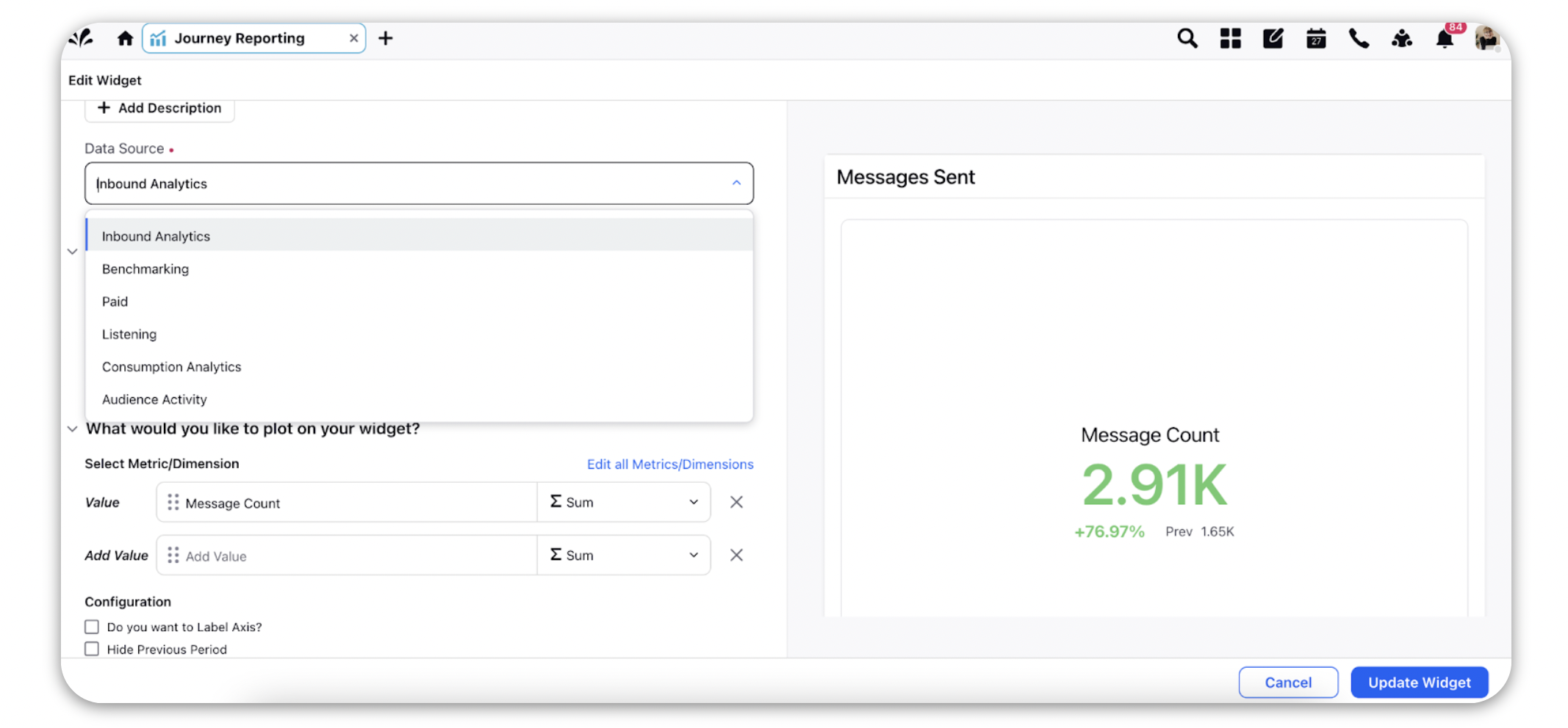
Select the desired Visualization for your widget.
Under the What would you like to plot on your widget? section, select a Metric or a Dimension in the given Column fields. Click the fields, type the Metric or Dimension name in the search bar in the pop-up window.
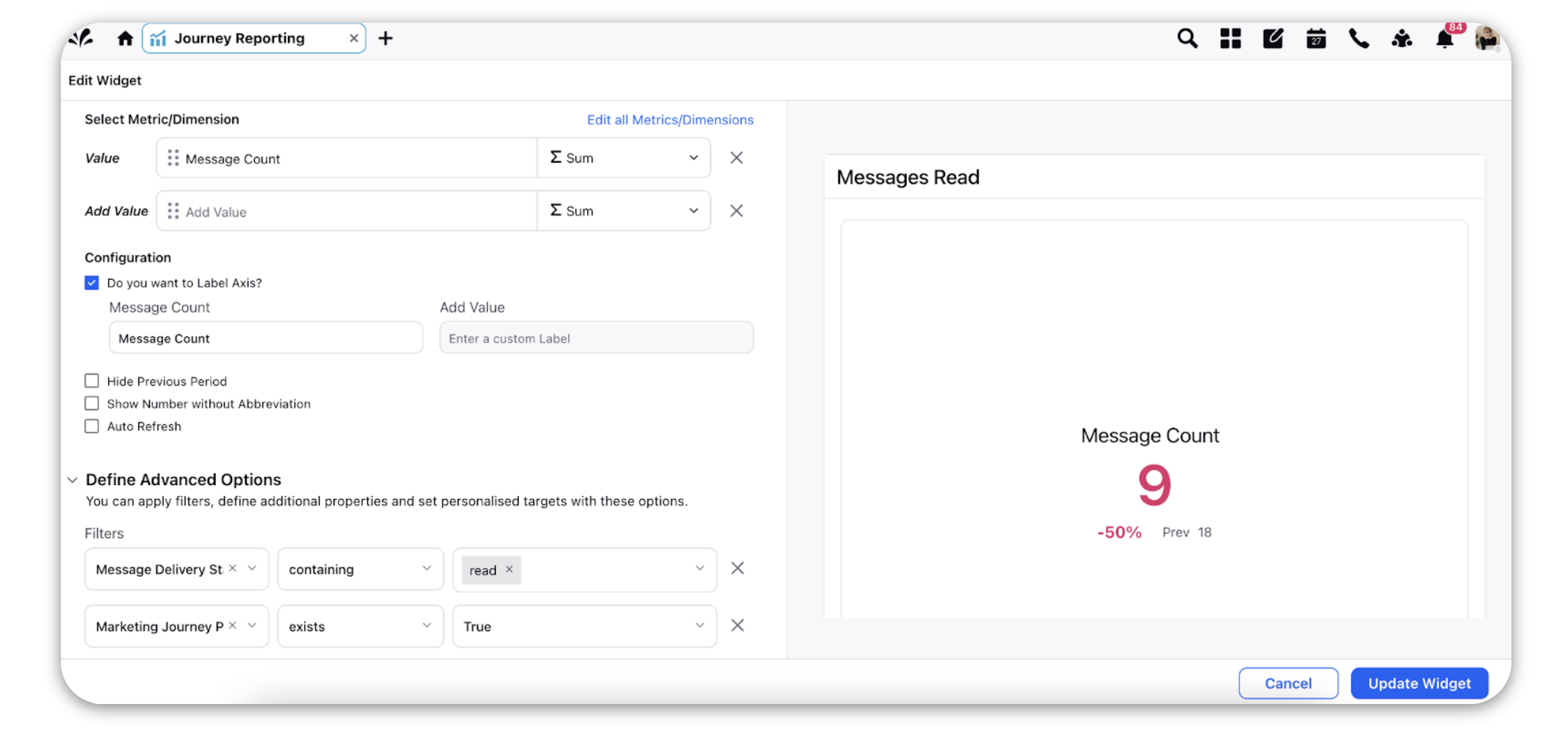
To report on the performance of your WhatsApp campaign, you can use metrics like Message Delivery Status and Message Count to plot all the messages sent, delivered and read.
In the Filter section under the Define Advanced Options apply the filter of Marketing Journey Post and set the value as True. This will help you plot all the messages that have been sent through Journeys.
You can also drill down to the next level and study the behavior of each audience profile by using the Audience Activity Actor as the dimension.
Once you select metrics and dimensions, you will be able to see a preview of the visualization on the right side pane.
Click Add to Dashboard in the bottom right corner to add the reporting widget to your dashboard.
You can apply your filters on the dashboard level as well with the help of the ‘Marketing Journey Post’ dimension and get results for specific Journeys.
3. SMS Journeys
On the Add Widget window, enter a name for your widget and select Inbound Analytics as the Data Source.
Select the desired Visualization for your widget.
Under the What would you like to plot on your widget? section, select a Metric or a Dimension in the given Column fields. Click the fields, type the Metric or Dimension name in the search bar in the pop-up window.
To report on the performance of your WhatsApp campaign, you can use metrics like Message Delivery Status and Message Count to plot all the messages sent, delivered, failed, etc. (these reporting metrics are dependent on the vendor used for sending messages)
In the Filter section under the Define Advanced Options apply the filter of Marketing Journey Post and set the value as True. This will help you plot all the messages that have been sent through Journeys.
You can also drill down to the next level and study the behavior of each audience profile by using the Audience Activity Actor as the dimension.
Once you select metrics and dimensions, you will be able to see a preview of the visualization on the right side pane.
Click Add to Dashboard in the bottom right corner to add the reporting widget to your dashboard.
You can apply your filters on the dashboard level as well with the help of the ‘Marketing Journey Post’ dimension and get results for specific Journeys.
![]() Note: It is mandatory to have at least one metric in a widget to plat the visualization.
Note: It is mandatory to have at least one metric in a widget to plat the visualization.