How to Show information in Guided workflow?
Updated
There are several ways to show information in a guided workflow, depending on the type of information and the context in which it is being presented. Some common methods include:
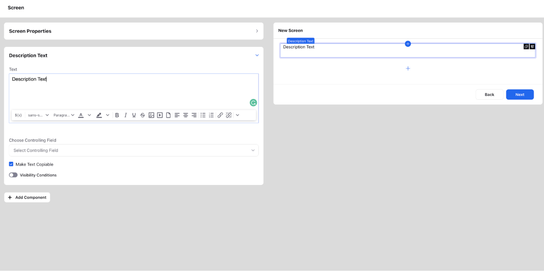
Description Text
Description text is used to convey any type of information to the agent. In an agent-facing GW, it can be a script that the agents can refer to during a conversation. In external GW, it can be used to inform the customer about the features of a certain product, steps to be followed to log a complaint, raise a ticket, etc.
Description text can be made copiable by checking the corresponding option while configuring. You can also add a refresh interval for auto-refreshing the content. There are basic formatting options available (bold, italic, underline, strikethrough, indenting options, highlight, styles, font, size, bullet points, and links). Variables can also be resolved in description text using ${var} or picking directly from the resource picker. If the variable is picked from any above components on the same screen, a controlling field can be used to change the resolved value as and when the value above is changed.
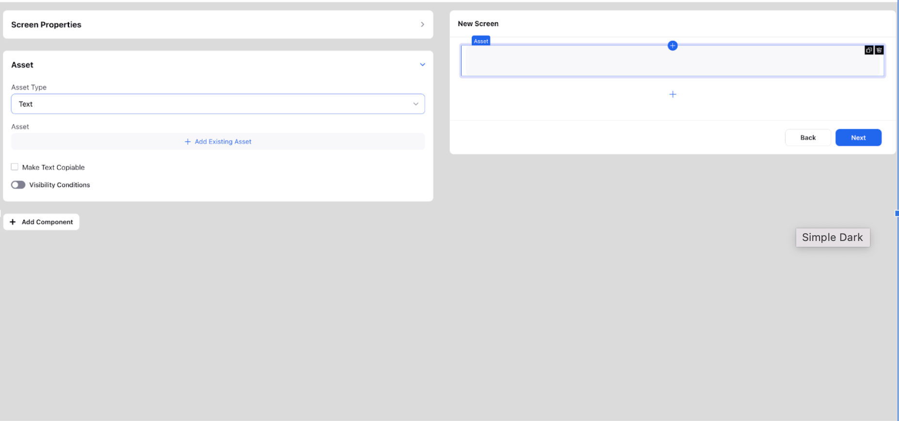
Asset
This is used to insert any text or rich text asset from the DAM. A text asset is a plain text file that contains simple text content, such as a piece of writing or a list of words. It can be easily edited and can be used for a wide range of purposes, such as displaying text on a website or providing dialogue for a video game.
A rich text asset, on the other hand, is a more complex type of text file that includes additional formatting, such as bold or italic text, different font sizes and colors, and images or other multimedia elements. These assets are typically used to create more visually appealing and engaging content, such as articles, blog posts, and marketing materials.
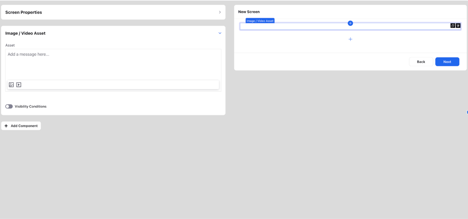
Image/video asset
It can be used to insert any image or video asset from the various sources as shown in the image from DAM, UGC, media valet and even upload from your local system.
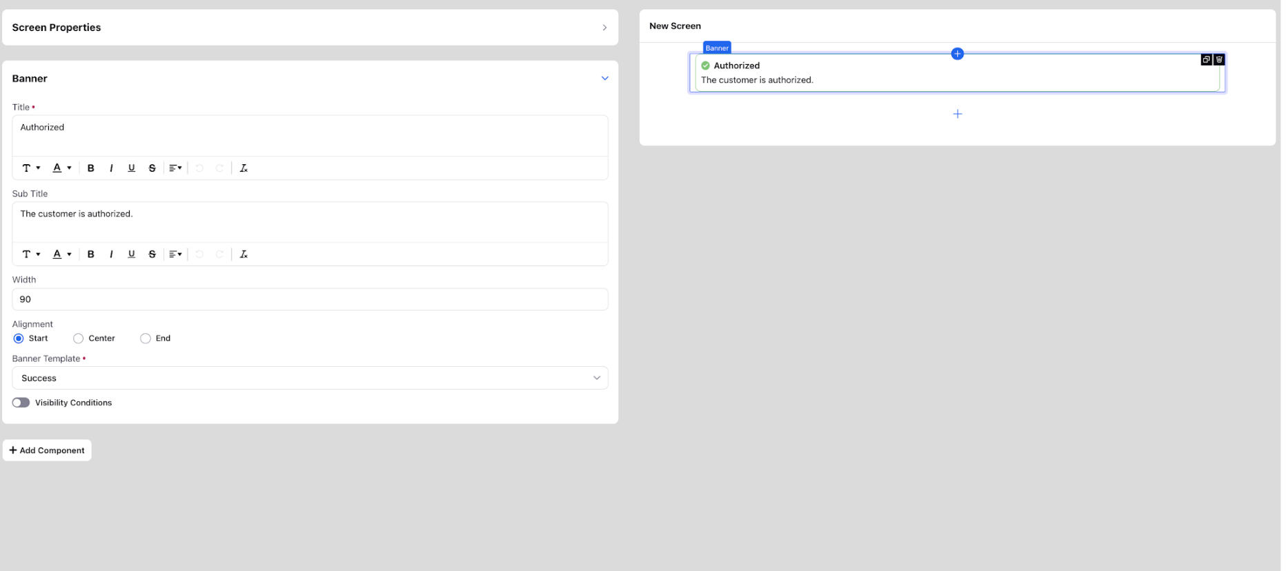
Banner
It is used to insert messages meant for the agent that can be in various template formats such as warning, success, error, disclosure, reminder. According to the template chosen, various symbols are used to indicate the same to the agent. For the banner component, add title, sub title, width, alignment and select the appropriate banner template from Error, Warning, Success, Reminder, and Disclosure. In title and subtitle, you can also add groovy to include case number (${UNIVERSAL_CASE.CASE_NUMBER}), profile ID, etc.
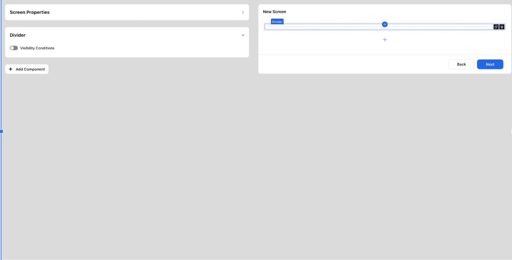
Divider
As the name suggests it is used to put a divider between any two components.
Two Columns and Three Columns
Generate a section, allowing for either two or three columns. Various column width templates are available for selection. You can also incorporate any further desired component into the columns.
