Take Inputs within Screen
Updated
In a guided workflow, you can easily gather input from the user by utilizing input components available on a Screen. These components are designed to collect specific types of information from the user such as text, numbers, radio buttons, picklists, etc. To ensure the accuracy of the data collected, validation rules can be set to verify the user's input.
Each component on the screen should be labelled appropriately to help users understand what information is required. Additionally, each component should be assigned an API name, which is a unique identifier and may be used to fetch user input value in subsequent actions/screens in the workflow.
The dynamic preview feature for added components will be available on the left side. The enhanced component library simplifies searching by sorting components alphabetically within their respective categories. Additionally, you can rearrange screen components using a drag-and-drop feature for improved customization and efficiency.
Here are multiple types of input components that are available inside a guided workflow:
Screen Properties
For every screen added to a Guided Workflow, provide screen properties.

Screen API Name: Each screen should be assigned an API name, which is a unique identifier and may be used to fetch user input value in subsequent actions/screens in the workflow.
Title Bar Text: Title of the screen visible to users.
Description: Optional decription of the screen.
Auto Submit Screen: The users will be auto-moved to the next screen after the set time if all the mandatory fields are filled.
Advance Screen Layout Settings: Specify the desired spacing value around the body in pixels. Additionally, you can choose to align the content of the form to the top, center, or bottom of the page. You can also adjust the height of the form to either automatically fit the content or set it to full height.
Navigation Bar: Add buttons to your screen, i.e., Next Screen Action, Back Screen Action, Close Screen Action and Message Parent Website Action. Using Message Parent Website Action, you can add custom components, e.g., trigger a live chat widget.
Customize the appearance of buttons by selecting the Label, Icon, Icon Position, Button Position, Variant, and Intent.
Once added, you can rearrange the order of buttons by dragging and dropping.
“Button Visibility conditions” can be set when you want to display a button only when those particular conditions are met.
reCAPTCHA v3: You have the option to integrate Google reCAPTCHA v3 into your workflow's screen properties to ensure human interaction and mitigate bot activity effectively. Operating invisibly, reCAPTCHA v3 assesses workflow interactions and assigns a score, discerning between human users and bots based on their behavior. To set up reCAPTCHA, you'll need to input both the site and secret keys.
Input Components

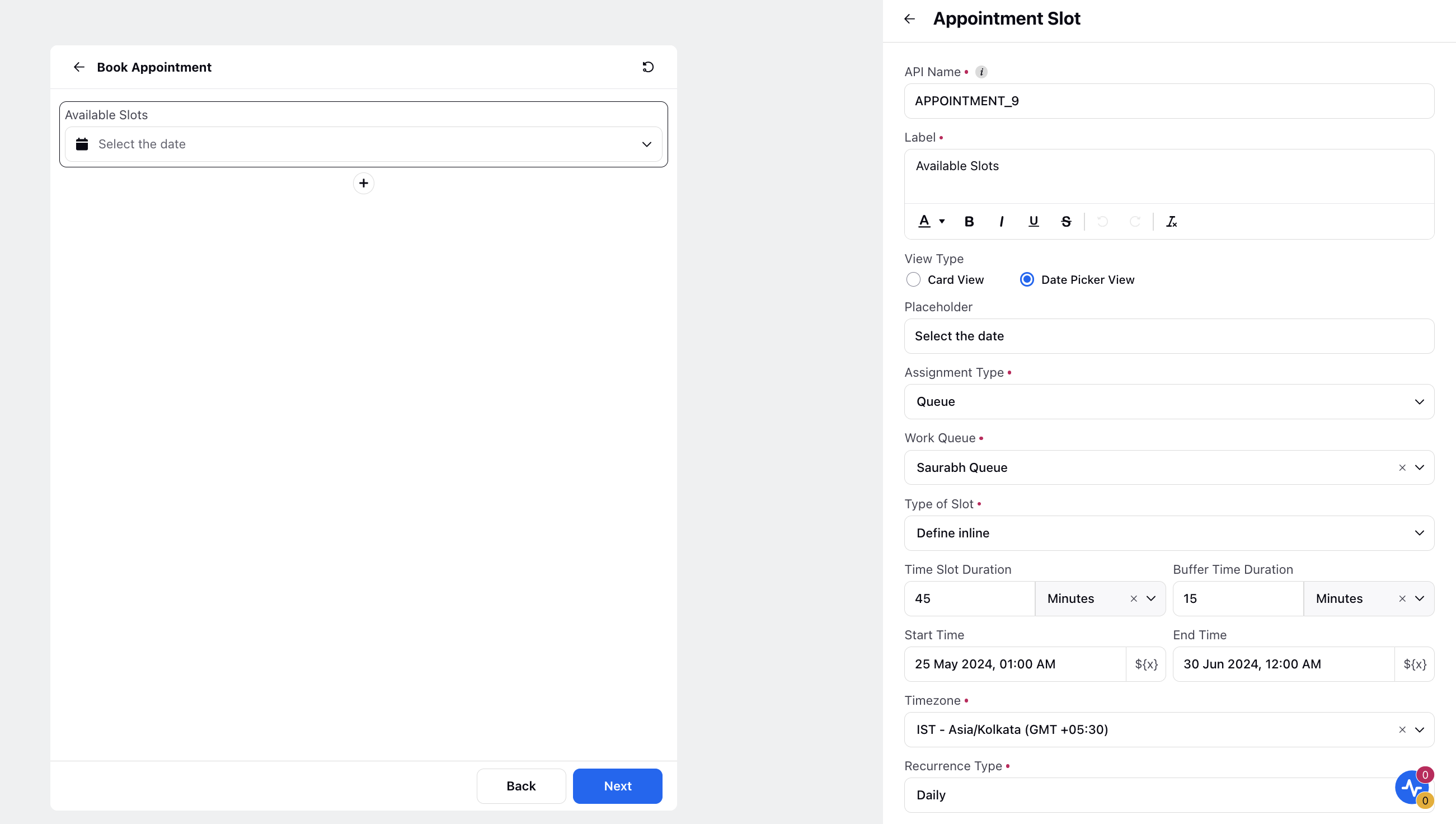
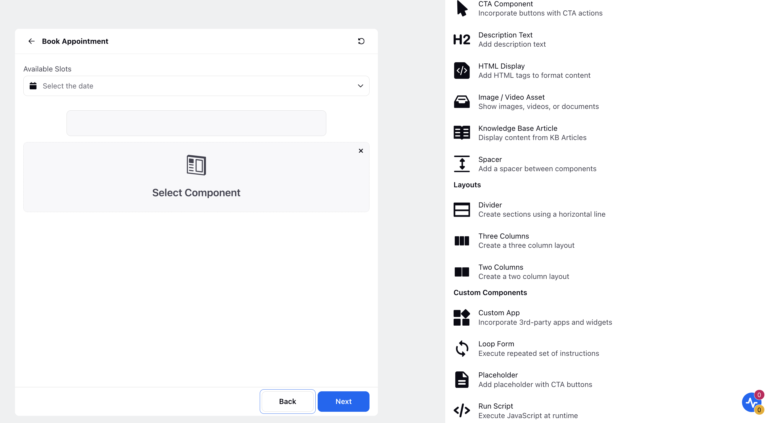
Appointment Slot
You can enable users to schedule appointments through Guided Workflows. You have the option to either opt for the inline type of slot, where you can specify the Time Slot Duration, Buffer Time Duration, Start Time, and End Time, or utilize an existing slot definition by selecting slots created in the Slot Availability Manager.
You can also choose the view type for displaying slots when scheduling appointments: Card View or Calendar View. The calendar view addresses concerns about the overwhelming nature of the card view, especially when handling very short appointment durations.
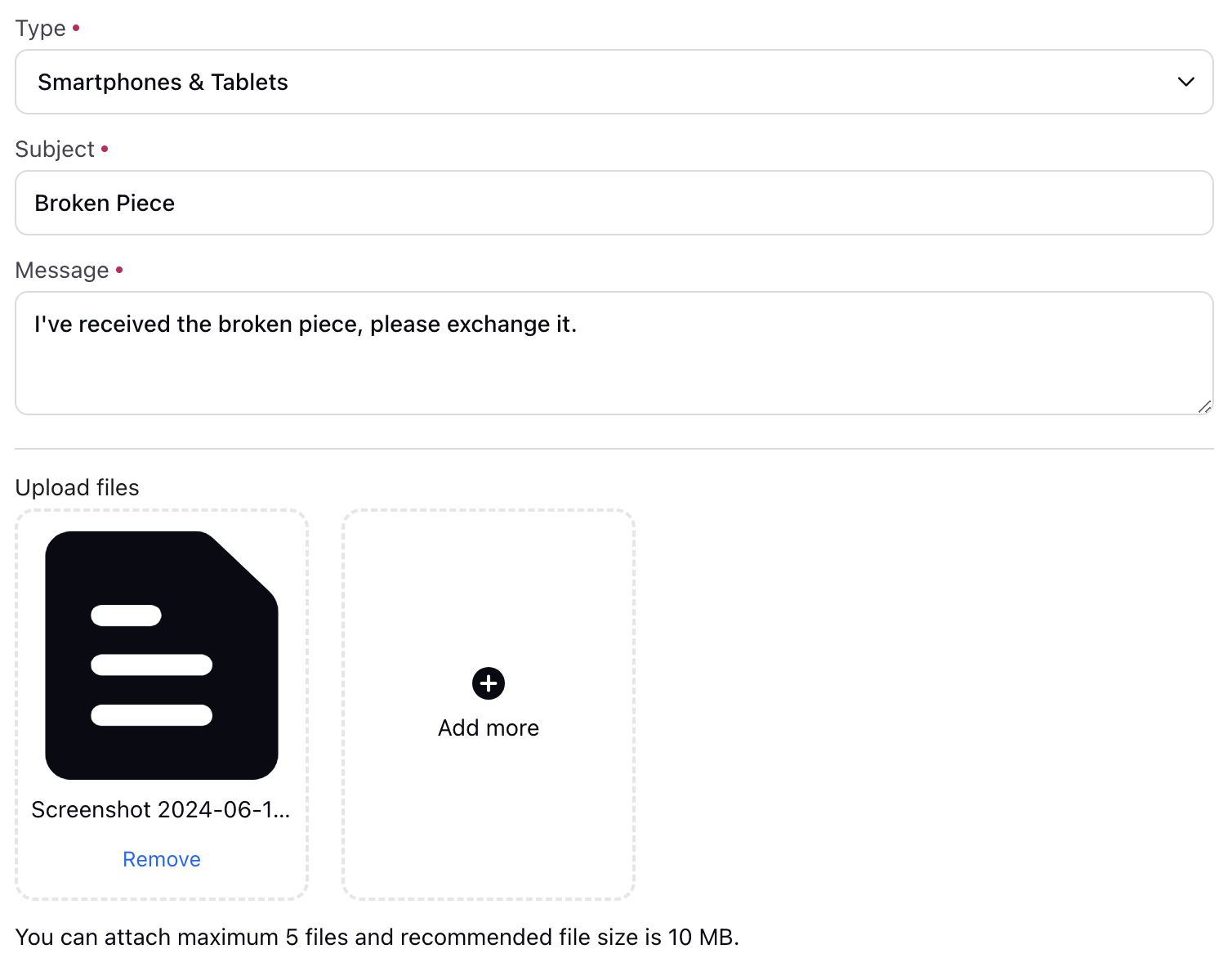
Attach File
The file attachment feature allows the users to upload or attach files, such as documents, images, or videos, as part of a process or transaction. This feature allows users to provide additional information or data that may be required for the workflow, such as a resume for a job application, or an image of a product for customer support.
In a guided workflow, the file attachment feature can be used for a variety of purposes such as:
Allowing customers to attach proof of purchase for a return or warranty claim.
Enabling users to submit documents or images as part of a registration or application process.
Allowing users to attach photos or videos to a report or feedback form.
Giving users the ability to attach a CV, cover letter, or portfolio for a job application
It also allows us to validate the files and ensure that they are in the correct format. We can also allow single attachment or multiple files.
Note: To enhance security and protect sensitive content, we have implemented measures to secure attachments uploaded via external guided workflows using the Attach File component. Previously, URLs containing the path to uploaded files were exposed in network calls, which could potentially be accessed without authorization. To mitigate this risk, attachments will now be saved in a secure bucket. Access to these files will be restricted via signed URLs, which will include an expiry time of 1 hour. This ensures that access to the uploaded files is both time-limited and secure, providing enhanced protection against unauthorized access.
Enablement note: To learn more about getting this capability enabled in your environment, please work with your Success Manager. |
Checkbox and Checkbox Group
A checkbox can help agents to stay organized and efficient during a call, by providing them with a clear and easy-to-use interface for tracking important information and tasks.
While a checkbox component can allow you to only one checkbox at a time, you can map multiple simultaneously through checkbox groups. You can add multiple inputs either manually or you can also resolve them in real-time via a variable. You also have the option to specify disability conditions for the corresponding component, which will disable it for users to fill.
Custom Field
The Custom Field Input component is used to fetch and modify a custom field value. This component can be used if you want to directly update the custom field through the user input. This saves the effort of taking the input in a text or number input and then separately configuring custom field action after the screen. You can update three types of custom fields through this component: Profile, Case and User. This you can select through the “Asset Class” field. Once a particular asset class is selected you can select which custom field you want to update through the user. You also have the option to specify disability conditions for the corresponding component, which will disable it for users to fill.
Date & Time Input
The use cases for this component typically includes - scheduling an appointment, delivery date, mentioning the date on which issue occurred while lodging a complaint, purchase date etc.
Date Format: There are a variety of formats available via which you can take the date input for example (dd/mm/yy, dd/mmm/yy etc). You can select these through via the “Date Format” field
Show Time: You can also take time as a input (along with date, month and year) by checking “Show Time” field
Business Hours: There is also an option of selecting the Business hours in the component. The options outside the selected business hours will be disabled for users to choose. Furthermore, if the user attempts to input a time outside the defined business hours manually, an error message will be displayed.
Date and Time Conditions: You can also limit the time range over which the user will have to input. This can be achieved via the “Date and Time Conditions”. If the user inputs outside of the time range an error message will be displayed.
Enable Date & Time Conditions: This field allows you to define specific conditions for displaying date and time values. By using a Groovy script, you can configure the display to show dates that are after, before, or within a specified time range.
You also have the option to specify disability conditions for the corresponding component, which will disable it for users to fill.
Dynamic Table
The dynamic table feature allows users to view, sort, filter, or select data in a tabular format, which can be displayed and updated in real-time, as part of a process or transaction. This feature allows users to easily view, manage, and interact with large amounts of data in a clear, organized manner. You also have the option to make rows copiable and freeze the first data column, which keeps the first column fixed in its position while scrolling horizontally.
In a guided workflow, the dynamic table feature can be used for a variety of purposes such as:
Displaying the results of a search or query in a tabular format.
Showing the status of multiple items or orders in a single view.
Allowing users to edit or update data directly in the table.
Displaying reports or analytics data in a way that is easy to understand and interact with.
You can select the Variable Type as Text, Date, Number, MultiValue, Picklist, MultiValue Picklist, Multi Line, Hyperlink Link, and Media. By selecting Media, you can effortlessly display product images for agents to conveniently view them directly within the table interface. Furthermore, agents can expand images for a full view by clicking on them.
Dynamic tables have features such as pagination, filtering, and multi-selection. Refer to the article on solving use-cases with Groovy.
Email Input
This is an extension of text input with the additional feature of making the input read only. Making an email input field read-only means that the field can be viewed by the user but cannot be modified or edited. This can be useful in a variety of contexts, such as when an agent is interacting with a customer during a call:
One possible use of making an email input field read-only is to prevent errors or inaccuracies when capturing the customer's email address. For example, if a customer provides their email address verbally, the agent can enter it into the field and then make it read-only to ensure that the email address is accurate and that the agent does not accidentally make any mistakes while typing it in.
Another use could be when a company already has the email of the customer and it wants to confirm with the customer that the email address is correct. Making the email address read-only can prevent the customer from mistakenly giving a wrong email address and also can help the company to update its records.
Additionally, making an email input field read-only can also help to protect the customer's privacy and security by preventing unauthorized access or changes to their email address.
You also have the option to specify disability conditions for the corresponding component, which will disable it for users to fill.
Location Input
The Location Input component allows users to capture location data using latitude, longitude, pinpoint, and a standard search bar. This feature enables agents to effortlessly view and select locations within the workflow interface, improving usability and flexibility. Refer to the location input field descriptions to easily configure your location input component.

Location Input field description
Field Name | Description |
API Name | Unique identifier used to reference a particular object, field, or component in an application programmatically. It is typically used in backend code, integrations, or API calls. API Names are often system-generated and follow a specific naming convention, such as using underscores instead of spaces (e.g., LOCATION_14) |
Label | Customize the label with formatting options (bold, italic, underline, strikethrough). |
Mark Field as Mandatory | Ensure the field is mandatory by selecting the checkbox. |
Add Help Text | Provide additional help text by enabling the toggle (optional). |
Default Value | Set a default value for the location input to pass.
|
Google Maps Credential | Select the appropriate credentials from the dropdown menu for your component. |
Map ID | Enter the Google Maps ID for integration (to be provided by the customer) |
Map Height | Configure the map height (default: 300 px; width is set to 100%) |
Alignment | Choose alignment options (Start, Center, End) |
Input Disability Conditions | Configure conditions for input disability |
Visibility Conditions | Set visibility conditions for the component. |
Configure Error Messages | Define error messages for better user experience. |
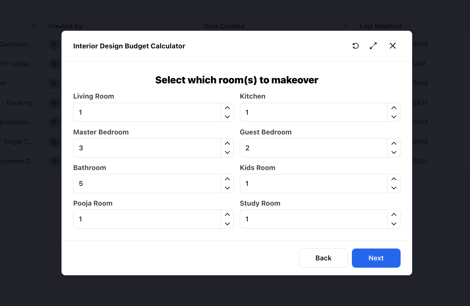
Number Input
Number input as the name suggests is used to input/store numerical information. You can apply the following constraints in the number input:
Minimum Value: If the number entered is less than minimum value an error message will be displayed.
Maximum Value: If the number entered is more than minimum value an error message will be displayed.
Maximum Decimal Places: If the number entered has more decimal places than defined and an error message will be displayed.
Additionally, you can enable the "Show Increment/Decrement Arrows" feature, which displays an input field with a default value and enables users to adjust the value by incrementing or decrementing it using arrow icons.
You also have the option to specify width, alignment and disability conditions for the corresponding component which will disable it for users to fill.

Password Input
This is a feature typically for the customer facing GWs, and it takes in a password to verify the user’s identity. The password while inputting is masked and the eye icon can be used to see the password. You can define the format of the password to be either numeric or alphanumeric with the maximum and minimum length specified. You also have the option to specify width, alignment and disability conditions for the corresponding component which will disable it for users to fill.
Phone
As the name suggests this component is used when the user input is a phone number. By default country code support in the Phone input component will be enabled.
You can define what will be the default value of the country that will appear to the user when they are using the guided path via “Default Country Code” field. You can also dynamically set the default country code value using the resource selector.

You can also define what values will be available in the country code dropdown as well via the “Filter Country Codes” field.
You can also define Regex validation for phone number componenet.

Pick List
It is an input field that facilitates selection of a predefined option from a drop-down menu. It is commonly utilized to represent specific actions or states that are pertinent to the workflow, and can aid in information gathering, decision-making, and process automation. Additionally, dropdowns can be employed to assign tasks to team members, as well as to set the status of a task or project. It is also possible to define picklists using variables in the format [[‘label’:’abc’,’value’:’abc’]] or through APIs, and to adapt their response to the UI.
Radio Group
Radio buttons can be a useful tool for agents during a call as they allow the agent to quickly and easily select from a predefined set of options. You can add input options either manually or you can also resolve them at real time via a variable. You also have the option to specify disability conditions for the corresponding component, which will disable it for users to fill.
Rating
The rating feature allows users to provide feedback or rate a product, service, or experience using a scale of values, represented by stars.
In a guided workflow, the rating feature can be used for a variety of purposes such as:
Collecting feedback from customers on the quality of a product or service.
Gathering information on customer satisfaction with a purchase or transaction.
Allowing users to rate the overall experience of using an application or website.
Helping users compare the relative quality of different products or services.
Slider
The slider element allows users to make selections or adjust settings within a continuous range of values. A slider is typically represented by a bar that can be moved left or right, to select a specific value within the range.
In a guided workflow, slider elements can be used for a variety of purposes, such as:
Setting a budget or price range for a product or service.
Selecting a specific date or time within a range.
Setting a preference for a certain level of intensity, such as workout intensity or coffee strength.
In the slider element, the minimum and maximum value can be used to specify the range and the step size can also be set.
You also have the option to specify disability conditions for the corresponding component, which will disable it for users to fill.
Text Input
Text input as the name suggests is used to take a text based input from the user that can be stored for future use. You can apply a pattern check as well to ensure that the correct input is taken from the user. Pattern check can be of the form @gmail.com, .com etc. You also have the option to specify width, alignment and disability conditions for the corresponding component which will disable it for users to fill.
Text area is similar to text input, the only difference is that pattern check is not supported in text area. It is generally used when you are expecting a paragraph type of a response from the user. You also have the option to specify the minimum and maximum character limit. The component size can be increased for better visibility to accommodate larger sized content. The drag functionality in the bottom right corner allows you to adjust the component, enabling you to view all the content on a single screen.
Rich Text Input
The Rich Text Input feature in guided workflows provides advanced text formatting capabilities, ensuring that formatting is preserved across all workflow nodes. Users can incorporate various styles, including bold, italics, and underlined text, to enhance visual appeal and readability. This feature also supports hyperlinks, lists, and customizable text styles and sizes, offering a robust and flexible approach to information presentation. Consequently, users can compose well-formatted emails directly within the guided workflow.
Toggle
Toggle allows users to switch between two states. They are often used to enable or disable a certain feature or option within a workflow. It is basically a switch that can be flipped back and forth to change the state. In a guided workflow, toggle can be used for a variety of purposes, such as:
Enabling or disabling certain features, such as notifications or email updates.
Indicating whether a user prefers to receive information in a certain format, such as text or email.
Specifying whether a user would like to opt-in or opt-out of certain services or programs.
You also have the option to specify disability conditions for the corresponding component, which will disable it for users to fill.
URL
This is an extension of the text input. It also has a pattern for validation of the url and a placeholder to show the end user the expected format of the url. In addition to the basic text input features, the URI Input component also has the following:
Pattern validation: The URI Input component has a pattern validation feature that ensures that the user inputs a valid URI. This validation feature helps to prevent invalid or incomplete URIs from being submitted.
Placeholder: The URI Input component has a placeholder attribute that shows the expected format of the URI to the end user. The placeholder is a non-editable text that disappears when the user starts typing, giving the user a visual cue of what type of input is expected.
You also have the option to specify disability conditions for the corresponding component, which will disable it for users to fill.
Asset
The asset component can be used to select display text , rich text and dynamic assets from your digital asset manager .

reCAPTCHA
You can add Google reCaptcha as an input component to verify that a human is completing the form or using the website, rather than a bot. If the user fails to complete the reCaptcha, they will not be permitted to advance to the next screen. To add reCaptcha, you will need to provide the site and secret keys.
To mask your site keys and secret key using the ReCaptcha v2 component,follow the below steps -
In your Guided workflows, select the Screen node.

Click on Component to add a screen Component.

Select the RecCaptcha v2 component from the drop down list on the right side of your screen.

Select the previously added reCaptcha v2 Credential from the reCaptcha v2 credential drop down and click on save.

 Note:
Note:
You need to add your reCaptcha v2 credentials in Sprinklr platform before you can use it in your reCaptcha v2 component.
To add an external Credential go to All Settings > Manage Customer > External Authentication > Add Credential > Enter the External Credential name, Set Authentication type as "API Key" , enter API key (this is your site key) and password(this is your secret key).

If you are an admin and want to allow users to add their API key (site key) and password (security key) for external authentication, create a role with the below permissions and assign it to the appropriate users or user groups.

Display Components
Banner
It is used to insert messages meant for the agent that can be in various template formats such as warning, success, error, disclosure, reminder. According to the template chosen, various symbols are used to indicate the same to the agent. For the banner component, add title, sub title, width, alignment and select the appropriate banner template from Error, Warning, Success, Reminder, and Disclosure. In title and subtitle, you can also add groovy to include case number (${UNIVERSAL_CASE.CASE_NUMBER}), profile ID, etc.
CTA Component
Enhance your screen by incorporating buttons with Next Screen Action, Back Screen Action, Close Screen Action and Authentication. By integrating authentication button, you empower agents to seamlessly authenticate customers before progressing further in the workflow. Choose the preferred Single Sign-On (SSO) using which the authentication has to be done.
Customize the buttons' appearance by selecting the Label, Icon, Icon Position, Button Position, and Variant. Additionally, you have the flexibility to set Visibility Conditions, allowing buttons to be displayed based on specific criteria being met. You also have the option to specify disability conditions for the corresponding component, which will disable it for users to fill.
Description Text
Description Text can be used to simply show a text output on a screen. The font, size, alignment of this text can be customized or links can be added to the text. You can also make the text copiable for the users. Additionally, you can add controlling field for the description text to show information basis the selected row of the table, picklist value, etc. You can also include a resource by inserting relevant placeholders.
You have the option to enable Auto Refresh Content and specify a duration in seconds to automatically refresh the description text at the defined interval. This is particularly useful when you have custom fields added in the description that may be updated and you want the refreshed content to reflect any changes in their values.
You can also add text assets so that a change in one text asset changes the static data in all the guided workflows.
HTML Display
Leverage the HTML Display option to incorporate and customize additional content. Using this option, you can create rich and visually appealing descriptions to complement the guided workflow. This can be achieved by employing HTML tags within the designated section to enhance and format the description as needed.
Additionally, you can make the individual blocks of text copiable in Care Console, by wrapping the desired content in <div class="gp-copiable-block"> content </div>.
Image/Video Asset
It can be used to insert any image or video asset from the various sources as shown in the image from DAM, UGC, media valet and even upload from your local system.
Knowledge Base Article
The Knowledge Base Article component enables you to display article content directly on a guided workflow screen. You have the option to specify the article's height in pixels. If you do not specify the height, the size of the component will automatically adjust to fit the content of the KB article. These Knowledge Base (KB) articles can also be presented on external guided workflows. In cases where articles are created/edited on third-party platforms and migrated into Sprinklr, such KB articles will also be accessible within this component.
Spacer
Define the spacing by specifying the height of the Spacer component, adjusting the space between two input fields.
Layouts
Divider
As the name suggests it is used to put a divider between any two components.
Two/Three Columns
Generate a section, allowing for either two or three columns. Various column width templates are available for selection. You can also incorporate any further desired component into the columns.
Custom Components
Custom App
Integrate a Custom App component into your guided workflow screen. These external apps can be added to the Sprinklr platform through the Custom Apps module under platform settings.
This feature empowers brands to incorporate third-party apps or widgets seamlessly into the guided workflows. For instance, an airline could integrate a seats selection app, meals selection app, and more to enhance customer interaction.
Moreover, customize your integration further by specifying a templated prop with the desired value. This allows you to pass specific variables, facilitating the addition of tailored widgets based on unique requirements and preferences.
Placeholder
A placeholder with CTA buttons such as Move to next screen, Close screen, Go back to previous screen, and Send payload can be added. You can customize the appearance of buttons by selecting the Label, Icon, Alignment, and Variant.
"Visibility Conditions” can be set when you want to display the placeholder only when those particular conditions are met