Creating Custom Components
Updated
You can customize your Care experience by creating custom components and deploying them to all or selected Agents.
Prerequisites
Setup Account in Sprinklr
Before you get started, you need to sign up for a Sprinklr account or log into your current one.
Install Node
NodeJS is needed to create and test custom applications. To create custom apps in Sprinklr, you must have version 16.x or above. You can use NVM to install NodeJS. The benefit of NVM is that it gives you the flexibility of managing different versions of Node. Follow the steps mentioned here to install nvm.
To install node 18.16.1, e.g., follow these steps -
To install Node, run
$ nvm install 18.16.1Verify the installation with the following command:
$ node --versionSet the default node version
$ nvm alias default 18.16.1
Install Yarn
We use yarn to manage dependencies and run tasks. To install yarn, open CLI and run:
$ npm install --global yarnFor other ways to install yarn, please refer https://classic.yarnpkg.com/lang/en/docs/install.
Getting Started
Create Custom Application
Sprinklr provides a boilerplate to assist you in setting up your custom app. This will create a basic Todo List component that can be uploaded to Sprinklr later. You have the flexibility to tailor the widget to your specific requirements, enabling you to make desired modifications.
Follow these steps to set up your custom application:
Open the CLI and navigate to the folder where you want to create your app.
Run the following command to start setting up your app.
$ npx @sprinklrjs/create-sprinklr-appThis will prompt you to enter the application name.

Enter the name you want to keep for your app. Once you enter the name, you will get a prompt to choose the component type.
Select Component Type
create-sprinklr-app provides two component types:
React Component
iFrame
React Component

Select the React Component option. Once done, all the necessary dependencies will be installed inside the folder named after your app.

If you open the newly created directory in the editor, you will see the following directory structure:
.webp "image (1).webp")
An important file to note here is the manifest.json file. This file defines the metadata of our application and has the definition of all the custom components that would be created. By default, this file looks something like this:
.webp "image (2).webp")
A detailed spec of the manifest.json file can be found at the end of this document.
To start working on this application locally, run the following command in CLI from inside the application root folder:
$ yarn devThis compiles all the components listed in the widgets attribute within the manifest.json file and places them into a designated folder. Subsequently, it initiates the local hosting of these components from your machine. If you opt to run the application on a port other than the default (3000), please make sure to update the basePath parameter within the manifest.json file accordingly.
If you open http://localhost:3000/todo/index.js, you will see a bundled output of your component like this:
.webp "image (3).webp")
iFrame
If you open the newly created directory in the editor you will see a NextJS app with the following directory structure:
.webp "image (4).webp")
The most important file to note here is the manifest.json file. This file defines the metadata of our application and has the definition of all the custom components that would be created. By default, this file looks something like this:
.webp "image (5).webp")
This indicates that we want to create a custom page called To Do hosted at a relative URL /todo. To know more about the supported parameters in manifest.json refer to its documentation.
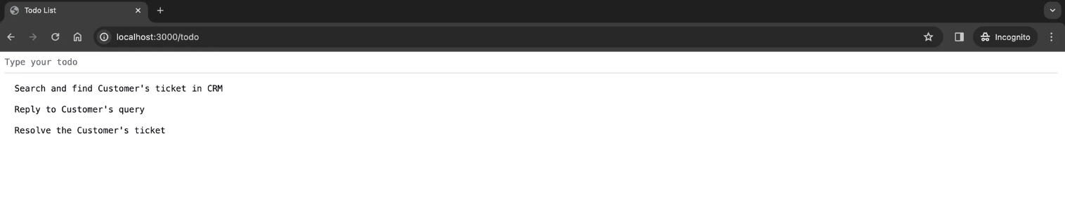
To see this application locally, run the following command in CLI from inside the application root folder -
$ yarn devThis would start the NextJS app. Now if you visit http://localhost:3000/todo from the browser, you will see something like this:
Uploading Application to Sprinklr
So far we have created a Sprinklr application that serves bundled output of our components. In this section, you will learn how to test this app inside the Sprinklr environment.
Login to Sprinklr with your credentials and go to the Settings section. Choose the Custom Apps option.
.webp)
Click on the Upload App button and choose App Descriptor option.
.webp)
Select the manifest.json from the application you created on your local machine and upload.
.webp)
If you scroll down within the above form, you will find various visibility options that allow you to control with whom you want to share this application.
.webp)
Once you click on the Upload button, which would add your custom application to the Sprinklr platform.
.webp)
Configuring Components in Agent Desktop
Once your custom application has been added, you need to configure these components in the Agent Desktop. Open the record page builder and open the layout where your custom component needs to be added. Click on the plus button to choose the location of the component and select your custom component from the list. In this case, it would be my-custom-todo-app > Todo List.
.webp "image (12).webp")
Once the changes are saved, head over to the Agent Desktop page to view your changes. You should be able to see your custom component.
.webp)
More info on how to configure the Agent Desktop can be found here.
Configuring Components in Launchpad and Persona Apps
Similar to Agent Desktop, apps can be configured in launchpad and persona apps. The entry points will be the pages added in manifest.json file.
.webp)
Click on View Details to open app details:
.webp)
Now, add your custom app to preferred location in launchpad or any persona app.
.webp)
You will be able to see your custom app To Do in Launchpad.
.webp)
Note: widgets and pages are supported in both React Component and iFrame.
Building your Custom Application
Making Changes to Your Custom Page
We have created a custom application and uploaded it to Sprinklr. You will now learn how to make changes to your components. Make sure the custom application is running on your localhost as explained above and open the Agent Desktop page.
Your component looks like this:
.webp "image (18).webp")
Suppose you wish to modify the existing placeholder text Type your todo and incorporate a user greeting into it. Open up the custom application, open the file Todo.tsx, and change the placeholder attribute to the following value:
.webp)
After making this change, reload the Agent Desktop app in Sprinklr. You will be able to see the custom widget with updated changes.
.webp)
Using Sprinklr SDK
Sprinklr offers an SDK to facilitate interaction between custom components and the Sprinklr platform.
SDK has the following methods:
sdk.getContext()
Returns the context within which the custom component has been opened. For e.g., in the case of Agent Desktop, it will have information about the currently logged-in user and the ID of the case being worked on.
{
  user: {
    id: string;
    email: string;
    name: string;
  },
  case?: {
    id: string;
  },
  profile?: {
    id?: string;
  }
}
sdk.getEnvParams()
This method can be used to get the environment parameters configured for this application inside the Sprinklr platform. It returns an object with the parameter names as keys and their corresponding values set against those keys.
sdk.request()
This method can be used for the following scenarios:
Fetch data from Sprinklr available in the current page's context.
Fetch data from a third-party service via Sprinklr.
Fetching Data from Sprinklr
This is used to fetch standard Sprinklr records in the current page's context like case, profile, and user.
sdk.request(operationName)//Returns the current case user has opened
const currentCase = await sdk.request('getCurrentCase');
//Returns the current profile associated with the case
const currentProfile = await sdk.request('getCurrentProfile');
//Returns the current logged in user
const currentUser = await sdk.request('getCurrentUser');operationName can have the following possible values:
Value | Description |
getCurrentUser | Returns the current logged-in user. |
getCurrentCase | Returns the current case the user is working on. |
getCurrentProfile | Returns the profile associated with the currently opened case. |
getAccessToken | Returns the access token which can be sent while making 3rd party requests. |
Fetching Data from a Third-party Service via Sprinklr
This is used to fetch data from a non-Sprinklr endpoint. For instance, if you need to access information stored in your own custom environment without the burden of handling user sessions independently, you can leverage the Sprinklr session for this purpose. You can use this method to let Sprinklr make the call to your endpoint with the necessary parameters. Sprinklr also injects a JWT token into the Authorization request header which can be used to identify that the request is coming from an authenticated Sprinklr user.
sdk.request(requestParams)const data = await sdk.request({
url: 'https://myCustom.domain.com/endpoint',
method: 'GET',
contentType: 'application/json',
});requestParams is an object with the following type:
Name | Type | Description |
url | string | The URL that should be hit to get the data. |
method | 'GET' | 'PUT' | 'POST' | 'DELETE' | The type of REST call. |
headers | object | Any optional headers that you want to send. |
contentType | string | The expected content type of the response. |
data | object | Any optional data that needs to be sent. This is important for PUT/POST calls. |
sdk.ui.snackbar(type, { message })
This method is used to render a snackbar notification in Sprinklr App with a given message.
//Success
sdk.ui.snackbar('SUCCESS', { message: 'Data saved successfully!' });
//Error
sdk.ui.snackbar('ERROR', { message: 'There was an error while saving data!' });
//Warning
sdk.ui.snackbar('WARNING', { message: 'Approaching SLA Limit!' });
sdk.ui.snackbar(type, params)Name | Type | Description |
type | 'SUCCESS' | 'ERROR' | 'WARNING' | Type of snackbar notification. |
params | { message: string } | The message to be rendered in the snackbar notification. |
The way to use SDK in both types of components is slightly different
React Component
SDK instance is passed as a prop to the custom widget. For e.g., in the custom widget, if you take a look at the file Todo.tsx, you can see the SDK prop passed to the component.
.webp "image (21).webp")
iFrame
In iframe components, the sdk usage is exactly same as react components but there is one difference. In iframe components, sdk can’t be passed as a prop therefore an npm package has been published to use Sprinklr sdk which can be found here. In order to use it for interacting with Sprinklr, user needs to initiate it first for iframe window authentication. Once it is initiated, it can be used same as above.
Using Sprinklr Component Library
Sprinklr provides a React Component Library (Spaceweb) to assist in the development of Custom React Components. To use Spaceweb in your repo, run the following command inside the application folder.
yarn add @sprinklrjs/spacewebRefer to the documentation here to learn more about Spaceweb.
Deploying the Application
Once you are satisfied with the final state of your application, you would want to deploy it for all or some of your agents.
Inside our custom application folder, open manifest.json file and remove the basePath attribute.
Bump up the version attribute in the manifest.json to be greater than the previous one as per semver. For e.g., if the current version is 0.1.0, change it to 0.1.1 or 0.2.0 or 1.0.0.
Open CLI and in the root folder of the application, run: $ yarn publish
This command will compile the final output in a zip file called <PROJECT_NAME>_<PROJECT_VERSION>.zip.
On the Sprinklr platform, navigate to the Settings. Choose the Custom Apps option as shown above. Go to the Options icon next to your application and select Update App.
.webp)
Then select the App tab and upload the zip file created in the above step. Click the Upload button. Once done you will be able to see the updated component on the agent desktop / launchpad / persona apps where we have configured it.
.webp)
Next Steps
Managing your Custom Applications
You can use Custom Application Manager to manage all your current applications. This can be used to manage visibility, update code, and view details of a particular application.
.webp "image (24).webp")
Once you click on the view details, you will see the details of that application.
.webp)
App ID: A unique ID to identify a particular application.
Public Key: This key can be used to verify the authenticity of the JWT token sent as a request header when making an API call to a third-party service via Sprinklr. Refer to the documentation of the request method present in Sprinklr’s SDK for more info.
Visibility: This option enables you to set the conditions on who can see a particular Custom Application in the settings as well as in the Tickets section. You can expose an application to yourself, everyone, or a particular team (which could be configured from the Settings section).
Environment Variables: This can be used to set custom parameters for your application. It’s a simple key/value pair that can be consumed by your application code using the SDK.
Whitelisted Response Headers: List of response headers to be whitelisted and sent back to the component while making a request to third-party service via Sprinklr.
Manifest.json file spec
name
Name of your custom application
version
Current version of the application. Sprinklr follows semantic versioning
basePath
Optional parameter indicating the base URL from where the application is being served. This is useful while developing your application to quickly test your components.
In case of iFrame, basePath can be used if you want to deploy your application on some other server.
widgets
Array of the custom components to be added. Each component config object looks something like this
{
  "id": "todo",
  "title": "Todo List",
  "url": "/todo",
  "scopes": ["RECORD_PAGE"],
  "props": {
    "height": "500px"
  }
}
id Id of the custom component.
title Name of the component.
url Relative url of the component. This is appended to the basePath of where the application is hosted, to render the custom component.
scopes In what areas of application to surface this component. Currently only RECORD_PAGE is supported.
props Properties to be passed to the component. For eg to set a fixed height for your component pass the height props as follows
"props": {
  "height": "500px"
}
pages
Array of custom components to be added. The difference between widgets and pages is scope. Components added to pages would be available in launchpad and persona apps.
Each component config object looks something like this:
{
  "id": "todo",
  "title": "Todo List",
  "url": "/todo",
}