Create Community
Updated
With Sprinklr Communities, you can create an environment where you as a brand can engage with customers directly and where customers can interact with each other in order to resolve issues, provide product feedback to internal teams, and help to reduce churn with initiatives focused on customer brand loyalty.
Enablement note:
|
To create a Community
Click the New Tab icon
. Under the Sprinklr Service tab, select Community Builder within Resolve.
On the Community Admin window, click Create Community in the top right corner.
The new community builder consists of 7 tabs, viz. Overview, Branding, Widget Library, Page Layouts, Content Settings, Screener, Gamification, and Version History.
Click Save in the bottom right corner to create the community.
Use cases of Sprinklr Community
Provide customers with a place to self-serve their care needs.
Give customers an opportunity to share ideas and troubleshoot together.
Gather and analyze feedback from customers about your products and services.
Engage with loyal customers and leverage them as brand ambassadors.
Seamlessly transfer feedback to product and R&D teams to drive enhancements.
Introduce new products and services that resonate with your customer base.
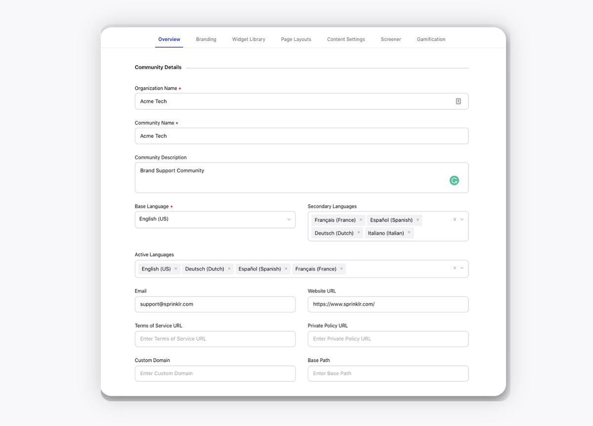
Overview — Terms and Descriptions
Enter the basic details of your community.
Term | Description |
 | |
Select Language | If you have selected the secondary languages, then change the language from the top right corner to translate the content.
|
Organization Name | Enter the organization's name. |
Community Name | Enter a name for the community. |
Community Description | Enter an optional description of the community. |
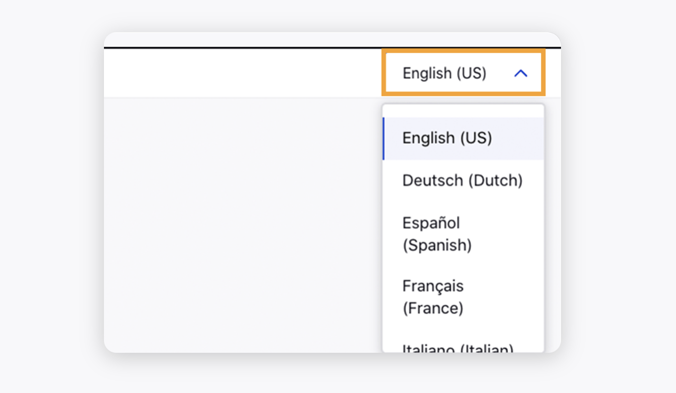
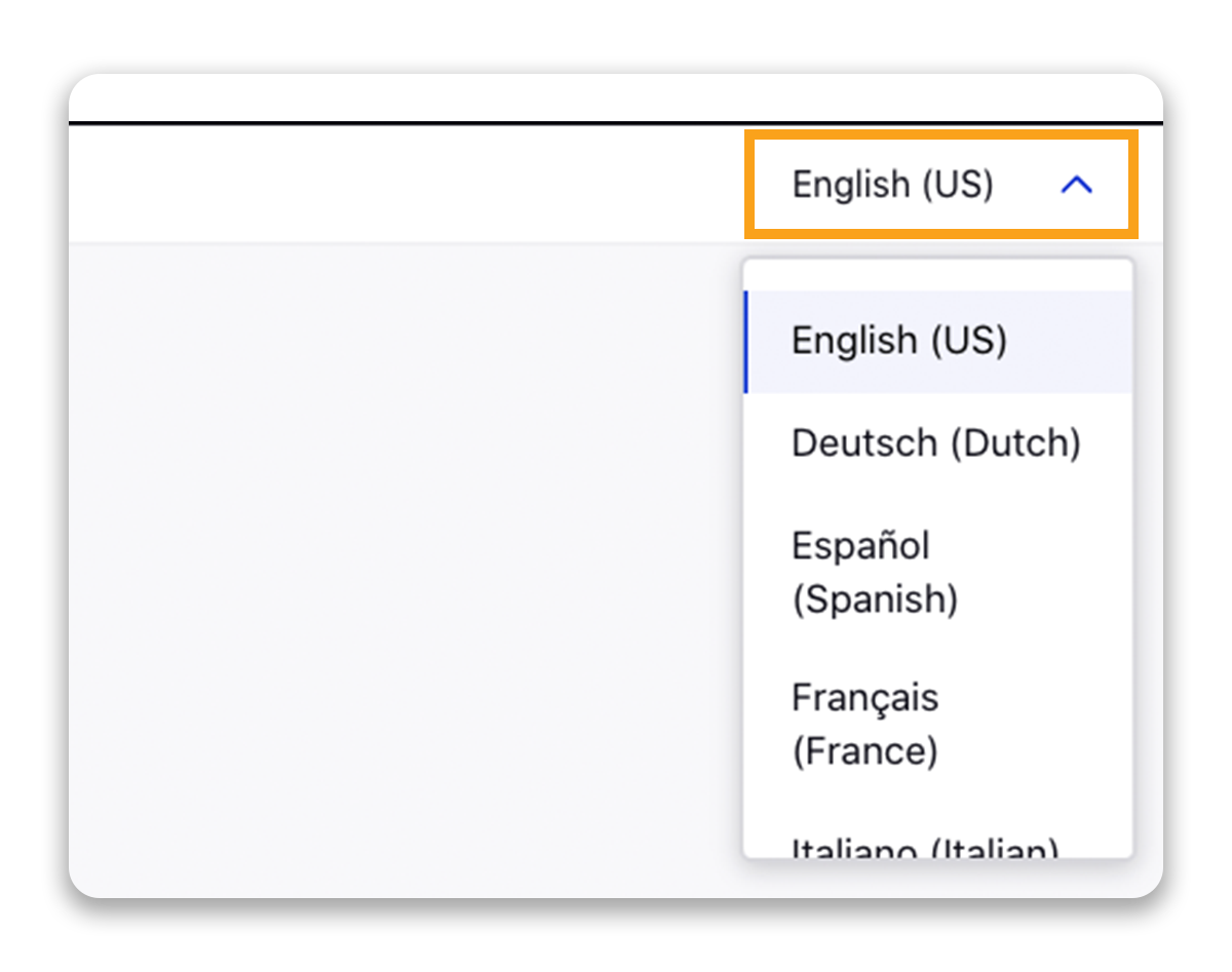
Base Language | Select the desired language in which your community will be created. The supported languages are English (US), English (UK), Dutch, Spanish, France, Italian, Brasil, German, Russian, Chinese, Arabic, Japanese, Korean, Danish, Romanian, Hebrew, Hindi, Indonesia, Kannada, Malaysia, Malayalam, Philippines, Tamil, Telugu, Thai, Czech, Greek, Finnish, French Canadian, Croatian, Hungarian, Norwegian Bokmal, Flemish, Polish, Swedish, Ukrainian, Vietnamese, Turkish, Icelandic, Egyptian Arabic, and Slovak. |
Secondary Languages | Select the secondary languages you want to translate your community into. |
Active Languages | Select the languages that you want the community to be active in. Select active languages only if your brand community is translated into the selected language. On the Community Forum, you can change the desired active language from the top right corner. Through Label Customization, you have the ability to customize labels for specific locales appearing within the language switcher. |
Email | Enter your brand's email address. |
Website URL | Enter the URL of your brand's website. |
Terms of Service URL | Enter the URL of the terms of the service. The Terms of Service is a set of rules that a user must agree to before they engage in services or use a product. |
Private Policy URL | Enter the private policy URL. A Private Policy is a statement or declaration that explicitly details your company policy regarding how you handle user and customer information. |
Custom Domain | Enter the custom domain. |
Base Path | Enter the base path, the consistent part of your web address. |
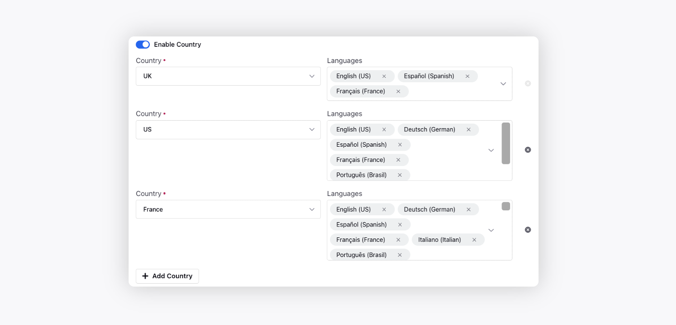
Enable Country | Add different countries and map active languages to show community content based on the country of a user.
|
View Full Page Preview | Click to preview the community page that you have created. |
Save | Click to save the changes. |
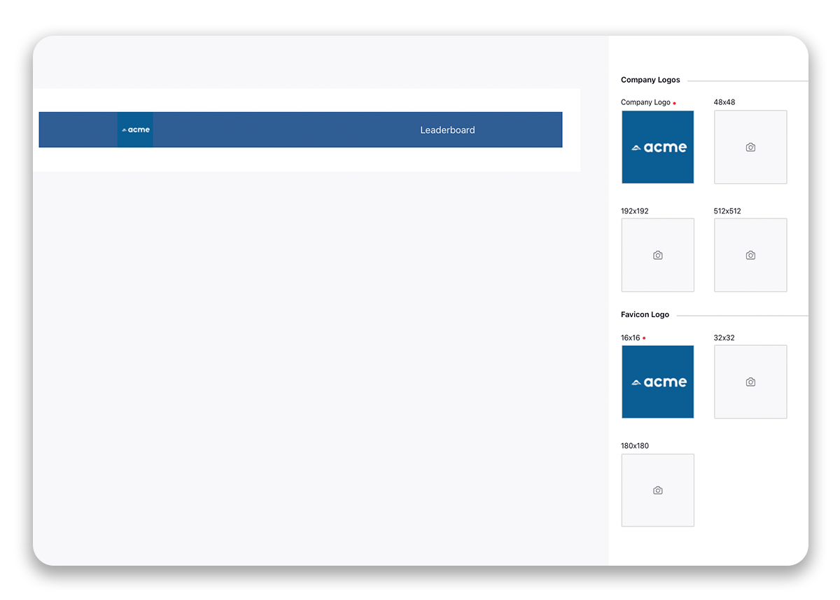
Branding — Terms and Descriptions
Customize the community as per your brand theme.
Term | Description | ||||
Logos |
| ||||
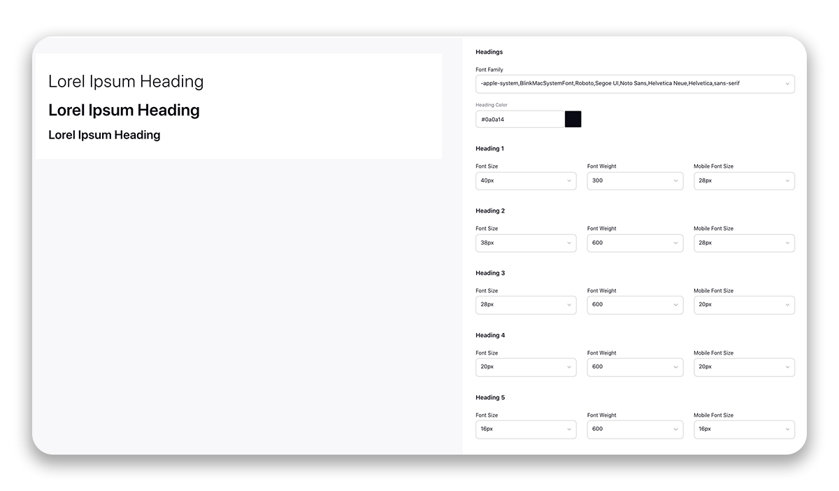
Typography | The typography section has the option to define the font family, color, and size of different fonts. It has two sub-sections: header and body. The Header section provides customization for headings 1-6 while the Body section provides customization for small, normal, large, and extra-large text.
| ||||
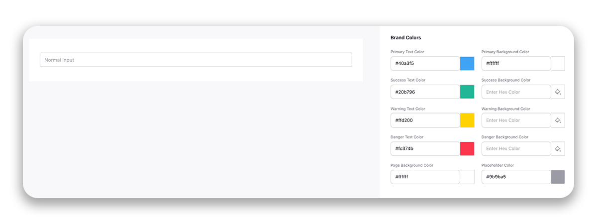
Colors | Color for any text can be changed by typing its code or by clicking on the color and selecting a color from the color pallet. You have the following options to select for Brand Colors:
| ||||
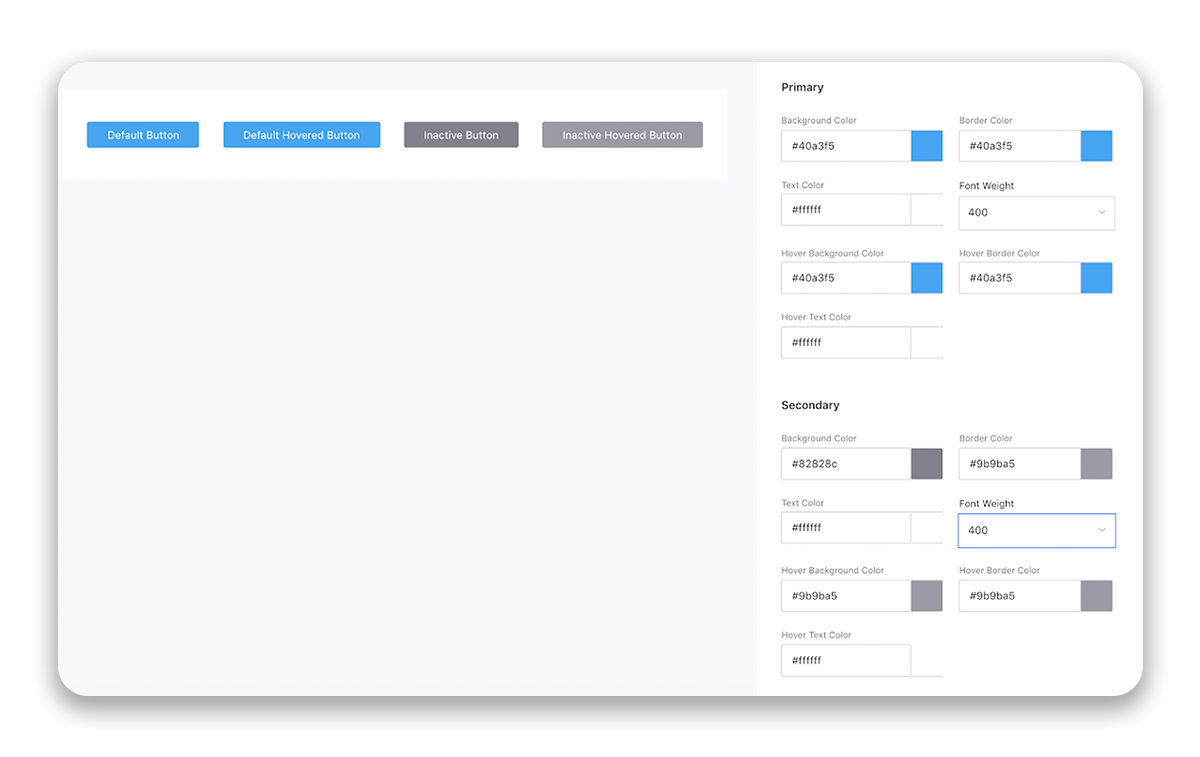
Buttons | This section provides customization options for the look and feel of the buttons on the page. Background, border, and text colors can be changed for primary as well as secondary buttons and also how the buttons will appear when hovered over. Primary Button (Active Buttons) - The Primary buttons are the actions that complete the user's task. It’s important that primary actions have the strongest visual weight as they grab attention. Secondary Buttons (Inactive Buttons) - A secondary action is not as important as a primary action so it should blend into the interface background color. You have the following options to select for Primary and Secondary Buttons:
| ||||
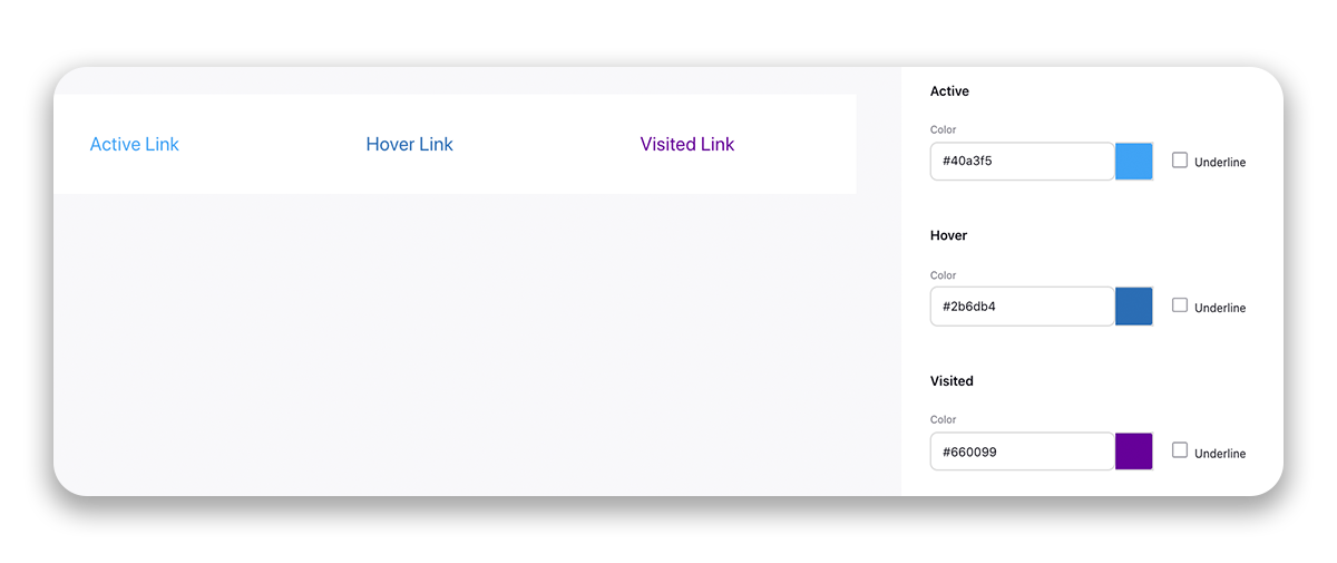
Links | This section provides color customization for Active, Hover, and Visited Links. Also, select if you want to underline the link. Active Link - Active Link is the link that redirects the user to another web page. Hover Link - When a user rolls the cursor over a link, it is referred to as "hovering" over the link. Visited Link - The link on which the user has already visited/clicked on.
| ||||
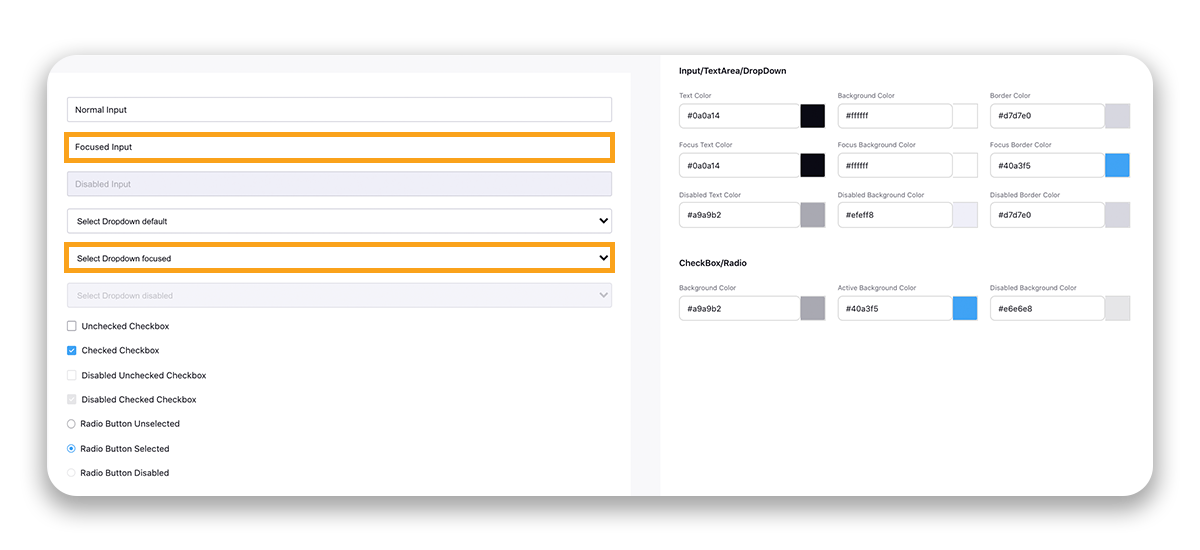
Forms | This section provides customization options for form elements like color for Input, Text Area, Drop Down, CheckBox, and Radio. It can be any form such as Signup Form, Profile Settings, Screener Form, etc. The preview will be available on the left. Options for Input, Text Area, and Drop Down are:
Options for Checkbox and Radio are:
| ||||
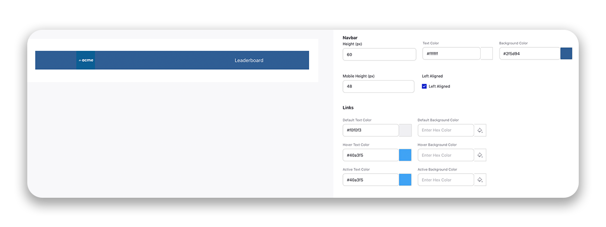
Navbar | You can customize the navigation bar appearing on the top of the community page. You have the following options:
Options for Links are:
| ||||
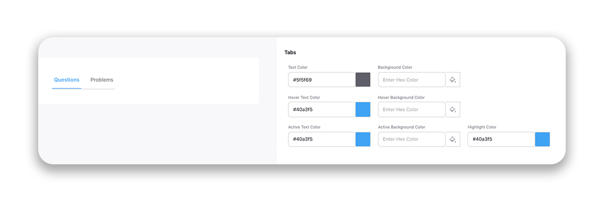
Tabs | You can modify the design of tabs. You have options to select colors for the following:
| ||||
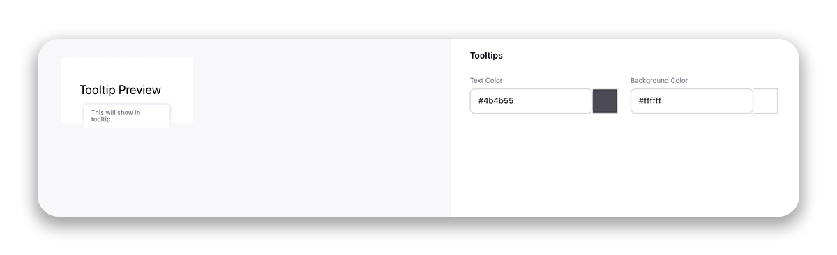
Tooltips | A tooltip is a small "hover box" with information about the item being hovered over. You have the option to select:
| ||||
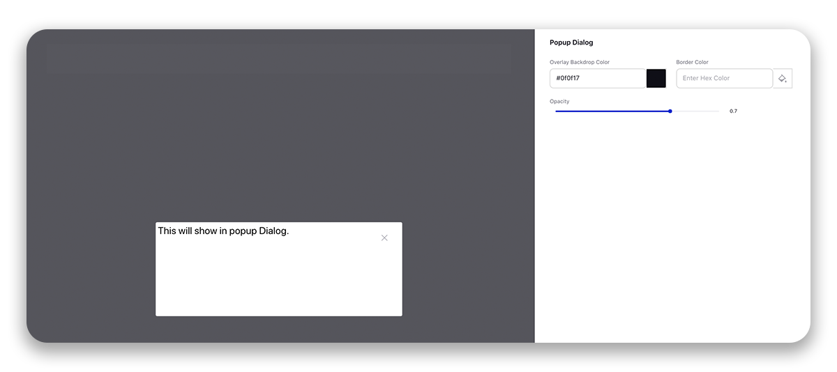
Popup Dialog | This section helps you define the different design elements of the popup. You have the following options:
| ||||
Avatars | An avatar is an icon or figure that appears in the bottom right corner of the user's profile image representing a brand user. You have the following options:
|
Widget Library — Terms and Descriptions
You can add the customized widgets to the community from the Widget Library as required. For more information, see Widget Library.
Page Layouts — Terms and Descriptions
Within the Page Layouts section of the Community Builder, you can design the layout and structure of your Community. You can do it by dragging and dropping the widgets created in the Widget Library section. For more information, see Page Layouts.
Content Settings — Terms and Descriptions
Configure the content flow and structure of the Community Forum.
Term | Description | ||||||
Select Language | If you have selected the secondary languages in the Overview section, then change the language from the top right corner to translate the content.
| ||||||
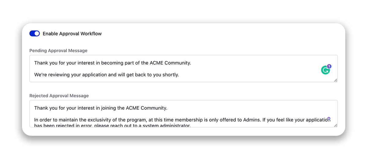
Login Page | It has three sub-sections:
| ||||||
SignUp Page | This section contains properties for the users to fill in when they sign up for the Community.
You can also define the email domains that will be allowed to signup on Community. To enable this capability, raise a support ticket at tickets@sprinklr.com. | ||||||
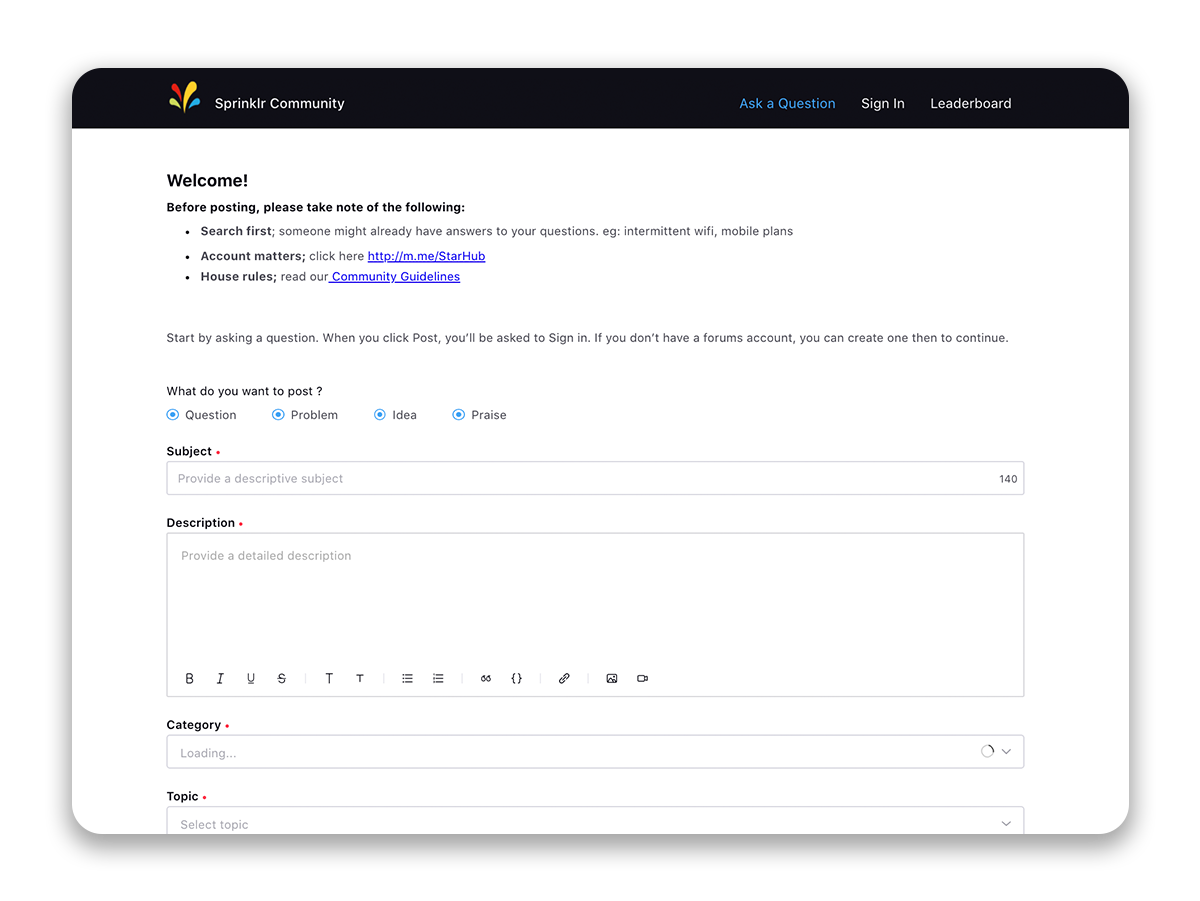
Conversation Types | Conversation can be of different types like a question, problem, idea, praise, etc. This section gives you the option to select different conversation types that will appear throughout the community. You must have at least one conversation type selected. You can also set the order in which they appear. If Allow Creation is enabled, then the user can create that type of conversation. If disabled, only the admin can create such a type of conversation. If Disallow Tags is enabled, users will not see the Tags field while creating a post.
| ||||||
Conversation Create Page | This section provides the customization for content that will be displayed on the "start a new conversation" page. Here, you can:
Within the Editor section, enable the toggle for Allow users to mention profile lists and select the profile lists for bulk mentions when creating posts, comments, and replies. | ||||||
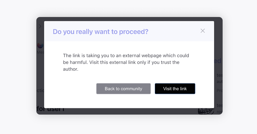
Conversation | Here, you can restrict the users from replying to public comments. You can also set the timer after which the users will not be able to edit or delete their posts/comments/replies. You can also allow users to create private comments and to mark their replies as private/public. Additionally, you can enable external link interception for domains. So whenever a user clicks on a hyperlink within a post which is taking them to another external website, a modal alert will appear. If whitelisted domains are added then the alert will appear for all the URLs except whitelisted ones, and if blacklisted domains are added then the alert will appear only for blacklisted URLs.
Sorting comments and replies on a discussion chronologically - Sort comments either from oldest to newest or newest to oldest. This new option gives users better control over how they view conversations. New comments will appear at the top or bottom based on the selected sort order, and sorting preferences will be saved for logged-in users. Track Last Read Comment - Admins can enable a feature that remembers the last comment a user read in each discussion (only top-level comments, not replies). When a user opens a discussion, the view will automatically scroll to the newest unread comment, helping them quickly pick up where they left off. A “Jump to Newest Comment” toggle will also appear to let users skip directly to the latest unread message.
Mark Comments as Read Users can now mark individual comments as read using the three-dot menu on each comment. This is useful if a comment wasn’t auto-marked due to fast scrolling or short content. Note: The option to mark comments as unread may be considered later based on feedback. | ||||||
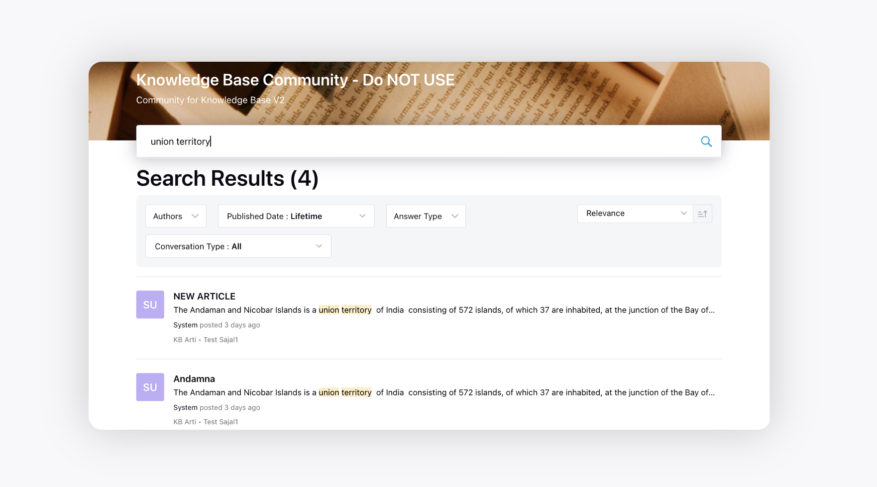
Conversation Search Page | Select the custom fields that can be shown as filters on the Community search page. Add Default Filters - Default filters defined will apply to any query searched in the community. To see the results without any filter, community users will have to manually change the filters on search page. Highlight matched keywords in search results - In the search results on community, the article preview will show highlighted searched keywords. Also, when a user opens an article from the results, it will automatically scroll down to the section with matched keywords to help the users easily find their query. | ||||||
Profile | You can hide the name of the users all over the community to use the usernames instead. Also, you can enable canned responses to be used on the community forum. Enable bookmarks for Category/Topic/Post to make it quickly accessible from the Bookmarks section on the community. Enable Message Drafts - When creating a new post or commenting/replying in the community, a draft pop-up will appear if there was previously saved content. If the user clicks "load," the drafted content will be added to the post. Conversely, if the user deletes the drafted content, it will be removed. Sort Conversations based on User Region - This will float conversations from the user's region prior to conversations from other regions. Disable User Image Upload - This will disable the users to upload their own profile images. | ||||||
Rate Limits | The Rate Limits feature allows administrators to control and limit how frequently certain actions can be performed within the community. This helps prevent spam, abusive behavior, and automated misuse.
Administrators can set rate limits for the following actions:
Rate limits can be configured per minute, hour, or day. For example, you can restrict media uploads to 20 per minute, 100 per hour, or 1,000 per day, depending on your moderation needs.
Rate limits can be applied at multiple levels to give administrators flexible control:
The rate limits can be configured to be implemented to selected Profile Lists and/or Ranks. | ||||||
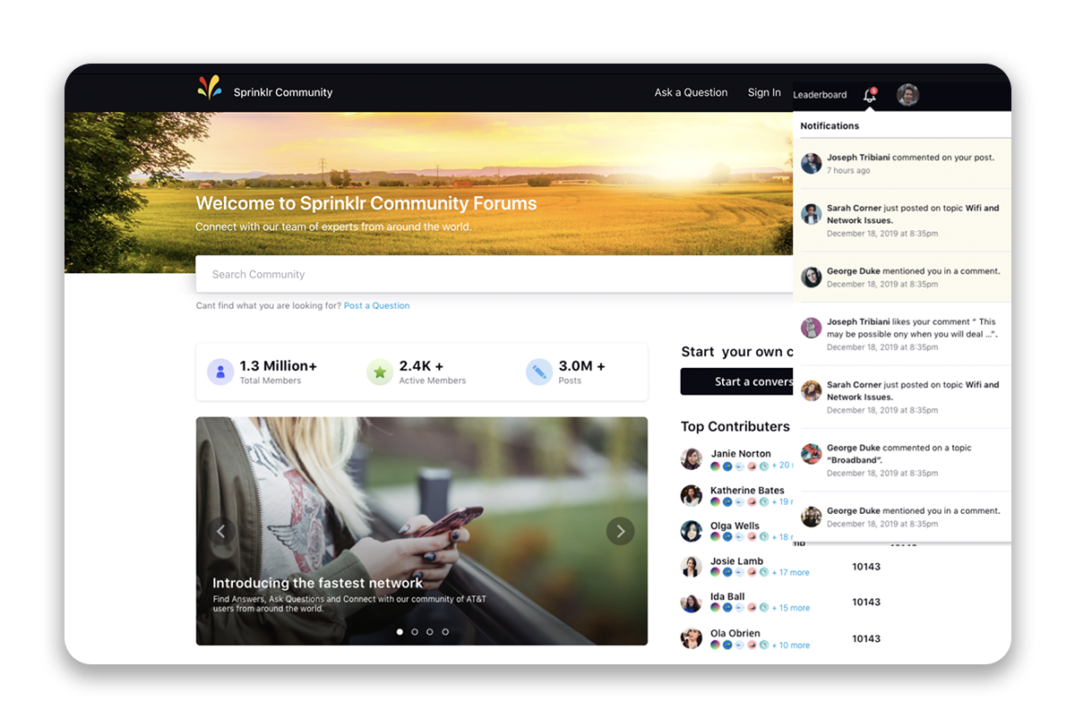
Notification Page | Customize the heading and subheading of the notification page. Select the Notification Types as desired. Selecting Platform will enable the bell icon on the navigation bar of the community forum for the users to receive in-platform notifications. Default Email Notification Preference - Admins can configure email notifications to be OFF by default for all users—both new and existing.
Note: Email notifications will only be sent if the user enables them. | ||||||
SEO | Robots.txt is a text file that webmasters create to instruct web robots (typically search engine robots) on how to crawl pages on their website. Also, you can specify a character limit for your message or post to be removed from indexing under the Minimum Character Count to Allow Indexing field. Also, you can whitelist domains for which you want to avoid using rel=nofollow. | ||||||
Survey | You can enable the Community Survey to be sent to the users. | ||||||
Live Chat | Enable Live Chat on the community and select the desired Live Chat account from the dropdown. You can also enable to show the Live Chat to only logged-in users and select profile lists for whom the chat will be hidden. | ||||||
Direct Messaging | Enable Direct Messaging on the community. | ||||||
Knowledge Base | Enable to show Knowledge Base articles on the community that were created from the Knowledge Base module. | ||||||
Guided Workflow | Enable to show Guided Workflows on the community. | ||||||
Default Avatars | Upload images/GIFs that will be assigned automatically to new users when they sign up to the community. Once logged in, users will be able to choose from a default set of avatars or upload their own in the Profile Settings. | ||||||
Under Maintenance Page | Enable the Under Maintenance page to be displayed when the site is down. You can create this page in Widget Library. | ||||||
Global HTML/CSS | You can add HTML and CSS at different positions on the website and it will reflect across all the pages of your community. You can use this to customize your community. | ||||||
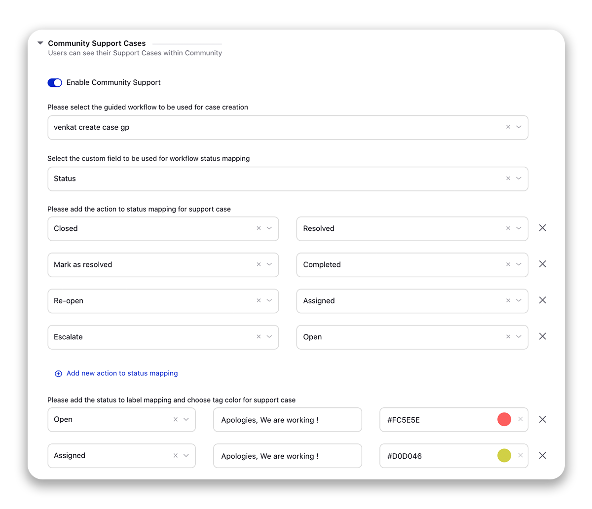
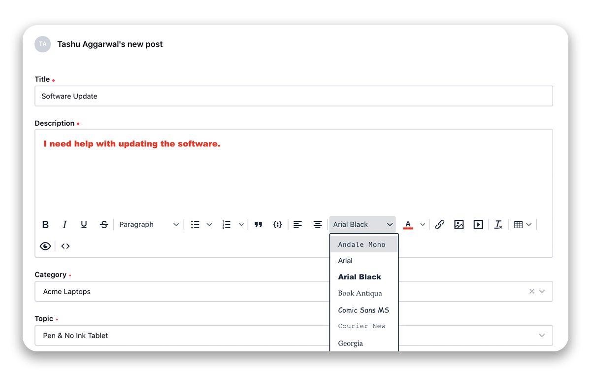
Advanced Settings | Under Analytics, slide the toggle to enable desired analytics. Google Analytics Google Tag Manager Adobe Tag Manager Custom Analytics Sprinklr Analytics Google Webmaster Tools Verification - You can verify the ownership of your community site to use Google Webmaster Tools by entering the verification code. It is a code that gives a site verification token validating that the particular authenticated user is an owner of the domain or site. Status Mapping - Map the "Workflow Message Status" in Sprinklr to the "Conversation statuses" you desire in the community. Community Support Cases - Enable users to create, view, and reply to email cases/tickets on the community forum. Select the desired guided workflow that you want to add to the community for the users to fill. These Guided Workflows can be configured in multiple languages for a multi-language community. Community Editor - Select the community editor as either Slate or TinyMCE. You can allow only the desired users to post media content (Image, Video, Hyperlink) based on permission. By default, all users will be allowed. You can also allow users to change font color and font family while creating a post/comment/reply/signature on the community. Page View Editor - Slide the toggle icon to the right to show the sidebar on the left side. Also, provide the Page Width and Page Max Width. By default, the values are 70% and 1008 pixels, respectively. Community Session - Enter the Session Expiry Time (In Minutes) after which the users will be logged out if there is no activity done by them during that period. Enable Session Expiry Timer to display a popup to users with a 2-minute countdown, notifying them that they will be signed out. Users can click "Stay Signed In" to extend their session.
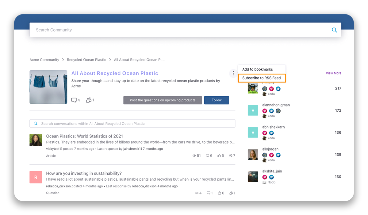
Sandbox Community - From here, you can add an additional layer of security to the sandbox communities that would prompt visitors to enter the username and password to access the community site. RSS - Enable RSS Feed to subscribe to RSS Feed on Community. Time Format - You have the flexibility to select preferred date formats, allowing users on the community to choose the format they prefer. By accommodating various date formats, this feature contributes to making the community more accessible and user-friendly on a global scale.
|


Screener — Terms and Descriptions
Add questions that you might want to ask the users when they first sign in/log in.
Term | Description |
Select Language | If you have selected the secondary languages in the Overview section, then change the language from the top right corner to translate the content. |
Header Image | Check the box to add a header image. |
Screener Description | Check the box to add a description. |
Screener Title | Change the title. |
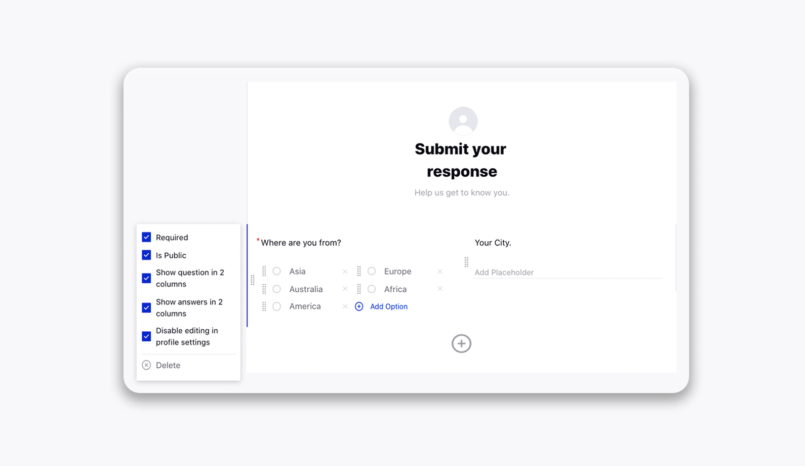
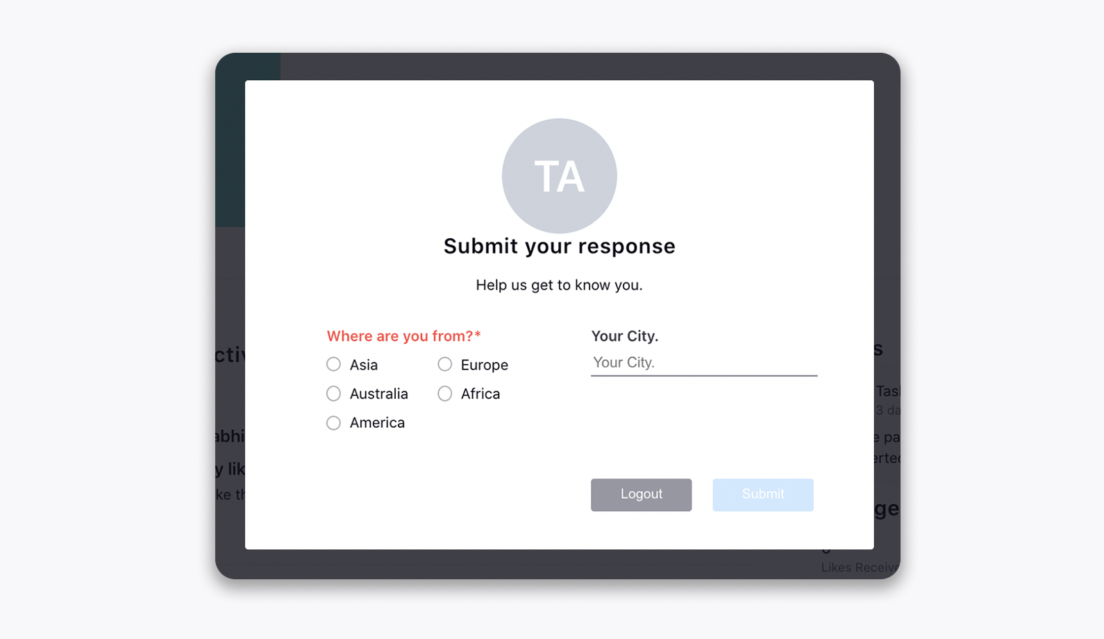
Custom Question | Click the Addition icon to add custom questions that you might want to ask the users when they first sign in. This helps to collect extra data about the users. After adding a question, click the question to view more options. Required - Mark the questions mandatory. Is Public - Show the submitted data on the user profile. Show question in 2 columns - To display questions in 2 columns (see the image above). Show answers in 2 columns - To display answers in 2 columns (see the image above). Disable editing in profile settings - To not allow users to edit the submitted information in profile settings. Delete - Delete the question. |
Gamification — Terms and Descriptions
Incentivize your members to participate, increase engagement, and lead to a more active community as a whole.
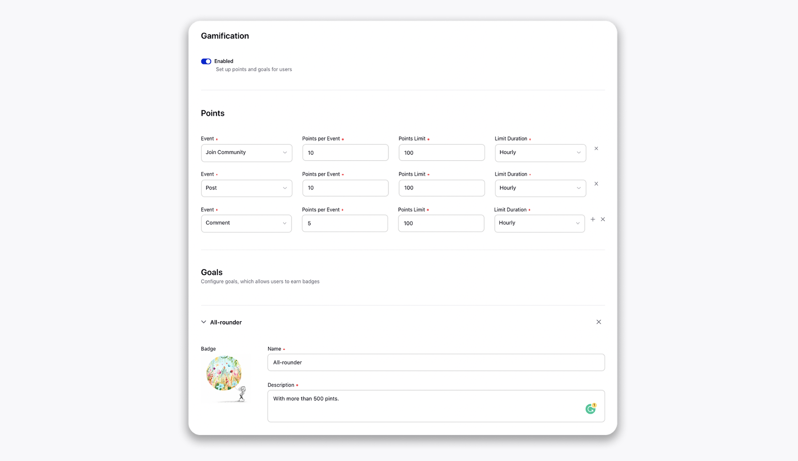
Term | Description | |
Enabled | Slide the toggle to set up points and goals for users.
| |
Points | In this section, points for each event can be defined along with the limits. You can also set the duration for users to score those specific points. For example, the Event is set to Post. The Points per Event and Points Limit are set to 20 and 200, respectively, whereas the Limit Duration is set to Hourly. So, on each post, a user will get 20 points but in an hour the points can not exceed 200 points. | |
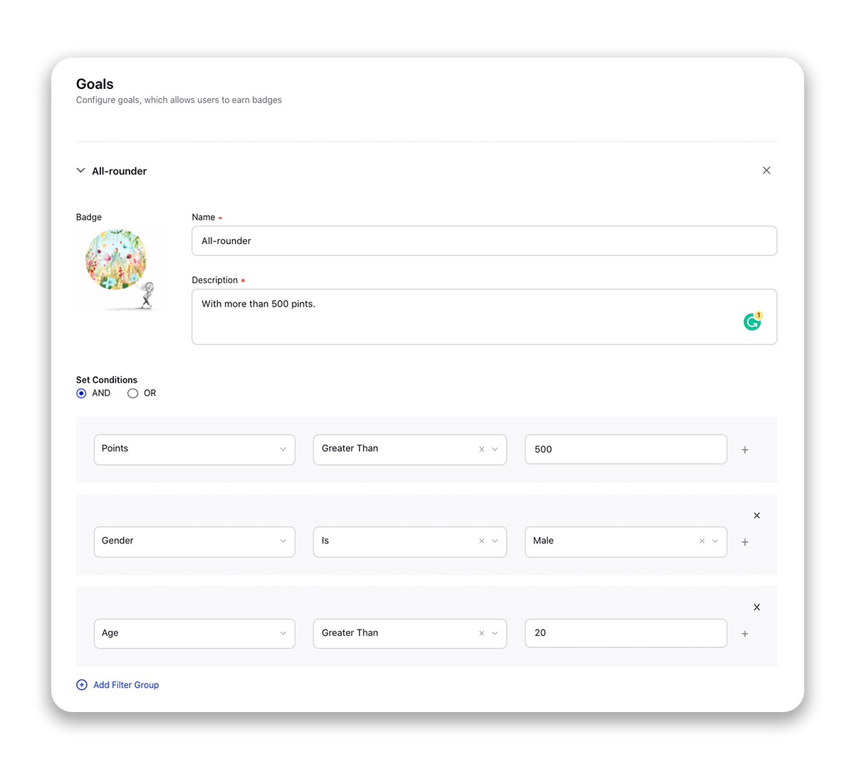
Goals | In this section, goals can be set for users to allow them to earn badges. The conditions can be set for each badge along with the badge image, name, and description.
|
Version History — Terms and Descriptions
Within the Version History section of the Community Builder, you can view the current and previous versions of a community, and when and who created those versions. You can also clone and restore the previous versions of the community. For more information, see Version History.