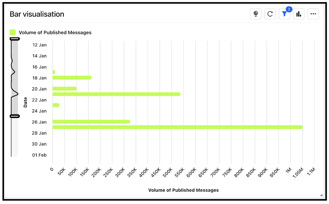
Widget visualization type - Bar
Updated
Bar charts are ideal for comparing a single data category or multiple categories. If multiple categories are being compared, the bars can be grouped together to form a grouped bar chart. Vertical or horizontal bars can be utilized to create visual representations of bar charts.
Steps To Add a Bar Widget
In the top right corner of the Reporting Dashboard window, click Add Widget.
Clicking Add Widget in the top right corner of the Reporting Dashboard window
Enter a Name to display at the top of the widget.
Select Bar as the Visualization Type.
Select the metrics for which you want to view the reporting. The metrics depend on the type of widget and visualization selected in steps 3-4. A Bar chart is a data visualization where each category is represented by a rectangle, with the length of the rectangle being proportional to the values being plotted. Bar charts are also known as horizontal column charts.
Select the Filters for the values to populate in the widget as required.
Select the display parameters as needed.
Click Add to Dashboard in the bottom right corner to add your widget to the dashboard. To view the newly created widget, scroll to the bottom of the dashboard. You can also rearrange the widget into a preferred slot by dragging and dropping

In bar charts, volume is used to illustrate the variations between each bar. Therefore, it is essential for bar charts to always begin at zero. When the starting point of a bar chart is not zero, there is a possibility that users might miscalculate the difference between the data values.