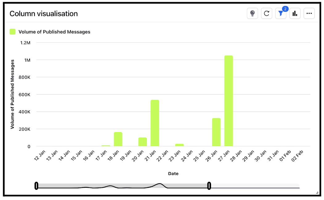
Widget visualization type - Column
Updated
With Columns, you can present the information in a clear and straightforward manner for the audience. Column charts are often considered the most effective type of data visualization, as they utilize our natural ability to comprehend height, unlike many other types of visualizations that may necessitate some form of instruction for the viewer to interpret.
Steps To Add a Column Widget
In the top right corner of the Reporting Dashboard window, click Add Widget.
Clicking Add Widget in the top right corner of the Reporting Dashboard window
Enter a Name to display at the top of the widget.
Select Column as the Visualization Type.
Select the metrics for which you want to view the reporting. The metrics depend on the type of widget and visualization selected in steps 3-4. A column chart is a data visualization where each category is represented by a rectangle, with the height of the rectangle being proportional to the values being plotted. Column charts are also known as vertical bar charts.
Select the Filters for the values to populate in the widget as required.
Select the display parameters as needed.
Click Add to Dashboard in the bottom right corner to add your widget to the dashboard. To view the newly created widget, scroll to the bottom of the dashboard. You can also rearrange the widget into a preferred slot by dragging and dropping.
