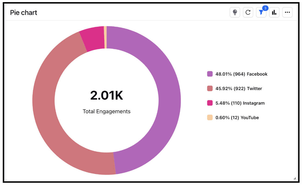
Widget visualization type - Pie Chart
Updated
A pie chart is a circular graphical representation of data in which the data is divided into slices or sectors, with each slice representing a proportionate part of the whole. Pie charts are often used to show the composition of a whole, where each slice represents a part of the total, or to show the distribution of data into different categories.
When to go for Pie Chart visualization type
Pie charts are useful when there are relatively few categories or slices and when the data is presented as percentages or proportions. They are particularly effective for showing the relative sizes of different categories or parts.
Pie charts have some limitations as well. They can become difficult to read when there are too many slices, and it can be hard to compare the sizes of different slices. Additionally, it can be difficult to accurately determine the actual values of each slice from the visual representation alone.
Steps To Add a Pie Chart Widget
In the top right corner of the Reporting Dashboard window, click Add Widget.
Clicking Add Widget in the top right corner of the Reporting Dashboard window
Enter a Name to display at the top of the widget.
Select Pie Chart as the Visualization Type.
Select the metrics for which you want to view the reporting. The metrics depend on the type of widget and visualization selected in steps 3-4.
Select the Filters for the values to populate in the widget as required.
Select the display parameters as needed.
Click Add to Dashboard in the bottom right corner to add your widget to the dashboard. To view the newly created widget, scroll to the bottom of the dashboard. You can also rearrange the widget into a preferred slot by dragging and dropping.
