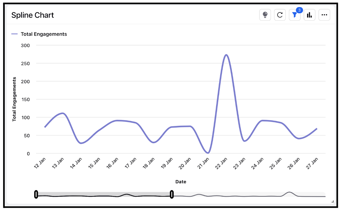
Widget visualization type - Spline Chart
Updated
A spline chart is a type of chart that shows changes in data over time using a smoothed curve that passes through a series of data points. The curve is generated using a mathematical formula called a spline, which is designed to reduce the effect of noise or fluctuations in the data and highlight the overall trend.
Steps To Add a Spline Widget
In the top right corner of the Reporting Dashboard window, click Add Widget.
Clicking Add Widget in the top right corner of the Reporting Dashboard window
Enter a Name to display at the top of the widget.
Select Spline as the Visualization Type.
Select the metrics for which you want to view the reporting. The metrics depend on the type of widget and visualization selected in steps 3-4.
Select the Filters for the values to populate in the widget as required.
Select the display parameters as needed.
Click Add to Dashboard in the bottom right corner to add your widget to the dashboard. To view the newly created widget, scroll to the bottom of the dashboard. You can also rearrange the widget into a preferred slot by dragging and dropping.
