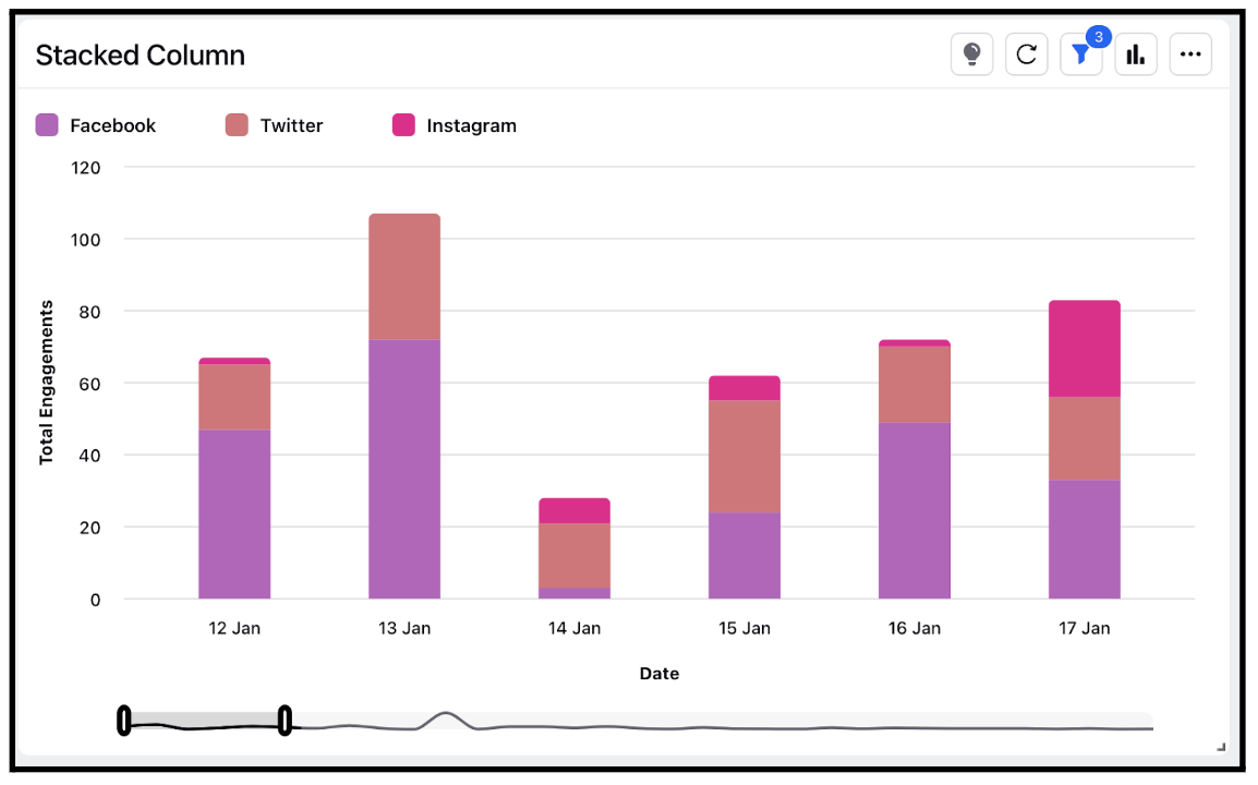
Widget visualization type - Stacked Column
Updated
Stacked column visualizations are a type of chart that displays data in columns, with each column representing a category or a group of items. The columns are stacked on top of each other, and the height of each column represents the total value of the category or group it represents.
Stacked column charts are useful for comparing the relative sizes of different subcategories within a larger category. They allow viewers to easily see how much of the total value each subcategory contributes and how the subcategories compare to each other.
Steps To Add a Stacked Column Widget
In the top right corner of the Reporting Dashboard window, click Add Widget.
Clicking Add Widget in the top right corner of the Reporting Dashboard window
Enter a Name to display at the top of the widget.
Select Stacked Column as the Visualization Type.
Select the metrics for which you want to view the reporting. The metrics depend on the type of widget and visualization selected in steps 3-4.
Select the Filters for the values to populate in the widget as required.
Select the display parameters as needed.
Click Add to Dashboard in the bottom right corner to add your widget to the dashboard. To view the newly created widget, scroll to the bottom of the dashboard. You can also rearrange the widget into a preferred slot by dragging and dropping.
