Widget visualization type - Summary Table
Updated
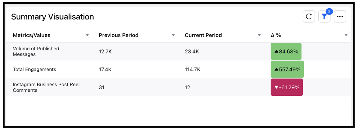
The summary table gives an overview of statistical information about data in a table form. Users can leverage Summary Table to view the reporting data for the previous period as well, where the previous period refers to the equal duration of time as the duration of the current period that falls just before the current period. For example, the previous period with respect to the fourth quarter of the year 2019 would be the third quarter of the year 2019.
Steps To Add a Summary Table Widget
In the top right corner of the Reporting Dashboard window, click Add Widget.
Clicking Add Widget in the top right corner of the Reporting Dashboard window
Enter a Name to display at the top of the widget.
Select Summary Table as the Visualization Type.
Select the metrics for which you want to view the reporting. The metrics depend on the type of widget and visualization selected in steps 3-4. Using the Summary Table widget, you can view the reporting for the previous period as well. For example, if you select Inbound Analytics as the widget type and Message Count as a metric, you can compare the count of the messages between the current and the previous period and also view the percentage change between the two.Creating Summary Table widget in the Create Widget window
Select the Filters for the values to populate in the widget as required.
Select the display parameters as needed.
Click Add to Dashboard in the bottom right corner to add your widget to the dashboard. To view the newly created widget, scroll to the bottom of the dashboard. You can also rearrange the widget into a preferred slot by dragging and dropping