How to Plot a Forecast Adherence Report
Updated
The Forecast Adherence Report is a powerful tool within Sprinklr WFM designed to evaluate the accuracy of forecasts by plotting actual volume against forecasted volume for each workload. This report provides a comprehensive overview, allowing users to measure adherence and make data-driven decisions to enhance workforce planning.
Prerequisites for Adherence Report:
Sprinklr WFM should be enabled for the environment and your user should have access to Workforce Planner Persona along with View and Create permissions under the forecasting section in the workforce management module.

Workload should be created & enabled and Work Queue should be mapped within each workload.
Metrics: In the context of reporting and analytics, metrics are quantitative measurements that represent specific aspects of performance, engagement, or other relevant data. These are numerical values that provide insights into various aspects of your business. These metrics help in evaluating the effectiveness of customer service efforts and social media interactions.
Dimensions: Dimensions, on the other hand, are the attributes or categories by which we can slice and dice our data. They provide context to the metrics. Dimensions include information like channels (eg., Twitter, Facebook), agents, time periods, and more. Dimensions allow us to analyze how metrics vary across different segments, helping in understanding the context and drivers behind the performance metrics.
Before accessing the adherence report, ensure that users have the necessary platform permissions to access care reporting module to view forecast adherence report.
Major Components:
Access: Supervisors can navigate to the Care Reporting module in the Sprinklr Service launchpad and access the Forecast Adherence Report.

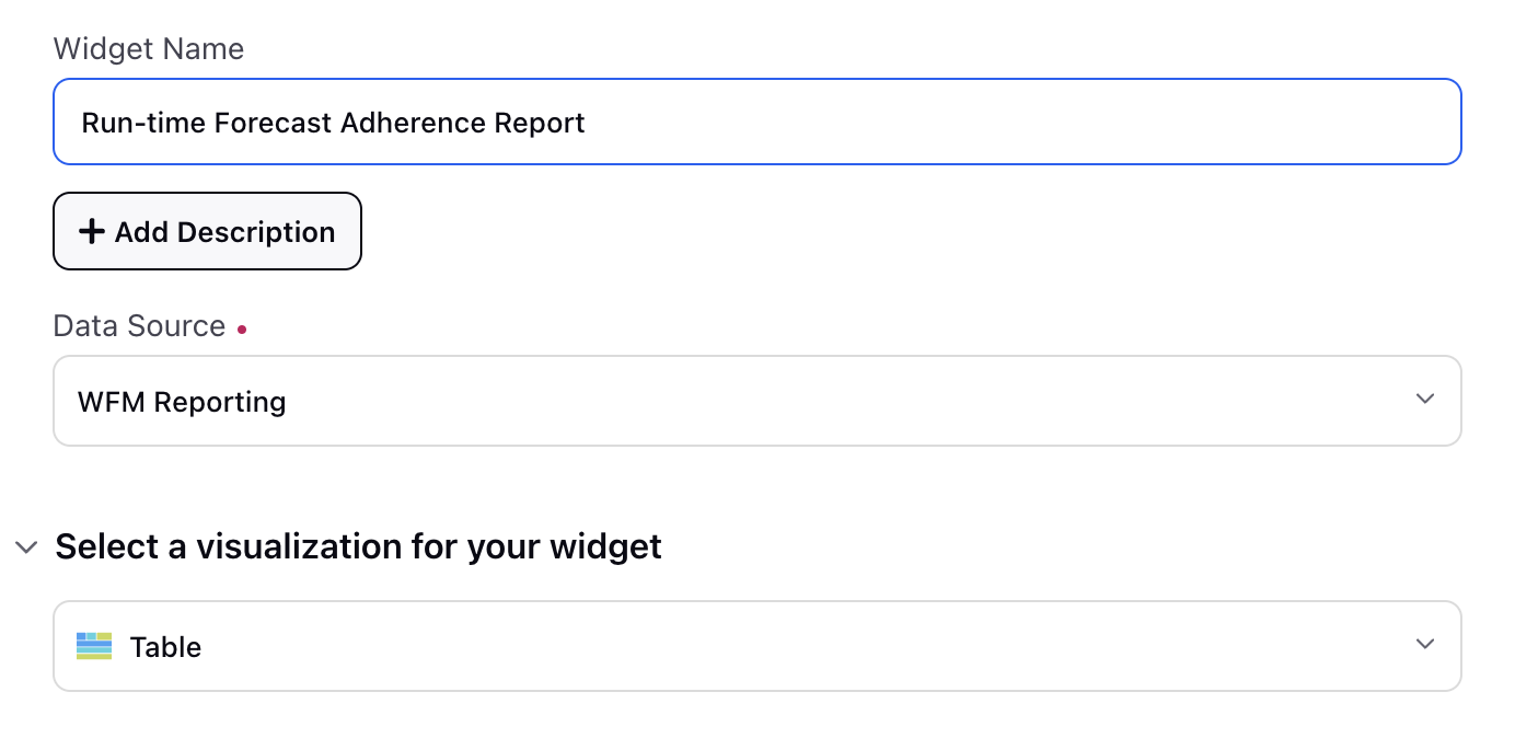
Configuring a Widget: They can add a widget from top right side and provide a widget Name and an optional Description to uniquely identify the widgets in the report. They can specifically choose the Data Source as WFM Reporting to ensure that the relevant data is displayed in the adherence dashboard. Further, they can select an appropriate visualization for their widget.

Plotting Columns in Widget: Supervisors can plot Start Time and Workload Ids as dimensions and Forecasted Case Volume, Actual Case Volumes and Adherence as metrics. On the right half, they can also select the metric type that is to be used for aggregation on the time dimension.
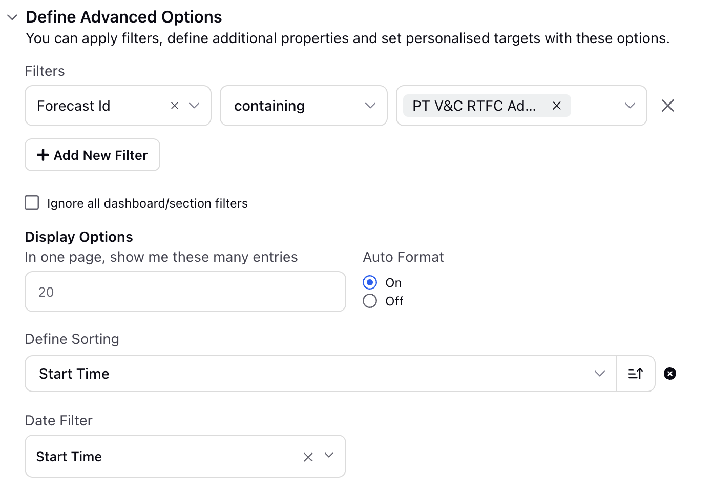
Advance Settings: Supervisors can additionally set Advanced Options by setting up filters and sorting criteria. They can set released forecasts as filters to see forecast adherence report for particular reports and define the sorting criteria in ascending or descending order based on start time.

Report Interpretation:
Adherence metrics provided in the report could be utilized to measure accuracy of forecast. The metrics help in offering insights into the effectiveness of the forecasting. Adherence trends could be analyzed for every workload over time to identify patterns and potential area of improvement in forecasting accuracy.