Create Reports and analyse the performance of an Email Marketing Campaign
Updated
Once you have sent out the emails, you might want to evaluate the engagement of the audience. Sprinklr provides you with the ability to measure audience activity and demand generation funnel via its Reporting dashboard. It helps you to have a detailed overview of sent, opened, and clicked emails, both at an aggregate level and individual level. With this, Data Analysts can keep a tab on high-performing and low-performing emails and take necessary actions.
In this article, you will learn how to set up reporting dashboards to analyze your email marketing campaigns.
To View Reporting on Bulk Emails
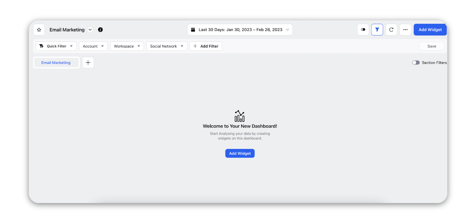
Click the New Tab icon and select Reporting within Customized Reports under the Marketing section of Sprinklr Marketing.
Search for your existing dashboard using the search bar at the top or create a new one using the Create Dashboard action button.
In the Reporting Dashboard, click Add Widget in the top right corner of the desired reporting dashboard.

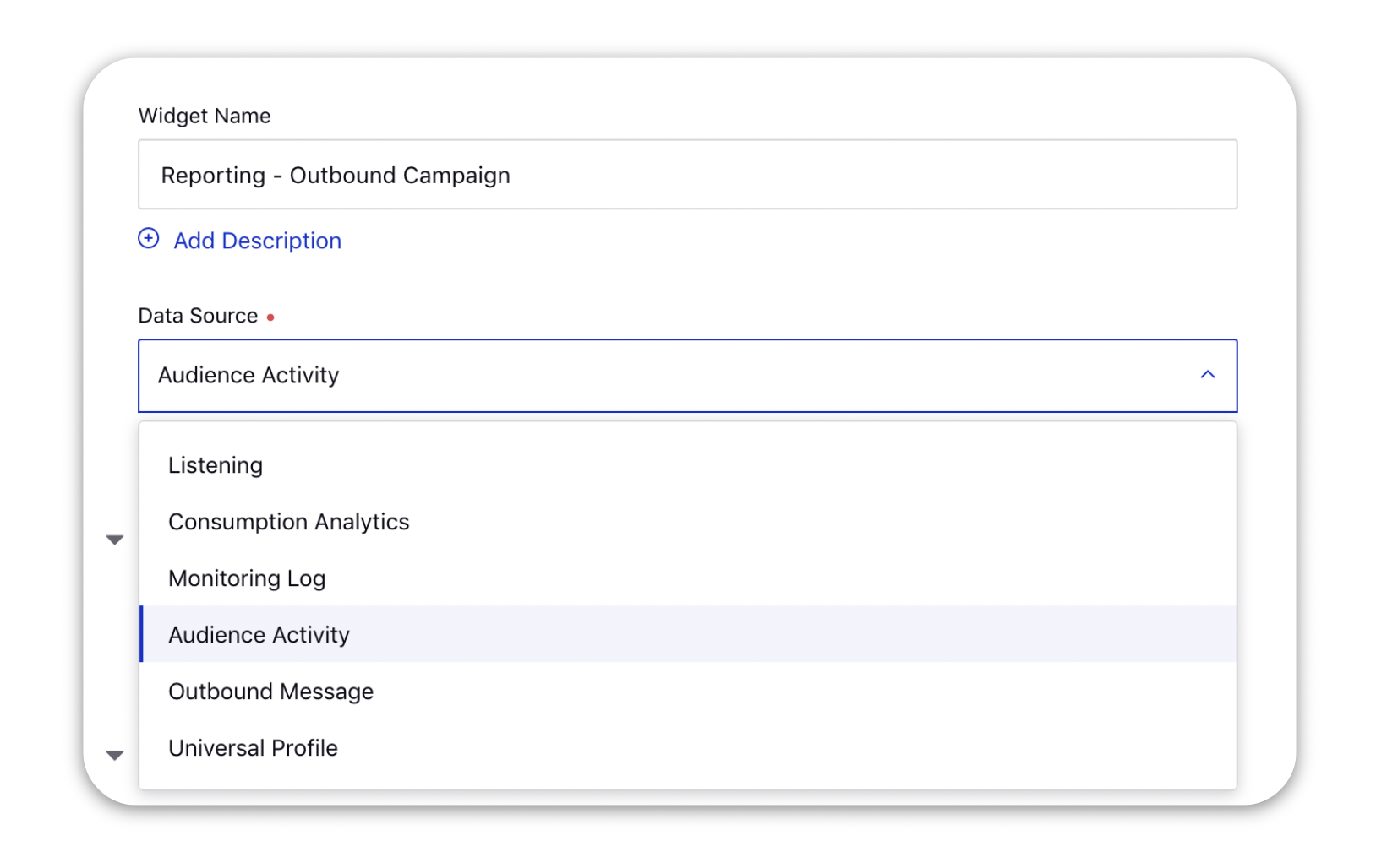
On the Add Widget window, enter a name for your widget and select Audience Activity as the Data Source.

Select the desired Visualization for your widget.
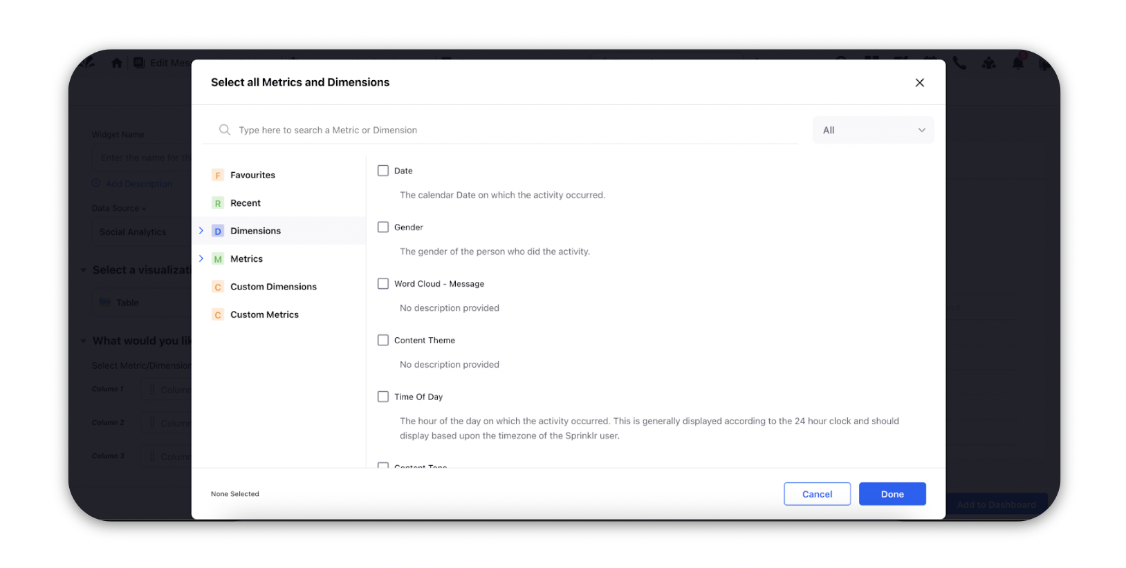
Under the What would you like to plot on your widget? section, select a Metric or a Dimension in the given Column fields. Click the fields, type the Metric or Dimension name in the search bar in the pop-up window.

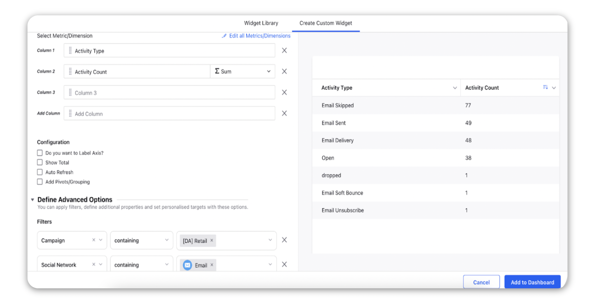
To report on how your audience is interacting with your emails, you can select Activity Type as the dimension and Activity Count as the metric (described at the bottom of the article)
You can also filter these in the Filter section under the Define Advanced Options with dimensions like Campaign or Outbound Post to report on specific campaigns or outbound messages.

You can also drill down to the next level and study the behavior of each audience profile by using the Audience Activity Actor as the dimension.
Once you select metrics and dimensions, you will be able to see a preview of the visualization on the right side pane.
Click Add to Dashboard in the bottom right corner to add the reporting widget to your dashboard.
Note: It is mandatory to have at least one metric in a widget to plot the visualization. |
Metrics - Descriptions
Metric | Description |
Unique Email Delivered | Number of unique delivered emails. |
Unique Email Open | Number of unique email opens. |
Unique Email Click | Number of unique clicks on links included in email content. |
Email Delivery Rate | Number of delivered emails in respect to number of sent emails. |
Email Open Rate | Number of email opens in respect to number of delivered emails. |
Email Click Rate | Number of email clicks in respect to number of delivered emails. |
Activity Count | Number of total user activities, including all Activity Type. |
Dimensions - Descriptions
Term | Description |
Campaign | The campaign for which the reporting is sought. |
Outbound Post | Outbound Post is one of the dimensions that you can choose to get reporting for. |
Audience Activity Actor | Users - those who are responsible for Audience Activity. |
Click URL | URLs within email content that users clicked on. |
Reason | Reason for certain Activity Types. |
Activity Type
Term | Description |
Email Open | Emails that were opened by the users. |
Email Sent | Emails that were sent from Sprinklr. |
Email Delivery | Emails that got delivered to the end client out of all the sent emails. |
Email Skipped | Emails that got skipped while sending because the end user had unsubscribed or the subject was duplicate. |
Email Bounce | Emails with the valid email addresses that reached the recipient’s mail server but could not get delivered. A common reason is that the server was down or the recipient's mailbox was full or the message was too large for the recipient's inbox. |
Email Unsubscribe | Email unsubscribes done by the users. |
Email Spam | Emails that are considered as spam. |
Email Click | Clicks on URLs within Email content. |
Email Failed | Emails that faced delivery failure. |
Email Deferred | Emails that have been deferred. |