Overview
Updated
The home screen of Livechat can be broken down into 2 components as shown in the diagram below. Each component can be customized as per brand requirements
Cards
Sprinklr Live Chat supports 5 types of cards:
After adding the cards, you have the flexibility to rearrange their order through a simple drag-and-drop action, providing you with convenient control over the card sequence.
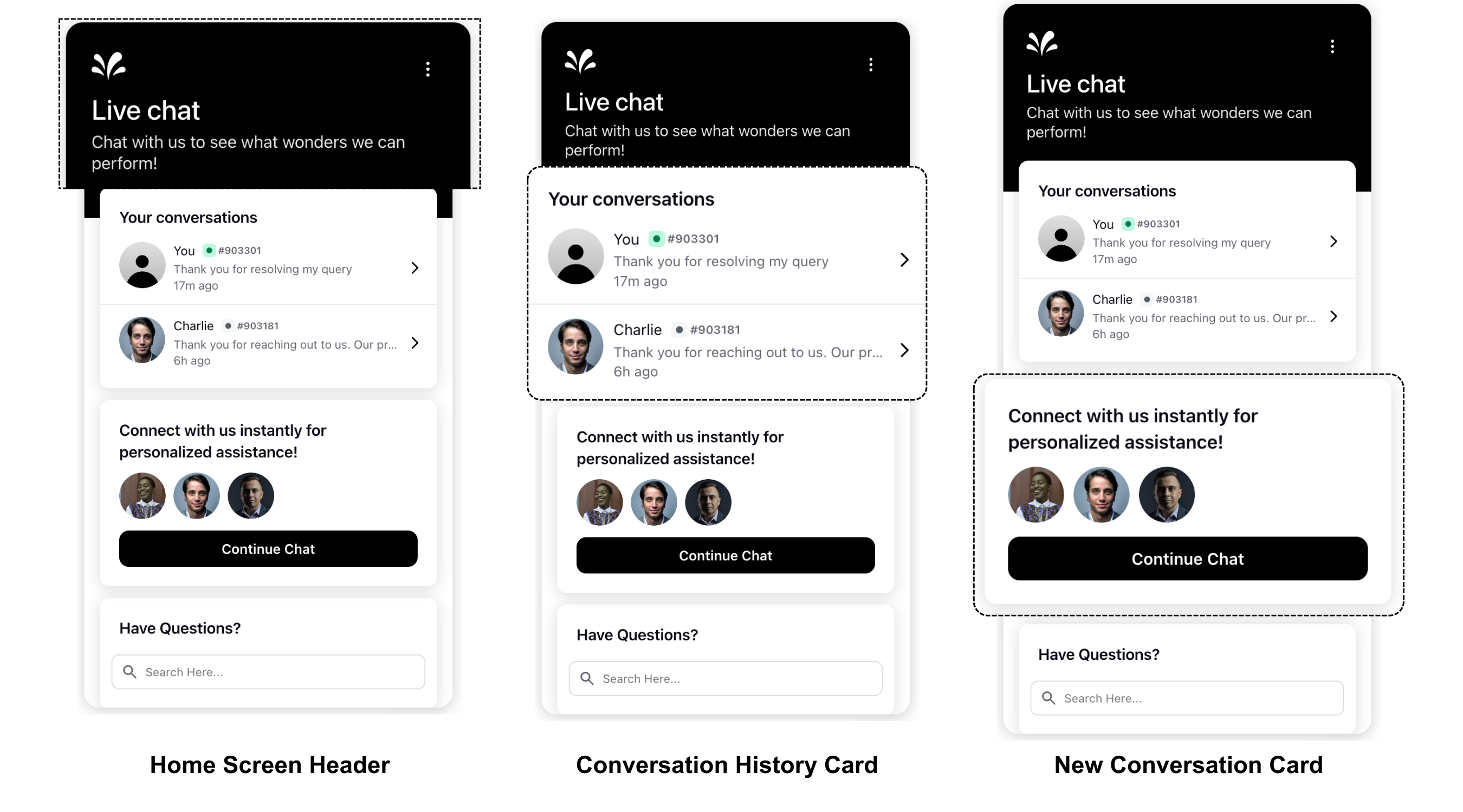
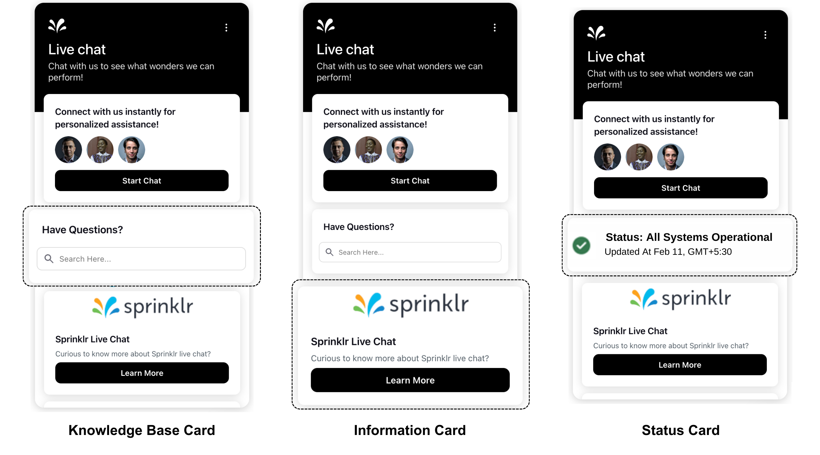
You can also customize the visibility of these cards based on various user-specific factors such as browsing behavior, session details, user info, and profile custom fields. This includes fields like country, page URL, city, region, and user device. By enabling the toggle for "Enable conditionally hiding the card," you gain the ability to display or hide cards dynamically. Additionally, you can add multiple status and information cards at different locations and set various visibility conditions. For example, you might display certain cards only to users from specific regions or on particular devices.
This feature allows for a more personalized and relevant user experience, ensuring that users see content that is most pertinent to them based on their unique attributes and current context.

Compact and Comfort Mode
Brands are provided with the flexibility to select either the compact mode or the comfort mode based on their preference. In the compact mode, all the cards visible on the homepage, such as conversation cards and info cards, are presented in a concise layout, optimizing space and allowing for a quick overview. To get this capability enabled, please reach out to support at tickets@sprinklr.com.
Compact Mode | Comfort Mode |
|
|