Enhanced Modern View for Distributed Home Page
Updated
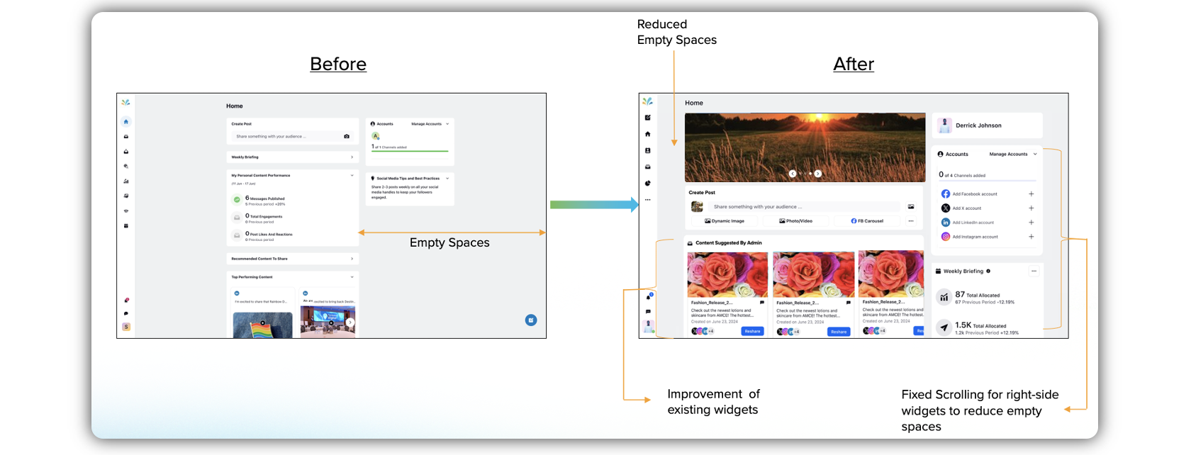
The Distributed platform now comes with a completely revamped UI that provides a fresh look to the home page and enhances your experience of using the platform. The space is now fully utilized, while the widgets are strategically placed, and tailored to cater to your specific needs while using the platform.
To be able to use the enhanced Distributed modern view, you need to set it up in the Distributed Control Panel.
Steps to Enable Modern View for Distributed
Click the New Tab icon
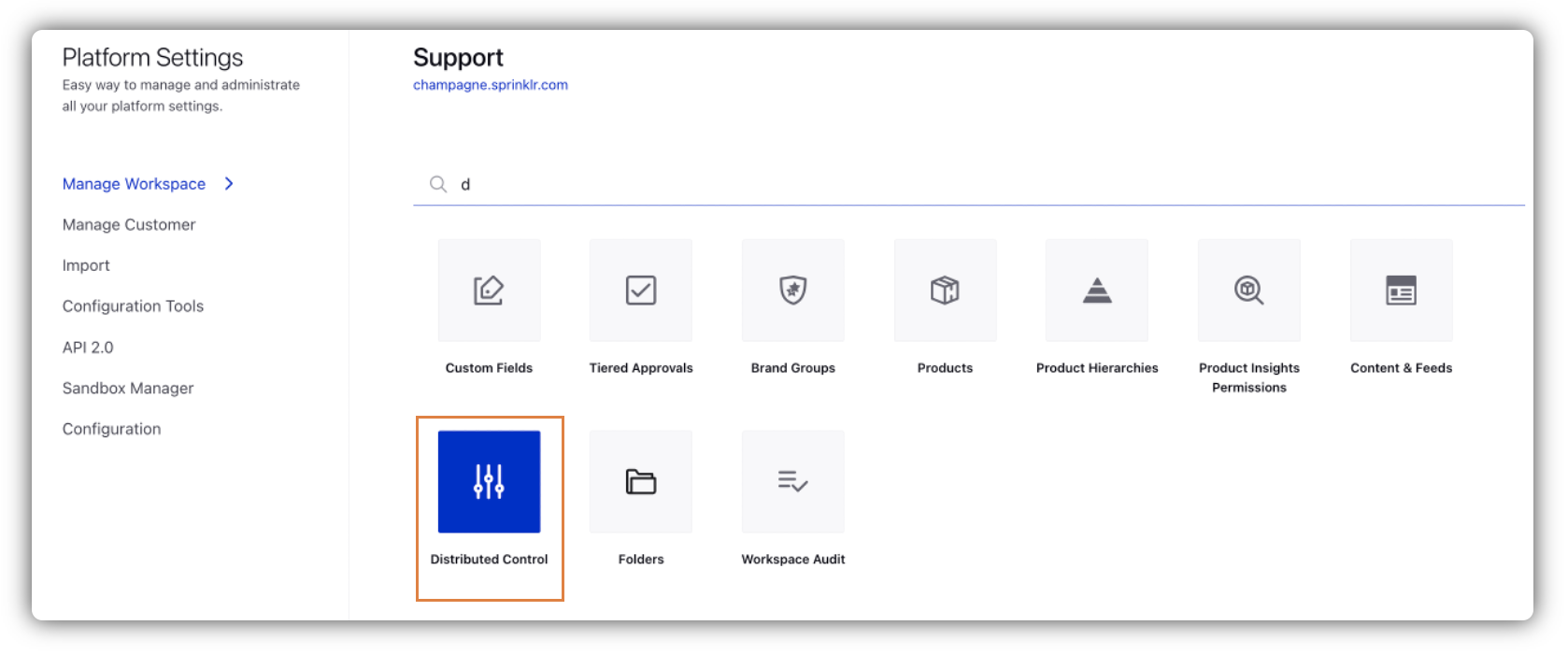
. Under the Governance Console tab, click All Settings within Listen.
Search and select Distributed Control Panel.
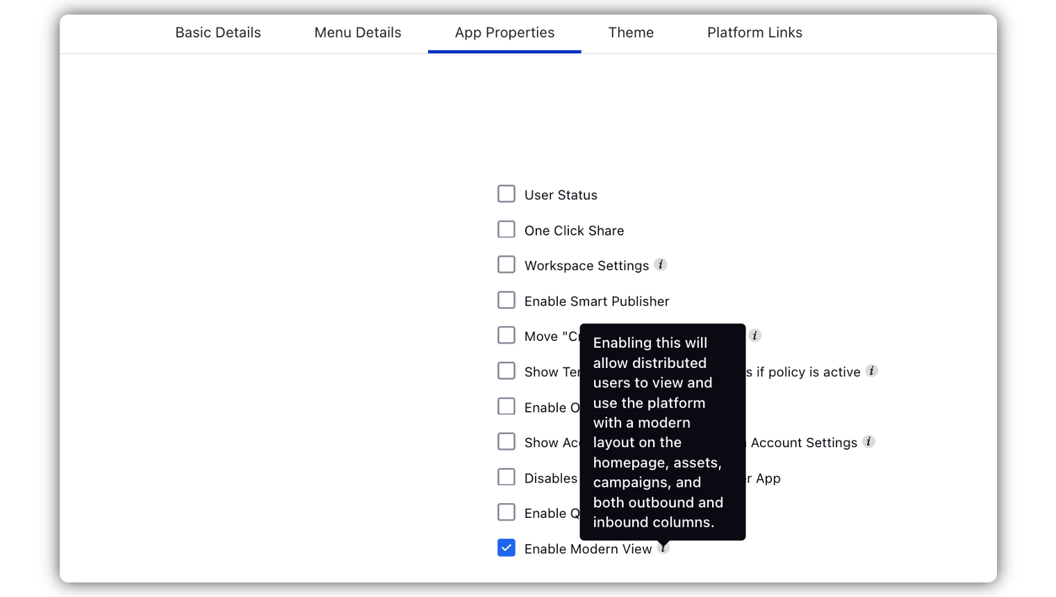
Under the App Properties tab, check the Enable Modern View box.
Enhanced UI for Distributed Home Page
Here is an overview of the UI enhancements that you will notice on the Distributed home page.
Scroll Restriction for the Right Pane
Scrolling on the widgets present on the right side of the home screen of the Distributed platform is stopped once you reach the end of the widgets. This has helped us get rid of the blank space that earlier kept scrolling down along with the widgets in the center pane.
Fixing Padding on the Home Page
The previous home page had plenty of empty space on both sides(right and left). We identified the scope to enhance the look of the widgets on the right as well as the center pane, especially the width factor. To ensure a more effective and advanced user experience on the Distributed home page, we have fixed the padding on the screen, while the width of the widgets in the center pane has been adjusted as required.
Changes in the Widgets
In order to give an enhanced look to the Distributed home page, the widgets in the center pane, as well as the right pane, have undergone modifications from several aspects. Here's a quick overview.
Center Pane | Right Pane |
Banner
Old UI | New UI |
|
|
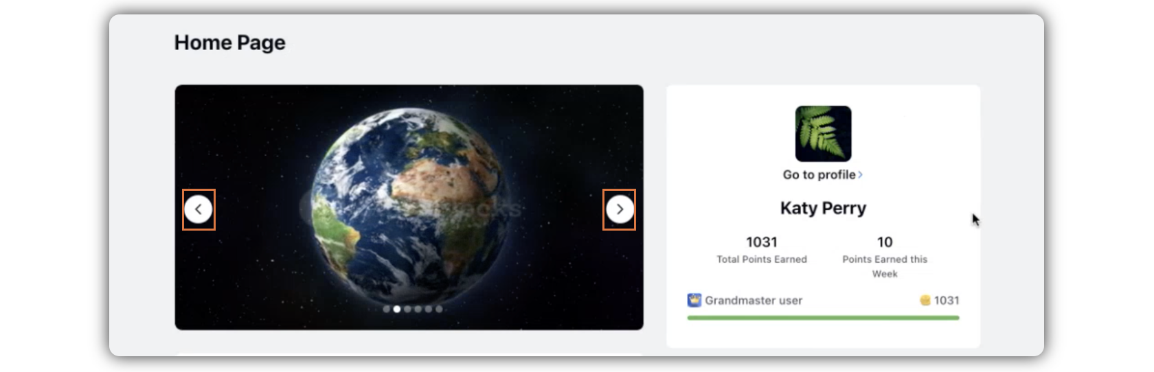
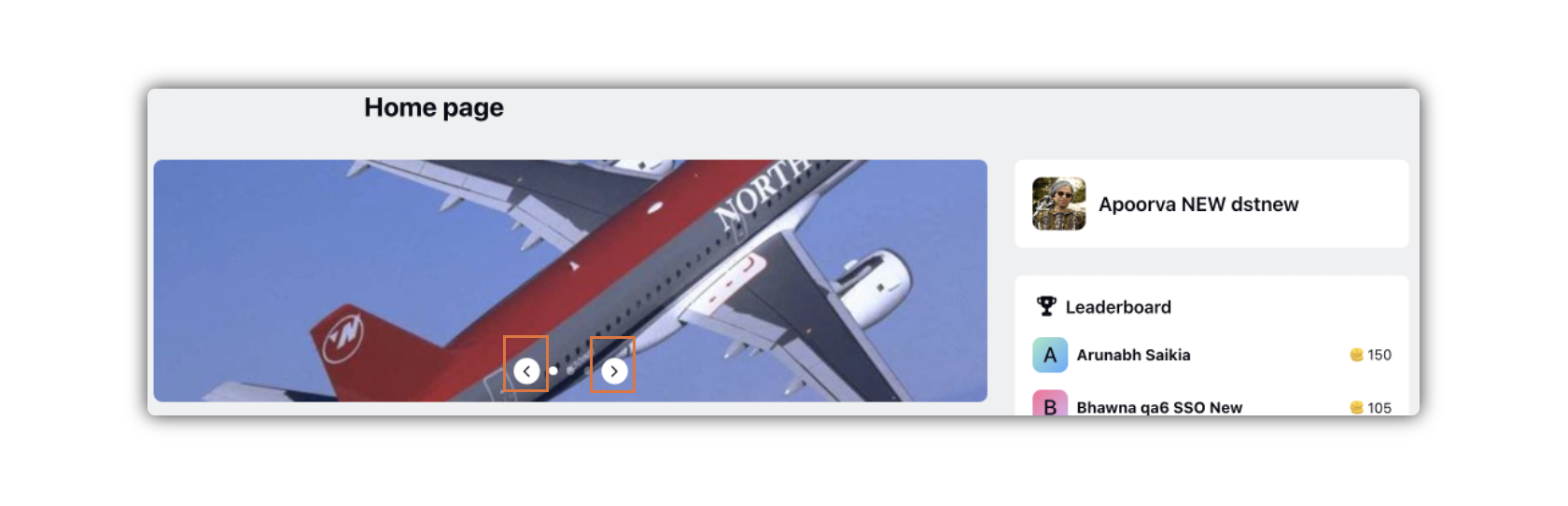
The Banner in the Distributed home page is endowed with a new design that is smarter and sharper. The width and height of the banner have been adjusted to cast a compact look and smooth padding.
The positions of the Previous and Next icons on the banner images/videos have been changed. While the icons were far from each other in the old UI, making the user move from the left of the banner to the right, or the other way around, in the new UI, the icons have been brought close to each other, making it a lot easier for the user to check the next or the previous banner image/video.
Create Post
Old UI | New UI |
|
|
.png)
.png)
As you can view in the images above (click the images to view the enlarged version), the Create Post widget in the new UI is a lot cleaner, sophisticated, and more user friendly.
The widget has been given a new shape - the width increased and the height reduced - to give a look to the widget so that it merges with the rest of the page smoothly and perfectly.
The Create Post widget comes along with your Profile Picture, keeping parity with the native environment.
Dynamic Image and Photo/Video CTAs have been incorporated with the Media Upload icon adjacent to the textbox. When you click the Media Upload icon, you can see a different tab for Dynamic Image along with other regular upload options in the Upload Media window.
Below the textbox, there are only channel related CTAs.
Profile & Gamification
Old UI | New UI |
|
|
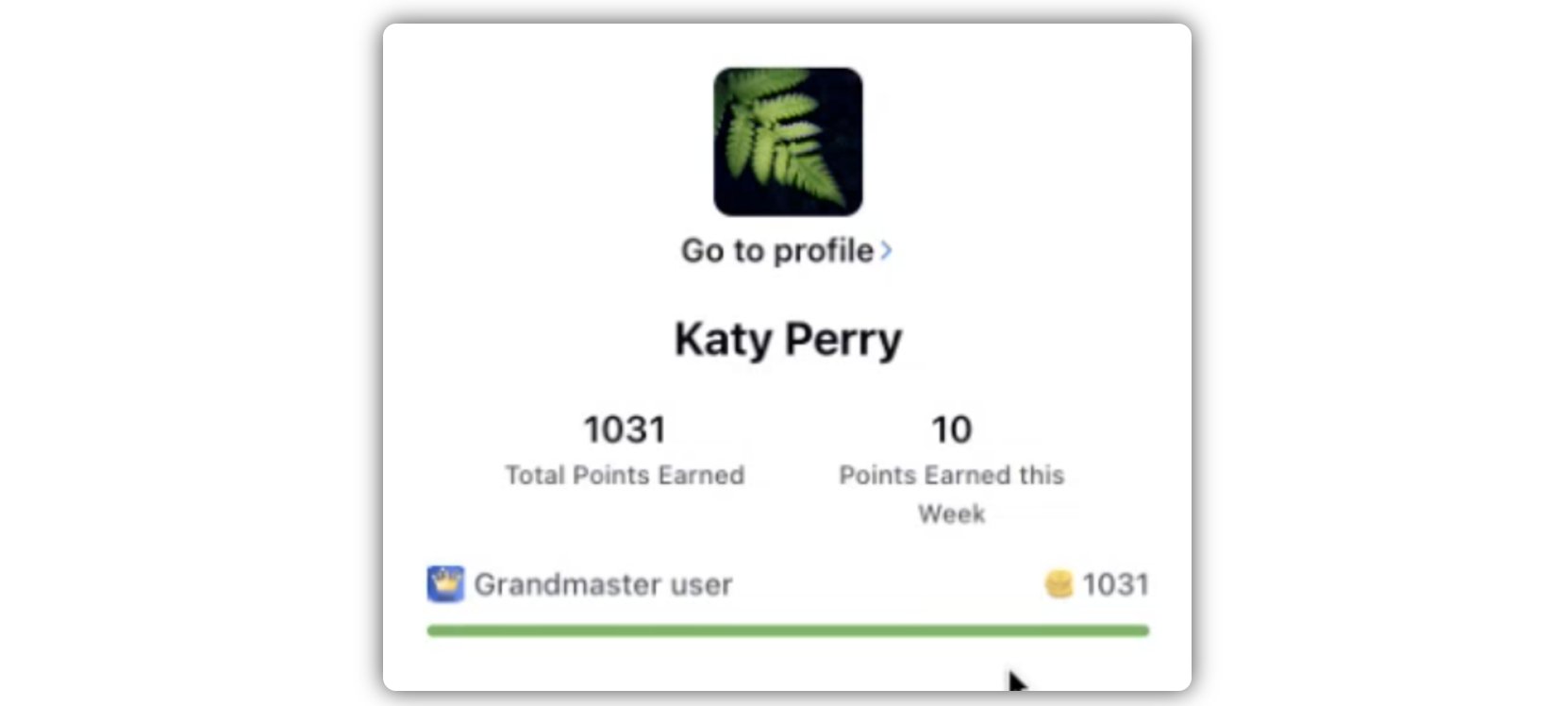
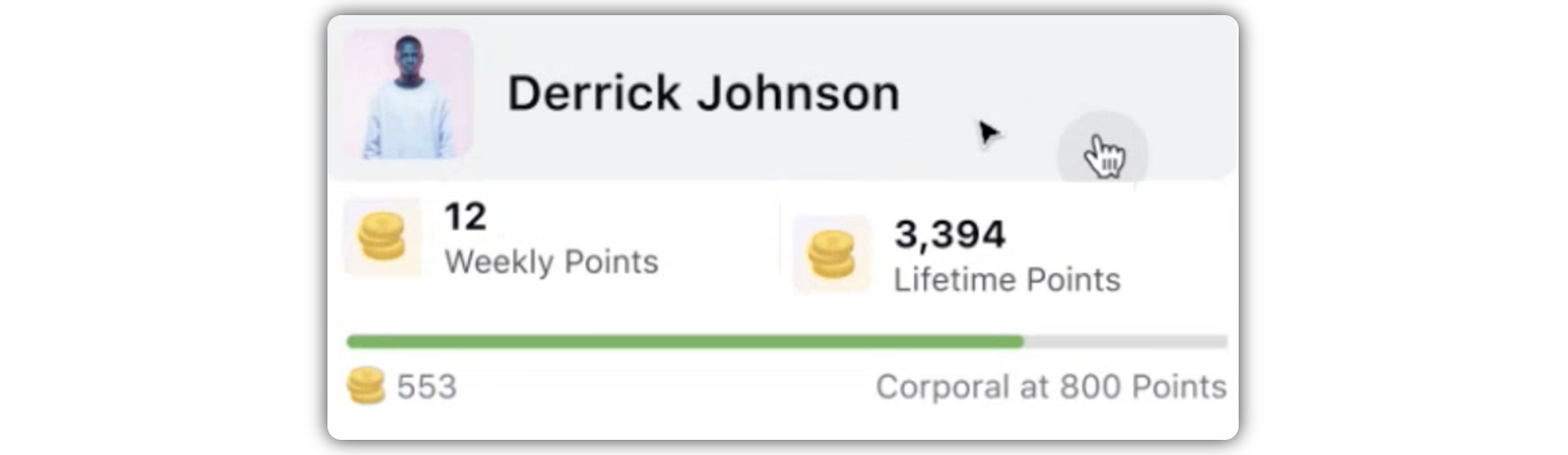
The Profile & Gamification widget comes with a new sleek look that is not only finer but also smarter from the UI perspective. The Go To Profile CTA has been replaced by a new interactive and clickable profile image design. If you click the profile icon or the name, you are directed to the Profile window.
Under Gamification, you will see your total points and last week's points. In the new UI, your points will appear along with new point icons (If you have Gamification enabled for your profile).
You will also be able to view in case you are close to a milestone (If you have Gamification enabled for your profile).
Leaderboard
Old UI | New UI |
|
|
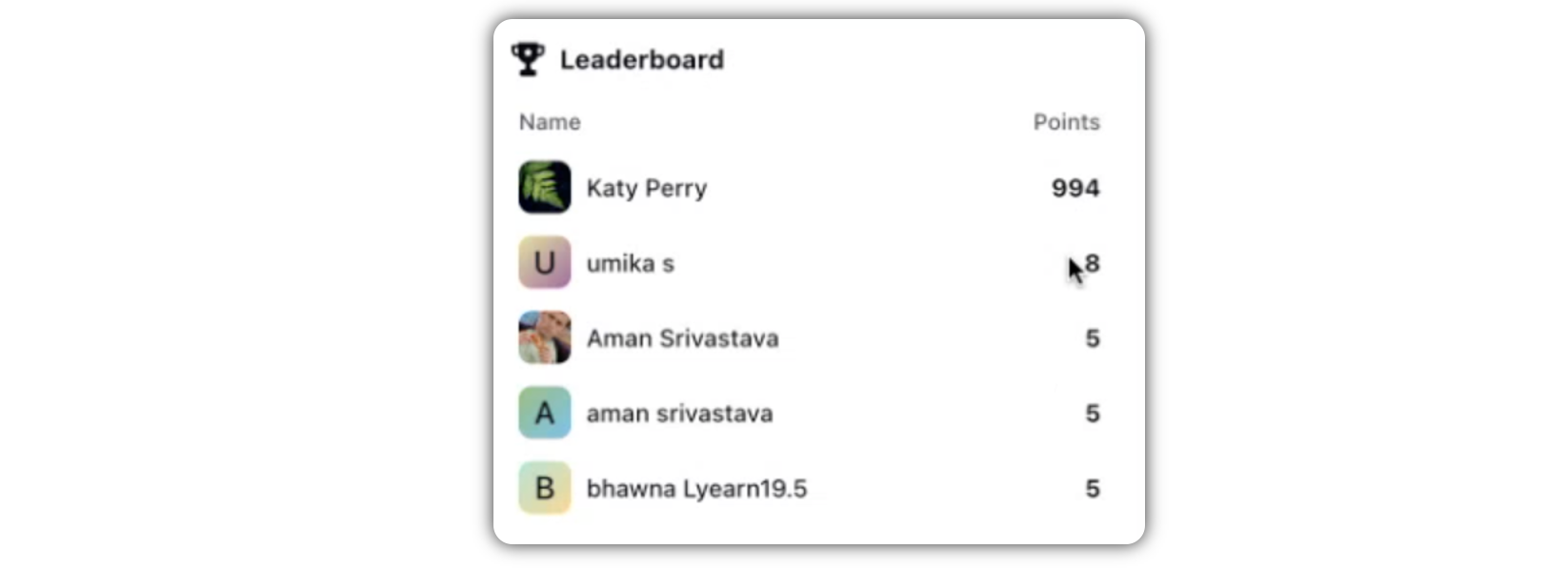
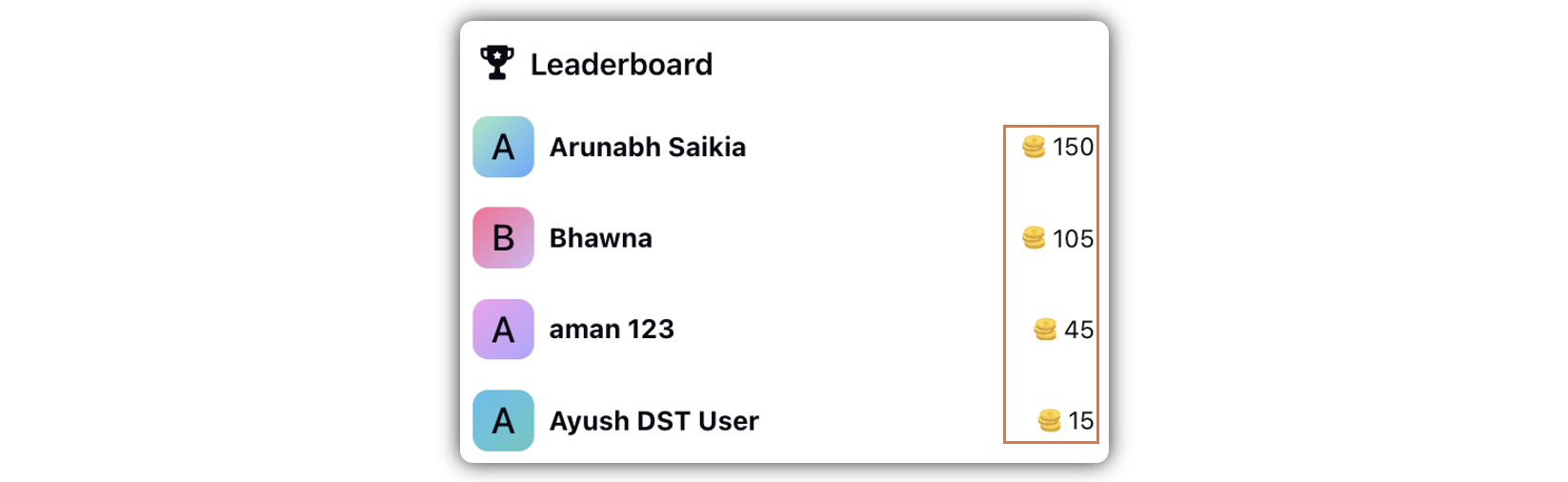
The Leaderboard widget in the Distributed home page comes with a height and width adjustment, to match with the overall padding.
In the Leaderboard in the new UI, the points will appear along with new point icons.
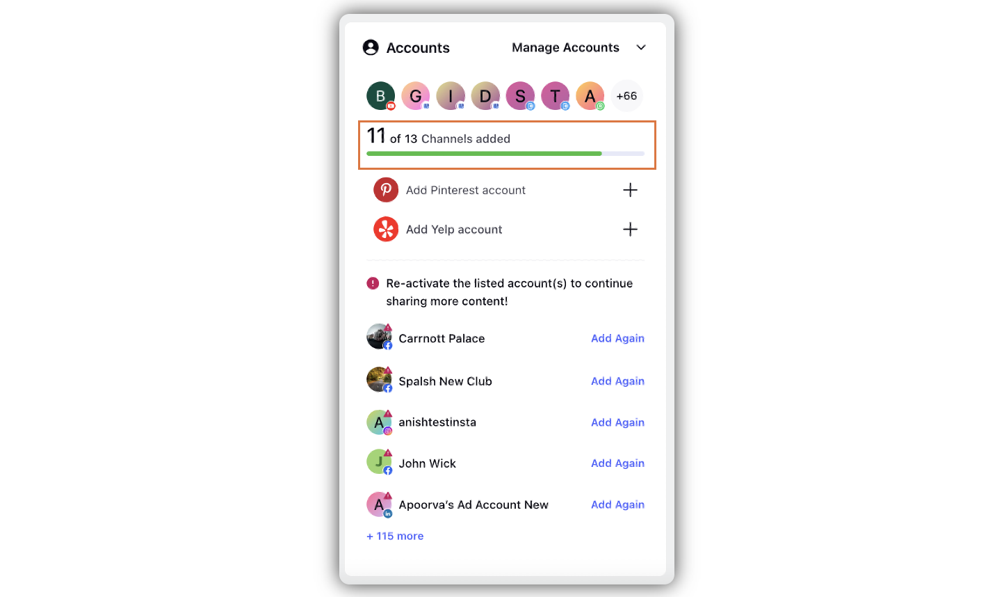
Accounts
The Accounts widget remains almost the same, while its size and dimensions do change to fit in the new UI design.
In case there are some channels for which no account has been added, it will be presented through a progress bar. The Accounts widget will show CTAs to add an account of that channel.
Once accounts have been added for all the channels, the progress bar will be filled. Then, the progress bar as well as the CTAs to add accounts of any channel will no more appear in the Accounts widget.
Tips
The Tips widget remains the same, while its size and dimensions are modified in order to seamlessly merge into the new UI design.
Live Chat
The Live Chat widget remains the same.
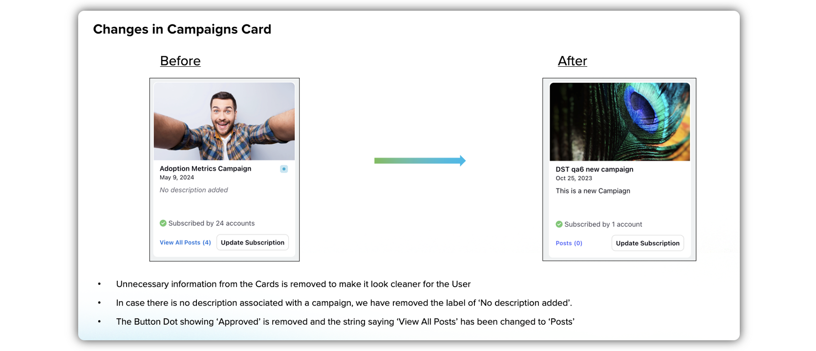
Campaigns
In the new UI, the Campaigns widget comes with very slight changes.
In addition to the modifications in size and shape, the new UI has got rid of the Approved icon. The implication is that the posts/assets that appear under suggested campaigns are already approved.
The View All Posts(#) CTA in the campaign cards in the Campaigns widget in the old UI has been replaced by Posts(#) in the new UI. This change will be beneficial, especially in cases when the campaign cards are translated into another language.
You can view the number of accounts the campaign has been subscribed by - Subscribed by # accounts (preceded by a green Tick icon). If it has not been subscribed so far, the tag would be Not subscribed yet (The Tick icon would be greyed out in this case).
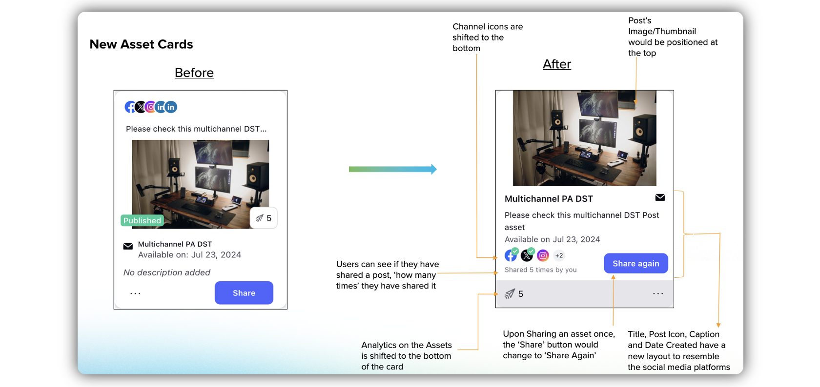
Assets
The asset cards under the Asset widget come with thumbnails.
Asset name along with asset type icon appears below the thumbnail.
There is a post description/caption below the asset name.
Below the description, you will view Date of creation.
There are icon(s) to denote that the asset can still be posted on those channels. If the asset can be posted on any channel, it is denoted by the presence of the globe icon. When you click on the icon, you can view the Post Activity (when it has been shared on a channel or a few channels).
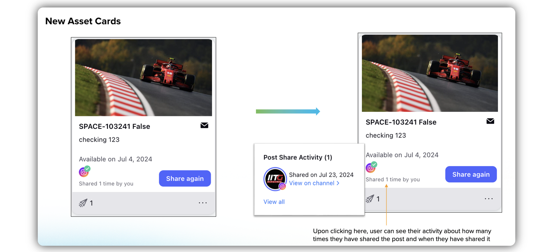
Once you have shared the asset, the Share button will be transformed into the Share Again button.
Reporting details (Analytics) for the asset is available at the bottom of the asset card.
The Asset screen has also undergone significant UI changes. Take a look at the revamped Asset screen.
Engagement (Inbound/Outbound)
The engagement widgets also have a changed look in the new UI. The enhanced UI present fixed height widgets (Inbound, Outbound, Suggestios, and other such engagement columns), and you can scroll within that widget. With fixed height widgets, we have not only solved the problem of long scrollings throughout the home page, but also reduce the overall height of the home screen.
Both Inbound and Outbound screens have been enhanced from the user perspective. Both the screens come with a new compact look, rich with user-friendly UI changes. Take a quick look.