Enhanced Modern View for Inbound Window in Distributed
Updated
With the v.19.8 release, Sprinklr Distributed is endowed with an enhanced UI that provides a fresh look to the platform. In this article, we provide you with the details of the changes you will view in the Inbound window within Distributed.
To be able to use the enhanced Distributed modern view, you need to set it up in the Distributed Control Panel.
UI Enhancements on the Inbound Window in Distributed
In the new UI, the Filters widget has been moved from the right pane to the menu bar at the top. It appears as the Filter icon.
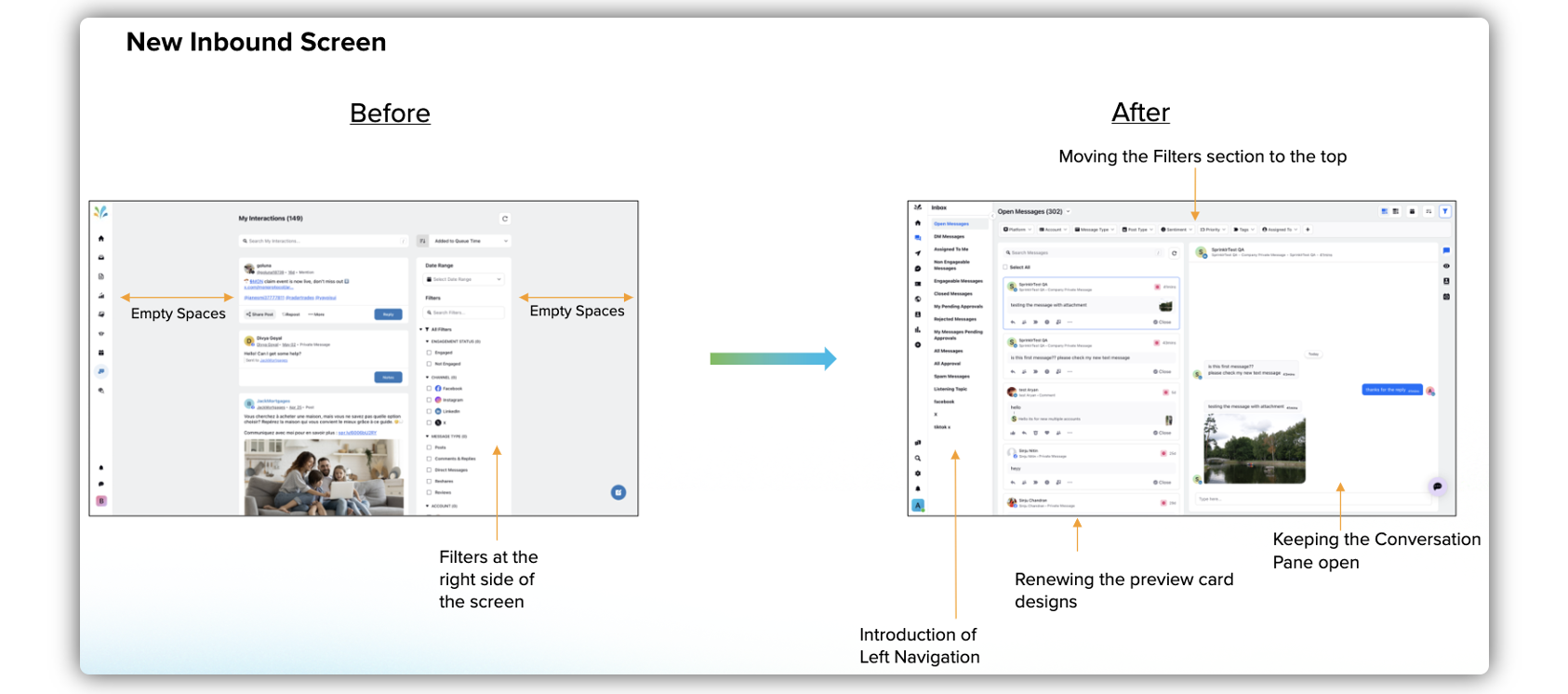
As the Filters widget has been moved to the top, there is more space in the middle pane for the redesigned post/message cards with strategically placed options.
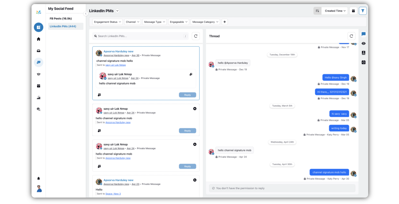
A new collapsible Sub-navigation pane has been introduced, which includes the content columns/categories. This improves the visibility of the dropdown options. By default it remains open as the left pane. You can collapse it by clicking the Arrow icon.
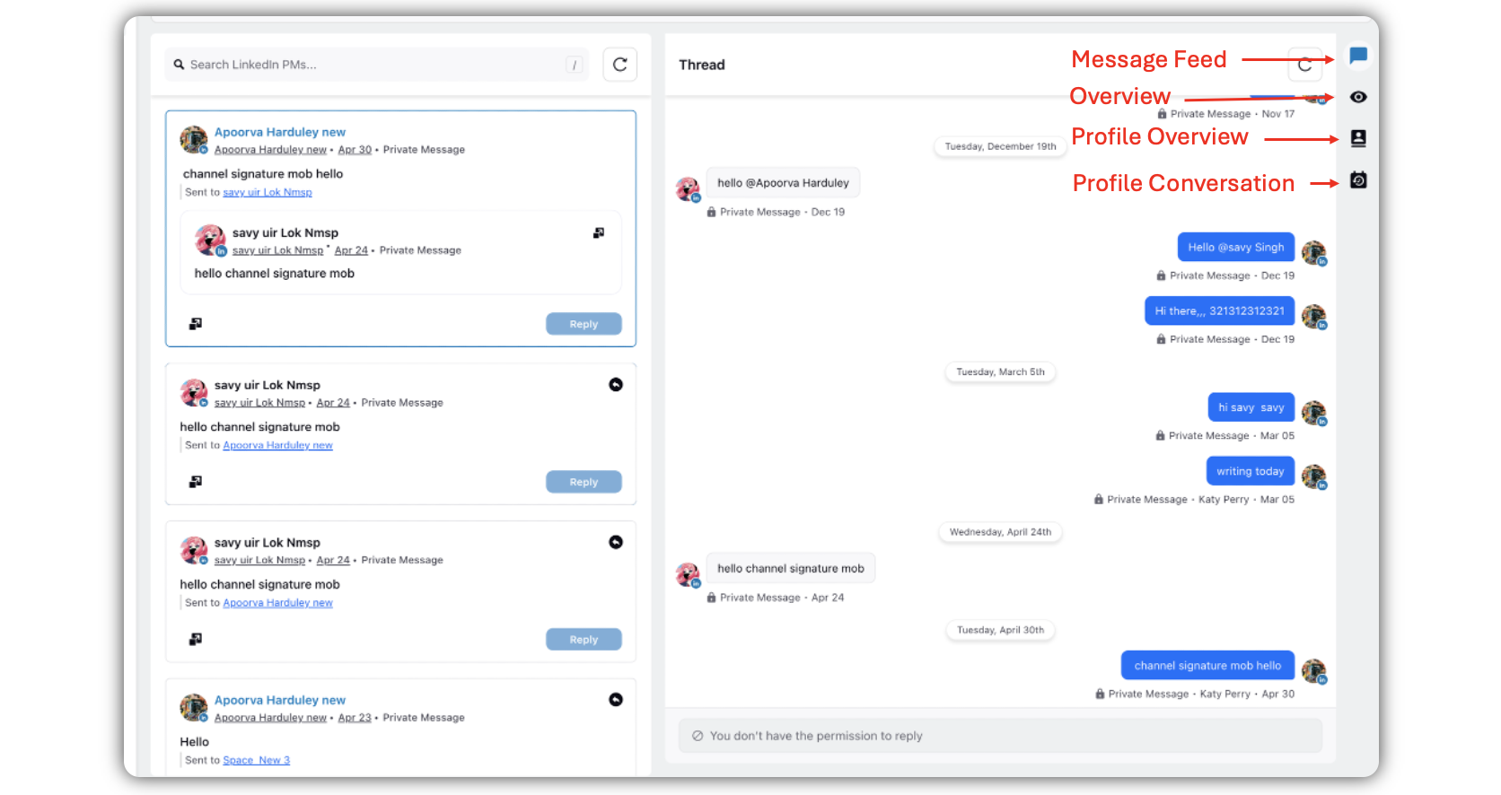
Parity with the Native environment - Once you arrive at the Inbound screen, for parity with social media platforms, you will find the message cards in the center pane, and the Third pane is, by default, open. The Third pane or the Thread pane remains open. There are 4 tabs in the Thread pane - Message Feed, Overview, Profile Overview, and Profile Conversation.
Note: By default, the first message is selected, and it is open(Message Feed tab) in the third pane or the Thread pane.
If you select other messages, they will reflect in the third pane or the Thread pane that is already open.
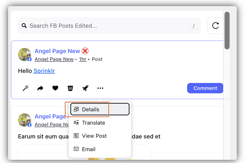
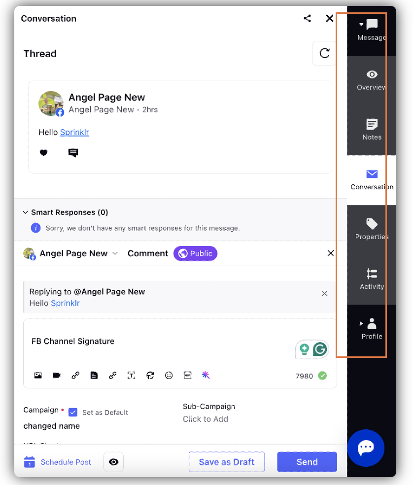
Details Pane - The Details pane used to exist in the old UI, which used to open on clicking on the message card. In the new UI, the Thread pane is upfront, as explained in the point above. You can access the Details pane by clicking Details. The Details pane has 7 tabs - Message, Overview, Notes, Conversation, Properties, Activity, and Profile. When you click Details, the Conversation tab opens in the Details pane by default.
