Enhanced Modern View for Outbound Window in Distributed
Updated
With the v.19.8 release, Sprinklr Distributed is endowed with an enhanced UI that provides a fresh look to the platform. In this article, we provide you with the details of the changes you will view in the Outbound window within Distributed.
To be able to use the enhanced Distributed modern view, you need to set it up in the Distributed Control Panel.
UI Enhancements on the Outbound Window in Distributed
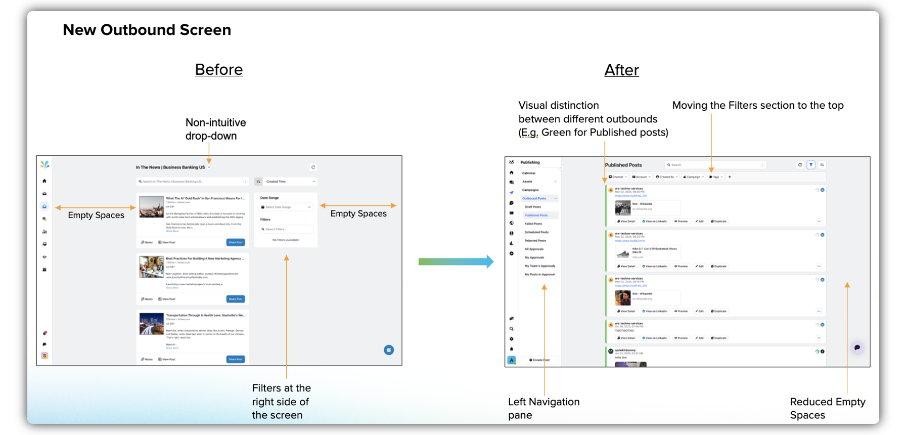
In the new UI the Filters widget has been moved from the right pane to the menu bar at the top. It appears as the Filter icon.
After the Filters widget has been moved to the top, there is more space in the center pane for the redesigned post cards with strategically placed options. The message card size and shape have been revamped for an enhanced and more compact look, reducing empty spaces in the screen.
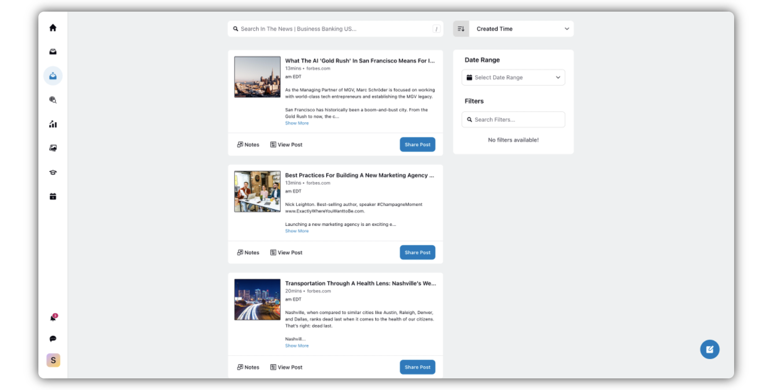
Old UI
Enhanced UI
.png)
A new collapsible Sub-navigation pane has been introduced, which includes the content columns/categories. This improves the visibility of the dropdown options. By default it remains open as the left pane. You can collapse it by clicking the Arrow icon.
In the old UI, if the original message as well as the reply to that message included images, both the images would appear in their full sizes. Even if the reply did not include an image, the image in the parent message would appear in full size. This issue has been resolved in the enhanced UI. When you reply to a specific message that includes an image, the parent message included in the reply would have a smaller media icon/thumbnail compared to that in the original parent message, while the image in the reply (if included) will appear in full size.
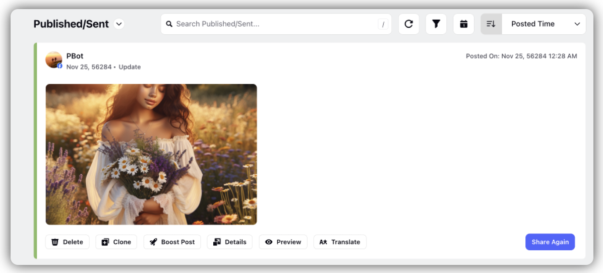
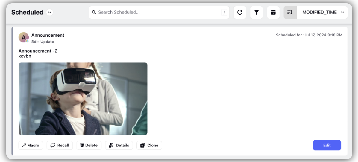
The number of the upfront action buttons has been increased to 6. If the action buttons are more than 6, then the 6th and the next buttons will be included within a More Actions button.
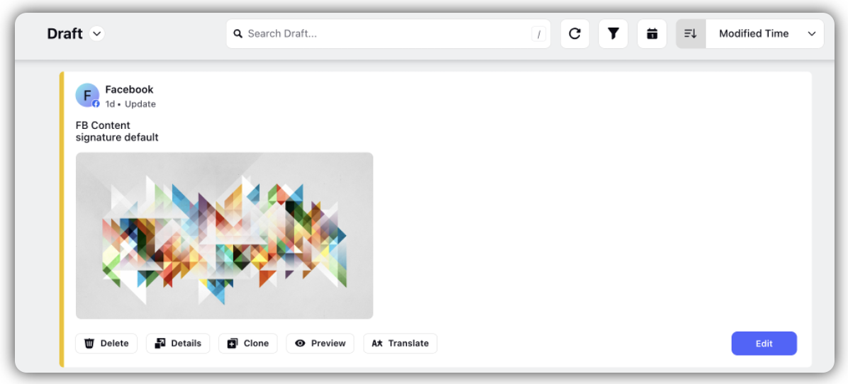
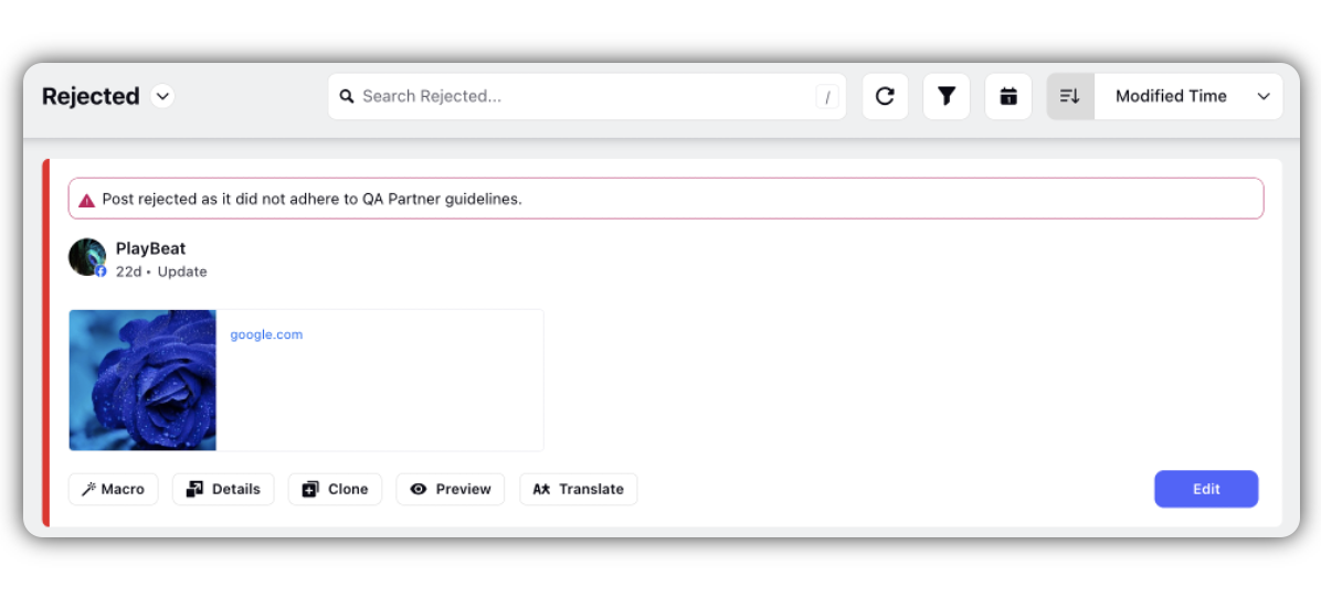
Color codes are used for post cards(left border), based on their categories. For example, green is used for the published posts, while it is yellow for drafts, red for rejected posts, and grey for scheduled posts.
Post Status | Color Code | Image |
Published/ Sent | Green |
|
Scheduled | Grey |
|
Saved as Draft | Yellow |
|
Rejected/Failed | Red |
|
RSS Feed
RSS Feed is now in the form of grid view which earlier used to appear as steam. Now it is made more similar to Asset Screen:
RSS feeds can be shared across all supported channels.
Share button is now located at the bottom right of each feed.
The View Post option is available for each feed, allowing users to view the relevant post in the grey space (aligned with the asset card view).
The Email option is also available in the grey space (aligned with the asset card view).
Translate option is available as well in the grey space.
If there are more than two options, the third option can be accessed by clicking the Vertical Ellipses (three dots).
