Multi-Parameter Forecasting
Updated
The Multi-Parameter Forecasting feature is designed to help users make informed decisions by utilizing historical data to predict future trends in key operational metrics. This feature integrates smoothly into the Sprinklr Workforce Planner persona, allowing users to generate detailed forecasts for various parameters such as Case Volume and Average Handle Time (AHT).
Note: The steps and information provided in this article pertain to Sprinklr WFM Version 1 (v1), which is the older version. For information on Sprinklr WFM Version 2 (v2), please refer to the Version 2 section.
Workforce Management (WFM) Metrics
Work Queue Assignment Count: The number of calls that enter the work queue.
Average Handle Time (Voice) (Per Assignment): The average time an agent spends handling a call, including total talk time, hold time, and wrap-up time.
% Abandoned Calls (Per Assignment): The percentage of calls that enter the work queue but are not answered and are abandoned by either agents or the system.
Key Benefits
Accurate Predictions: Utilizes historical data to deliver reliable forecasts.
Customizable Dashboards: Lets users create and tailor dashboards to their specific needs.
Flexible Forecasting: Supports various types of forecasts and AI algorithms.
Operational Efficiency: Aids in optimizing resource allocation and enhancing service levels.
Multiple Metrics: Allows for forecasting multiple metrics such as volume, AHT, and abandonment rate.
Key Functionalities
Workload: Begin by defining workloads in the Settings tab. A workload is a combination of essential Sprinklr entities such as work queues, skills, and channels, along with a type. These combinations serve as data sources for the forecasting process. By selecting relevant parameters like case volume and AHT, you establish the foundation for the system to analyze historical data and generate forecasts.
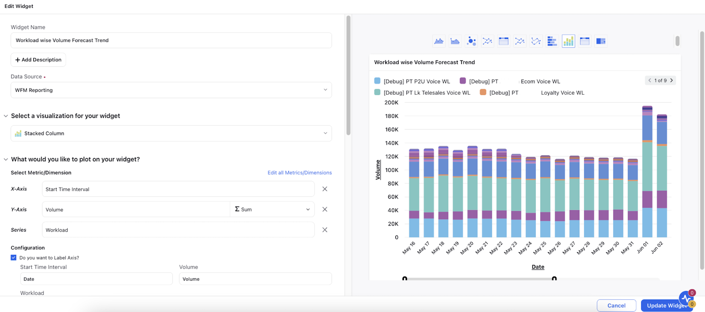
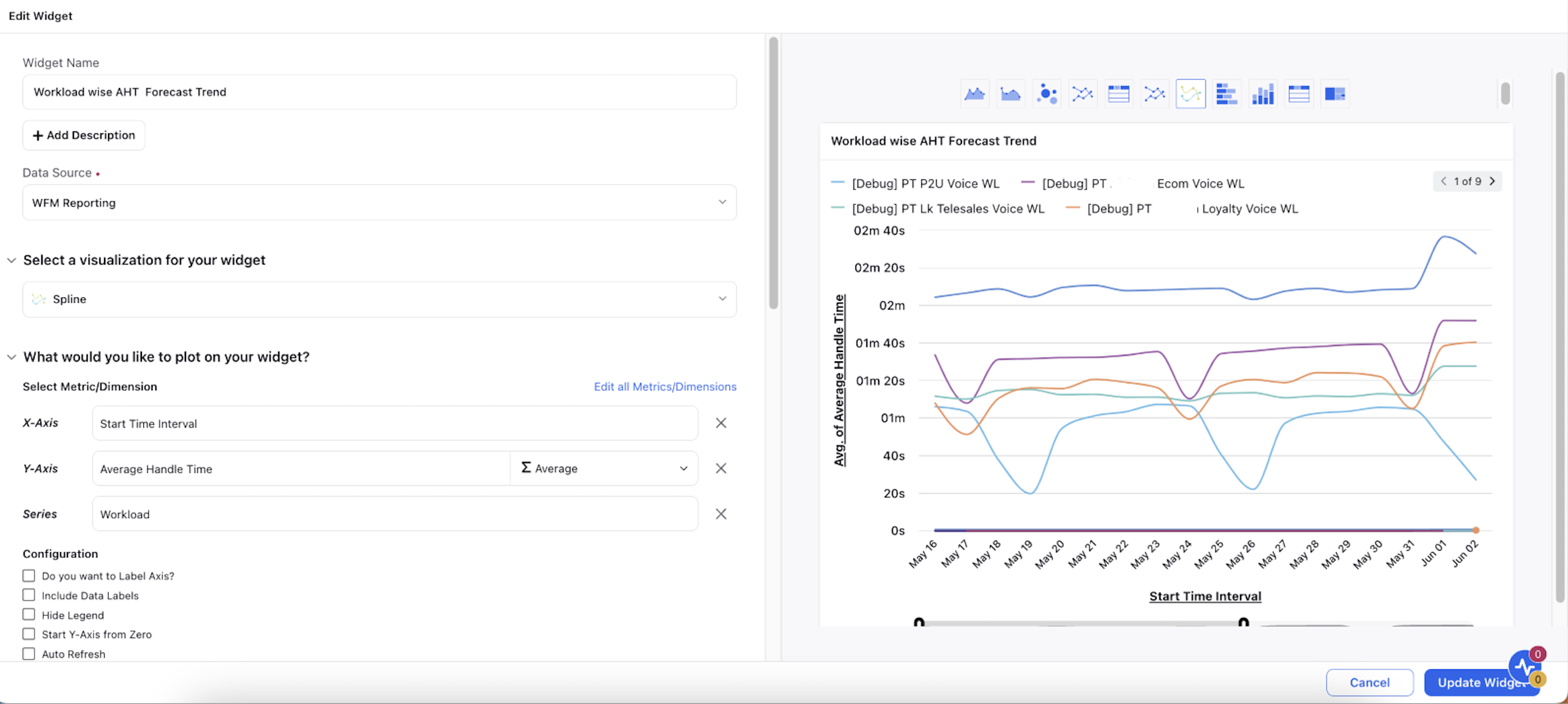
Reporting Dashboard Creation: Within the Care Reporting module, create and customize dashboards to visualize key metrics. This involves adding widgets to the dashboard that display data in various forms such as dual-axis visualizations, stacked columns, and spline charts. For instance, one widget might show case volume over time, while another might display AHT across different workloads over time. These visualizations will help you understand past performance and set the stage for accurate forecasting.
Forecast Creation: Once workloads and dashboards are set up, navigate to the Forecasting module.
Run-time Forecasting: Create a new forecast by filling out a form that specifies the forecast type (Run-time Model), the parameters to be forecasted, and the workloads to be used. Also, select the date ranges for both the forecast period and the historical data period, which the system will use as a training set.
Imported Forecasting: Import a new forecast using a CSV file in the prescribed format by filling out a form that specifies the forecast type (Import), desired granularity of the forecast, granularity of the imported data, and the time-zone setting in which the data should be considered.
AI Algorithm: Choose from various AI algorithms to apply to their forecasting model. These algorithms analyze historical data to predict future trends. The choice of algorithm can significantly affect the accuracy and relevance of the forecast, making it a crucial step in the process.
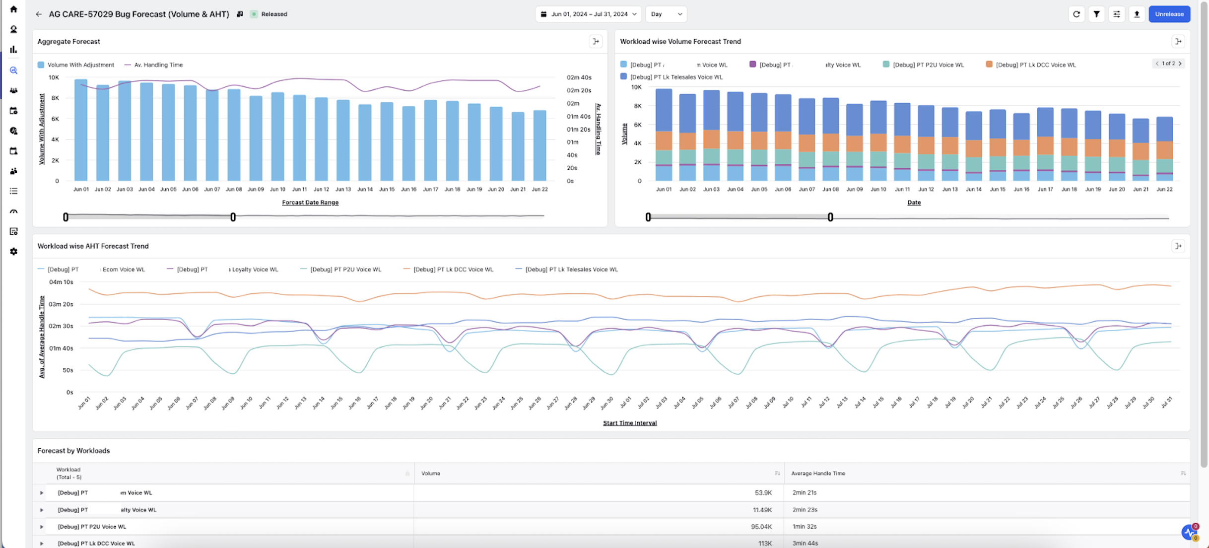
Visualization and Analysis: After the forecast is processed, the results are displayed within the same dashboard framework used for historical data visualization. The customizable nature of the dashboards allows users to tailor the view to their specific needs, providing further insights into expected trends.
Creating Workloads
Go to the Workloads section under the Settings tab of the Workforce Planner persona.
Combine work queues, skills, and channels to define the workload.
Choose parameters such as case volume, AHT, etc. The system will use historical data for these parameters as a training set to forecast future time periods.
Creating and Customizing Reporting Dashboards
Open the Care Reporting module from the Sprinklr Service launchpad.
Create a dashboard and tag it with "SPR#PERSONA#WORKFORCE_PLANNER#FORECAST".
Customize the dashboard by adding metrics within the widgets:
Example 1: Add a widget with dual-axis visualization. Plot the start time interval on the x-axis, volume (summation) on the y1-axis, and AHT (average) on the y2-axis.
Example 2: Add a widget for workload-wise distribution of volume using stacked column visualization.

Example 3: Add a widget for workload-wise distribution of AHT using spline visualization.

Label the axes, add legends, and customize the dashboard as needed.
.png)
Creating a Forecast
Create a new forecast.
Run-time Forecasting:
Fill in the details
Name: Provide a mandatory name.
Description: Optionally, provide a description.
Forecast Type: Select “Run-time”.
Granularity: Choose the desired granularity of the forecast.
Parameters and Workloads: Select the parameters (e.g., volume, AHT) and the relevant workloads.
Date Ranges: Set the forecast date range and the historical date range to define the training set.
AI Algorithm: Choose the AI algorithm for the forecast.
Dashboard Template: Select the dashboard view template created earlier.
.png)
Import Forecasting:
Fill in the Form
Name: Provide a mandatory name.
Description: Optionally, provide a description.
Forecast Type: Select “Import”.
Granularity: Choose the desired granularity of the forecast and mention the granularity of the imported data.
Time-Zone: Select the time-zone in which the imported dataset should be considered.
Dashboard Template: Select the dashboard view template created earlier.
Upload CSV File: Upload the CSV file in the upload forecast section with relevant fields and columns such as workloadId, startTime, volume, averageHandleTime, and abandonmentRate.
Process the forecast and view the results in the specified dashboard.
