Carousel Templates
Updated
Carousel Template
A carousel is a collection of card assets arranged side by side, allowing horizontal scrolling. Using the Digital Asset Manager, you can design a carousel template for use in Sprinklr Live Chat, enabling customers to engage by choosing an option directly within the conversation thread. Each carousel can contain up to 10 cards (carousel elements), with each card supporting up to 5 buttons.

Key Benefits of Carousel template
Enhanced User Engagement: Carousels provide an interactive way for users to engage with content, making the chat experience more dynamic and engaging.
Compact Information Display: They allow multiple options to be displayed in a compact format, saving space and making it easier for users to browse through options.
Improved Decision Making: By presenting options clearly and concisely, carousels help users make informed decisions quickly.
Seamless Navigation: The horizontal scrolling feature ensures smooth navigation through the content, enhancing the overall user experience.
Customization and Flexibility: Carousels can be customized with images, titles, descriptions, and buttons, providing flexibility to tailor the content to specific needs.
Use Case and example
Carousel templates are particularly useful in customer service scenarios where multiple options need to be presented to the user in a compact and interactive format
Consider a customer service scenario where a user is looking for assistance with their mobile phone plan. The customer service representative can use a carousel template to present different plan options. Each card in the carousel can display a different plan with details such as data limits, pricing, and benefits. The user can scroll through the options and select the one that best suits their needs, making the interaction seamless and efficient.
To Create a Carousel Template in Digital Asset Manager
Click the Digital Asset Management under the Integrate section of your new sprinklr tab.
In the top right corner of the Asset Management window, click Create Asset in the top right corner and select Omni Chat Templates from the dropdown.
On the Create New Asset window, enter a Name and optional Description for your asset under the Basic Details section.
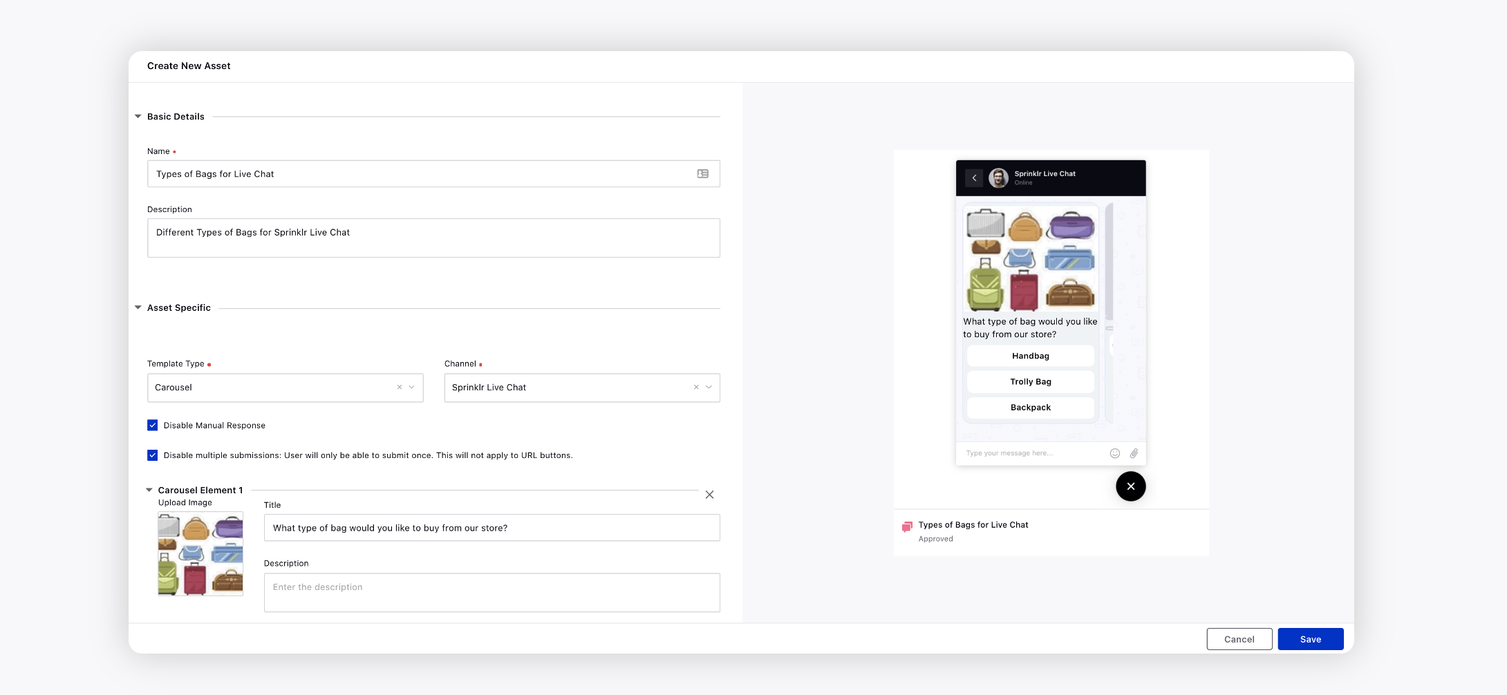
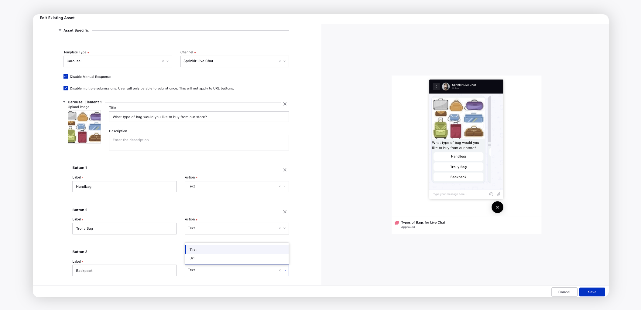
Under the Asset Specific section, select Carousel from the Template Type dropdown and Sprinklr Live Chat from the Channel dropdown. For more information, see Carousel Template — Field Descriptions .
Under Asset Details, select Campaigns, Sub Campaigns, Status, Available from, Visible from, Expires on, Tags, Restricted, Brands, Persona, Customer Journey Stage, Automated Tags, and Information.
Fill in the required fields under Asset Sharing and Properties.
Click Save in the bottom right corner.
Carousel Template — Field Descriptions
Term | Description |
Hide Attachment Option | If you check the box, your customers will not be able to send any attachments before/after selecting a response from this template until you (brand) send a message again. |
Disable Manual Response | If you check the box, your customers will not be able to send any message before/after selecting a response from this template until you (brand) send a message again. |
Disable multiple submissions: User will only be able to submit once. This will not apply to URL buttons. | Check the box to make the card buttons disabled for clicking if already clicked once. So, the users will not be able to click any button other than the URL button if they have already made the selection once. The options will be greyed out once clicked as shown in the GIF below. |
Enable automatic scroll | You can enable automatic scroll for carousels by setting the duration for automatic scrolling in milliseconds. This feature ensures seamless navigation through the carousel content without manual intervention. Additionally, users will notice indicators in the form of dots representing the number of elements within the carousel. Hovering over any element will trigger a pause, allowing users to pause the automatic scrolling temporarily for closer inspection or interaction with specific content.
|
Upload Image | Add an image for Carousel Element 1. |
Title | Provide a title for your Carousel Element 1. You can bold, italicize, underline, and strikethrough the text. |
Description | Enter the description for your carousel element. You can bold, italicize, underline, strikethrough, and hyperlink the text. |
Button 1 | Buttons contain click and action properties that define the type of action set on user click operation. Enter the following details: Label: Enter a label for button 1. It should not exceed 20 characters. Tracking ID: This ID will be used in the button click reporting Action: Select action as Text, URL, Phone call or change locale.
Postback Message: This is a message that is sent back as the user response after they click button |
Add New Button | Click to add a new button to your template. You can add up to 5 buttons. |
Add New Carousel Element | Click to add a new carousel element to the template. You can add up to 10 carousel elements. |
Button stacking direction | It allows you to specify how buttons are arranged within a layout. You can choose between three stacking directions: Row, Grid, or Column. When selecting the Grid option, you have further customization options by specifying the number of columns. This can be set to either "Automatic," where the system determines the optimal number of columns based on the available space, or you can manually select a number from 1 to 4 columns. This flexibility enables you to tailor the button layout according to your design preferences and the available space on the interface. |
Screen Reader Label | You can configure a custom label for carousel Template to enhance accessibility for users. By default, the asset is identified as a "form," and the screen reader announces it as "You have received a form." However, if you prefer a more specific label, such as "Registration Details Form," you can customize it accordingly. |
