Contact Details Form
Updated
A contact details form allows you to capture user information efficiently. This form can be customized to suit various requirements and can be integrated into Live Chat applications. It allows you to include multiple fields, which can be designated as mandatory or optional based on your needs. This flexibility ensures that you gather all necessary information while providing a seamless user experience.
.png)
Key Benefits of Contact Details Form
Customization: Tailor the form to capture specific information relevant to your business needs.
Integration: Easily integrate the form into Live Chat applications, enhancing user interaction.
Efficiency: Streamline the process of collecting user data, reducing manual entry and errors.
Accessibility: Configure the form to be accessible to all users, including those using screen readers.
Security: Implement reCAPTCHA validation to ensure that only legitimate users can submit the form.
Use Case and example
Gather detailed and accurate information from customer during Live Chat sessions. For instance, when a user initiates a live chat to inquire about a product, the service agent can send a customized form to capture the user's name, email address, and phone number. The email address can be marked as mandatory to ensure essential information is collected.
Once the user fills out the form, the details are automatically populated in the Profile tab of the Agent Console, allowing the representative to address the user by name and follow up via email if needed. This streamlined process improves efficiency and ensures a seamless user experience.
Create a Contact Details Form
To create a secure form, follow these steps:
1. Click the New Page (+) icon to open the Launchpad.
2. In the Sprinklr Social tab, under Engage > Digital Asset Management, and click Assets.

3. In the top-right corner of the Asset Management window, click Create Asset.

4. From the dropdown menu, select Templates > Omni Chat Templates.
This opens the Create New Asset window.

5. In the Basic Details section, enter a Name and optional Description for your asset.
6. In the Asset Specific section, select the following:
Channel: Select Sprinklr Live Chat
Template Type: Select Contact Details Form

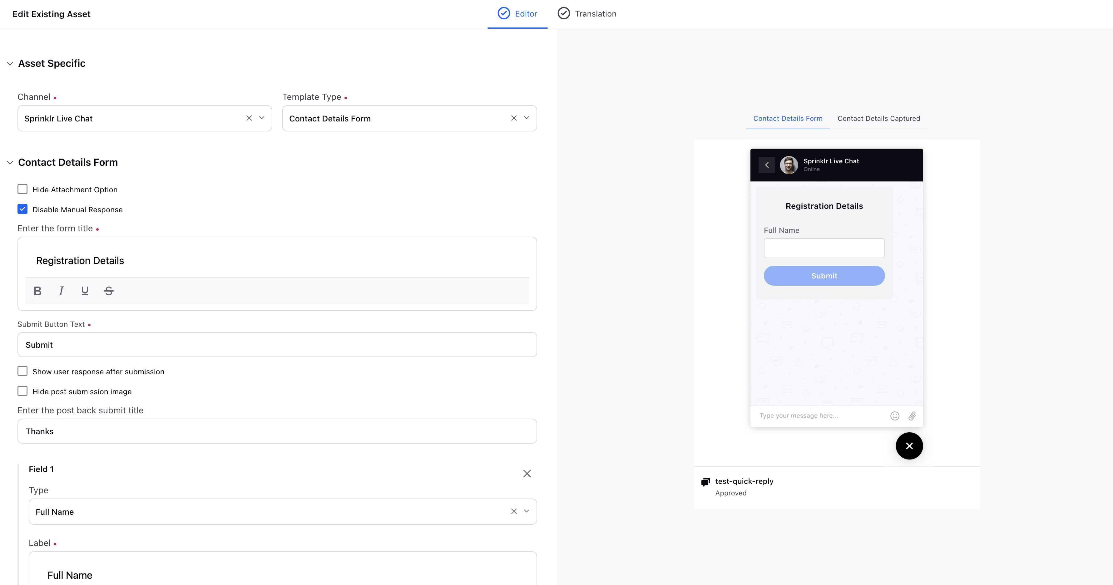
7. In the Contact Details Form section, enter the form title. This title will be displayed at the top of the form.
8. Configure the Submit button fields:
Field | Description |
Submit button text | Text displayed on the submit button. |
Show user response after submission | Check the box to send the details, that the user submitted via this form, as a brand message. Next, enter a message that will appear after the user submits the form, e.g. Thank you, in the Submit Button Post Feedback field. |
Submit button post feedback | |
Enter the post back submit title | The message displayed after successful form submission (for example, “Thank you”). |
Make external callback on submit | Enable this if your system, rather than Sprinklr, will handle submitted data. |
External Action Name | Name of the external action (if applicable). |
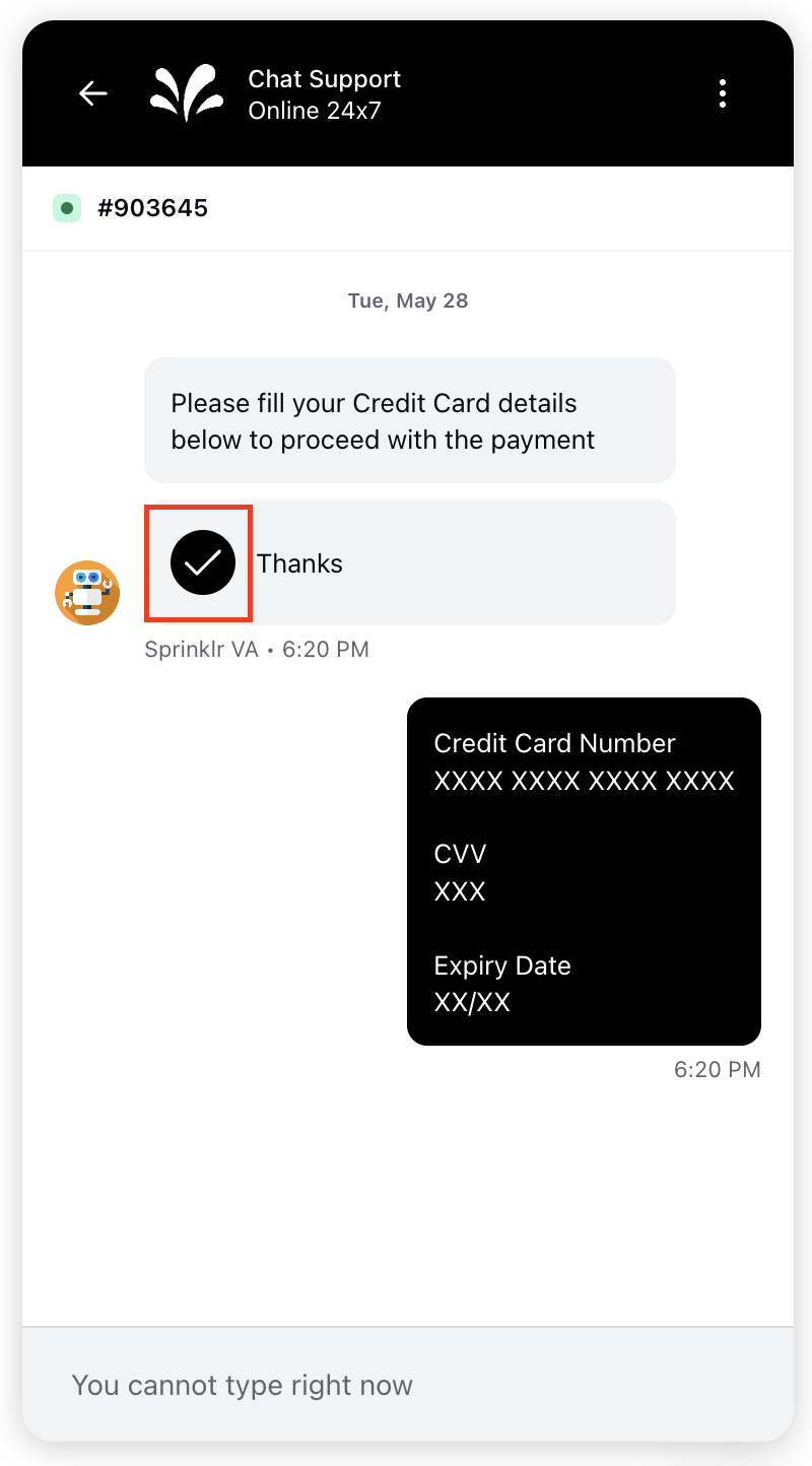
Hide post submission image | Hides the checkmark icon that appears after submission.
|
9. Add a Cancel button.
This enables users to exit the form and proceed with the workflow if they choose not to provide the requested information.

Field | Description |
Enable cancel button | Select this checkbox if you want to add a cancel button to your form. |
Enter the cancel button text | Text displayed on the cancel button (for example, Cancel, Go Back). |
Enter the post back cancel title | Title shown after the user cancels the form. |
Enter the post back cancel message | Message displayed after the form is canceled (for example, “Your form has been canceled”). |
10. Add the fields to the form. Click Add New Field to include form fields.
For each field, configure the following:
Field | Description |
Type | Choose from the standard and generic field types:
|
Field name | Field name is a unique indentifier that can be used as a reference to the value of this field. This is auto-generated but must be present for every field. |
Label | The visible name of the field shown to users. This appears above the input field. |
Help text | Optional supporting information shown when users hover over the ( This helps users understand what the field is for or how to fill it correctly. |
Mark field as mandatory | Enables validation to ensure the field is filled out. |
Mark field as non-editable when default or pre-filled value is present | Prevents users from modifying the field if it already contains a default or pre-filled value, ensuring the data remains unchanged. |
Enable field mask | Select this checkbox to mask individual form fields that contain sensitive information after a user submits the form. Admins can also configure the desired masking character and the regex pattern used to apply the masking. For more information, see the Mask Individual Fields section. |
Placeholder | Greyed-out text inside the input field that provides a hint or example of the expected input. |
Copy field value to custom field | Select the custom field where you want to copy the value of this field. |
Field validation using regular expression (RegEx) | Allows advanced input validation using regular expressions (RegEx). This ensures the data entered meets specific formatting or value criteria. Using RegEx validation improves data quality by enforcing correct formats for inputs like email, phone numbers, or custom patterns. |
11. Enable reCAPTCHA for a specific field by entering the site key and secret key.
12. Add translations for the asset, if needed. For steps, see Add Translations for Your Form.
13. Under Asset Details, select Campaigns, Sub Campaigns, Status, Available from, Visible from, Expires on, Tags, Restricted, Brands, Persona, Customer Journey Stage, Automated Tags, and Information.
14. Fill in the required fields under Asset Sharing and Properties.
11. Once all details are complete, click Save in the bottom-right corner.
Add Translations for Your Form
Switch to the Translation tab and add languages from the top left corner.
Enablement note:
To learn more about getting this capability enabled in your environment, please work with your Success Manager.
Internal note:
Use this DP: CHAT_TEMPLATE_TRANSLATION_ENABLED
Tabs for the added languages will appear at the top. Click on the desired tab to add the translations.

Go back to Editor and click Save at the bottom to save the translations.
View Information Captured by the Contact Details Form
The details captured via a contact details form will appear within the Profile tab of the third pane of Agent Console and Care Console.
.png)
Mask Individual Fields
You can mask individual form fields that contain sensitive information after a user submits a form. The masking configuration allows you to:
Define the masking character (for example, * or #).
Apply a regular expression (regex) to control how the masking is applied.
Optionally copy the masked data into a custom field for further use.
For example, if masking is enabled for the Email field, then after form submission the user’s email address will appear in a masked format (for example, *****) within the chat UI as well as across all other relevant views.
To mask an individual field, follow these steps:
1. Select a field from the Standard Types list (for example, Full Name or Email).
2. Select the Enable field mask checkbox. Once selected, the masking-related options will be displayed.
3. Choose the masking character to be applied.
4. Enter the regular expression (regex) that will be used for field validation.
5. Select the custom field where you want the masked value to be copied.

Contact Details Form — Field Descriptions

Field Name/Term | Description |
Hide Attachment Option | If you check the box, your customers will not be able to send any attachments before/after selecting a response from this template until you (brand) send a message again. |
Disable Manual Response | If you check the box, your customers will not be able to send any message before/after selecting a response from this template until you (brand) send a message again. |
Enter the form title | Provide a title for your Form. You can bold, italicize, underline, and strikethrough the text. |
Submit Button Text | Enter the label for the submit button |
Show user response after submission | Check the box to send the details, that the user submitted via this form, as a brand message. Next, enter a message that will appear after the user submits the form, e.g. Thank you, in the Submit Button Post Feedback field. |
Hide post-submission image | Hide the checkmark that appears after submitting the form. |
Enter the post back submit title | Enter the message that the users will see after they submit the form, for example, Thanks. |
Field 1 | Type: Select the contact information that you want to capture from the users such as their Full Name, First Name, Last Name, Email Address, and Phone Number. You can also add generic fields in the template . Label: Enter the label for the field. You can also bold, italicize, underline, strikethrough, and hyperlink the text. Help text: It will be displayed when users hover over the "i" icon. This help text offers users extra information or guidance about the specific fields, helping them to complete the form accurately. Placeholder: Add the background text shown in the input field, e.g. Full Name, Email Address, Type here, etc. Copy field value to custom field: Select a profile custom field to copy the value entered by the user. Mark the field as mandatory: Mark the field as mandatory for the users to fill. Field validation using regular expression (RegEx): Enter your Regular Expression for the validation of the user input. It also supports POSIX regex. Make field non-editable when default or prefilled value is present - Fields that have pre-filled data from previous entries (Standard Fields) or a default value (Generic Fields). |
Add New Field | Click to add a new field to the template. |
Enable Recaptcha | Enable reCAPTCHA validation to allow only legitimate users to fill out the form. You will need to create a site and secret keys in Google reCAPTCHA. For more information, please refer here. Please note only the v2 captcha is supported. |
Standard Fields | Full Name - field to capture the full name of the user. First Name - field to capture the first name of the user. Last Name - field to capture the last name of the user. Email Address- field to capture the email address of the user.You can provide a list of allowed domains for validation. The form cannot be submitted if the email does not match the allowed domain list. To configure, contact support at tickets@sprinklr.com. Phone Number - field to capture the phone number of the user, including international dialling code.
|
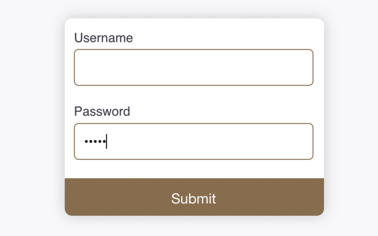
Generic Fields | Checkbox - single checkbox field. You can mark the checkbox as selected by default. Checkbox Group - A group of checkboxes allowing multiple selections. You can mark options as selected by default. Email - text field for capturing an email address. Pick List - dropdown list of predefined options to choose from. You can set an option to be selected by default. Multi Pick List - multi-select dropdown list, allowing multiple options to be selected. You can set options to be selected by default. Text - field that allows users to enter free text Number - field that allows users to enter numerical data. Can enable Increment/Decrement controls with a counter field that includes +/- buttons, providing a more intuitive method for entering numbers. You can set minimum, maximum, and step values. Password(masked by default) - field for entering a password, where the entered value is obscured (masked).
Date - field that allows users to select a date using a date picker. You can enable a date picker in a specific format, and restrict users to select only future dates, past dates, dates before/after a specific date and disable few dates. Reach out to support at tickets@sprinklr.com to get this capability configured. Text Area - larger text input field for capturing more detailed information (multiple lines) Pick List Open(allows free text) - A dropdown list of predefined options where users can also add their own custom options. Multi Pick List Open(allows free text) - A multi-select dropdown list that allows users to add custom options as well. Default Value: You can configure a default value for any field to be pre-filled Ensure the value of the field is the same as that of the following field added in the same form - Ensures that the value of a field matches the value of another field in the form. |
Adding Help Text | Help text can be added to each field, providing users with guidance through an "i" icon. To add help text, enter the help text description within the Help Text field. |
Screen Reader Label | You can configure a custom label for contact details form to enhance accessibility for users. By default, the asset is identified as a "form," and the screen reader announces it as "You have received a form." However, if you prefer a more specific label, such as "Registration Details Form," you can customize it accordingly. |

