Quick Replies
Updated
Overview
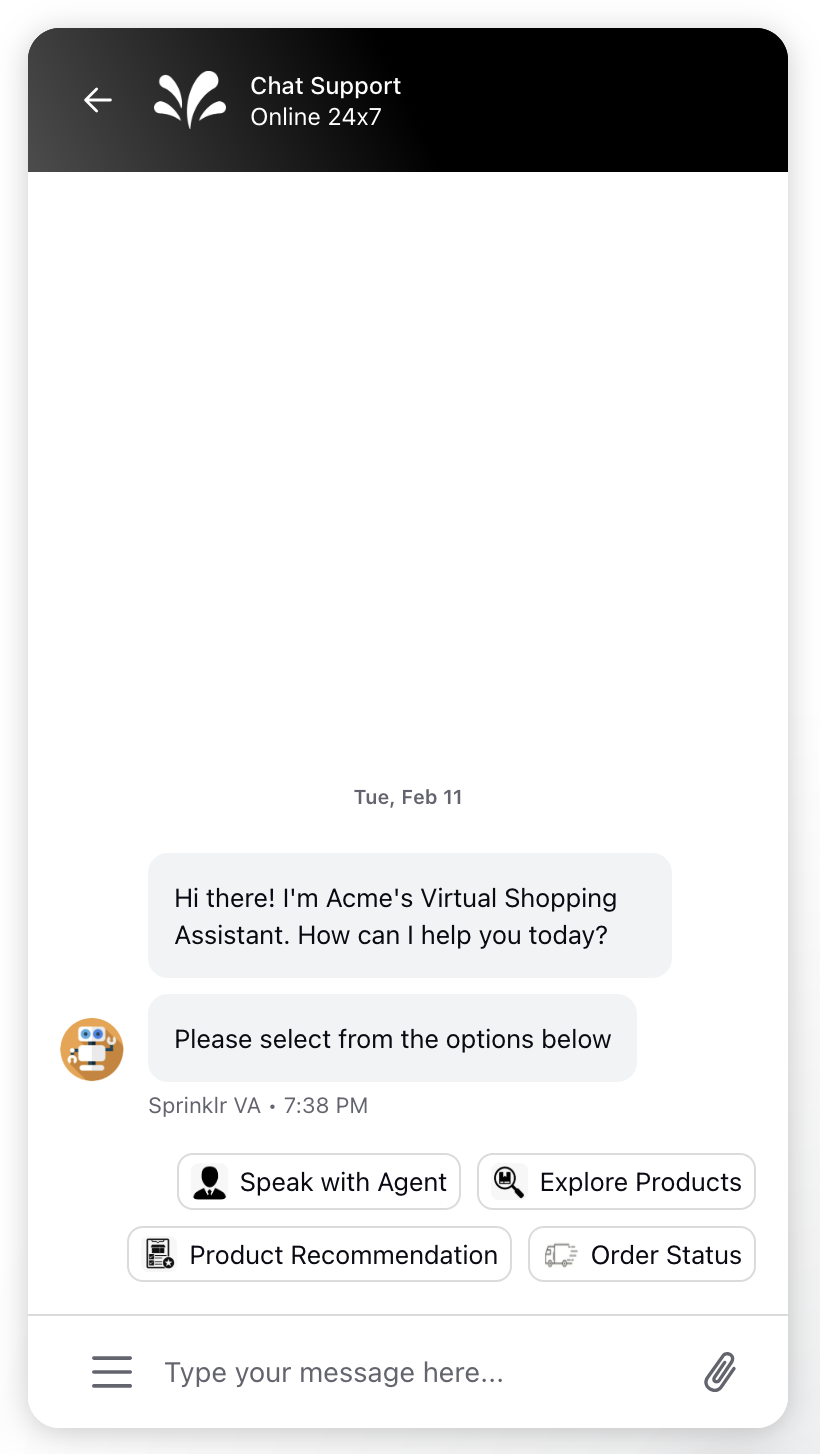
Quick replies in Sprinklr Live Chat provide users with selectable options for faster and more efficient responses. These are particularly useful when the bot asks a question and expects an answer. By creating a quick reply asset with different options, users are prompted to select one of the possible issues. Once an option is selected, the quick reply options disappear, leaving only the chosen answer visible.
Note: You have the option to include both text and images with each bot reply. While adding an image is not mandatory. If you choose to include an image, we recommend using a square image with a minimum size of 18x18 pixels.

Key Benefits of Quick Replies
Faster User Interaction: Predefined options allow users to respond quickly and efficiently.
Improved User Experience: Clear choices simplify decision-making, reducing friction and enhancing engagement.
Enhanced Bot Efficiency: Accurate responses are gathered faster, streamlining conversations and improving response times.
Customizable Responses: Text and images can be included in replies, making interactions more dynamic and visually engaging.
Increased User Satisfaction: Clear options reduce confusion, ensuring users can easily select the most relevant response, boosting satisfaction.
Use Case and example
Customer Support: When a user contacts support, the bot can present quick replies for common issues like "Billing," "Technical Support," or "Account Management." This helps direct the conversation efficiently.
Surveys and Feedback: Quick replies can be used to gather user feedback by presenting options like "Very Satisfied," "Satisfied," "Neutral," "Dissatisfied," and "Very Dissatisfied."
Product Recommendations: For e-commerce, quick replies can help users choose product categories such as "Electronics," "Clothing," or "Home Appliances."
Appointment Scheduling: Users can select available time slots for appointments, making the scheduling process seamless.
Steps to configure Quick Replies
Click the Digital Asset Management under the Integrate section of your sprinklr home page.
In the top right corner of Asset Management, click Create Asset and select Omni Chat Templates from the dropdown.
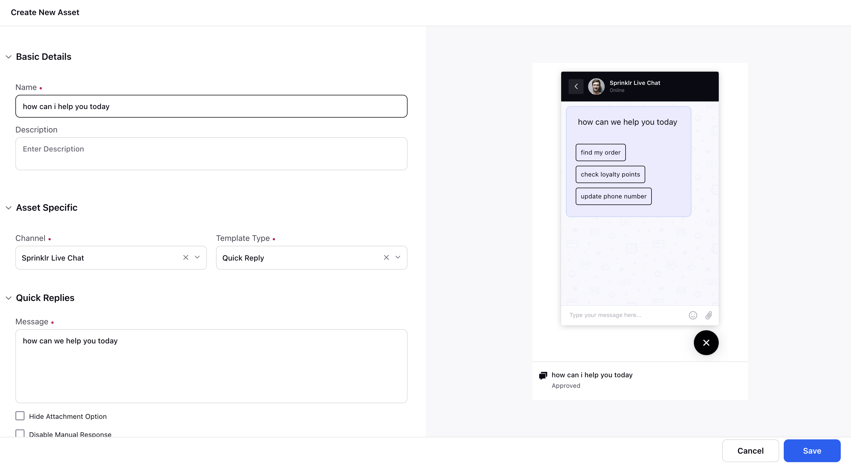
On the Create New Asset window, enter a Name and optional Description for your asset under the Basic Details section.
Under Asset specific section, select Template type as Quick Reply and channel as Sprinklr Live Chat.

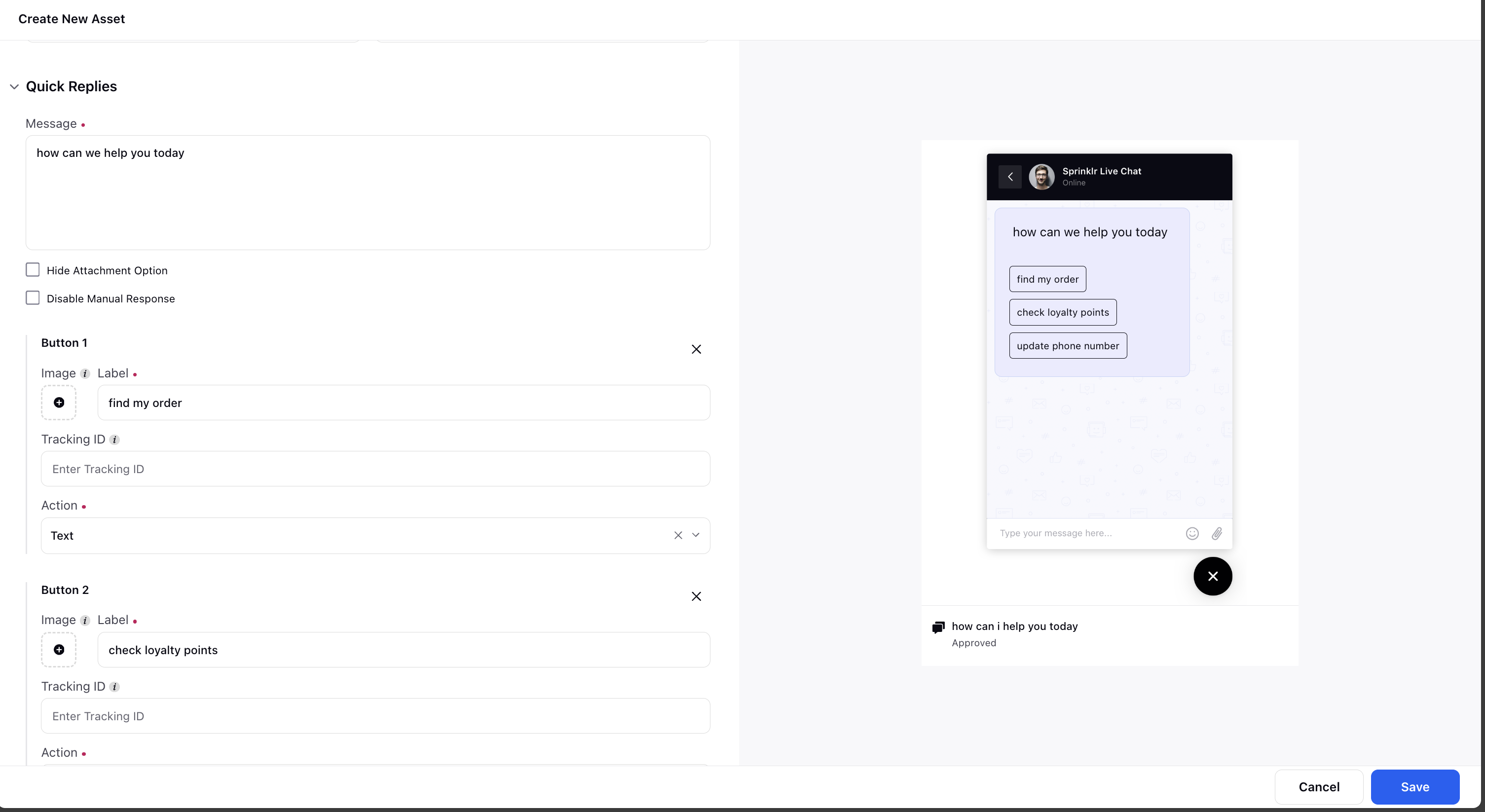
Enter your message under the Message section. Refer to the Quick Replies - Field Descriptions for details on the Quick Reply fields.

Under Asset Details, select Campaigns, Sub Campaigns, Status, Available from, Visible from, Expires on, Tags, Restricted, Brands, Persona, Customer Journey Stage, Automated Tags, and Information.
Under Asset Sharing, select Workspace(s) and Users/Users Group(s) you want to share this asset with. You can also check the box alongside Visible in all workspaces to share the asset within all workspaces.
Next, enter the Properties per your needs.
Switch to the Translation tab if you wish to translate your form into other languages. Select all the languages to translate the form into from the Select Languages dropdown. Next, select the Translation Language to open the editor for that particular language. You can view the form in your base language in the left pane and add the translated text in the right pane.
Click on Save to save your quick reply template.
Quick Replies - Field Descriptions

Field Name/ Term | Description |
Message | Enter your text message. |
Hide Attachment Option | If you check the box, your customers will not be able to send any attachments before/after selecting a response from this template until you (brand) send a message again. |
Disable Manual Response | If you check the box, your customers will not be able to send any message before/after selecting a response from this template until you (brand) send a message again. |
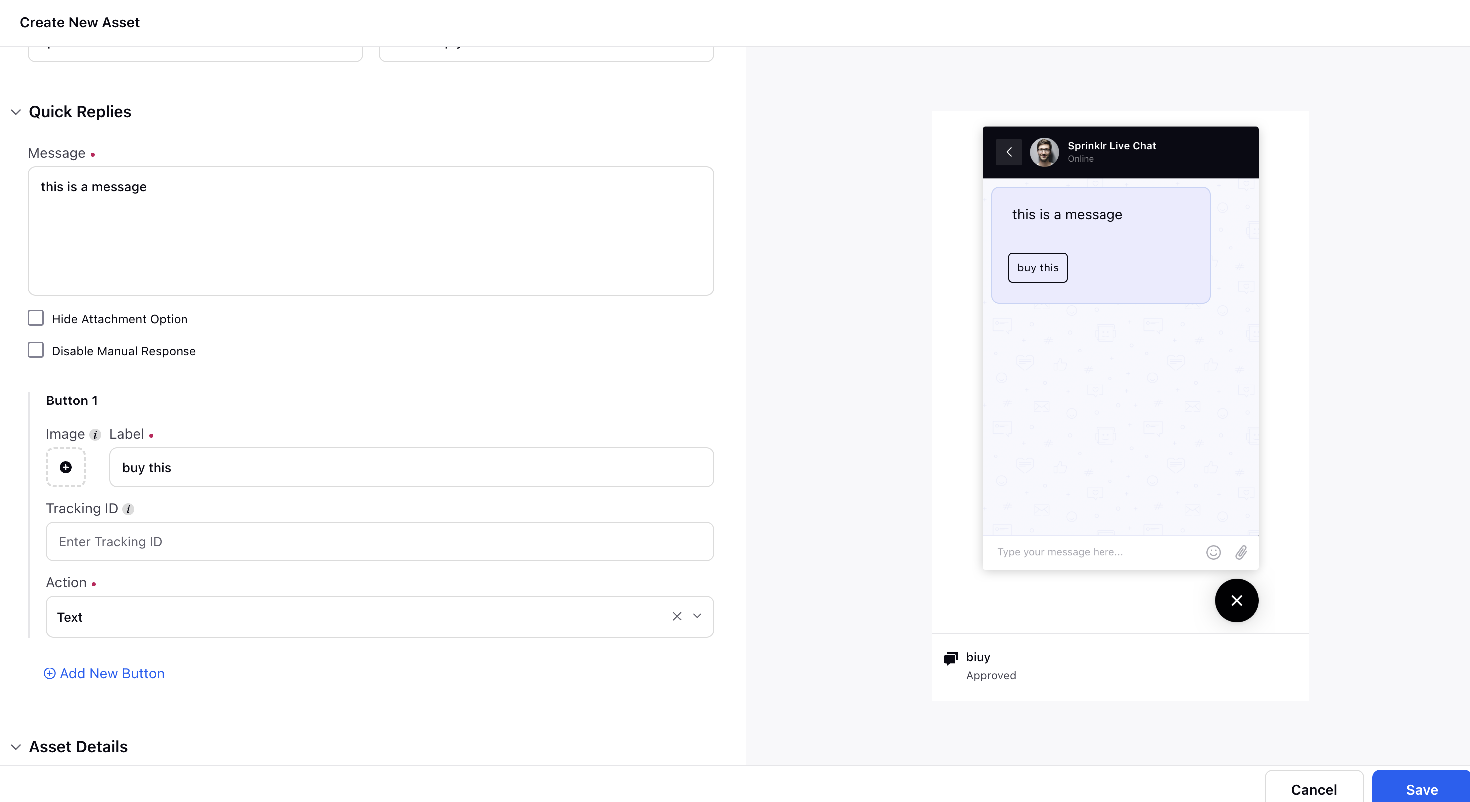
Button 1 | Buttons contain action properties that define the type of action set on user click operation. Under Button 1, enter the following details: Image: Upload or select the image to be used in the button. Label: Enter a label for button 1. Tracking ID: This ID will be used in the button click reporting. Action: Select action as Text. When the Text button is clicked, the label of the button is captured as the user text response. |
Add new button | Click to add a new button to your card template. |