Layout Customisations (Use-Cases of Record Page Builder)
Updated
Increase Height of a widget
The height of a widget can be increased by changing the same in settings when clicking on a particular widget as shown in the screenshot below. This can also be done by adding the line “Height” : “50rem” in the code editor as well.

Configure the layout into 2-pane or 3-pane
Depending on the ask, we can configure the layout into a 2-pane or a 3-pane layout which essentially means that there will be 2 columns for 2-pane layout i.e one column of the conversation Widget and another column of other widgets. Similarly, 3-pane layout gives 1 column to the conversation pane and other 2 columns to the rest of the widgets. These layouts are controlled by the specific code block written for both the types of layouts.
Steps:
Take the code block for the 2-pane/3-pane layout and replace it with the existing code.
Replace the record ID given as “6344636e88567c4c8ca10fed” (which is for the standard 3-pane layout for this example) with the existing record page ID of the page where we want the change
You can see the ID of the page in the URL as shown in the screenshot below i.e 6344636e88567c4c8ca10fed.
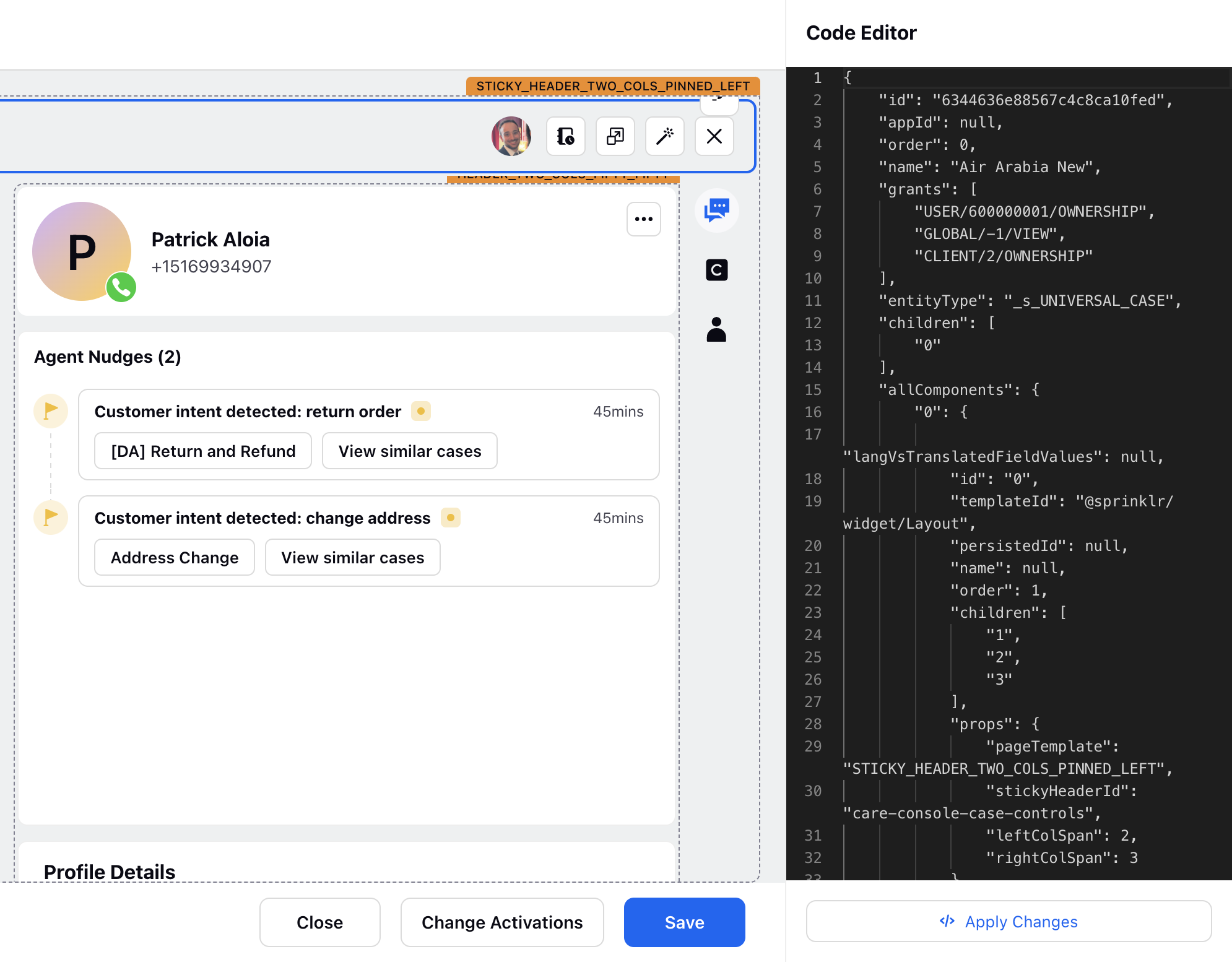
To see the result of any changes made in the record page, we can just click on the preview button to see the layout overall. This is very important to check before you publish/save the record page, because that publishes the changes in the environment immediately.
Configuring the Width of the Conversation Pane
To change the ratio of the conversation pane and the column(s) containing the other widgets, change the ratios of the ‘leftColSpan’ and the ‘rightColSpan’ in the JSON of the record page. To do so -
Head to the Care Console Manager, open the concerned Record Page and head to its JSON.
Within the "allComponents", head to “props”
Change the ratio as desired
For example, in the following 3 pane layout, the ratio of the conversation pane to the right column is 2:3


Widget Repositioning
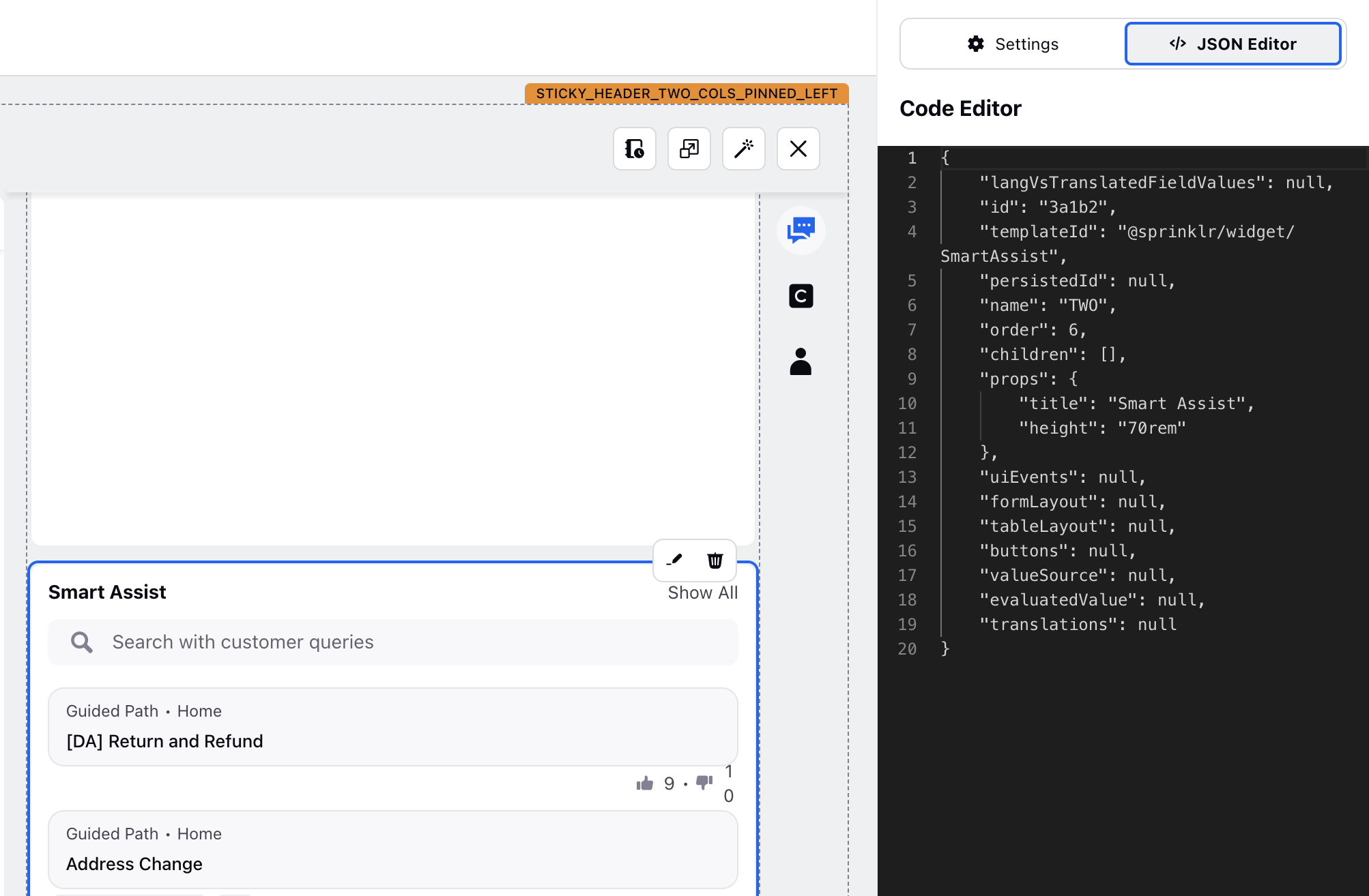
Widgets in Care Console can be positioned in any specific pane and can also be rearranged to be above or below in a certain order. When clicked on a widget, we can see in the code editor that the "name" is defined as "TWO". This defines the column on pane in which this widget is placed. If we change this to "THREE", we can reposition this widget to be in the 3rd pane.
Conversation Pane Configuration
When we click on the conversation pane in the record page builder, we can see the options to configure the information/features to be shown or hide in the pane such as message actions in the reply box or increasing the size of the reply box.
Steps:
Head to the Record Page you want to modify via the Care Console Manager.
Click on the Conversation Widget which is the leftmost widget of the record page.
Head to the settings tab on the right.

You can configure multiple aspects of the conversation pane as well as the reply box from the settings, such as changing the height of the reply box, controlling the visibility of the reply box and message or case related actions etc.
Let's say you want to hide the 'Canned Response' button from the Reply Box of this Record Page. You simple head to 'Message controls to remove from reply box' and select Canned Responses.


Case Control Buttons
Case Control Buttons can be considered as shortcuts to execute certain actions via buttons present at the top a record page.
Use Case:
To initiate a Guided Workflow
To apply any macro
To apply a specific macro
To open a URL
To Generate Summary of the Case

Steps:
Open the Record Page you want to add the buttons in, via the Care Console Manager.
Click on the Case Control Widget which is the topmost section of the Record Page.

Head to the JSON Editor of the Case Control Widget to edit the buttons.
Within the ‘props’ section of the JSON code, you can control the number of buttons visible in the widget by changing the "upfrontActionsCount". In this example, it shows all the 4 action buttons.

Let’s change the value of "upfrontActionsCount" to 3. Only 3 buttons are now visible – two action buttons with the third being a three-dots button. You can access the other two action buttons by clicking the three-dots button.

Head to the ‘buttons’ section of the code to configure the buttons. This is how the code for a button looks like

The “label” determines the name of the button, and the “icon” determines the icon that is placed beside the name of the button.
The “type” within “props” determines whether the button is only an icon or an icon-with-text. For example, these are two buttons –
Icon with text ("type": "ICON_TEXT_BUTTON")
Only an icon ("type": "ICON")

The “tooltipContent” determines the tooltip for the button, and when it is not given, the label will be used as the tooltip for Icon type of button.
To add a button, enter the code within the "buttons" section.
The placement of the code for a respective button determines its position. The left most button is the one whose code is placed first within ‘buttons’.
Code for Guided Workflow Button:
{"id": "ID_5","templateId": "@sprinklr/action/GuidedAction","label": "Search Company ID","icon": "search","entityType": "UNIVERSAL_CASE","action": 27267,"props": {"type": "ICON_TEXT_BUTTON","viewType": "QUICK_WINDOW","position": "BOTTOM_RIGHT"}} Note: In "action", enter the ID of the GP you want to execute
Code for Button to Apply a Specific Macro:
{"id": "ID_6","templateId": "@sprinklr/action/ApplyMacroWithId","label": "No Response Required","icon": "macro","entityType": "UNIVERSAL_CASE","action": "RANDOM_MACRO_ID_3","props": {"type": "ICON"}}Note: In "action", enter the ID of the Macro you want to apply
Code for Apply Macro Button:
{"id": "ID_7","templateId": "@sprinklr/action/ApplyMacro","label": " Apply Case Macro","icon": "macro","entityType": "UNIVERSAL_CASE","props": {"type": "ICON"}}Note: This action opens a list of macros, and any macro can be applied when selected. This button is present in the default record pages.
Code for Button to Open a URL
{"id": "ID_8","templateId": "@sprinklr/action/OpenExternalUrl","label": "Sprinklr","icon": "link","entityType": "UNIVERSAL_CASE","props": {"type": "ICON_TEXT_BUTTON","url": " https://www.sprinklr.com/"}}Note: For an external URL, enter the full URL of the destinations including http:// or https://
Code for Button to Generate Case Summary
{"id": "ID_9","templateId": "@sprinklr/action/OpenSprinklrAISummaryQuickView","label": "View Generated Summary","icon": "sprinklrAI","entityType": "UNIVERSAL_CASE","props": {"type": "ICON_TEXT_BUTTON","actionParams": {"caseNumber": "CASE_NUMBER"},"intent": "ai","variant": "secondary","shouldShowNewSummaryAlways": true},},Note: Sprinklr AI+ must be enabled on the platform.
If "shouldShowNewSummaryAlways" is configured to false, the button functions as a "View Generated Summary" option that will open the third pane to show a previously created summary. Conversely, when "shouldShowNewSummaryAlways" is set to true, a new summary will be generated each time.
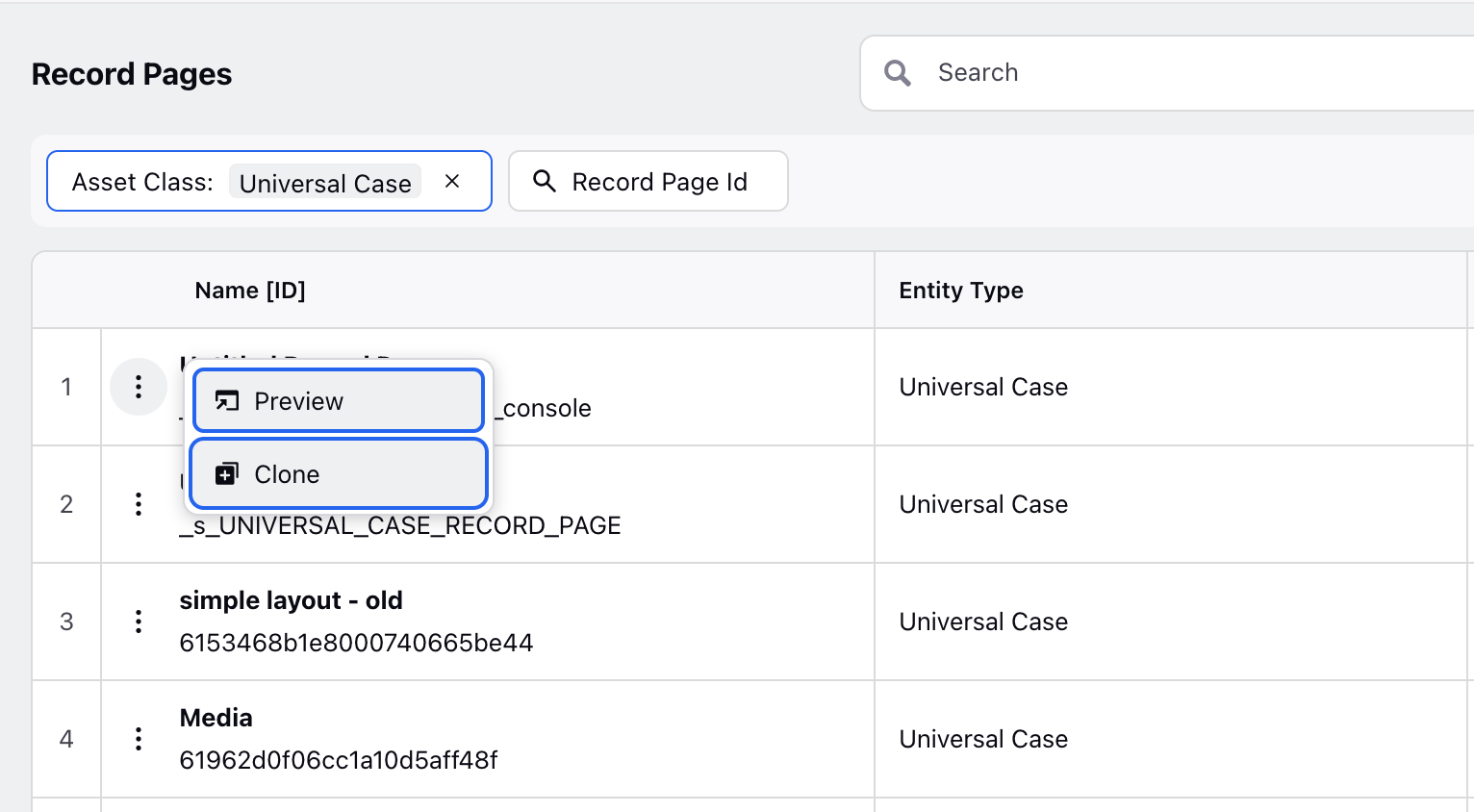
Adding a New Record Page
Steps:
Go to Care Console Manager, we can see all the record pages here. We can clone any of these record pages by clicking on theoptions as shown below.
This new record page can be renamed and can be configured according to the relevant ask or condition for which this page needs to be loaded.