Page Density controls
Updated
Unlock the power of information with page density controls – tailor your viewing experience to your preference.
In today's fast-paced digital landscape, where you need to navigate through a myriad of information, the importance of optimizing user experience cannot be overstated. With this in mind, we are thrilled to introduce our latest feature: Page Density Controls. By offering Compact, Comfortable, and Spacious modes, you will be able to tailor your viewing experience, thereby enhancing productivity and satisfaction. You will be able to switch between 3 different modes viz. Spacious, Comfortable & Compact.
Spacious: This mode provides a more visually expansive interface that allows you to focus on key elements without distractions. Our Spacious mode offers just that. By increasing the spacing between interface elements, this mode creates a sense of openness and airiness, giving users a sense of freedom and clarity.
Comfortable: This mode offers a balance between content density and readability. By slightly increasing the spacing between interface elements, Comfortable mode reduces visual clutter and creates a relaxed environment for users. This ensures comfortable reading and interaction with the platform, minimizing eye strain and facilitating a seamless workflow.
Compact: The Compact mode condenses the interface elements, such as margins, paddings, and font sizes, to provide users with a more condensed view. This allows users to maximize their screen space and view more information at once. Compact mode will eliminate excessive scrolling and enables efficient information consumption.
Availability: This capability is available by default for every user under Preferences and is not permission controlled. No enablement is required for this feature.
How to change Page Density?
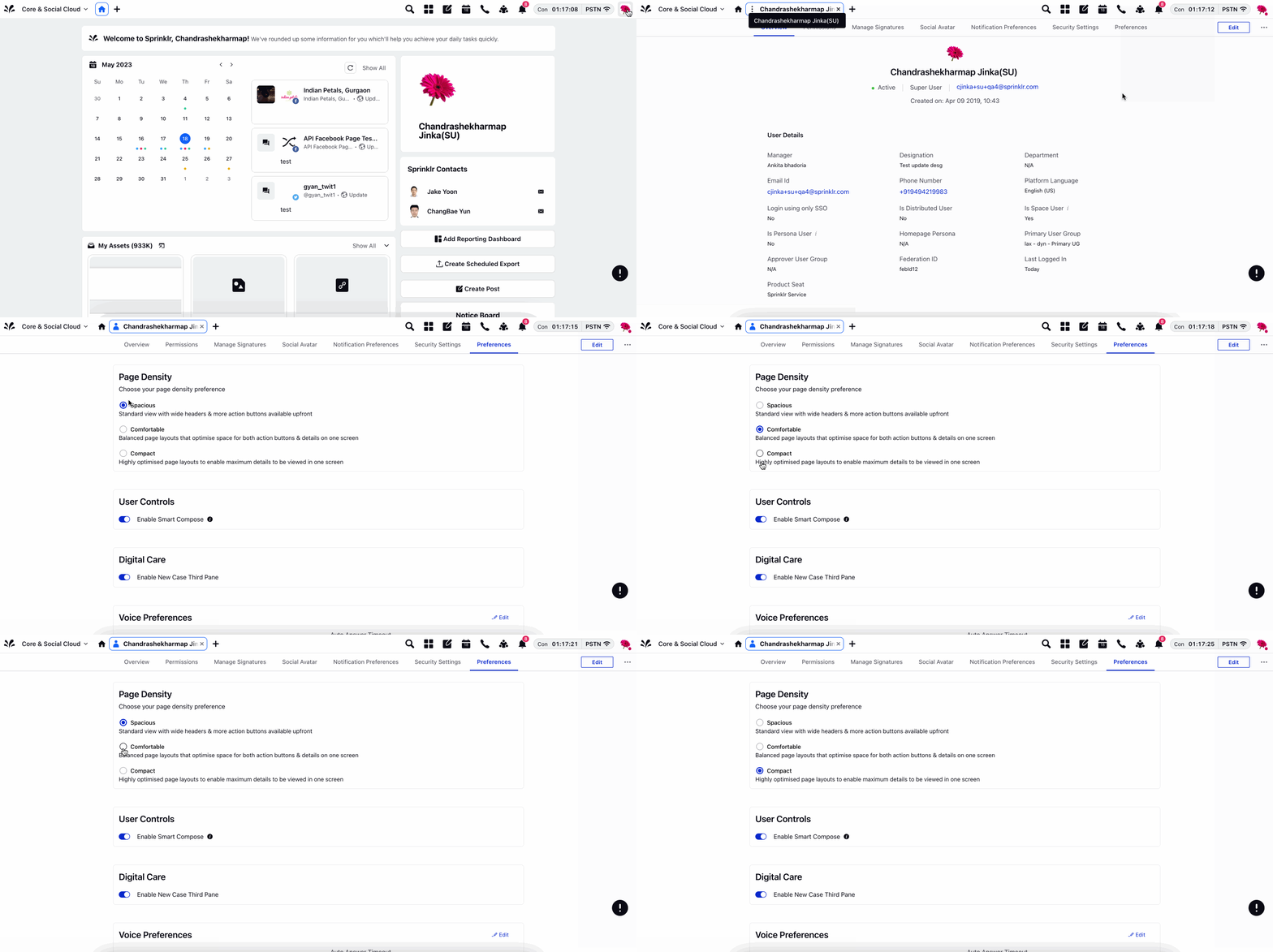
Navigate to the profile icon and go to the Preferences tab.
You will notice an option to switch Page Density with available selection of Spacious, Comfortable, and Compact Mode.
Choose a suitable page density. Density would change across pages in Sprinklr for your user.
How are these modes different?
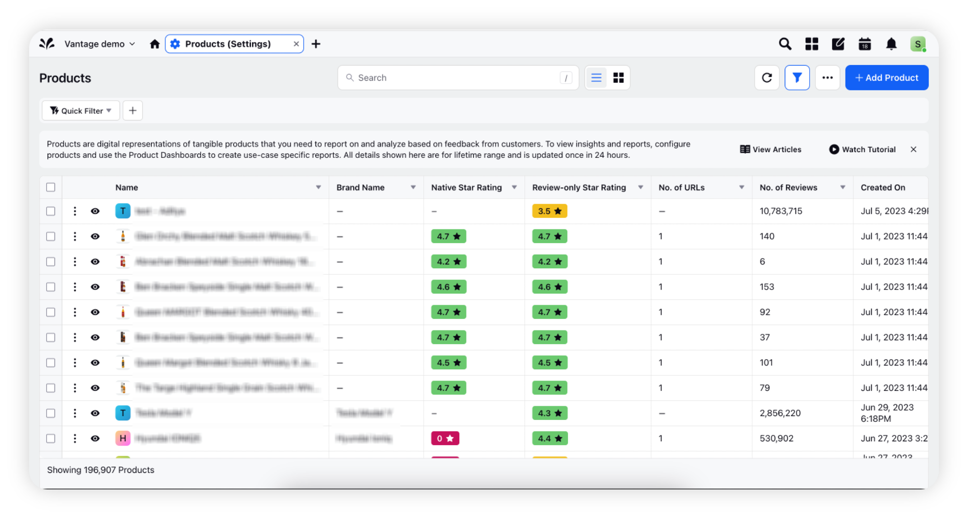
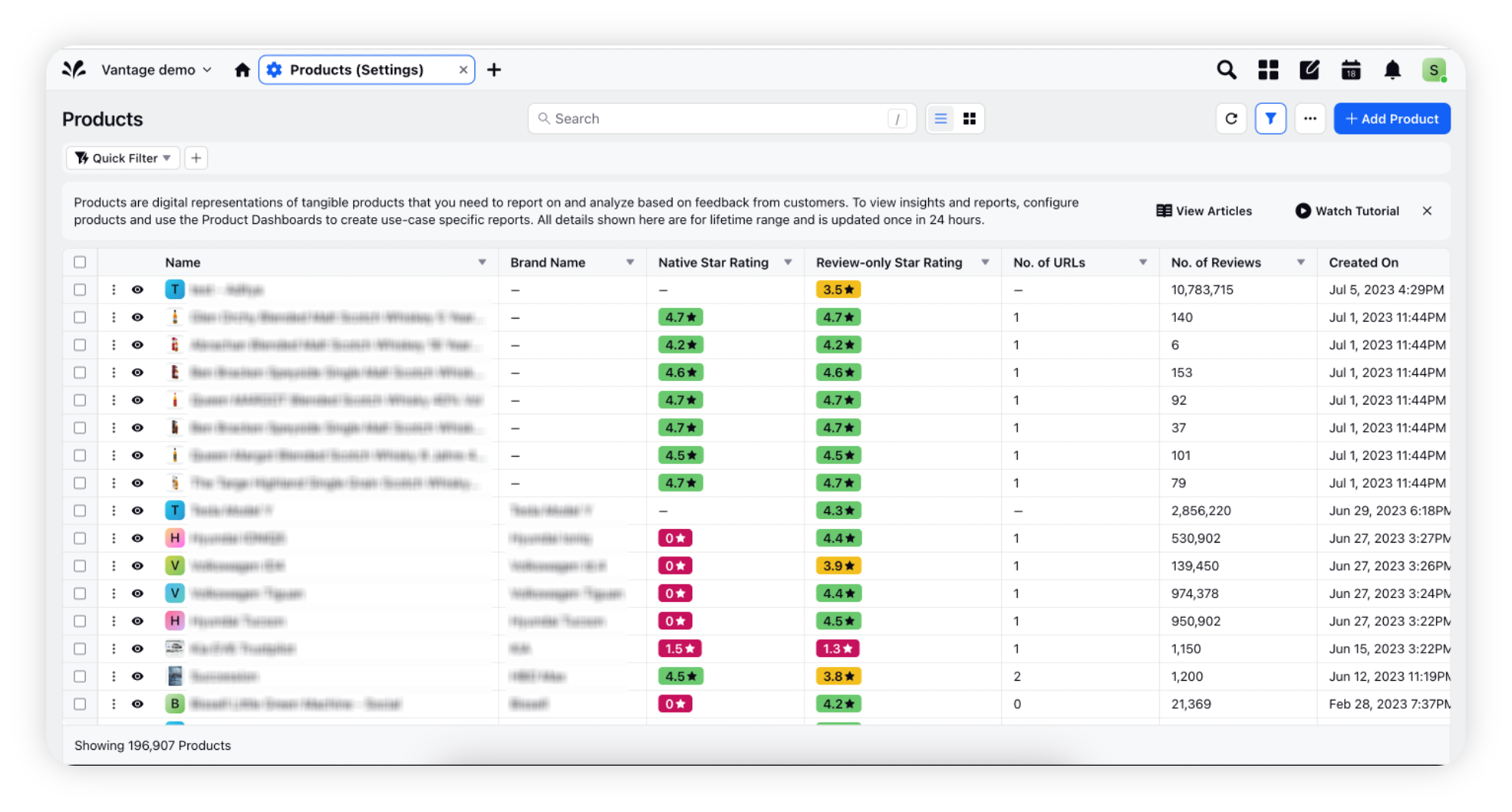
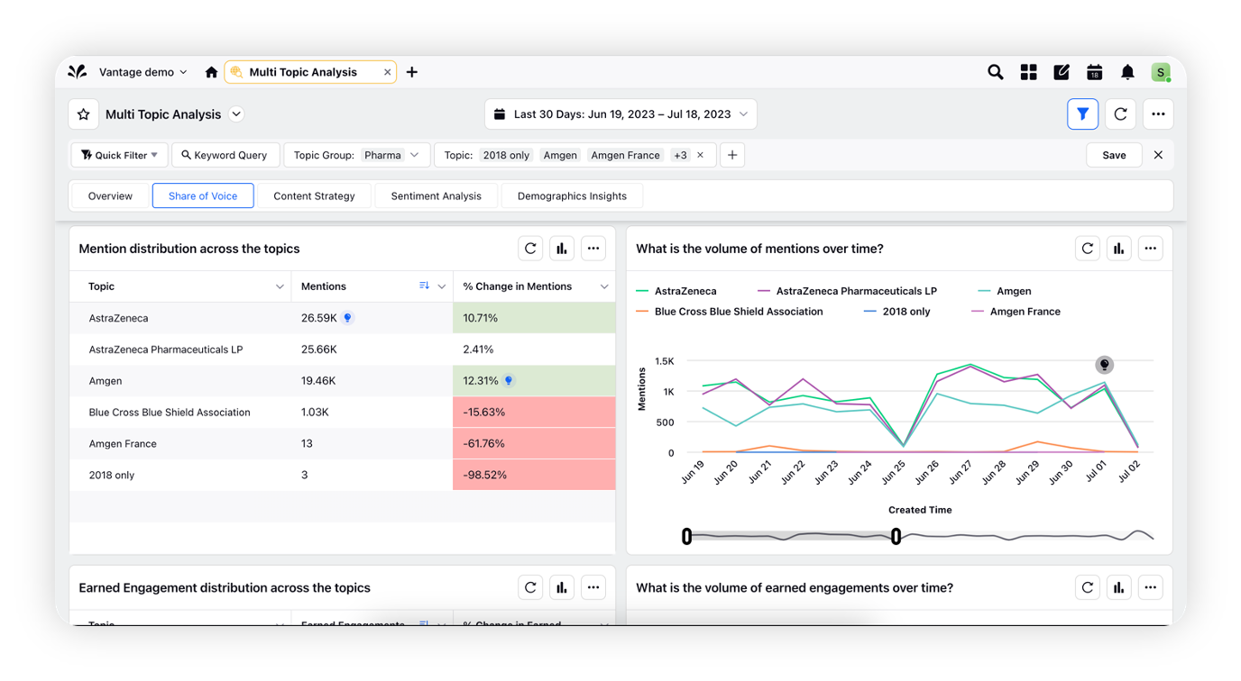
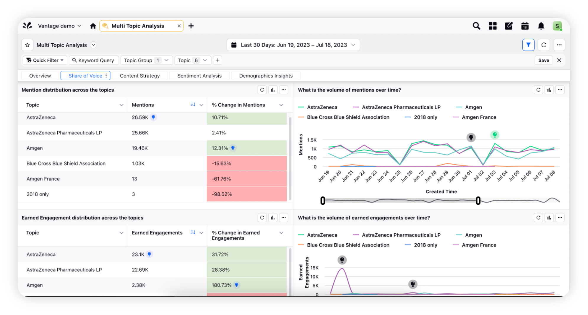
Let's see how same platform areas will look in comfortable & compact modes –
Comfortable Mode | Compact Mode |
Record Manager | Record Manager |
Dashboard view | Dashboard view |
UX changes made with Page Density Control
We have made the below UX changes to the existing functionalities of the Sprinklr platform –
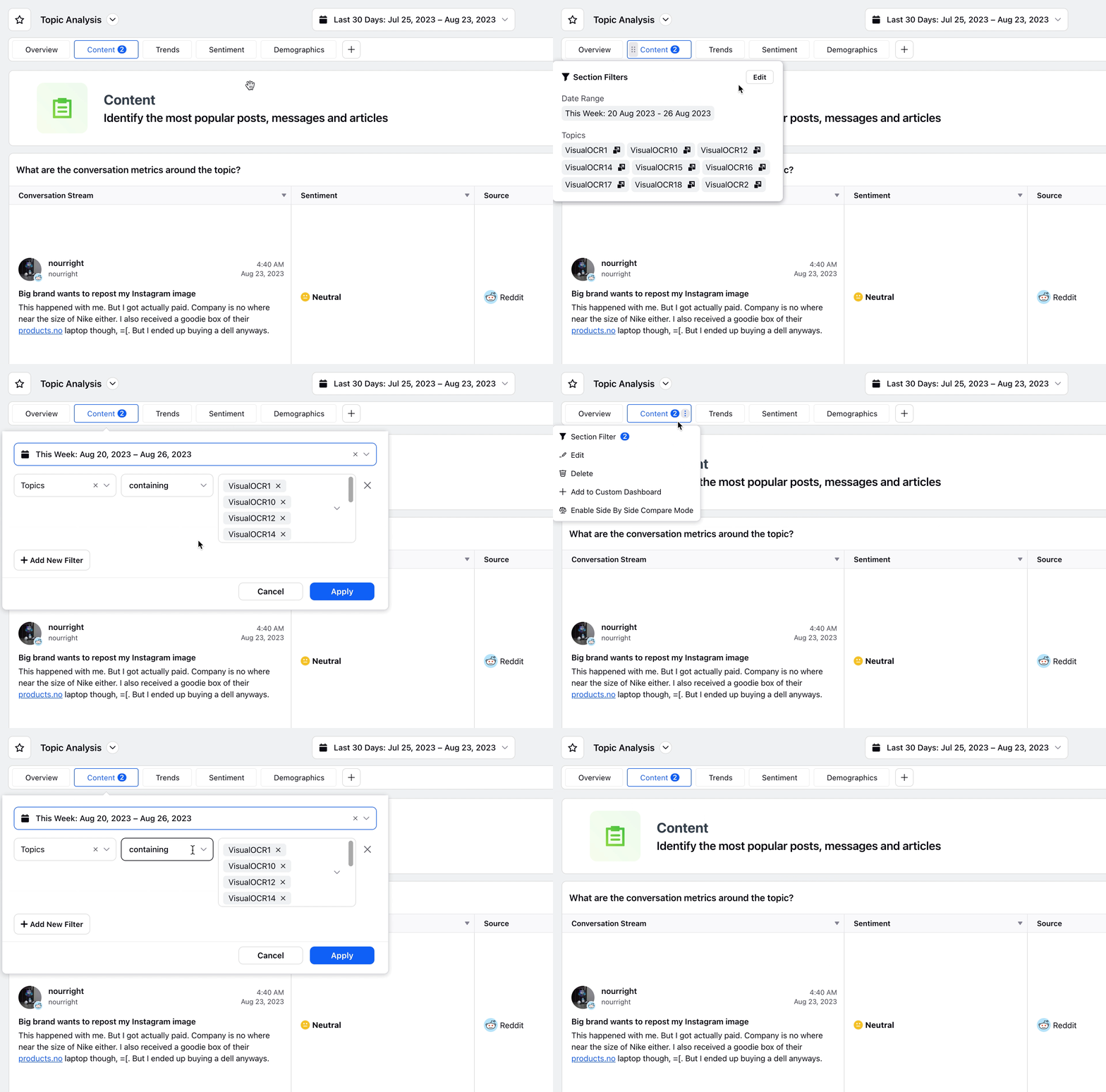
Section-level Filters
You can access the section-level filtering by navigating to the 3 dots Options icon, where you will find the option for section-level filters.
When filters are applied to a section, you can easily identify them by the number of filters displayed on the section header. Besides, upon hovering over the number reflected on the section, you will see the summary of the filters applied with a quick edit option in summary.
You can also edit the section filters by clicking on the number reflected on the section when section filters are applied.
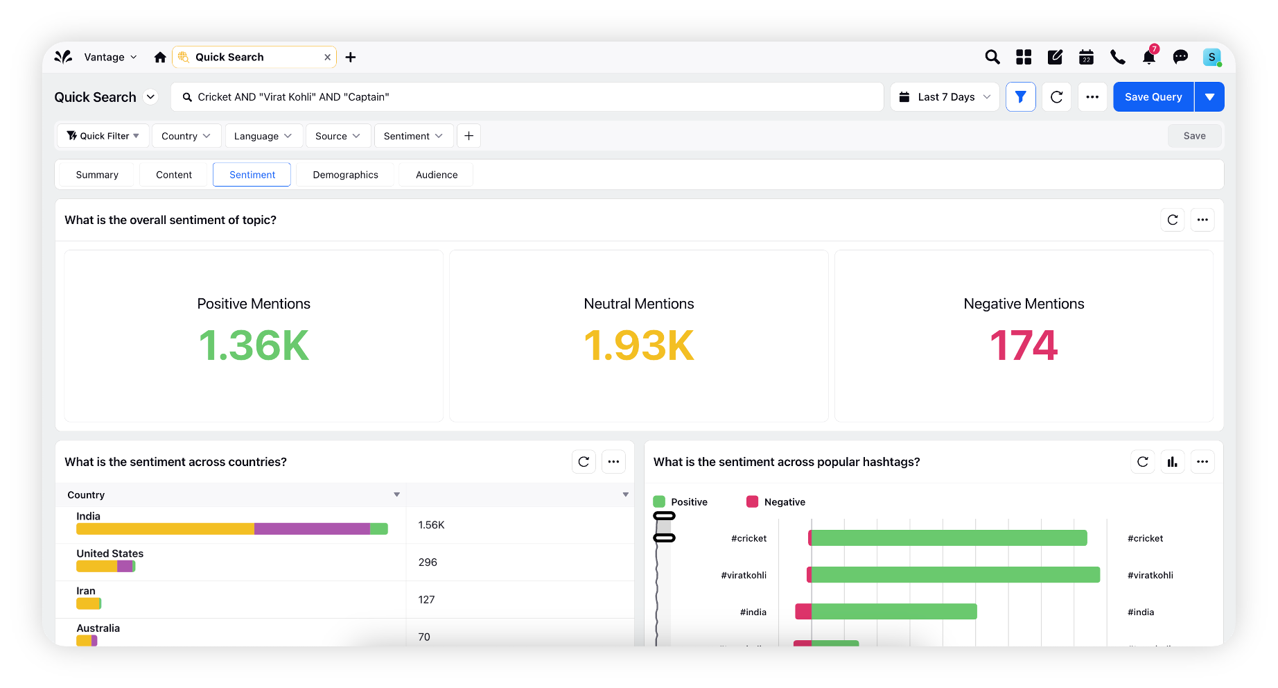
Quick Search & Research Query dashboard
You will now be able to access Search bar & Research Query bar from the top header which will enable you to see more widgets in one view. We have further improved the horizontal scrolling behavior when editing a query in Search bar & replaced it with drop down so that user is able to access the query easily.
Post Card Hyperspace changes
Upgraded hyperspace post card with improved usability. Ads preview can now be accessed by hovering over the post card which will show as quick actions at the top edge of post card.
These UX changes aim to provide users with more space for dashboard widgets and allow them to view more data at a time.
