Use Side By Side Compare Mode in Reporting Dashboards
Updated
Learn how you can perform quick and insightful comparative studies for your Brand, Product, or Campaign.
Sprinklr’s side-by-side compare mode allows you to easily compare different products, topics, campaigns, brands, and much more right next to each other. The compare mode functionality automatically creates up to 3 copies of the widgets in a dashboard section upon which you can add different sets of filters & time ranges to make a head-to-head comparison.
Persona
As a Brand Manager, I want to compare my brand’s performance with my competitors.
As a Marketing Analyst, I want to understand if one of my products is overperforming or underperforming in the market to advise my business and marketing strategy
As a Campaign Manager, I want to understand how my current campaign compares to my brand’s previous campaigns
As a Research Analyst, I want to compare the engagements and volume of mentions for different Topics of interest
Use cases
Creating a comparison study can be a hassle. A lot of time goes into creating multiple copies of widgets, applying specific filters, and switching between tabs or dashboards to compare a previous campaign with a new one or the performance of one of your products with another.
The Side By Side Compare Mode will give you the ability to quickly generate intuitive comparison studies where the same widgets with different filters can be seen right next to each other.
Availability
The feature is available in all custom reporting dashboards:
Listening
Benchmarking
Research Explorer (Custom Research Query Dashboards)
Engagement Reporting
Care Reporting
Ads/Marketing Reporting
Story Dashboards (Media Monitoring & Analytics)
To enable Side By Side Compare Mode in your dashboard
The Side By Side Compare Mode can be enabled in any custom reporting dashboard as long as you have permission to edit it. To get started, you can use any existing editable dashboard or create a new one. Refer to this article to learn how to create a Listening dashboard.
Once you have the dashboard where you want to perform a comparative study, follow the steps shown below –
Click the New Tab icon
. Under the Sprinklr Social tab, click Reporting within Analyze.
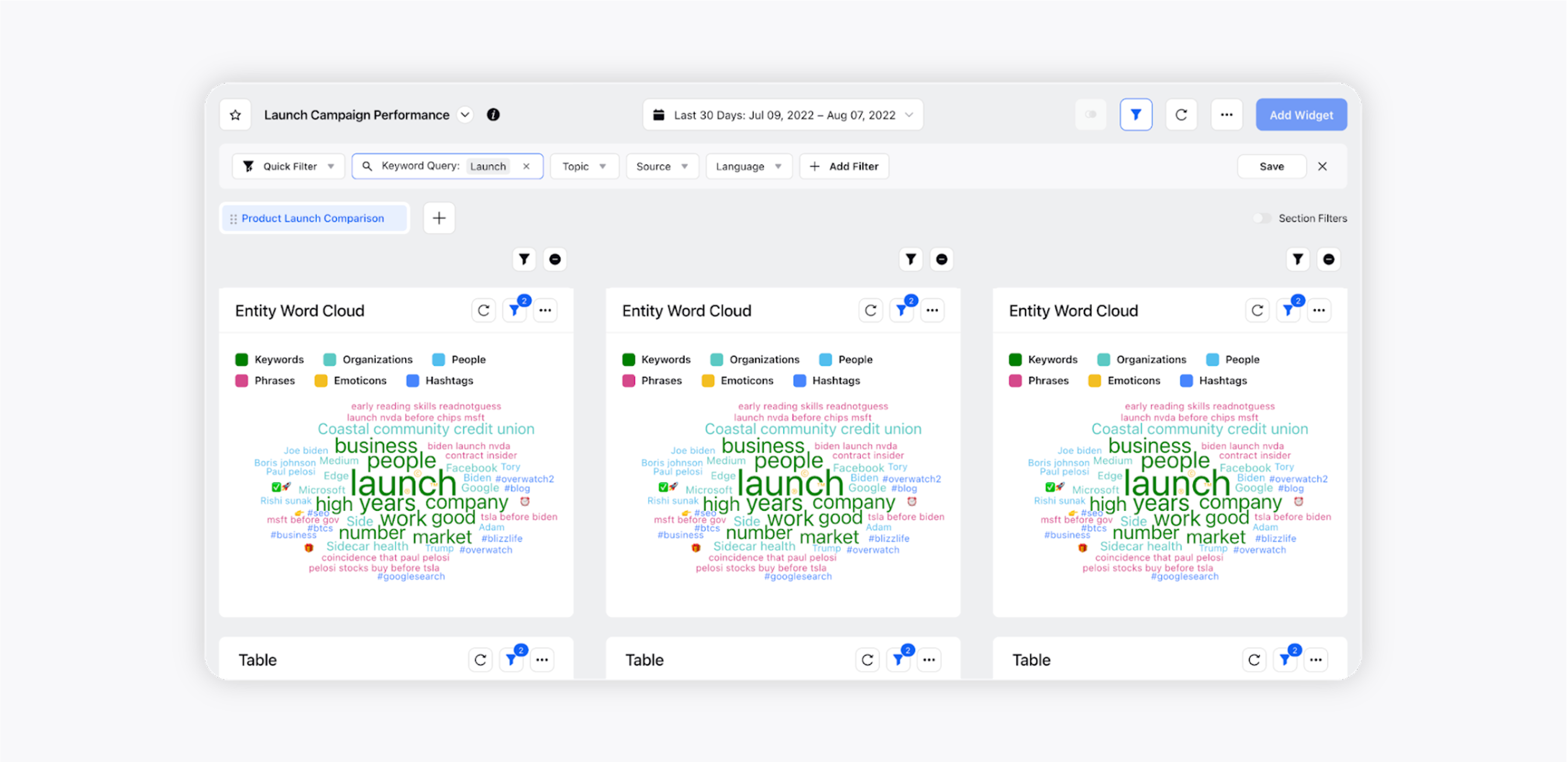
Go to the preferrred reporting dashboard, and click Add Widget to add different widgets.
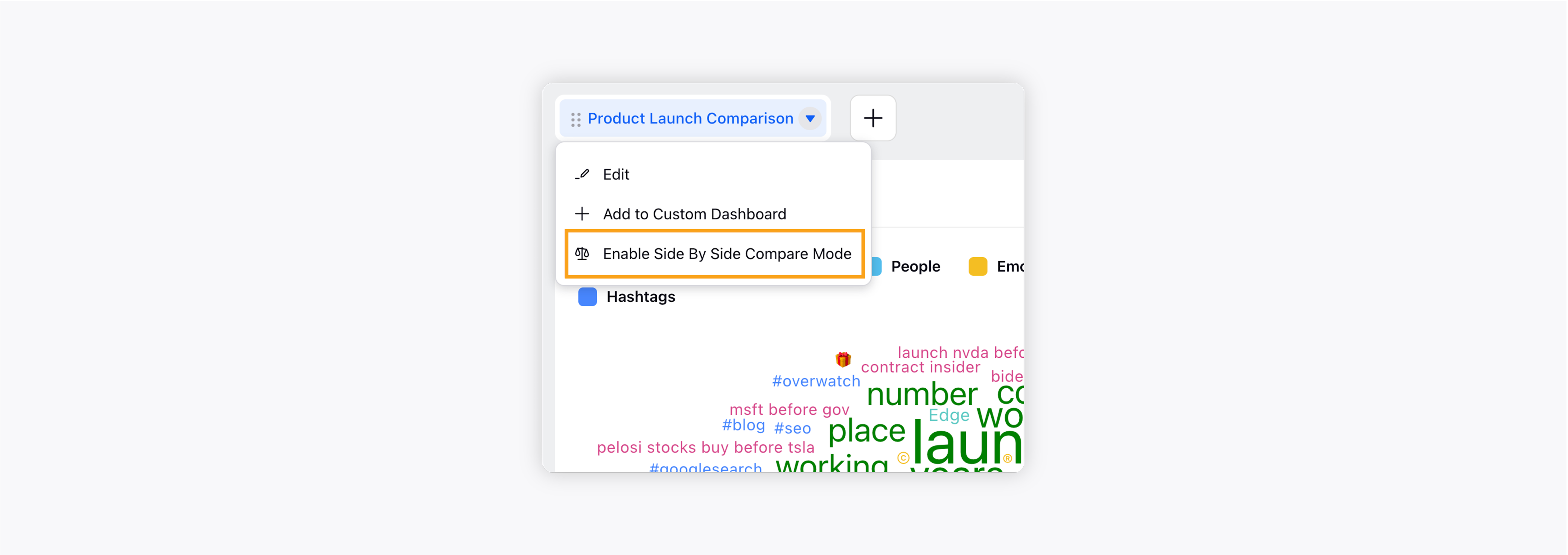
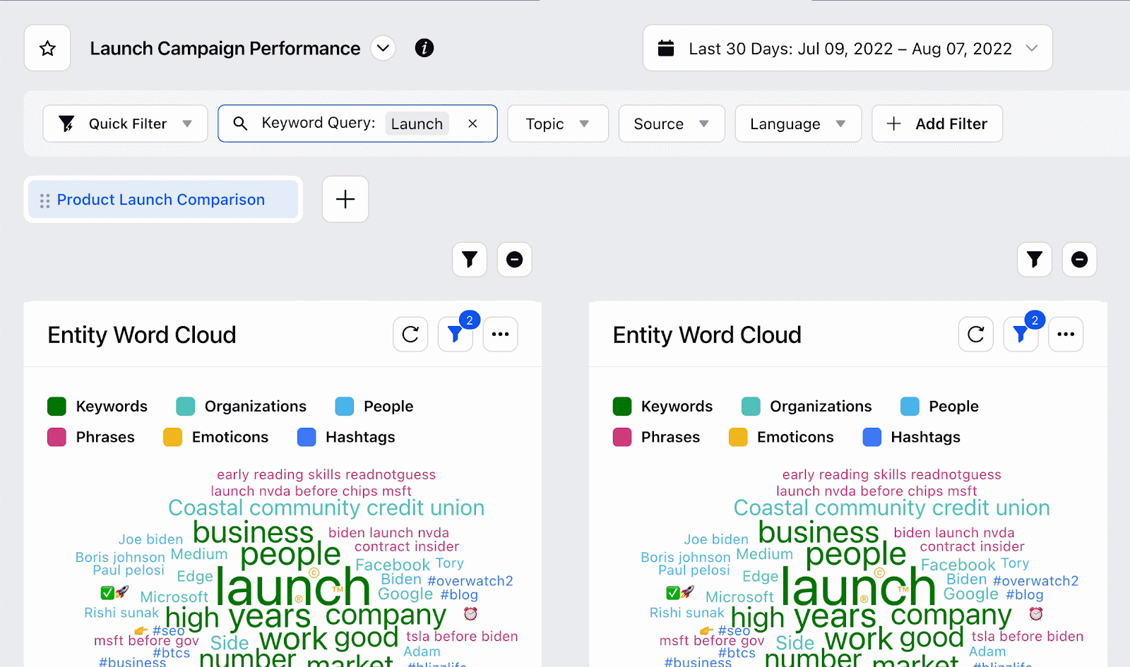
The ability to create a side-by-side comparison view is available at the section level. To enable it, click on Enable Side By Side Compare Mode in the drop down options.
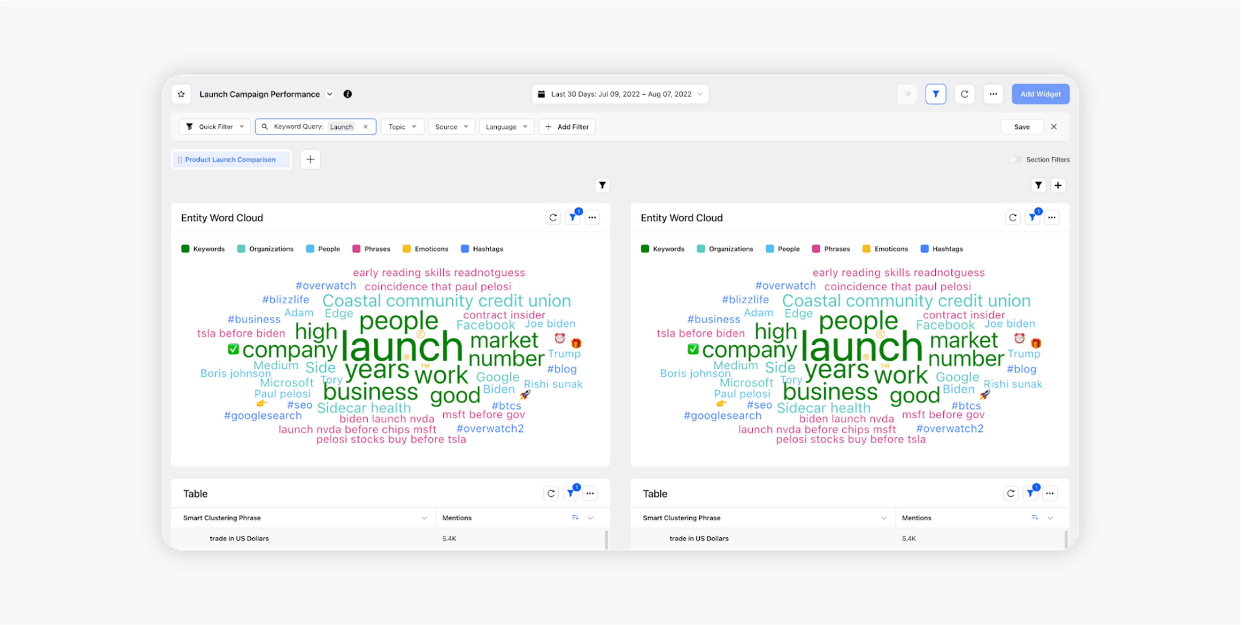
Once enabled, identical copies of all supported widgets will be created in a side-by-side view. The widgets will automatically be converted in 50% view to fit the dashboard.
Note:
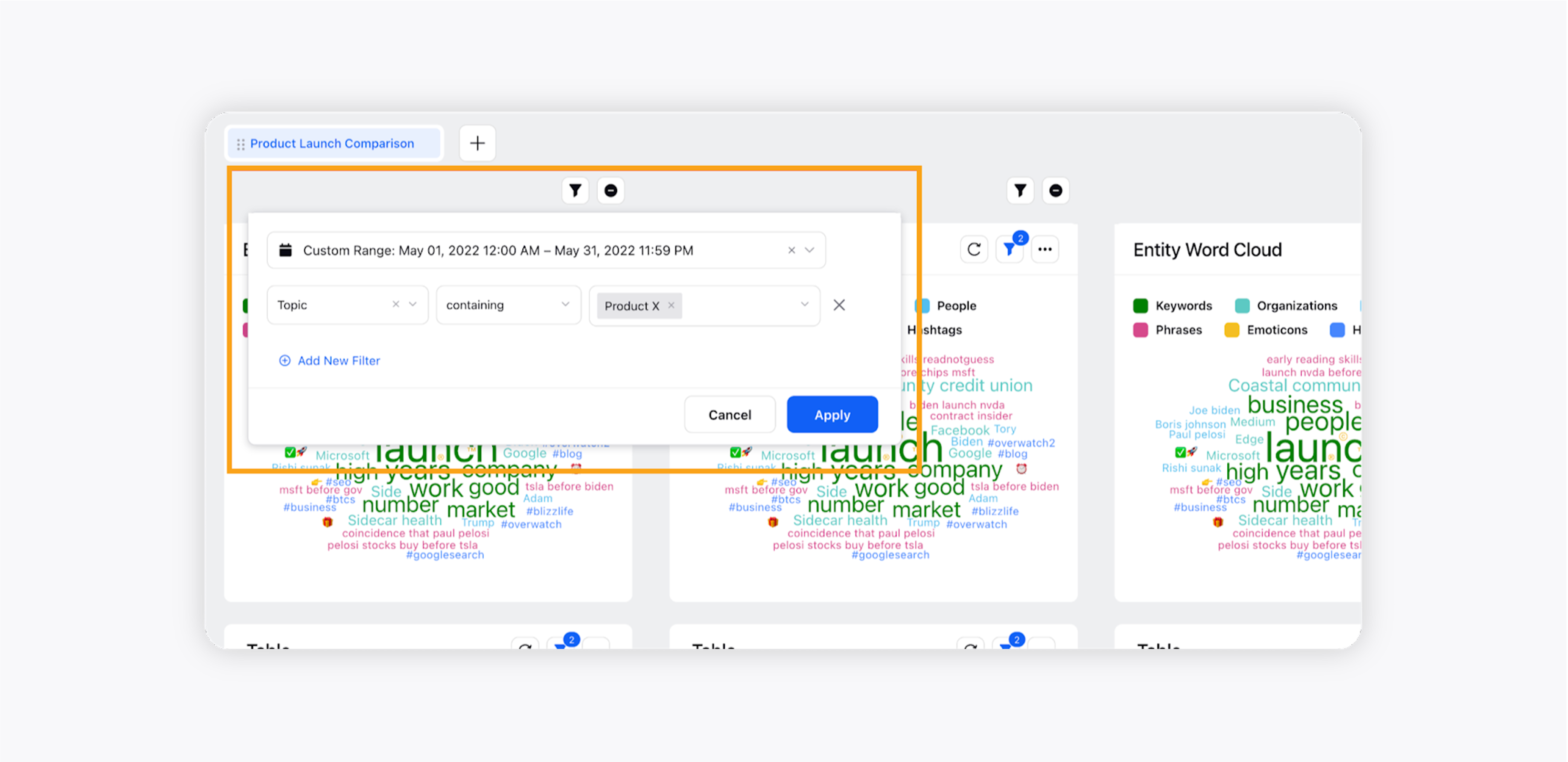
* The columns created after enabling this feature are called sub-sections.
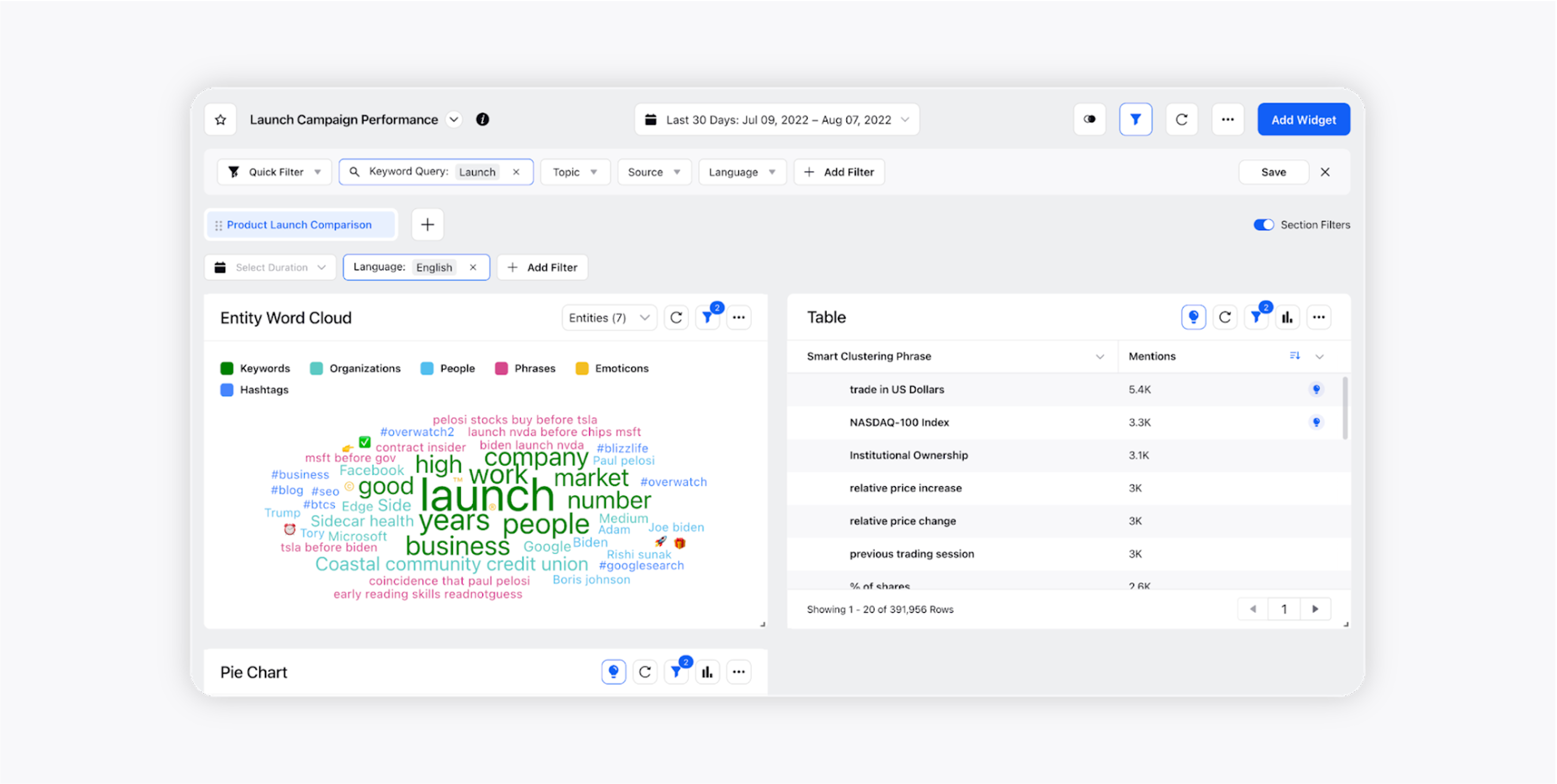
* All the filters applied to the dashboard at the section level are automatically applied to all the widgets in both sub-sections.
You can click on the addition + icon to add another sub-section.

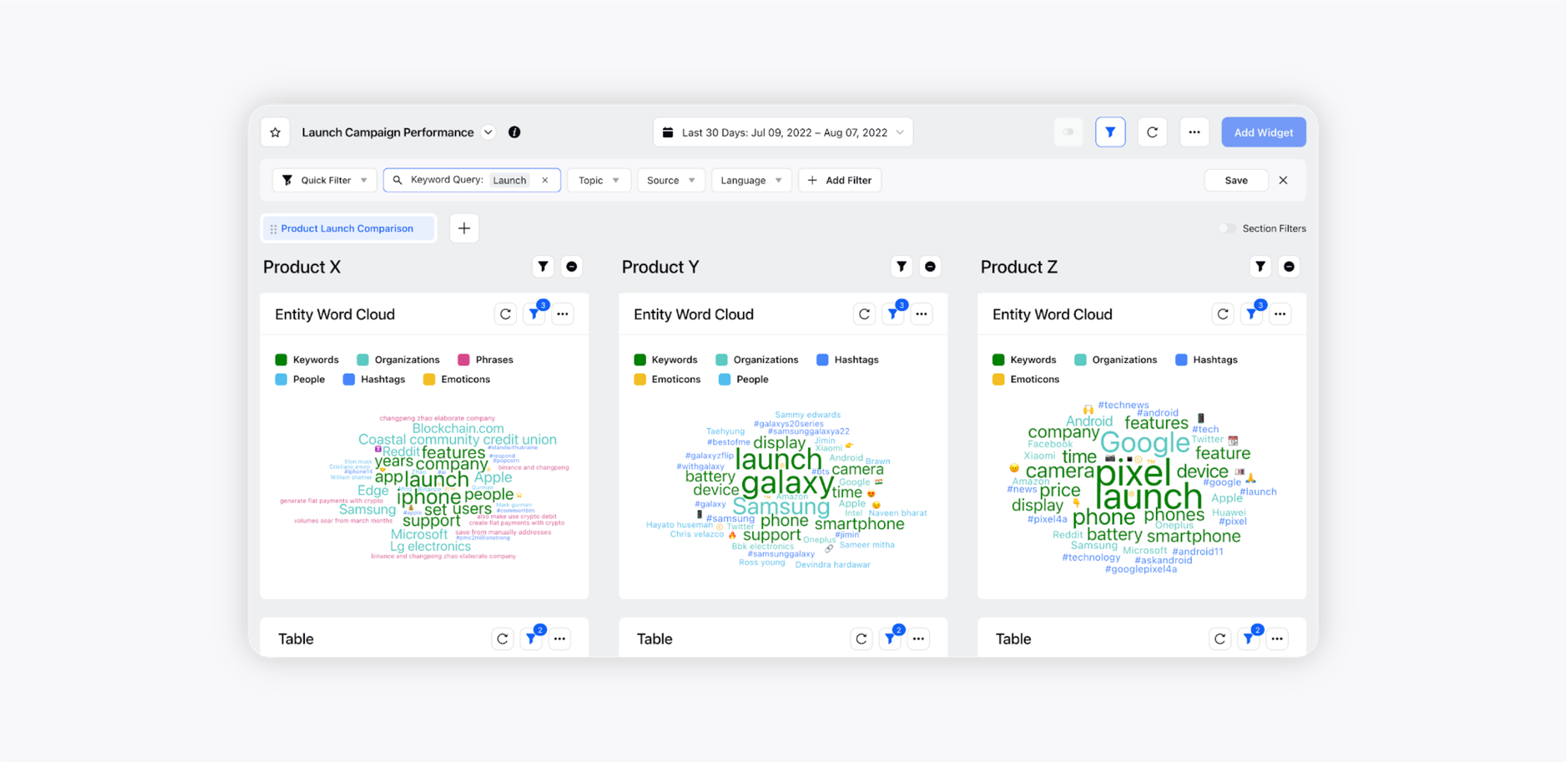
At most, 3 sub-sections can be present in a dashboard. All widgets will automatically be adjusted to 33% view.
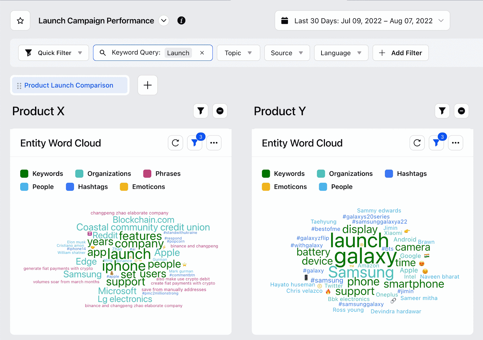
The sub-section filters and time range can now be adjusted as per your requirement. For example, you can choose the appropriate Topics and Time Range for comparison –
1st sub-section: Topic = Product X; Time Range = May 1, 2022 – May 31, 2022
2nd sub-section: Topic = Product Y; Time Range = May 1, 2021 – May 31, 2021
3rd sub-section: Topic = Product Z; Time Range = May 1, 2020 – May 31, 2020
You can add appropriate titles for the sub-sections. This is demonstrated in the GIF below –
You can add filters to any specific widget inside sub-sections. These filters will not affect the copies of the widget in other sub-sections.
Your Side By Side Comparison dashboard is ready for you to deep dive and achieve your business goals.