Change Reporting Widget Data Visualization in Sprinklr Mobile App
Updated
In the Sprinklr Mobile App, you can update the visualization of data collected in Widgets by selecting new chart types.
Note You can only change visualisation from the current chart to table chart. |
To Switch Current Widget Visualization to Table View
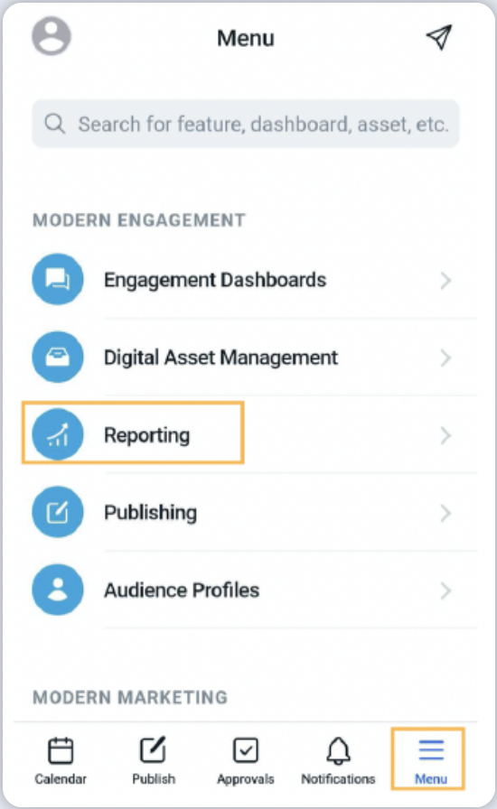
1. Log into the mobile app and tap the Menu icon in the bottom right corner. Then tap Reporting to open the Reporting Dashboards.
2. If you wish, in the top of the screen tap dashboard drop-down icon to switch to the desired dashboards.
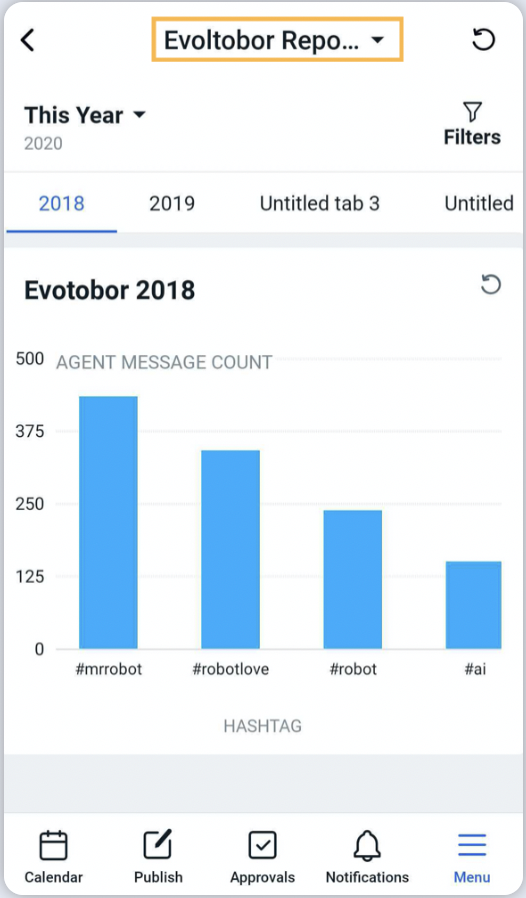
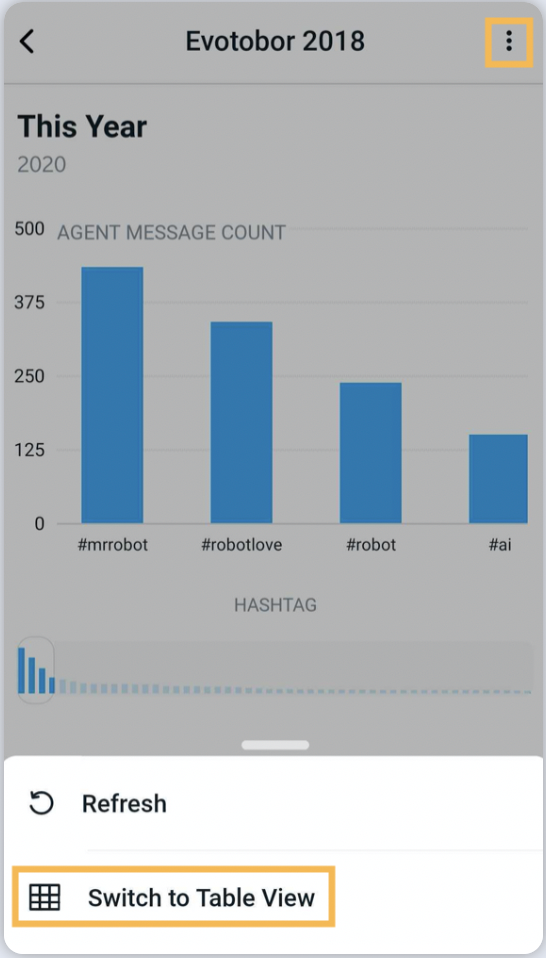
3. Tap on the desired widget.Tap the Options icon in the top right corner, next in the Options pop-up screen tap Switch to Table View.
List of Reporting Chart Type Supported in Mobile App
Column | Bar | Pie | Stacked Column |
Line | Dual Axis | Area Spline | Spline |
Counter | Counter Summary | Bubble | Funnel |
Title | Table | Area | Post Card |
Limitations
You cannot create Reporting Dashboards or Reporting Widgets from the Mobile App.