Color Coding Cells of Table Widget
Updated
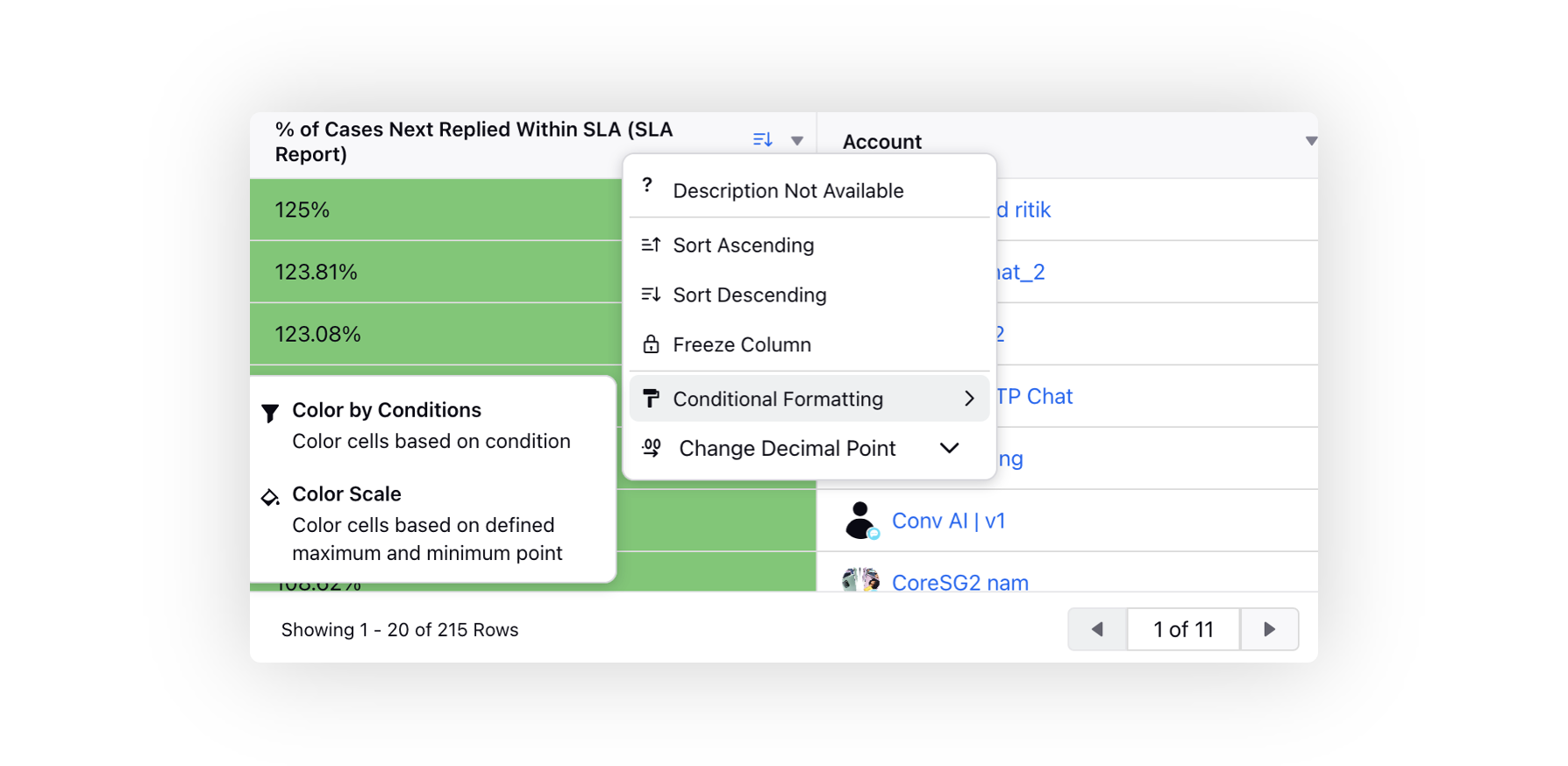
The Color by Condition feature in the table reporting widget allows you to customize the appearance of the number or percentage cells in the table based on certain conditions. There are three conditions you can set:
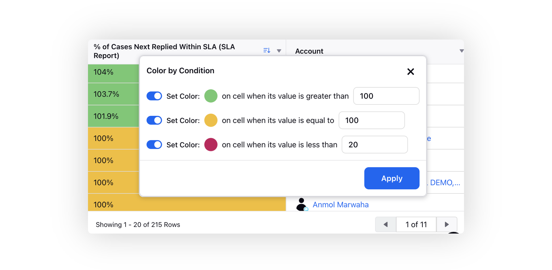
Set Color on cell when its value is greater than a specified number (e.g., 10): This means that if the value in a cell is greater than the specified number (in this example, 10), the cell will be colored according to the chosen color.
Set Color on cell when its value is equal to a specified value (e.g., Enter Value): In this case, you can manually enter a specific value, and if the value in a cell matches that entered value, the cell will be colored accordingly.
Set Color on cell when its value is less than a specified value (e.g., Enter Value): Similar to the second condition, you can manually enter a specific value, and if the value in a cell is less than the entered value, the cell will be colored based on the chosen color.
To modify the color, simply click on it, and you'll have the option to select the color or enter the hex code manually. By using these conditions, you can easily highlight specific data points in the table based on your criteria, making it easier to identify patterns and trends in the data.
The Color Scale feature in the table widget enhances the visualization of data by dynamically applying conditional formatting to create a color gradient based on the minimum, maximum, and midpoint values of the dataset. The cells with values closer to the minimum point will have one color, those closer to the midpoint will have a different color, and cells closer to the maximum point will have another color. This dynamic color representation makes it easier to identify trends, outliers, and patterns in the dataset, allowing users to gain meaningful insights at a glance.
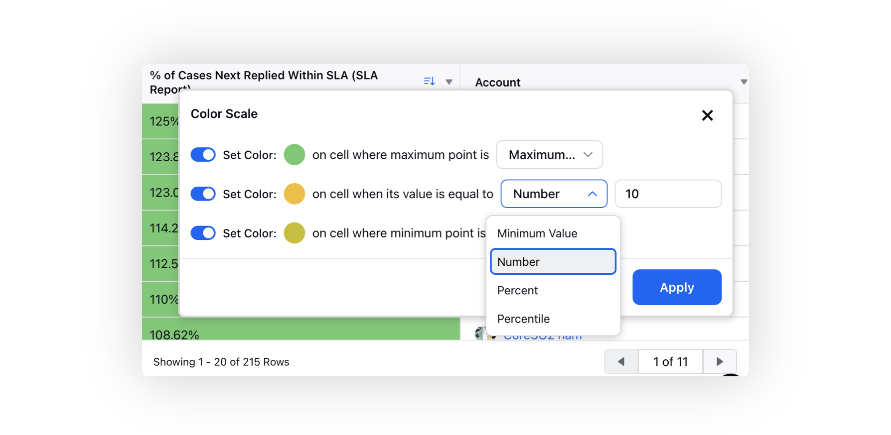
Maximum Point: Define the criteria for the maximum point of the color scale. You can set it to be a specific value, a percentage, or a percentile. For example, if you set it to "Maximum Value," the color scale will be based on the highest value in the dataset.
Midpoint: Define the midpoint value for the color scale. You can set it to be a specific value, a percentage, or a percentile. The midpoint is used to create a smooth transition between the colors of the minimum and maximum points.
Minimum Point: Define the criteria for the minimum point of the color scale. Similar to the maximum point, you can set it to be a specific value, a percentage, or a percentile.
The values can be selected as following.
Maximum Value: In the context of the "Color Scale" feature, the "Maximum Value" refers to the highest value present in the dataset being visualized. The color scale will be applied to cells with values equal to this maximum value. These cells will be assigned the color set for the maximum point.
Minimum Value: Similarly, the "Minimum Value" refers to the lowest value present in the dataset. The color scale will be applied to cells with values equal to this minimum value, and these cells will be assigned the color set for the minimum point.
Number: You have the option to set specific numerical values as criteria for defining the maximum, mid and minimum points of the color scale. For example, you can set a specific number as the maximum or minimum value, and cells with matching values will be assigned the corresponding colors.
Percent: You can also define the maximum, mid and minimum points based on percentages of the range of data values. To achieve this, the formula "scaleValue = ((rangeMax - rangeMin) / 100) * percent + rangeMin" is used. Here, "percent" represents the percentage value that determines where the point falls within the data range, and "rangeMax" and "rangeMin" represent the maximum and minimum values in the dataset, respectively.
Percentile: The "Percentile" is another way to set points in the color scale based on percentages. However, instead of specifying a percentage value directly, you can define the points based on percentiles. Percentiles divide the data into 100 equal parts, and each percentile represents a specific percentage of the data. For example, the 50th percentile represents the median, or the middle value of the dataset. By using percentiles, you can set color points based on specific positions within the data distribution.
![]() Note:
Note:
The supported visualizations include:
Inline Editable Table
Table
Two-Dimensional Table
Pivot Table
Summary Table
When both "Color by Condition" and "Color Scale" options are chosen, "Color by Condition" takes priority.
Colored cells only function for numeric and percentage metrics.
If you want to use the "Time Difference" metric for color formatting, you need to convert it into a numeric format using a custom metric. When you select the custom metric type as numeric for the "Time Difference" metric, the data is displayed in milliseconds. You can divide the values by 1000, 60000, or 3600000 to convert them into seconds, minutes, or hours, respectively.