Compare Mode
Updated
The Period-Over-Period reporting data compares values from two different time periods. For example, you can create a widget in the reporting dashboards to find out how much Case Handle time has increased or decreased since the previous time period.
What is Period-Over-Period Analysis in Sprinklr?
Different brands want to compare their performance in a given month/quarter with respect to the previous month/quarter.
You can discover if there is any seasonality to your business, and understand its impact by drawing comparative reporting widgets.
You can identify the leading and lagging indicators and develop a game plan for managing those.
Supported Widget Visualisations
There are currently 8 chart types supported for Period-Over-Period Widgets: Column, Bar, Line, Spline, Counter, Summary Table, Grouped Summary and Counter Summary.
Note Currently, Sprinklr only supports above-mentioned visualizations in Reporting. Other visualizations, such as Table Chart, is not supported. |
Period-over-period charts support one dimension only with multiple metrics.
Visualization Type | Screenshot |
Column: Column charts display vertical bars going across the chart horizontally. Note that Date (Dimension) cannot be plotted for this chart type. Alternatively, you can use Day of Time Range and Week of Time Range. |
|
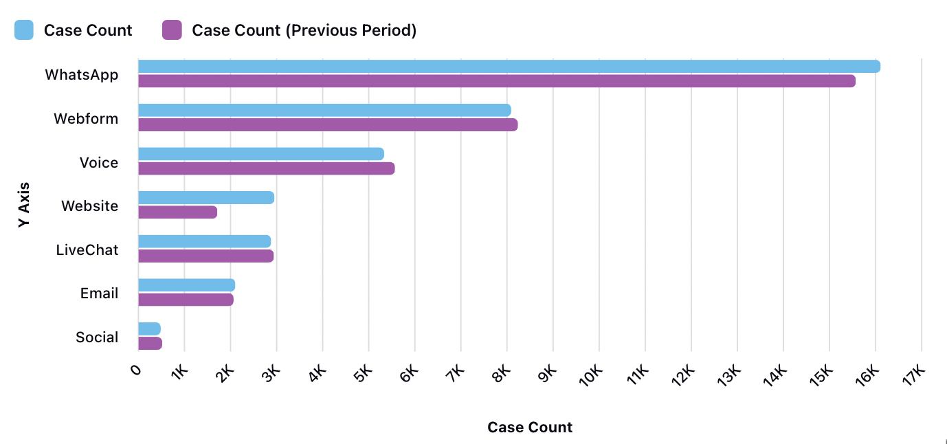
Bar: Bar charts show a comparison between different categories. Note that Date (Dimension) cannot be plotted for this chart type. Alternatively, you can use Day of Time Range and Week of Time Range. |
|
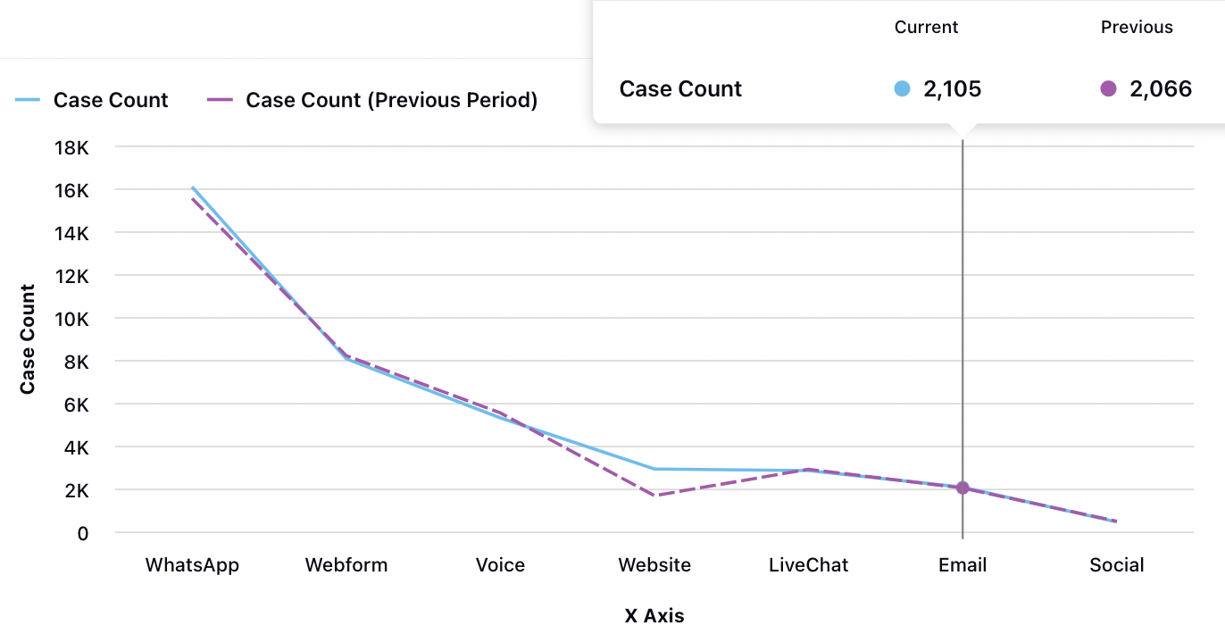
Line: Line graph displays information as a series of data points connected by straight line segments. |
|
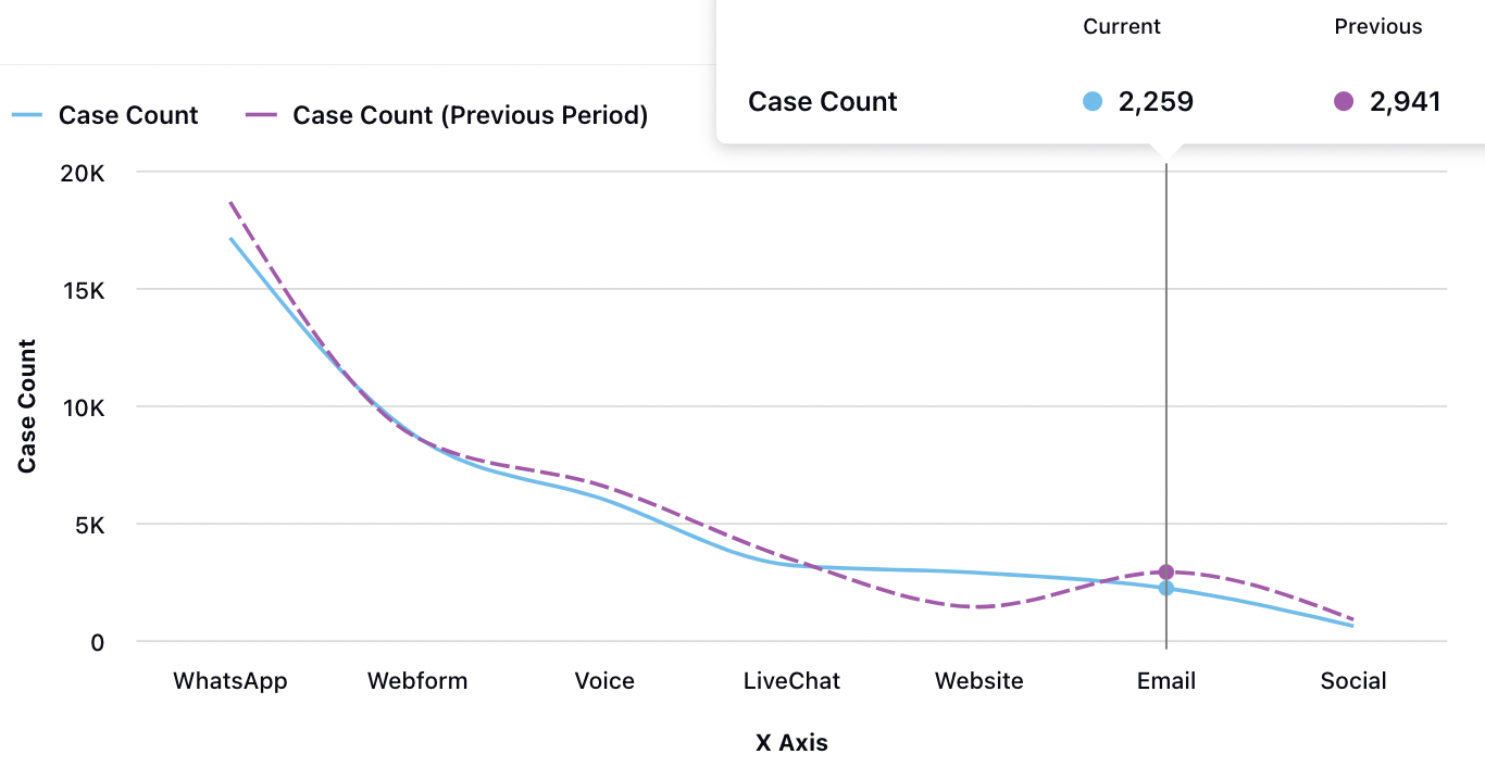
Spline: Spline graph draws a fitted curved line to join the data points. |
|
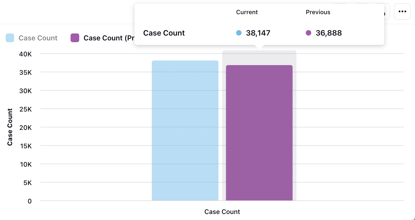
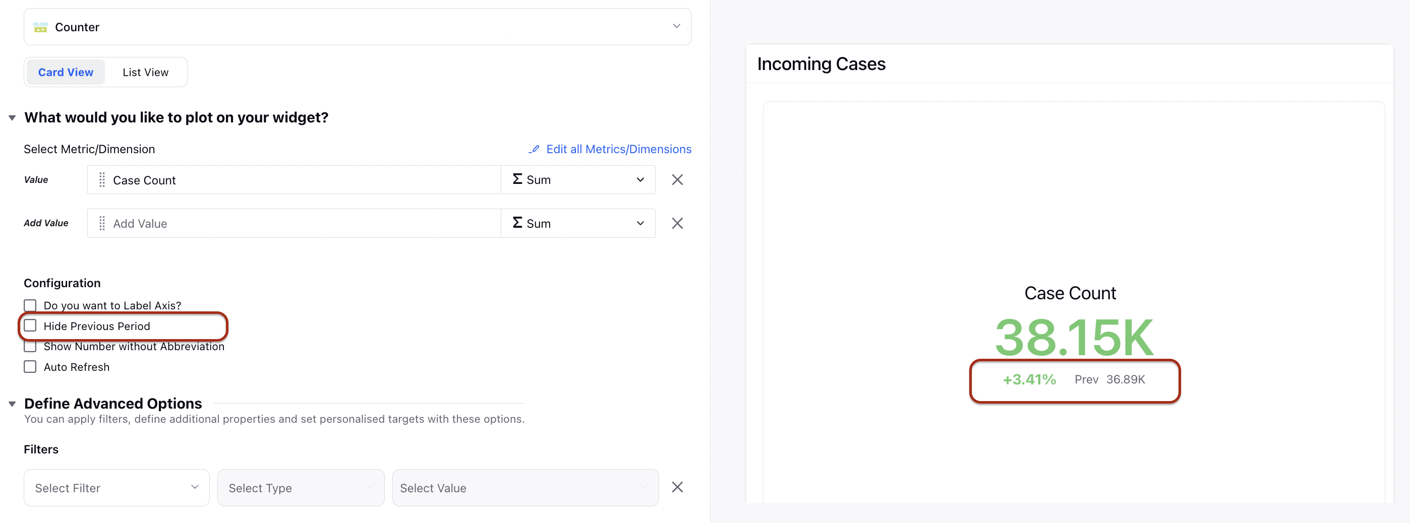
Counter: The counter widget allows you to see how many of a particular event happened in the previous period comparitively and the incrmental or decremental %. To hide this previous period comparison Deselect the 'Hide Previous Period' option in the Configuration section. |
|
Summary Table: The summary table summarizes statistical information about data in a table form. | |
Grouped Summary: The Grouped summary tables group records on unique values in one or more key fields and then perform a count for the number of matching records. | |
Counter Summary: A Counter summary graph is a cumulative metric that represents a single monotonically increasing counter whose value can only increase or be reset to zero on restart. |
To Access the Compare Mode in Analytics
Click the New Tab icon. Under the Sprinklr Service tab, click Care Reporting within Analyze.
Click the Dashboard Menu icon to open the left-side menu and select the dashboard on which you'd like to create a widget.
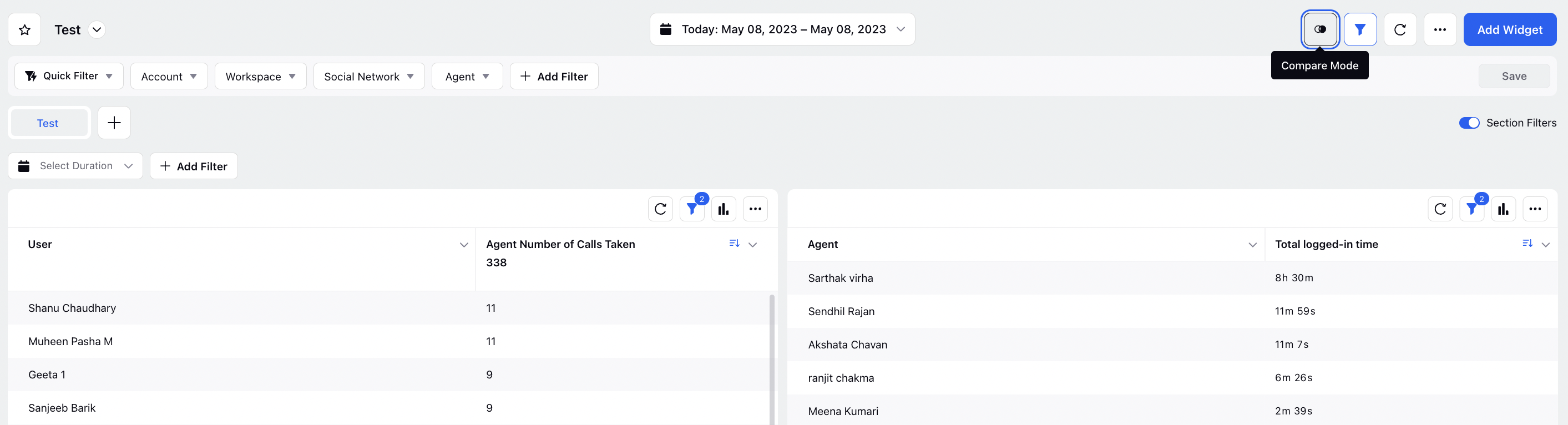
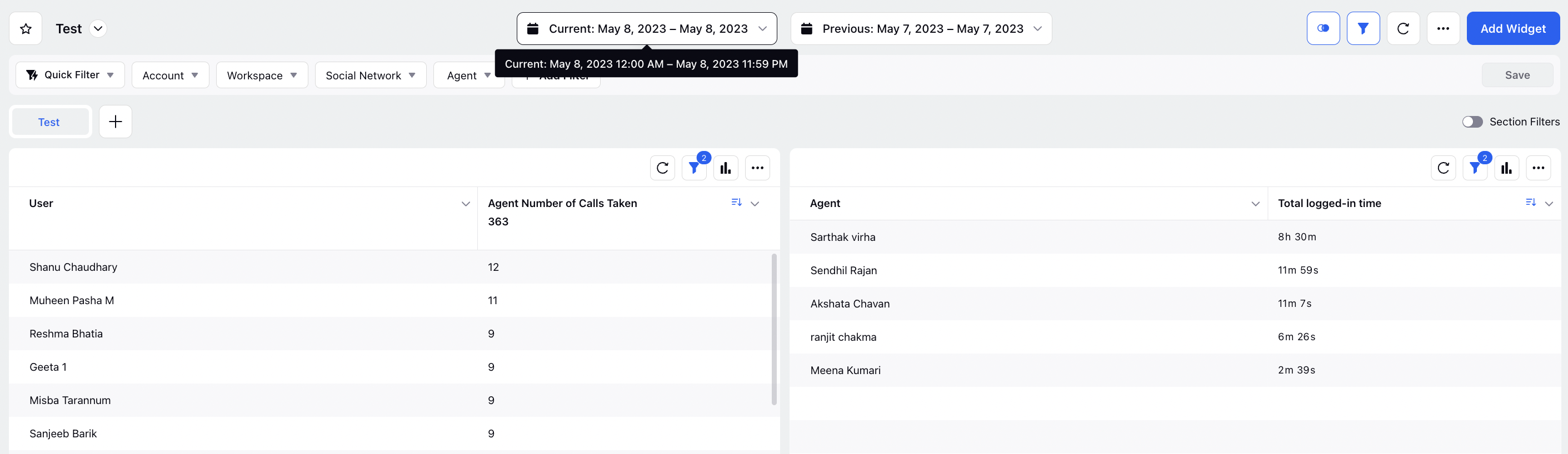
In the Reporting Dashboard window, click Compare Mode at the top right corner of the Reporting Dashboard to create the Period-Over-Period comparison widget.
Set the Time Range for Current Time Range and Previous Time Range for which you want to compare the data. The data will be displayed in the widget.
Tip
Same Date Range in Previous Year: This date range is only available in Previous Time Range. Using this date range, your Previous Time Range will be automatically set with respect to the Current Time Range.
Note
Period-over-period reporting widgets can only be created and visualized in Compare Mode. If you don't want to view period-over-period reporting widget, click Exit Compare Mode at the top of the Reporting Dashboard.
New Dimensions Added for Period-Over-Period Analysis
Dimensions | Description |
Day of Time Range | This dimension specifies the respective day number in the selected time range. Note that the start date will be referred to as Day 1 and so on. |
Week of Time Range | This dimension shows the respective week number in the selected time range. Note that the starting week will be referred to as Week 1 and so on. |
Note In the Compare Mode, when you plot Date (Dimension) in the above mentioned visualizations, dates are not shown on the x-axis. We recommend you to use Day of Time Range and Week of Time Range dimensions instead. |