Customise your prompt
Updated
Overlay Popup Prompt
Field | Description |
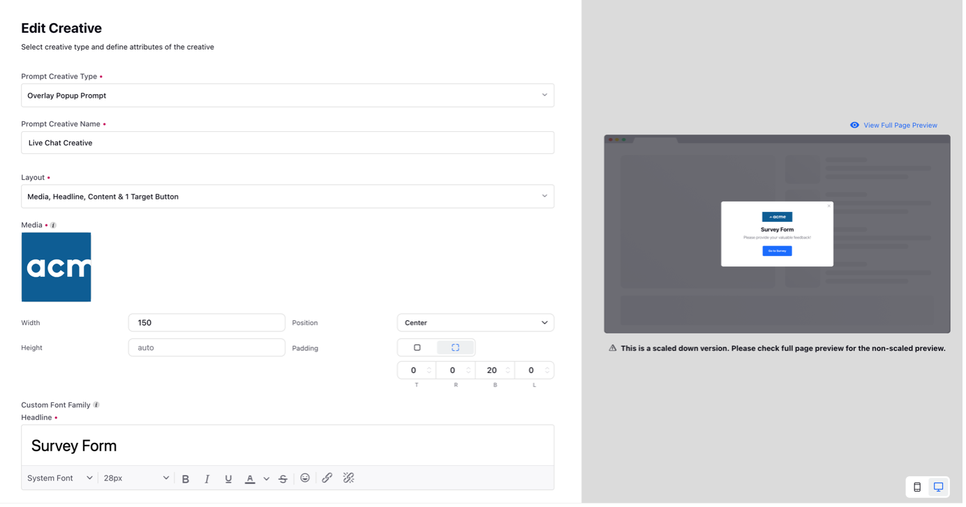
Prompt Creative Type | Select Overlay Popup Prompt from the dropdown. |
Prompt Creative Name | Enter a creative name. It will not be visible to the customers. |
Layout | Select the desired layout of the creative from the dropdown e.g. media, Headline, Content & 1 Target Button. |
Popup Media | Select the media from the Digital Asset Manager or upload it from your computer. |
Media Properties | Define the width, height, position, and padding of the media. Padding is the space between the media and the border and you can change the padding for each side. |
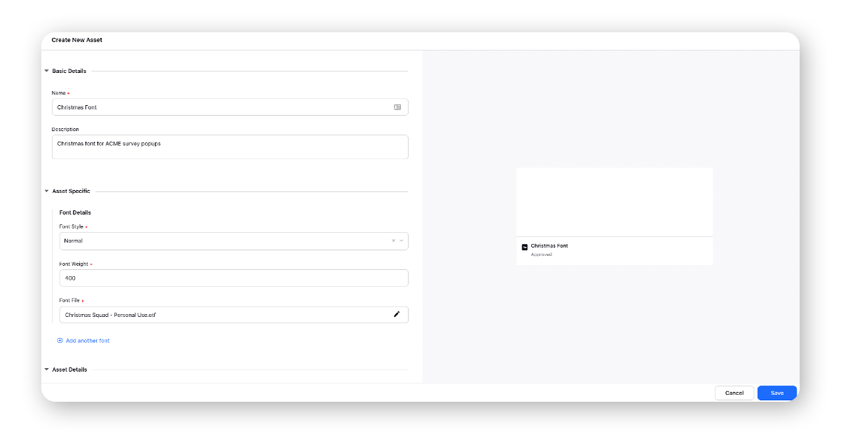
Custom Font Family | Select a custom font family to match your brand guidelines and give a seamless experience to your customers. First, add a Font Family asset in the Digital Asset Manager and upload the font files. Note that the accepted file formats are .woff, .ttf, .eot and .otf. Next, select that font family asset from the Custom Font Family dropdown. Once you select the font asset, make sure you also select it from the Headline Text, Content Text, and Target Button Text fields, as required. |
Headline Text | Enter the text for the headline. You can also add placeholders which will get resolved on publishing and use different formatting styles such as font style, size, color, etc., and insert smiley. |
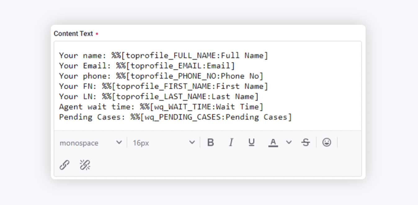
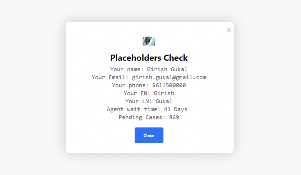
Content Text | Enter the main content text. You can also use different formatting styles such as font style, size, color, etc. and insert smiley. You can also add placeholders which will get resolved on publishing. %%[toprofile_FULL_NAME:Full Name] %%[toprofile_EMAIL:Email] %%[toprofile_PHONE_NO:Phone No] %%[toprofile_FIRST_NAME:First Name] %%[toprofile_LAST_NAME:Last Name] %%[wq_WAIT_TIME:Wait Time] %%[wq_PENDING_CASES:Pending Cases] |
Brand Message Text | This message will be published as a brand message in the live chat widget when used with live chat targets. You can also add placeholders which will get resolved on publishing. |
Target Button Text | Enter the text for the target button like Open Survey, Close, etc. You can also use different formatting styles such as font style, size, color, etc., and insert smiley. |
Button | Customize the look of the target button. You have the following options to select:
|
Popup Background | Customize the look of the background of the popup. You have the following options to select:
|
Overlay Background | Customize the look of the overlay background. The color overlay creates a better background for text while being much more visually interesting. You have the following options to select:
|
Mobile Overrides for Footer | Arrange the buttons either in a row or column for your mobile interface. |
Preview | Select the Mobile/Desktop icon in the bottom right corner to see the preview of the creative. |
Positioned Popup Prompt
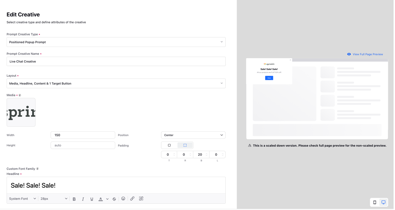
Field | Description |
Prompt Creative Type | Select Positioned Popup Prompt from the dropdown. |
Prompt Creative Name | Enter a creative name. It will not be visible to the customers. |
Layout | Select the desired layout of the creative from the dropdown e.g. media, Headline, Content & 1 Target Button. |
Popup Media | Select the media from the Digital Asset Manager or upload it from your computer. |
Media Properties | Define the width, height, position, and padding of the media. Padding is the space between the media and the border which you can change for each side. |
Custom Font Family | Select a custom font family to match your brand guidelines and give a seamless experience to your customers. First, add a Font Family asset in the Digital Asset Manager and upload the font files. Note that the accepted file formats are .woff, .ttf, .eot and .otf. Next, select that font family asset from the Custom Font Family dropdown. Once you select the font asset, make sure you also select it from the Headline Text, Content Text, and Target Button Text fields, as required. |
Headline Text | Enter the text for the headline. You can also add placeholders which will get resolved on publishing and use different formatting styles such as font style, size, color, etc., and insert smiley. |
Content Text | Enter the main content text. You can also use different formatting styles such as font style, size, color, etc., and insert smiley. You can also add placeholders which will get resolved on publishing. %%[toprofile_FULL_NAME:Full Name] %%[toprofile_EMAIL:Email] %%[toprofile_PHONE_NO:Phone No] %%[toprofile_FIRST_NAME:First Name] %%[toprofile_LAST_NAME:Last Name] %%[wq_WAIT_TIME:Wait Time] %%[wq_PENDING_CASES:Pending Cases] |
Brand Message Text | This message will be published as a brand message in the live chat widget when used with live chat targets. You can also add placeholders which will get resolved on publishing. |
Target Button Text | Enter the text for the target button like Open Survey, Close, etc. You can also use different formatting styles such as font style, size, color, etc., and insert smiley. |
Button | Customize the look of the target button. You have the following options to select:
|
Popup Background | Customize the look of the background of the popup. You have the following options to select:
|
Popup Box | Customize the width and position of the popup. |
Mobile Overrides | Customize the width and position of the mobile popup. |
Mobile Overrides for Footer | Arrange the buttons either in a row or column for your mobile interface. |
Preview | Select the Mobile/Desktop icon in the bottom right corner to see the preview of the creative. |
View Full Page Preview | Click View Full Page Preview on the top of the prompt on the right to view full page preview. |
Live Chat Prompt
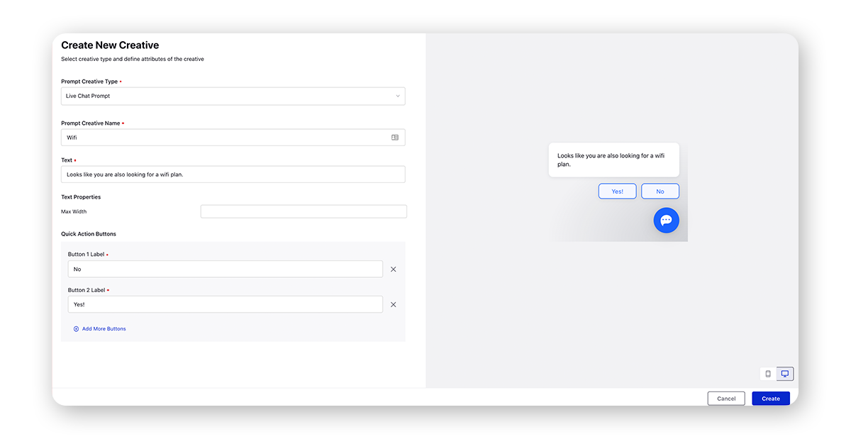
Field | Description |
Prompt Creative Type | Select Live Chat Prompt from the dropdown. |
Prompt Creative Name | Enter a creative name. It will not be visible to the customers. |
Text | Enter text for the title of the live chat prompt. You can also add placeholders which will get resolved on publishing and use different formatting styles such as font style, size, color, etc., and insert smiley. |
Add Quick Action Buttons | Click to add quick action buttons. |
Button 1 Label | Enter the label for button 1, for example, Chat with us! You can get the font color, background color, hover style, and border radius configured for the buttons by reaching out to support at tickets@sprinklr.com. |
Add More Buttons | Click to add more buttons. |
Hide Reply Box | Check the box to hide the reply box. |
