Create Articles in Sprinklr Knowledge Base
Updated
Create Article
1. Click on the New Tab icon on the launchpad. Under the Sprinklr Service tab, select Knowledge Base within Resolve.
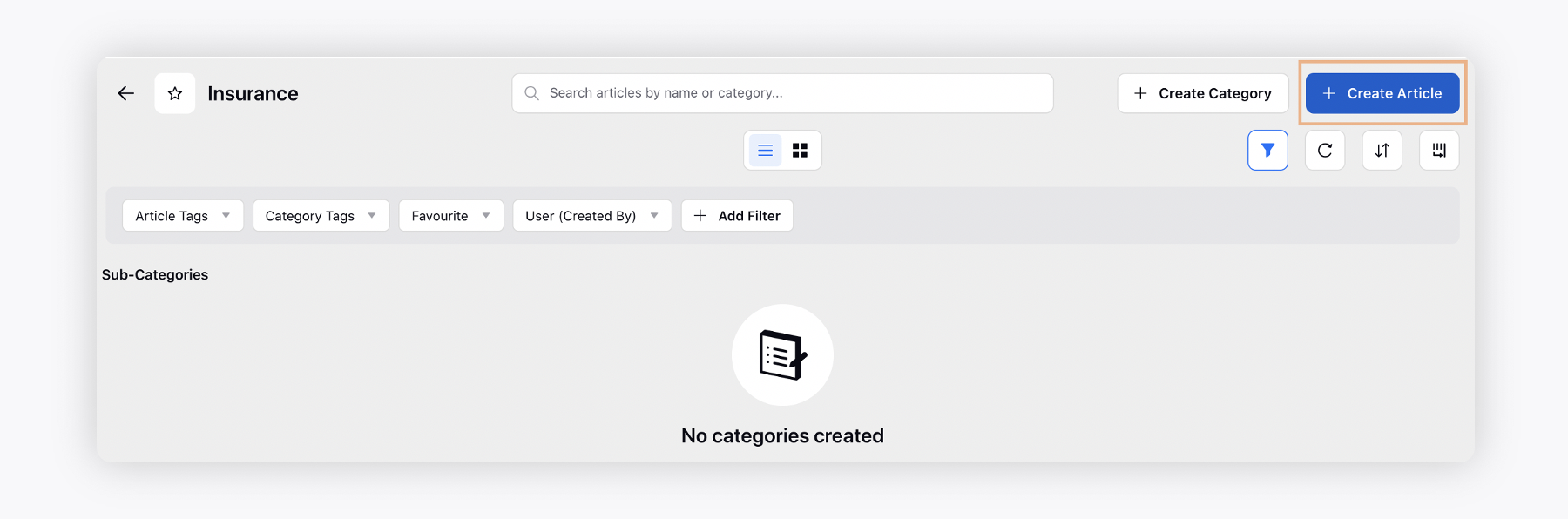
2. On the Knowledge Base builder, select the desired category or subcategory and click on Create Article in the top right corner.
3. On the Create Article window, enter the Title of the article.
4. Next, select the Category/Subcategory the article should be created in. An article cannot be created without a category. Learn more about creating a Category.
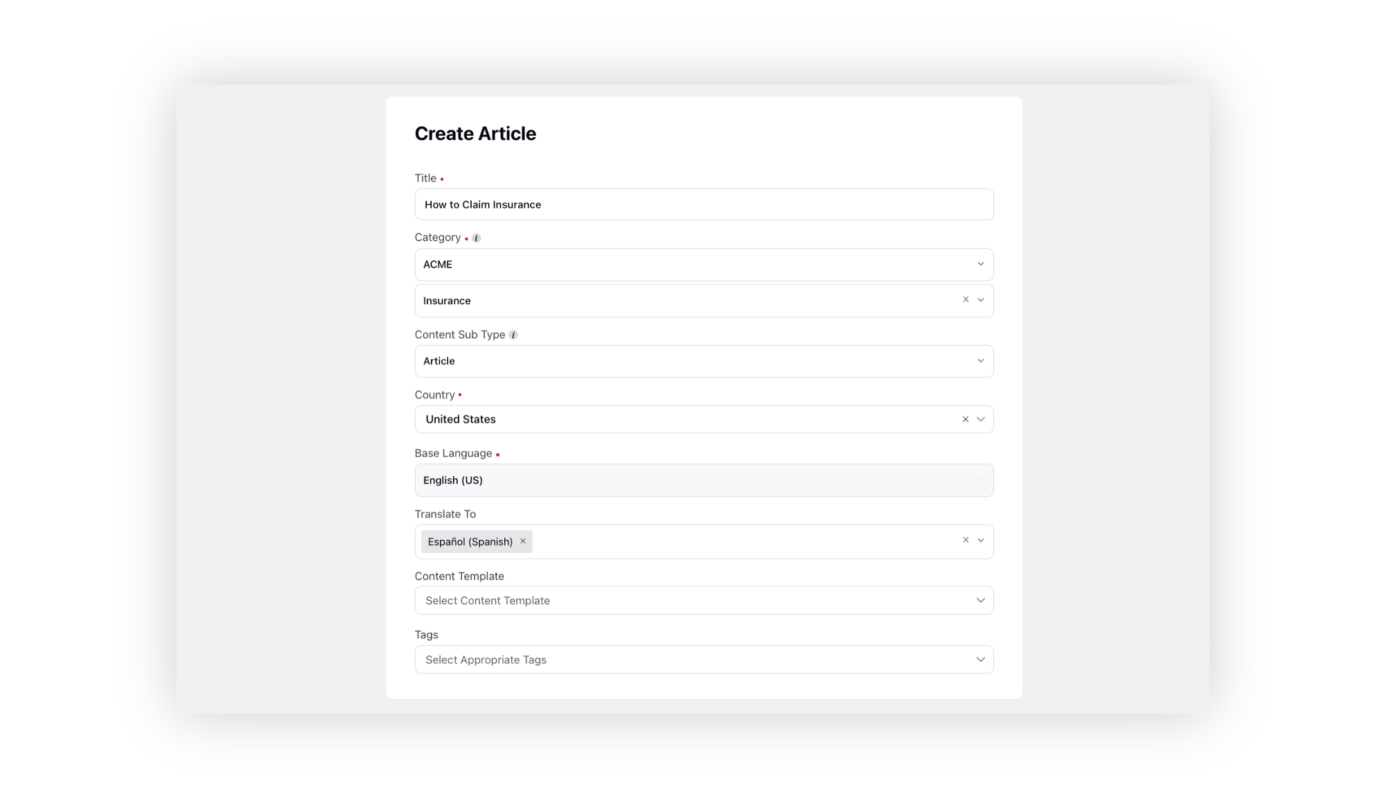
Content Sub Type
A content sub type can be article, block or release notes.
Country
Select country for the mapped languages to get selected.
Content Template
Select the content template.
Tags
Tags are essentially keywords or labels that you can assign to content to help classify and organize it. Unlike categories, which are pre-defined and structured, tags are free-form and can be customized to suit your specific needs.
Tags improve search performance and relevance by allowing users to find content related to their search query. Agents and customers can use tags to filter search results, making it easier to find relevant information.
4. After entering the details, click Save in the bottom right corner of the window.
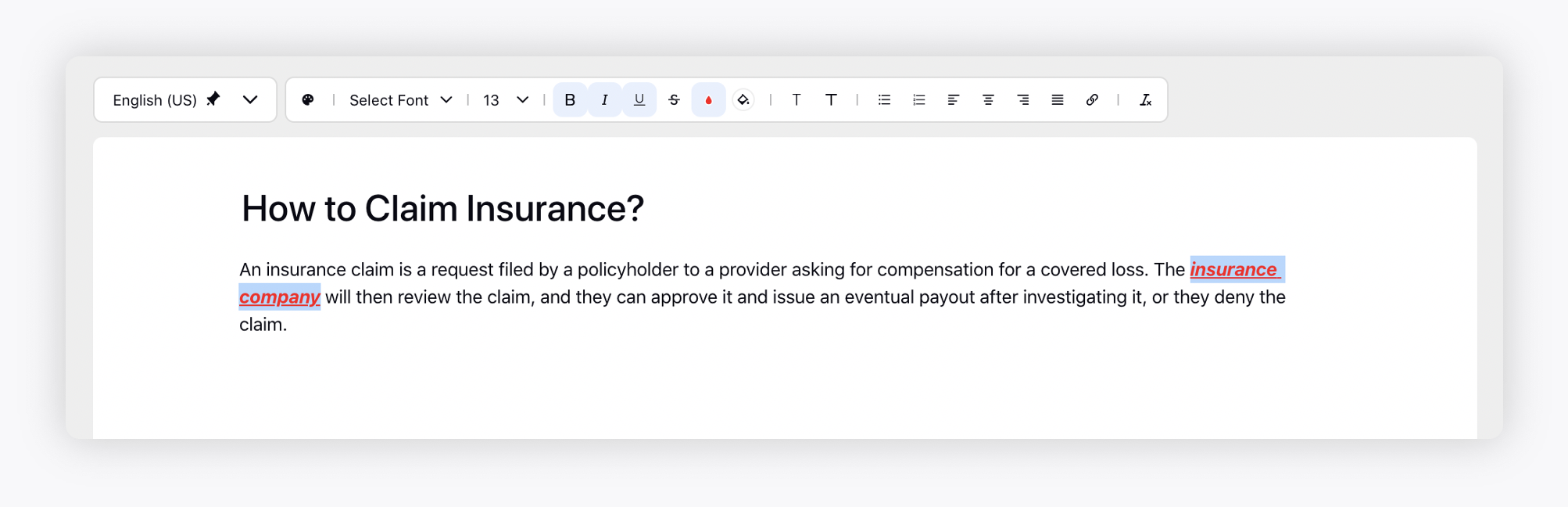
5. You will be redirected to the Article Editor window where you can add details of your article.

Formatting Options
1. You can change the formatting of your text. Highlight the text and select the appropriate option from the Formatting Toolbar. For example, you can change the font, font size, font color, alignmnet, or make the text bold, italic, or underline it.
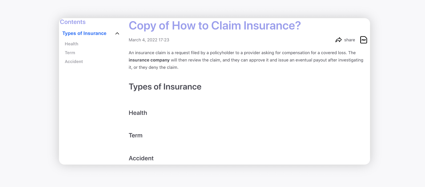
2. You can also add dividers, headings, hyperlink the text and use bulleted or numbered lists to organize your text. The anchor links will be genreated for all the headings on the page which you can copy using the Copy Link option on the toolbar.
List Formatting Options
When creating lists, you can choose from the following styles:
Bullet Lists

Disc: Solid round bullets
Circle: Hollow round bullets
Square: Solid square bullets
Numbered Lists

Decimal: 1, 2, 3...
Alphabets: a, b, c...
Roman Numerals: i, ii, iii...
You can mix bullet and numbered lists in your content and specify the style you want for each list type.
All the subheadings, e.g. H2, will be grouped under the main heading i.e. H1 on the community.
3. You can clear the formatting applied and reinstate the default formatting by clicking the Clear Format icon in the top right corner of the Formatting Toolbar. Additionally, using the Paint Format option, you can copy the formatting from one instance of text to another and apply the same font, size, color, etc.
4. You can increase or decrease indentation which refers to adjusting the space or distance between the beginning of a line of text and its left or right margin. It's a way of organizing and visually structuring content.
5. You can use Line Break to add a line between components for better readability and organization.
6. You can utilize superscript and subscript formatting in articles where you need to represent certain elements or equations accurately. For example, chemical formulas often require superscript and subscript notation to denote the number and arrangement of atoms in a molecule. Similarly, mathematical expressions, such as exponents or indices, often require superscript notation. To convert text to superscript or subscript, select the text you want to convert. Then, choose the superscript or subscript option from the toolbar above.

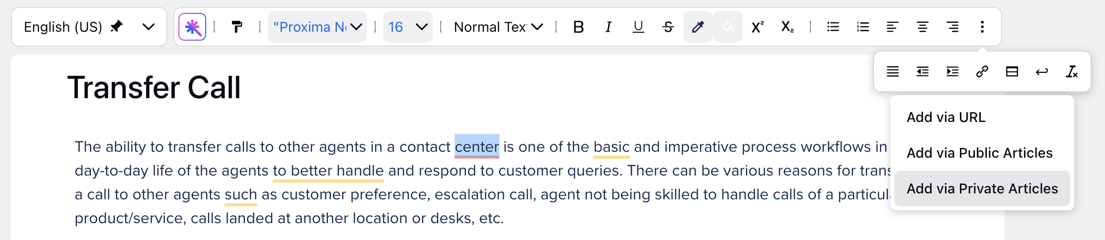
Hyperlinking Articles
Add via Public Articles
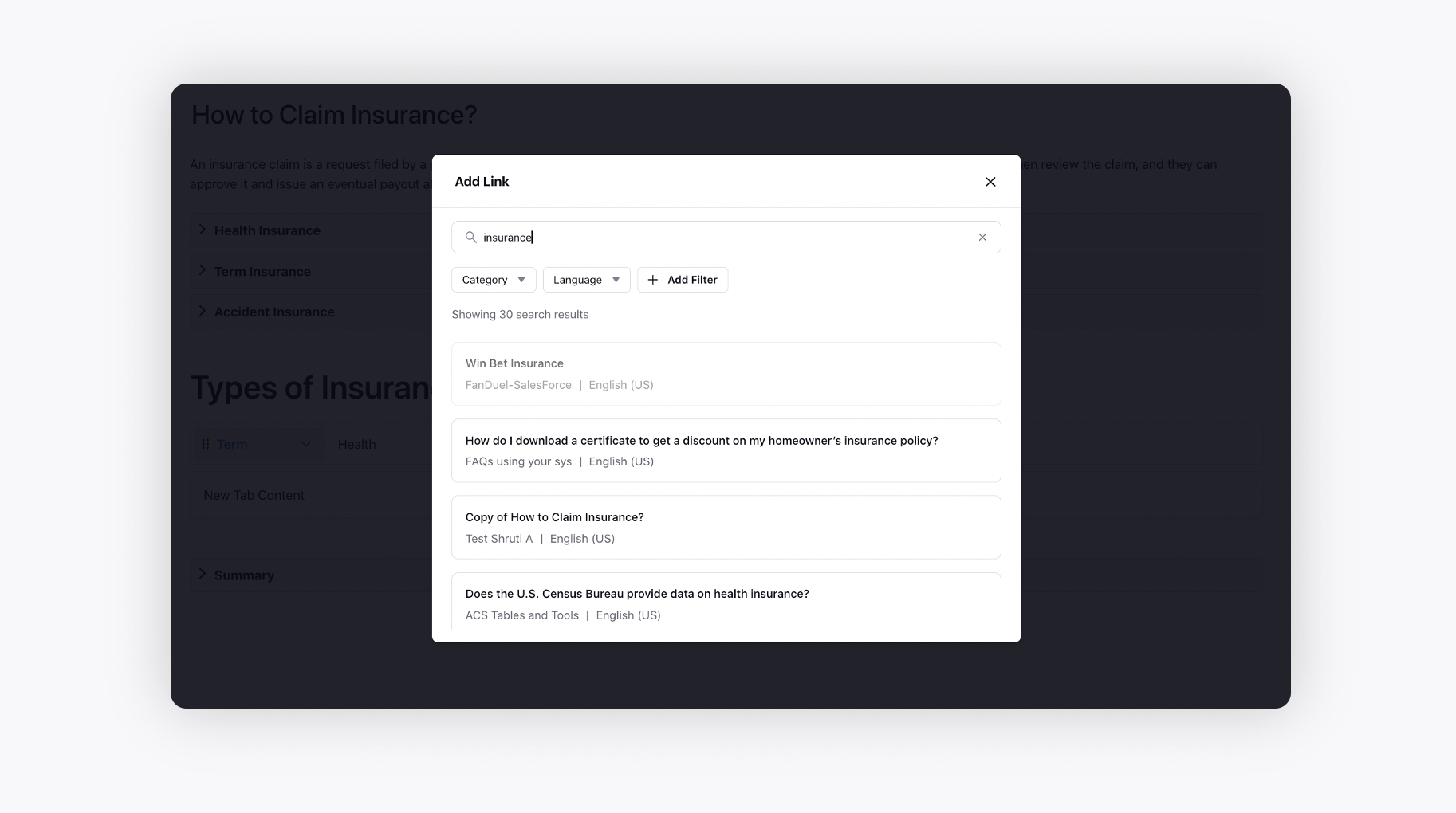
You can hyperlink the text with desired published articles by selecting the option Add via Public Articles.

On the Add Link pop-up window, you will view the list of all published articles, where you can use the search bar to search for the desired articles and also add any category and language filter(s).
Within the Smart Assist tab, you can choose to open these hyperlinked articles inline, directly within the tab, rather than opening them in a new tab. It also allows you to navigate backward to the previous article.
Enablement note: To learn more about getting this capability enabled in your environment, please work with your Success Manager. |
Add via Private Articles
You can now hyperlink text within a private article to another private article by selecting the option "Add via Private Articles."
Add via Articles
This option allows you to select from both public and private articles, consolidating the separate options for adding public and private articles.

Select the text you want to hyperlink, then click the Add via Articles button in the top toolbar to open the Add Link window.

The Add Link window displays all articles in the environment that you have access to. You can search for articles by title and filter them by Knowledge Base Category, Language, or Country. Additionally, you can enable the Show Country Variants toggle to display all available country-specific versions of a base article.
This helps authors clearly distinguish between base articles and their country-specific variants with the same title, reducing the risk of incorrect linking or accidentally unpublishing the wrong article.
 Note: Access to this feature is controlled by a Dynamic Property. To enable this feature in your environment, reach out to your Success Manager. Alternatively, you can submit a request at tickets@sprinklr.com.
Insert Media, Tables and Other Components
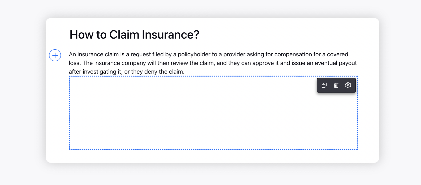
Click the Addition icon on the left to add the following components-
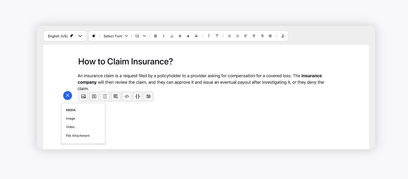
Media
Hover over the Media icon to add an image, video, or any other file attachment. Once a video/image is added, you can resize it by dragging a two-headed arrow from bottom, right, and, bottom-right. While resizing, you will be able to see the current dimensions. To add alternative text (Alt text) to an image, simply click on the image, select the Alt Text option and provide a description.
Note: Alt Text is not editable from the article editor if the image is added from Digital Asset Manager (DAM). It must be updated directly in the DAM, and the same Alt Text will appear in all articles where the image is used.When a video is uploaded for which the thumbnail and .vtt caption are added via the Digital Asset Manager, then the thumbnail/caption will be visible in the editor, Community, Live Chat, and Smart Assist tab.
Click on the image/video and then on the settings icon to resize it by specifying the width & height in px.
You can also lock aspect ratio, so changing any dimension (say width) will update the other dimension (height) according to the aspect ratio.
You can also get images/videos to span the full width and auto-height.
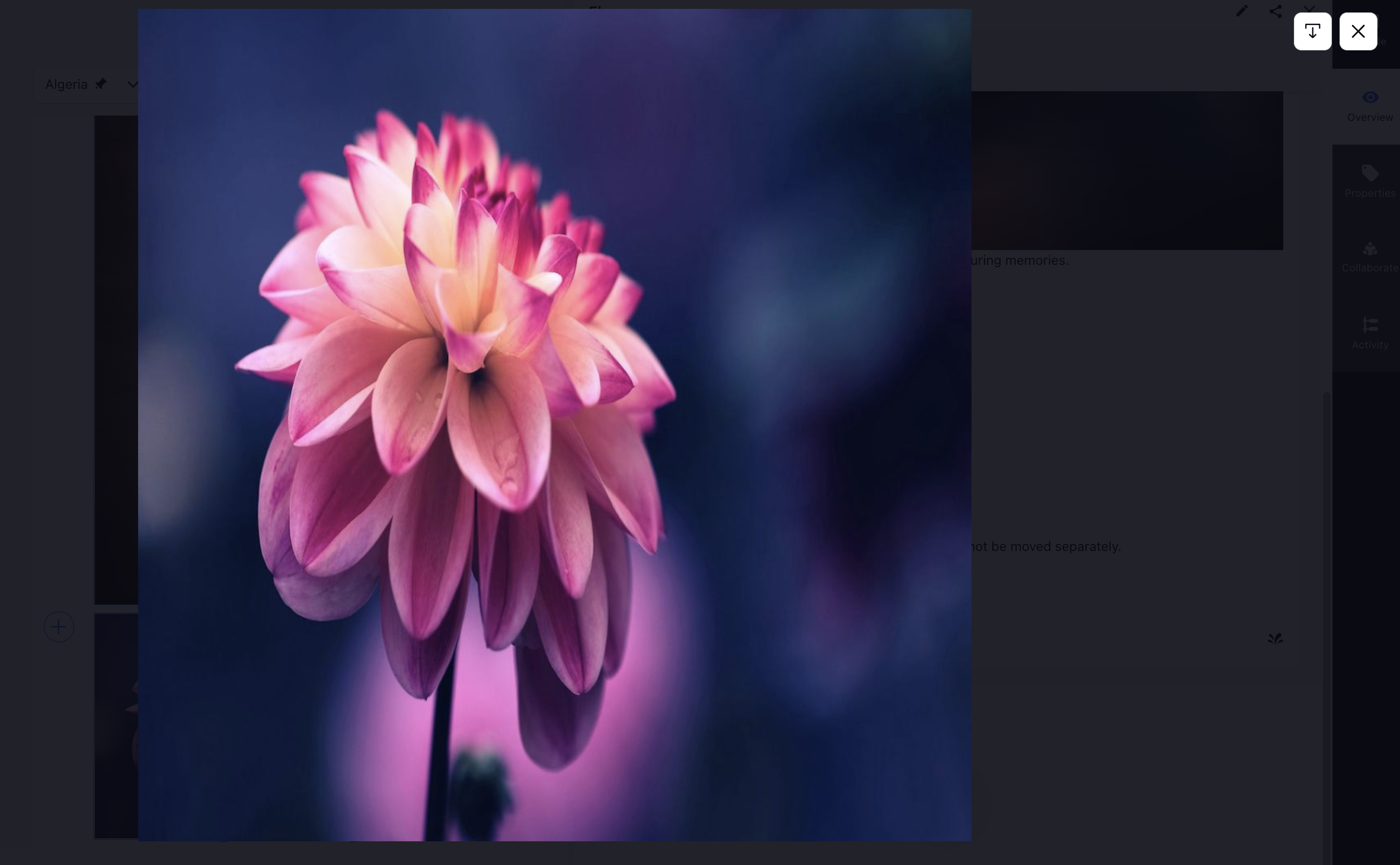
To prevent an image from opening in a pop-up, disable the lightbox feature for the image. When enabled, clicking on the article image, whether in the third pane, smart assist widget, or online platform, will open it in the modal view, with the option to download available at the top right. Clicking on the image again will zoom it.
Enabling captions for images added via DAM will automatically incorporate the image description as the caption. Enabling caption will automatically adjust the image to full width.

Images and videos incorporated through Digital Asset Manager (DAM) will automatically reflect any alterations made to them within DAM in real-time. This ensures that the media content within articles remains consistently up-to-date with any revisions or modifications made centrally in the DAM.
Note: When assets are updated in the Digital Asset Manager (DAM), the changes will automatically appear in published articles. There is no need to republish the article.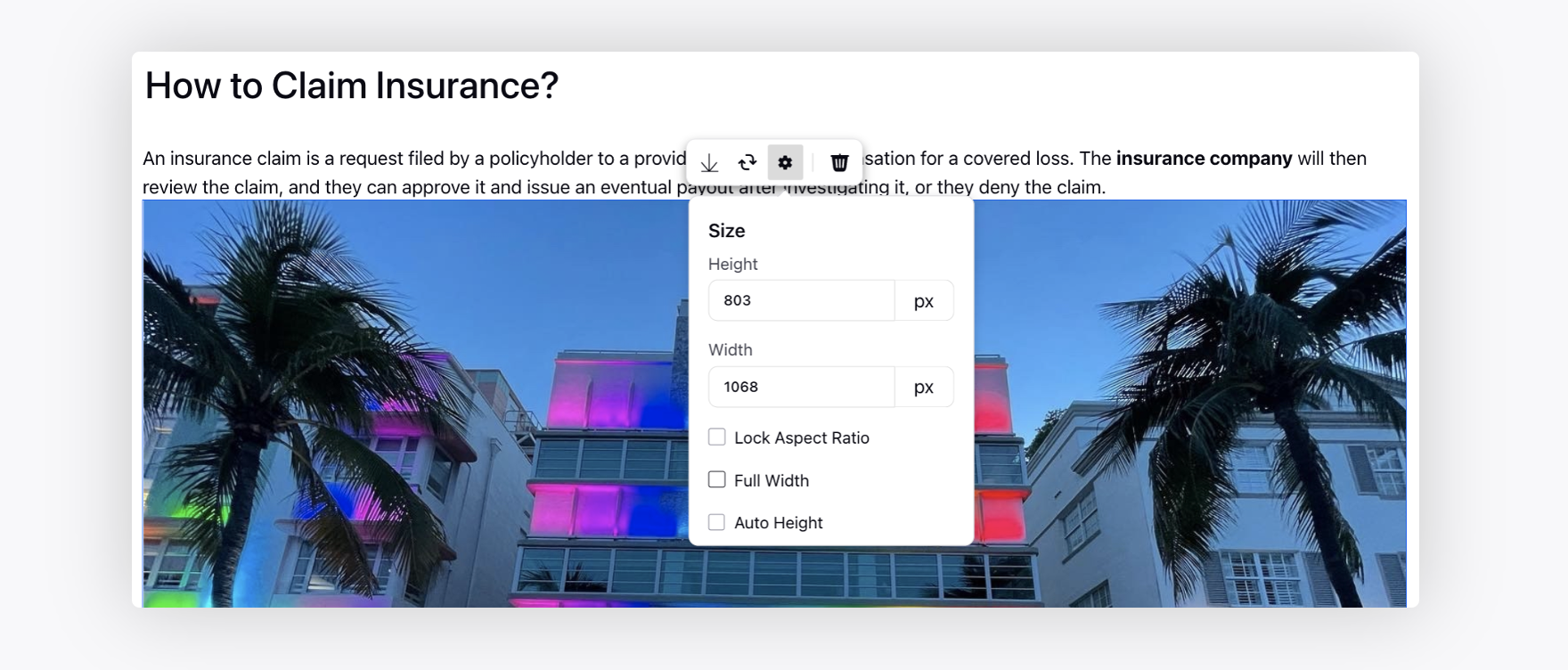
Drag and Drop Images and Videos into Article Editor
The article editor supports dragging and dropping media (images and videos) directly into the editor from your local file system. This eliminates the need for multiple clicks to upload media. Once the upload is successful, the files are uploaded to the CDN server, and the CDN link is embedded in the source HTML. This process eliminates the need to convert images to base64 format.
To drag and drop an image or video from your local system to the article editor, start by opening the article editor where you want to add the file. Locate the image or video on your local system, then click and hold the file with your mouse or touchpad (multiple files can be dragged and dropped simultaneously). Drag the file to the article editor window and release it into the article editor.

Wait for the file to upload; once the media is uploaded, the image will show in the article editor. Finally, ensure you save your changes in the article editor by either clicking the ‘Save as Draft’ button or publishing the article.
Copy and Paste Images into the Article Editor
The article editor also supports copy and pasting images directly into the editor from your local file system.
To copy and paste images into an article editor, start by opening the article editor where you want to add the image. Locate the image you want to copy on your local system or from another source. Right-click on the image and select "Copy" from the context menu or use the keyboard shortcut (Ctrl+C on Windows or Command+C on Mac). Multiple images can be copied and pasted simultaneously.

Next, click within the article editor where you want the image to appear. Right-click and select "Paste" from the context menu or use the keyboard shortcut (Ctrl+V on Windows or Command+V on Mac). Wait for the file to upload; once the media is uploaded, the image will show in the article editor. Finally, ensure you save your changes in the article editor by either clicking the ‘Save as Draft’ button or publishing the article.
Sections
Hover over the Sections icon to add sections.
Click the Addition icon on the left of the desired Section to add media, lists, background, YouTube and Vimeo videos, etc. to the section.
You can also make a copy of the section or delete it using the options available in the top right corner of the section.
Additionally, you can restrict the visibility of the section to specific profile lists on the community. For example, if you need to add an internal note which should be visible only to your employees, you can create a profile list and add it to the section. Click the Settings icon in the top right corner of the section and on the Visibility Settings pop-up window, select the profile lists you want to share the visibility of the section with.
Additionally, you have the flexibility to customize the appearance of the section by adjusting settings such as padding, margin, border width, and border color. You can also enable the auto-height feature to ensure that the section dynamically adjusts its height based on its content.

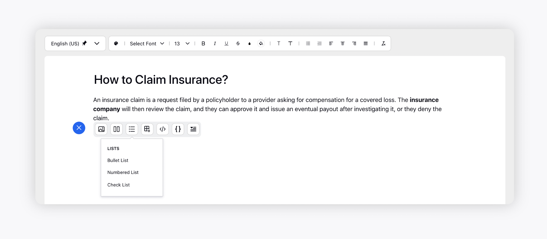
Lists
Hover over the Lists icon to add Bullet List, Numbered List, and Check List.
Tables

Hover over the Tables icon to add a new table. A pop-up with a 6x6 grid will appear, allowing you to select the desired number of rows and columns by choosing a position on the grid. If you need more than six rows or columns, first add the table and then add additional rows or columns as required.
After adding a table, click on any cell of the table to show the table management toolbar. This toolbar has the following options:

Add Row, Column, or Table: This option allows you to add a row (above or below the row of the selected cell), a column (before or after the column of the selected cell), or add a table inside the selected cell.
Delete Row, Column, or Table: This option allows you to delete the row or column corresponding to the selected cell, or the table itself.
Alignment: This option allows you to change the vertical alignment of the content of the selected cell(s). Available options are Top Align, Middle Align, and Bottom Align.
Cell Border Thickness: This option allows you to customize the borders of the selected cell(s), ranging from 0 pt to 6 pt (0 pt means no border).
Cell Border Style: This option allows you to select the border style of the selected cell(s). Available options are Solid, Dashed, Dotted, and Double.
Cell Border Color: This option allows you to set the border color for the selected cell(s). You can choose from Sprinklr presets, pick any solid color from the color chart, or enter a specific color using its hexadecimal or RGB code.
Note: Cell Border Style and Cell Border Color have no effect if Cell Border Thickness is set to 0 pt.
Background Color: This option allows you to set the background color of the selected cell(s).
Merge Down: This option combines the selected cell with the cell directly below it.
Merge Right: This option merges the selected cell with the cell to its immediate right.
Copy: This option clones the entire table below the existing table. Cloned table inherits the styling attributes of the original, ensuring a consistent look and feel.
Table Properties
You can customize the appearance and layout of table cells by updating their properties. These settings allow you to control aspects such as padding, spacing, alignment, background color, and borders. For example, you can change the border color by selecting from preset options, choosing a color from the chart, or entering a specific hex or RGB code. Adjusting these properties helps ensure your table is visually clear and matches your desired formatting. The following properties can be modified:

Cell Spacing: The space between adjacent cells in a table. It controls the gap between the outer borders of neighboring cells.
Cell Padding: The space between the cell’s content (text or image) and its inner border. Increasing padding adds more space inside the cell around the content.
Cell Alignment: Determines how the content inside a cell is positioned vertically. Available options are Top Align, Middle Align, and Bottom Align.
Background Color: The fill color applied to the background of cells in the table. It can be set using color presets, a color picker, or by entering a color code (hex or RGB).
Border Width: The thickness of the border of all cells in the table, ranging from 0 pt to 6 pt (0 pt means no border).
Border Style: The design of the cell’s border. Available options are Solid, Dashed, Dotted, and Double.
Border Color: The color applied to the borders of all cells in the table. It can be chosen from presets, a color chart, or specified using a hex or RGB code.
You can also insert media, sections, lists, code blocks etc. to the table by clicking the Addition icon on the left of the desired cell.

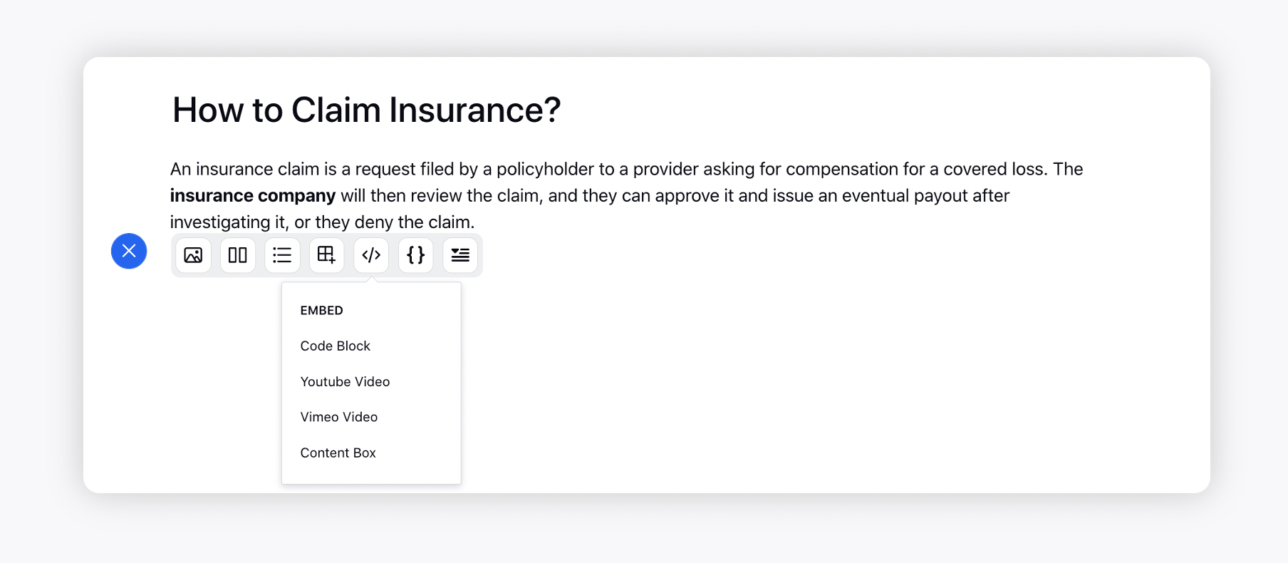
Add Embeddings
Embed Codeblocks, Custom scripts and Youtube/Vimeo Video
Hover over the Embed icon to add a Code Block, YouTube Videos, Vimeo Videos, and Content Box(for custom javascripts).
Once a video is added, you will be able to resize it by dragging a two-headed arrow. While resizing, you will be able to see the current dimensions. Click on the YouTube video and then on the Settings icon to resize it by specifying the width & height in px.
Embed iframe
The Embed iframe option allows you to embed iframes (Inline Frames) from whitelisted domains directly on the Knowledge Base Editor. This requires no modification of the source code. Supported formats include forms, documents, slides, and more.
Note: This feature is Dynamic Property (DP) controlled. Contact your Success Manager to enable this feature for your environment.
Note: Please contact your Success Manager for assistance with whitelisted domains.
Follow these steps to embed iframe in your article:

Click the Embed Iframe option in the Add Elements bar to open the Iframe Properties dialog box.
Fill in the required fields on the Iframe Properties dialog box. Fields marked with a red dot are mandatory. Below are the descriptions of the fields on this page:

Embed URL: Enter the public URL to be embedded. (Required)
Should use percentage width: Enable this toggle to define the iframe’s width as a percentage of its containing (parent) element's width.
Width: Specify the iframe’s width. (Required)
Note: If Should use percentage width is disabled, specify the width in pixels. The value must be greater than or equal to 100 pixels.If Should use percentage width is enabled, specify the width as a percentage. The value must be between 0 and 100, inclusive.
Height: Specify the iframe’s height. The value must be greater than or equal to 100 pixels. (Required)
Note: The default width is 300 pixels, and the default height is 150 pixels.
Click the Save button to embed the iframe.
Source Code

Embed HTML code into the editor. Click Source Code, enter the HTML code in the modal and click Save to embed it in the editor.

Search Within Source Code
While the source code is open, press Ctrl+F (Windows) or Cmd+F (macOS) to open the search bar. All instances of the matching search term in the code will be highlighted.

The following search options are supported:
Regular Expression (RegExp) search: Use patterns to find complex matches in the code. For example, you can search for all lines that start with a specific word or contain certain characters.
Case-sensitive search: Matches only text that exactly matches the case you type. For example, searching for Main will not match main.
Whole word search: Finds only complete words. For example, searching for init will not match initialize.
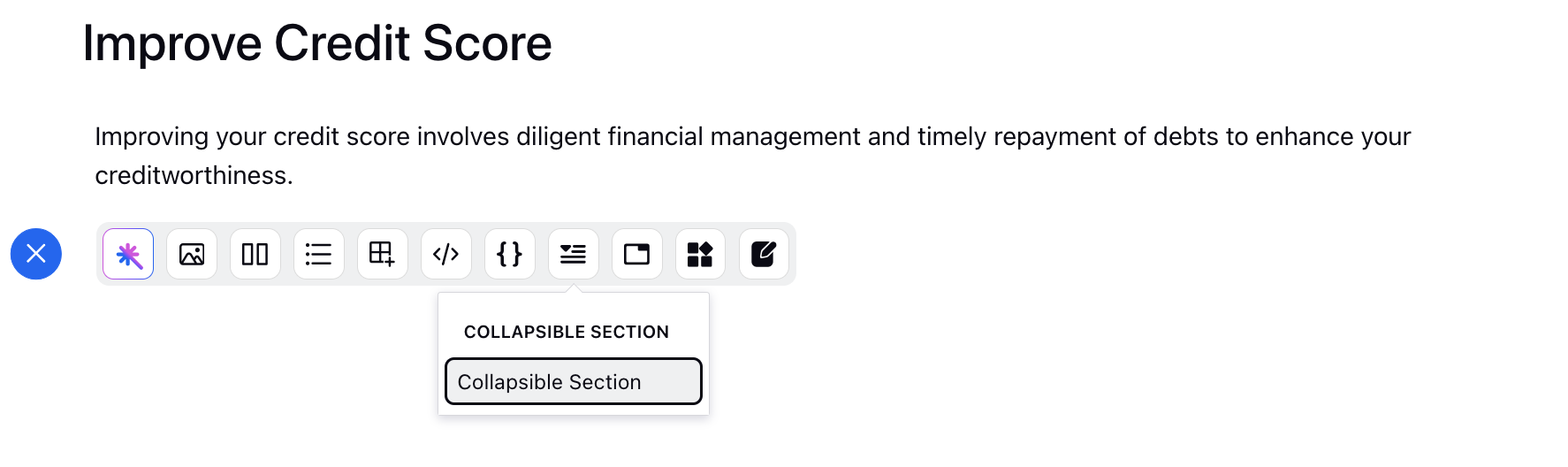
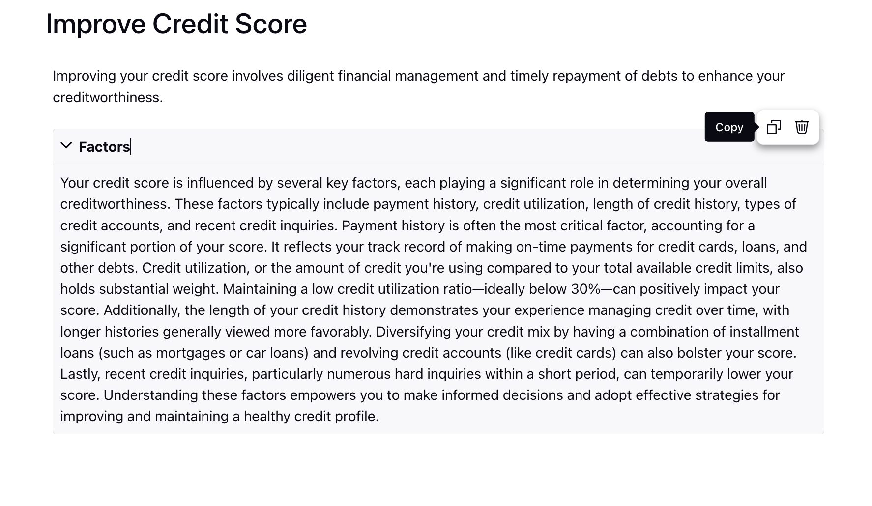
Collapsible Section
Collapsible sections allow users to expand/collapse sections of a page as necessary, without the need to scroll up and down much. You can also insert media, sections, lists, code blocks, etc. to the details (body) section by clicking the Addition icon on the left.
Hover over it to delete it or make a copy of it. Cloned sections inherit the styling attributes of their originals, ensuring a consistent look and feel. This promotes efficiency by eliminating the need to manually reapply styles to duplicated content. You have the flexibility to delete or tailor the duplicated sections to your specific needs.
Tabs
Add multiple tabs in the article. Tabs are perfect for displaying different subjects in your article.

Each tab will have a separate heading and content (incl. tables, sections, images, etc.), and a navigation link will be generated for each tab that you can hyperlink within the article. Once added, you can reorder the tabs using the draggable dots icon. Customers will be able to switch between the tabs by clicking on the tab heading. Click the dropdown icon alongside it to delete it or make a copy of it. Cloned tabs inherit the styling attributes of their originals, ensuring a consistent look and feel. You have the flexibility to delete or tailor the duplicated tabs to your specific needs.
For articles including multi-tab component, the active tab ID will be displayed in the published article URL.

Guided Workflow
Add step-by-step troubleshooting workflows in the article to facilitate customer or agent self-service. For more information, see Guided Workflows in Knowledge Base Articles.
 Note: You will have the ability to copy and paste formatting components, such as tabs and collapsible sections, while retaining their unique IDs.
If the destination article does not contain a component with the same ID, the original unique ID will be maintained.
If a component with the same ID already exists in the destination article, a new unique ID will be generated.
This feature helps prevent the loss of reporting history by ensuring that components maintain their identities, thereby streamlining the management of formatted content across articles.
Auto Save
You can utilize the auto-save capability, triggered every 60 seconds upon content changes in the editor. This feature acts as a safety net, periodically saving users' work in a draft state. Notification messages will appear in the header to keep you informed about the auto-save operation's status, whether it succeeds or fails.
Auto-save is done under the following conditions:
Article has a title.
The article is in Draft status.
Compare Mode is not active.
As part of the auto-save process, version histories with no changes or insignificant content modifications will be automatically removed. This ensures that version histories remain relevant and meaningful.
Note: To get this capability enabled, please work with your Success Manager.
Publishing
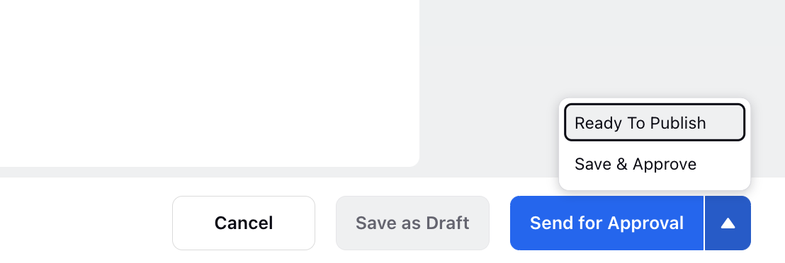
Save as Draft: Clicking Save as Draft will save the article as a draft.
Save & Approve: On clicking Save & Approve, the article will be saved and approved. If the article is approved and already live, you will see the Publish button to publish the changes.
Ready to Publish: Click Ready to Publish to signify its readiness for immediate publication or schedule it to go live at a later date and time. This action ensures that the article is prepared for a seamless transition into the live environment.
Send for Approval: By incorporating the Send for Approval button, the workflow accommodates a structured approval process, offering choices for immediate publication, scheduled release, or cancellation of the approval request.
Note: Once you send an article for approval, it automatically switches to view-only mode. This prevents further edits from your side and ensures that approvers, or other authors, can make the necessary updates during the approval process. You can click the Edit Article button to enter edit mode again, if nobody is editing the article.
After you create a knowledge base category and add articles within it, you are required to map it to Community to publish the articles on a given community. For more information, see publishing articles on Sprinklr Knowledge Base.
Insert comments
Select the desired text and add comments. You can also tag people. Once added, you can resolve, reply, edit, or delete your comment. Once resolved, a comment can be reopened.
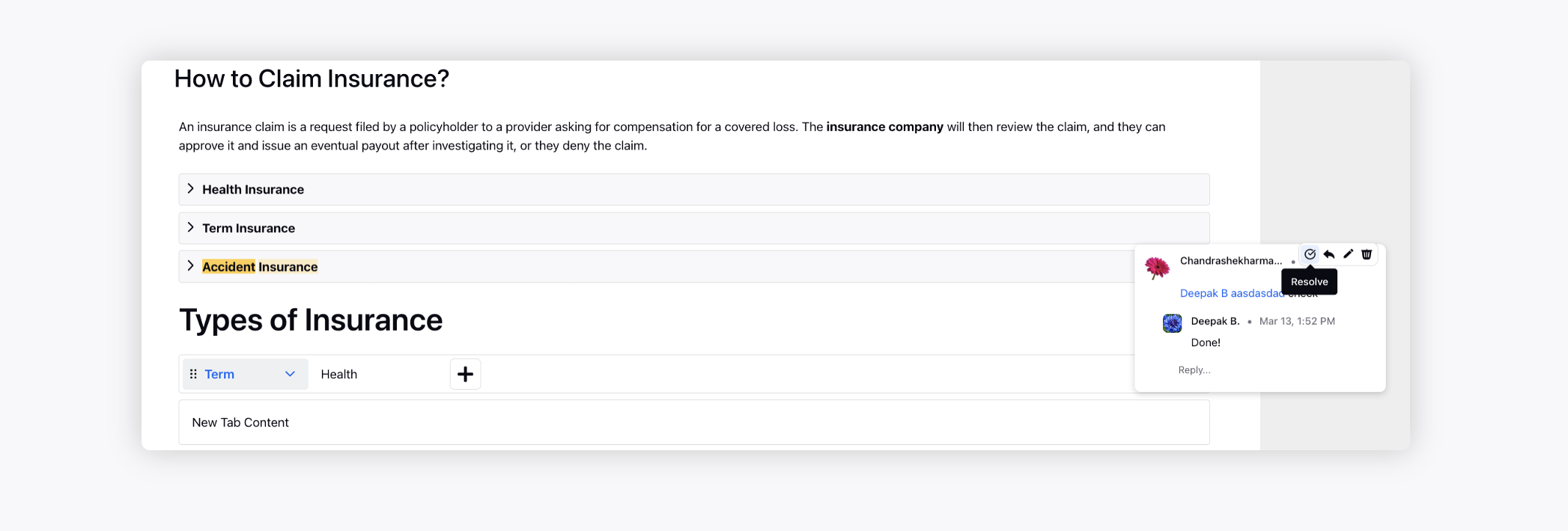
Click the Comments icon on the top to access all the comments and apply a filter to view the resolved or open ones. You can also sort the comments by the date.
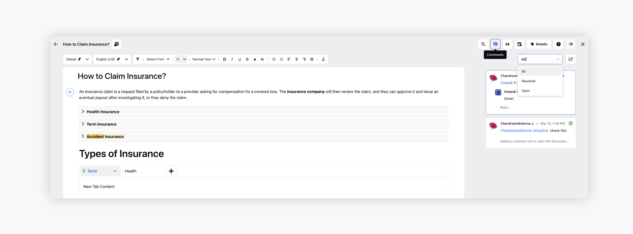
To learn more about getting the Comments capability enabled, please work with your Success Manager.