Customizable Styling Builder
Updated
Guided Workflows can be embedded within various customer-facing/external systems, such as a brand's website, mobile app, community, or knowledge bases, to empower customers in resolving queries and completing tasks on their own.
You can go a step further by personalizing various design elements to align with your brand's unique visual identity. By leveraging the customization options available, you can create tailored Guided Workflows that not only provide valuable assistance to your customers but also reflect your brand's personality and aesthetics.
Custom Design Elements
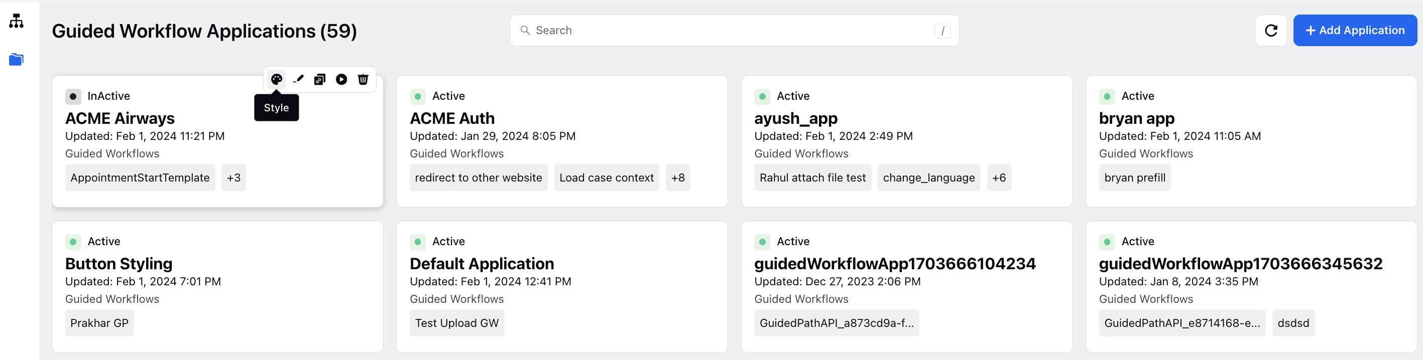
Hover over the desired guided workflow application and select Style. Here are some customization options available:
Global Style
Container
Choosing a specific background color for the container and selecting an appropriate font family contribute to the overall aesthetics and branding of your guided workflow.

Header
For the header section, set the padding to control the space within the header, select a background color to establish its visual theme, adjust the font size and weight for text elements, and choose a font color that complements the overall design.

Footer
In the footer section, adjust spacing for an organized layout, set a minimum space between buttons, and define a background color.

Components
Input Fields
Customize input fields with precision by specifying various design elements. Define the border radius, width, color, and distinct states like default, hover for the input container. Additionally, set the font size, weight, and color for input values and labels. This detailed customization ensures a cohesive and visually pleasing appearance for input elements.

Additionally, set the minimum height for text areas to control the layout and ensure optimal readability.

Buttons
Customize various aspects of buttons, including border radius, width, padding, and font size, to tailor their appearance and design.

Customize the styling of primary and secondary buttons by adjusting parameters such as state (default, hover, disabled), background color, border color, and text color.
