The widgets on the Location Insights Overview Dashboard are designed to provide a full and in-depth view of how customers feel about their experiences at a local, regional, or global level. Using the Locations Insight dashboard data will help you identify opportunities to increase customer satisfaction by adjusting content and care strategy.
In this article, we will cover the following –
Accessing the Location Insights dashboard
Location Insights filters
Subject Category and Attribute Category filters
Location Insights Category widgets
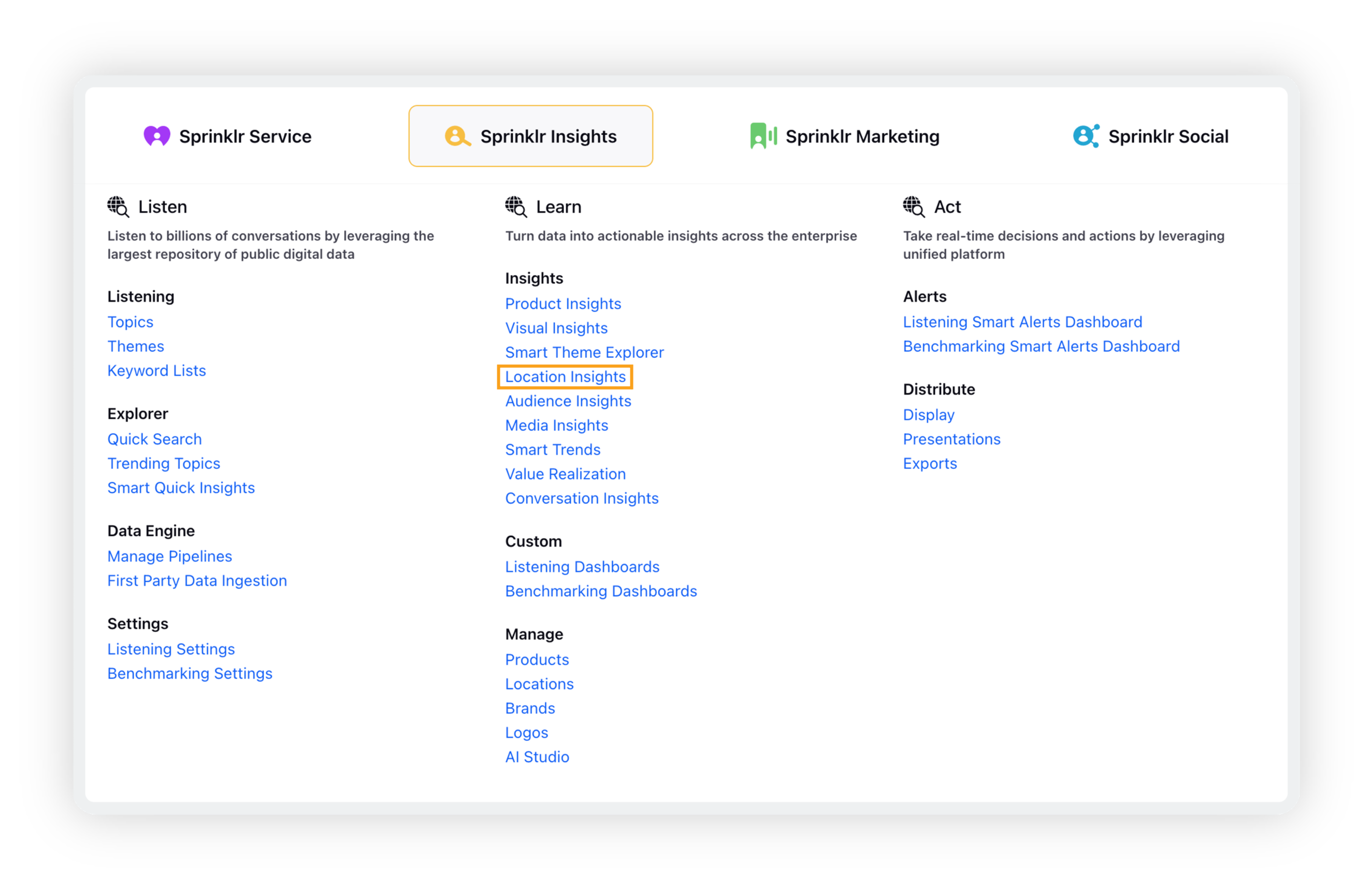
To access the Location Insights standard dashboard
Click the New Tab icon. Under Sprinklr Insights, click Location Insights within Learn.
Location Insights filters
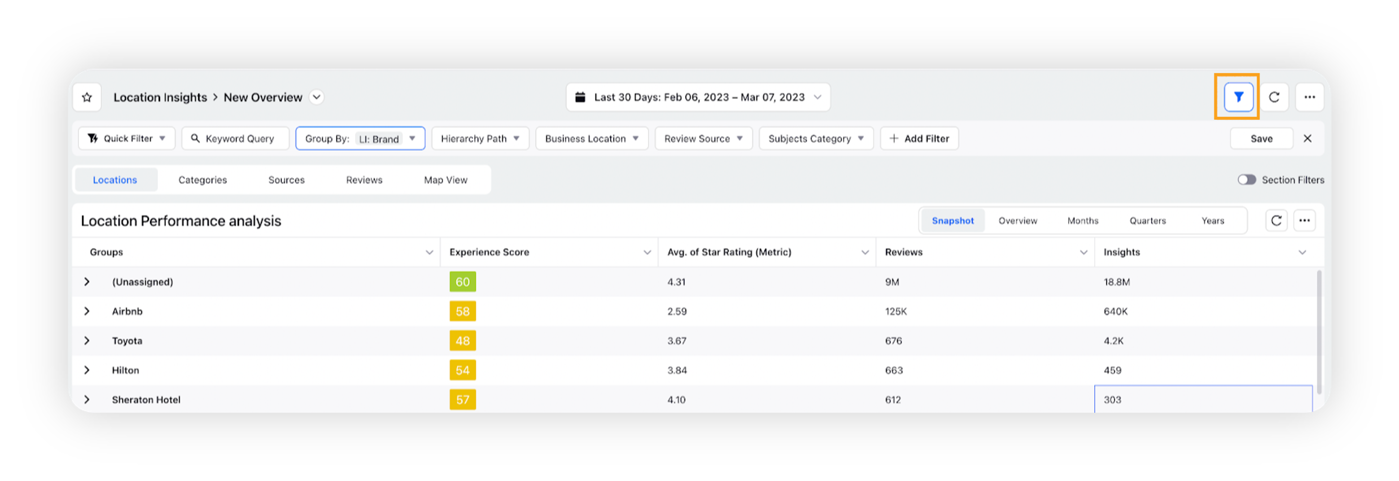
Filters can be applied to the standard Locations Insights dashboard and to custom dashboards. Applying filters will restrict the data the user wants to see displayed in the widgets. Upon viewing the Location Insights standard dashboard, users will see the most commonly used filters applied upfront, which they can modify as per your requirements.
Click the Filter icon in the top right corner to expand the filter option.
Note: Users can click the Star icon next to a filter to favorite a filter for later use.
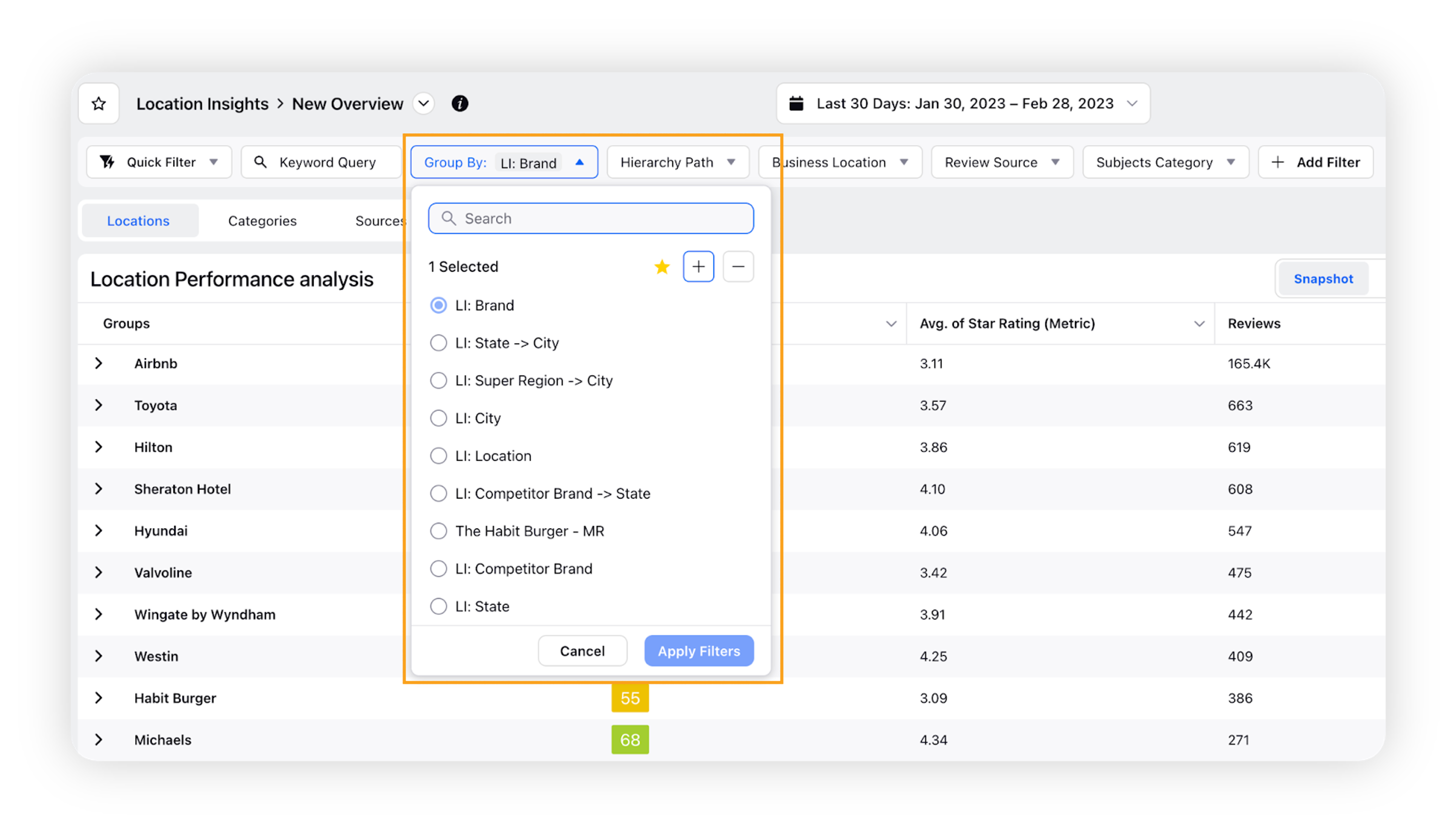
Group By Selector
Search and select Group By option and select the filter values as required.
Note:Group By allows you to organize your Business Locations into nested levels. Admins can create hierarchies/groupings by selecting properties to create these levels, which will automatically be reflected in Reporting using the Group By selector.
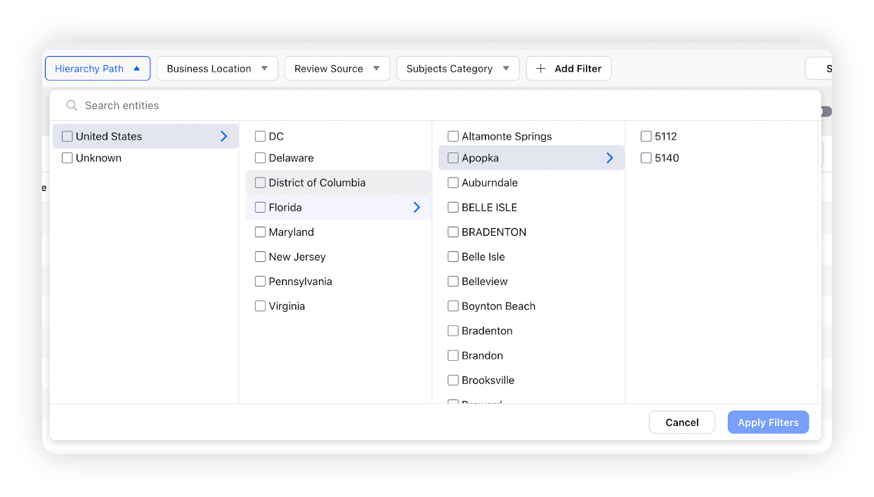
Hierarchy Path Selector
Hierarchies allow the users to organize your Business Locations into nested levels. Users can create Hierarchies by selecting properties to create these levels, which will automatically be reflected in Reporting using the Hierarchy Path Selector.
Use this filter to narrow the analysis to specific locations and branches of the hierarchy for comparison based on Country, State, City etc.
Refer to this document for more information – Creating Competitor Hierarchies
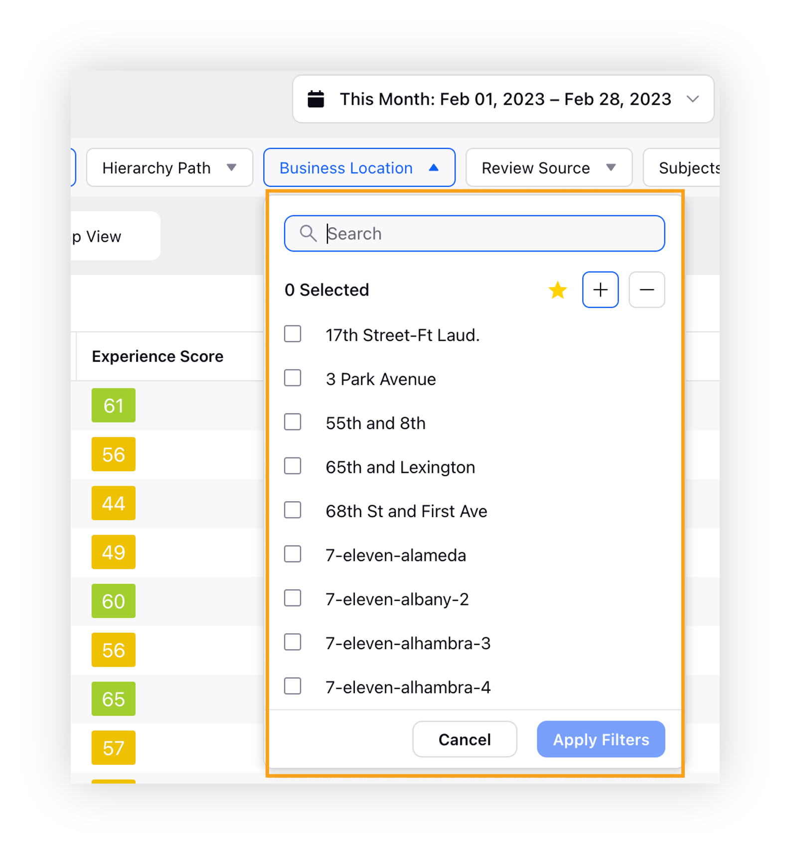
Business Location
This filter allows the users to select any business location and see the analysis for those locations only. You can select multiple business locations.
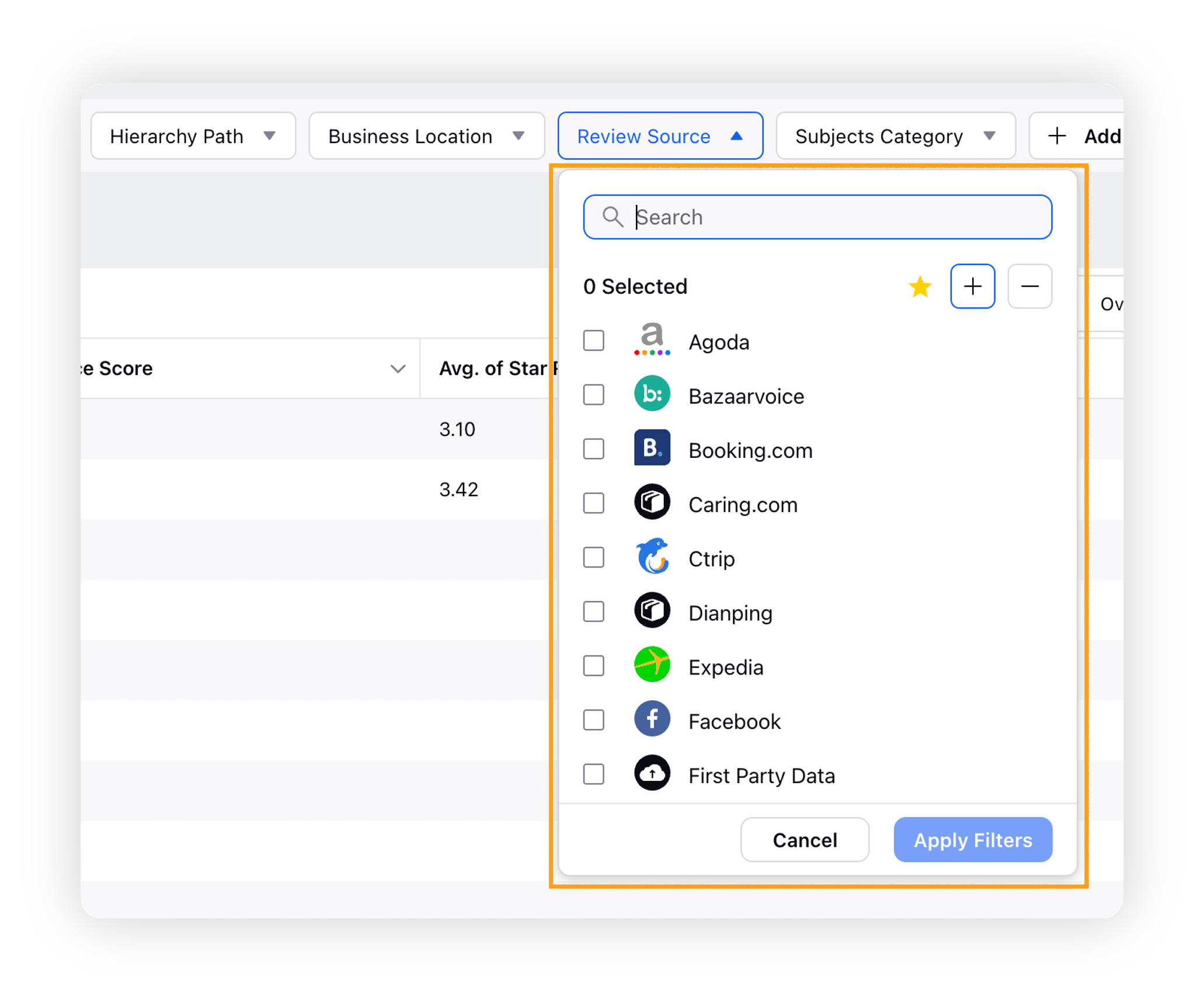
Review Source
The Review Source filter will restrict by Location-based sources, such as TripAdvisor, Yelp, etc.
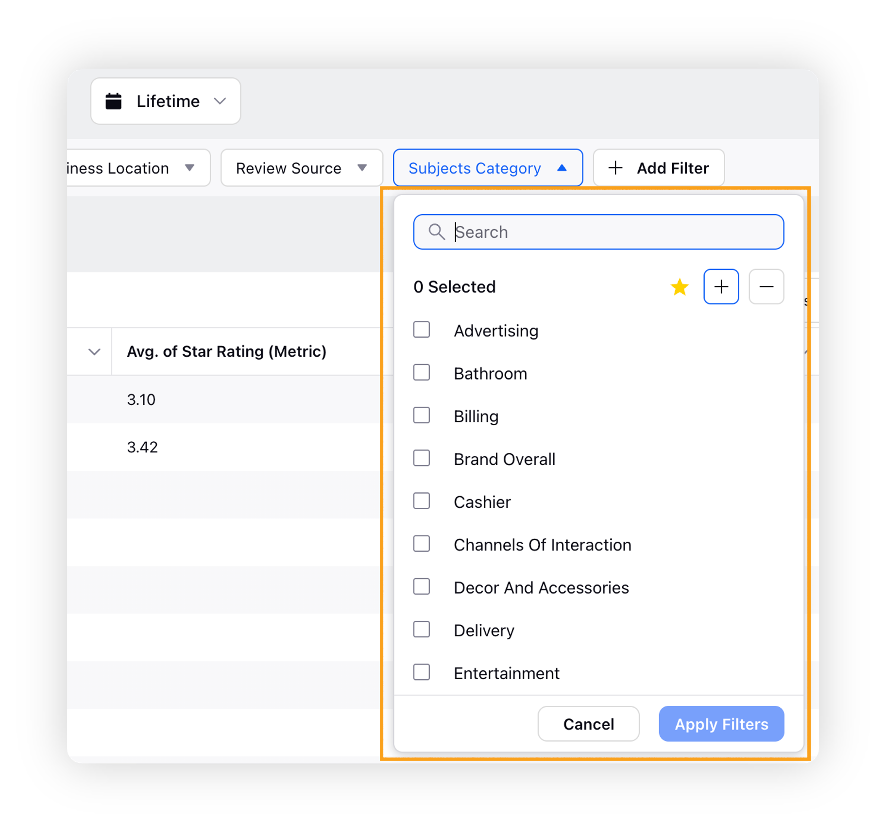
Subjects Category
The Subjects Category filter will focus on a particular sentiment category of interest.
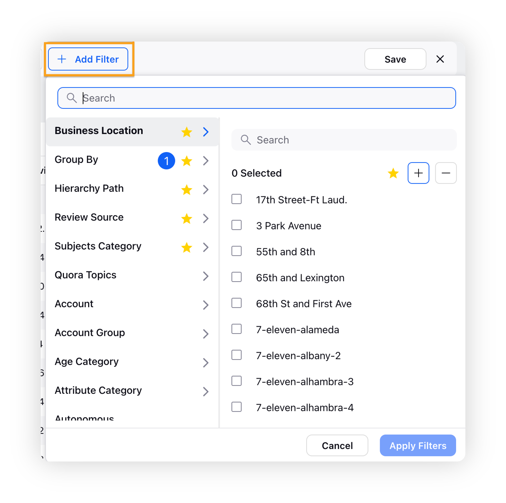
Add Filter
To apply additional filters to the dashboard widgets, click Add Filter and click on the relevant filters to apply.
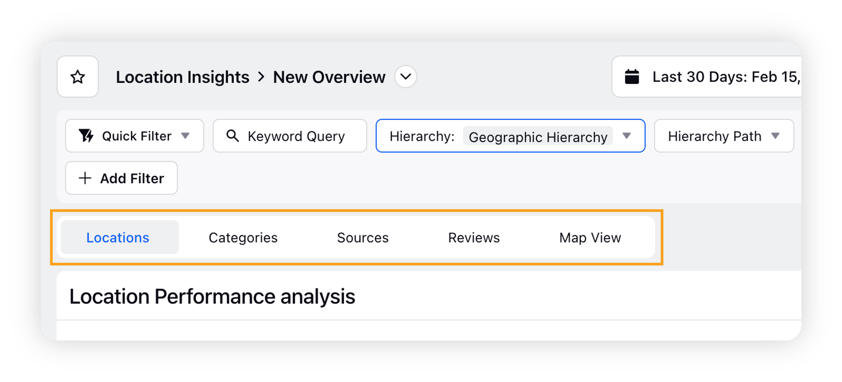
Location Insights dashboard widgets
The following widgets are included in the Business Locations Overview dashboard. Scroll through to learn more about widgets in each tab, or click a tab link below to jump to more information about widgets in that tab.
The following widgets are included in the Locations tab. Scroll through to learn more about each widget, or click a widget title link below to learn more about a specific widget.
Location Performance Analysis
Location Distribution
Location Performance Trends
Insights Word Cloud
Location Benchmarks
Smart Theme Explorer
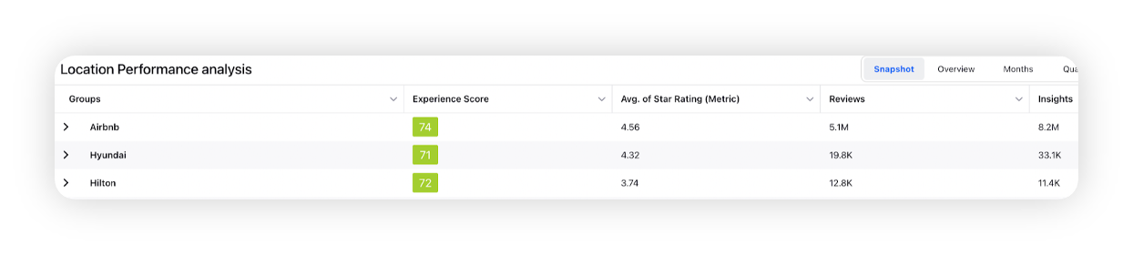
Location Performance Analysis
This table widget lets you analyze performance in terms of locations, along with their respective grades, average star ratings, number of reviews and insights.
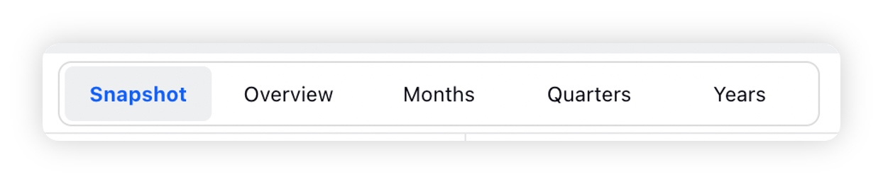
Users also have the ability to perform widget level interactions including Snapshot, Overview, Months, Quarters, and Years.
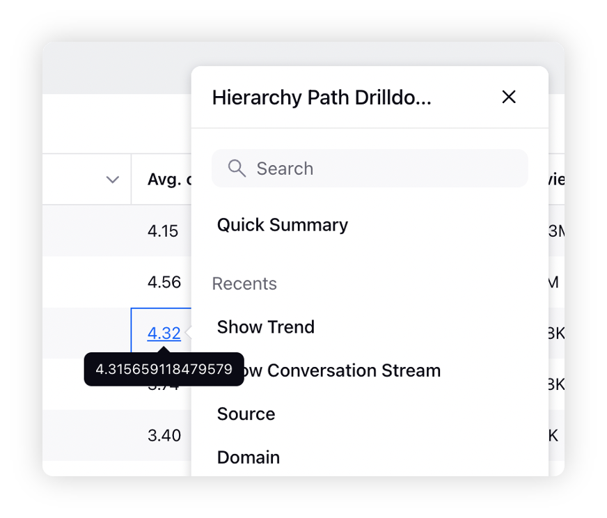
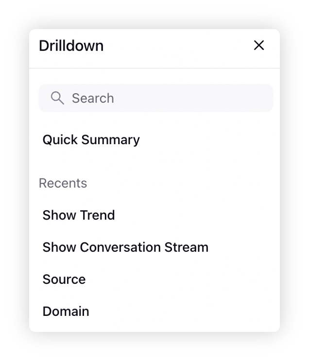
To explore an Avg. Star Rating, Number of Reviews or Insights value in more detail, click on the value to drill down by several options for better and accurate analysis.
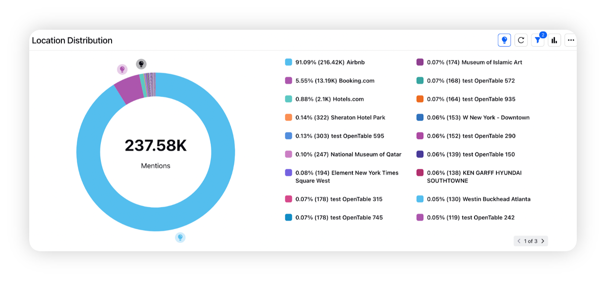
Location Distribution
This widget shows a pie chart of reviews in each location of the business. In addition, users can also select/deselect a location value to show or remove its data from the pie chart.
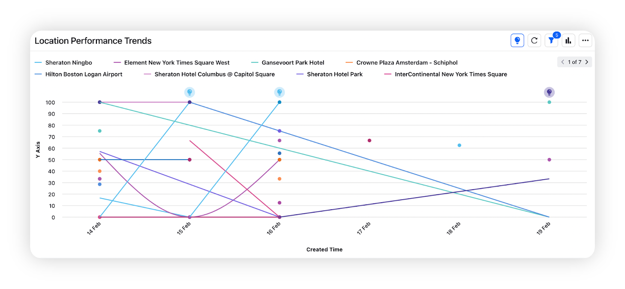
Location Performance Trends
This line chart shows the experience score trend over time for different locations. In addition, users can also select/deselect a location value to show or remove its data from the line chart.
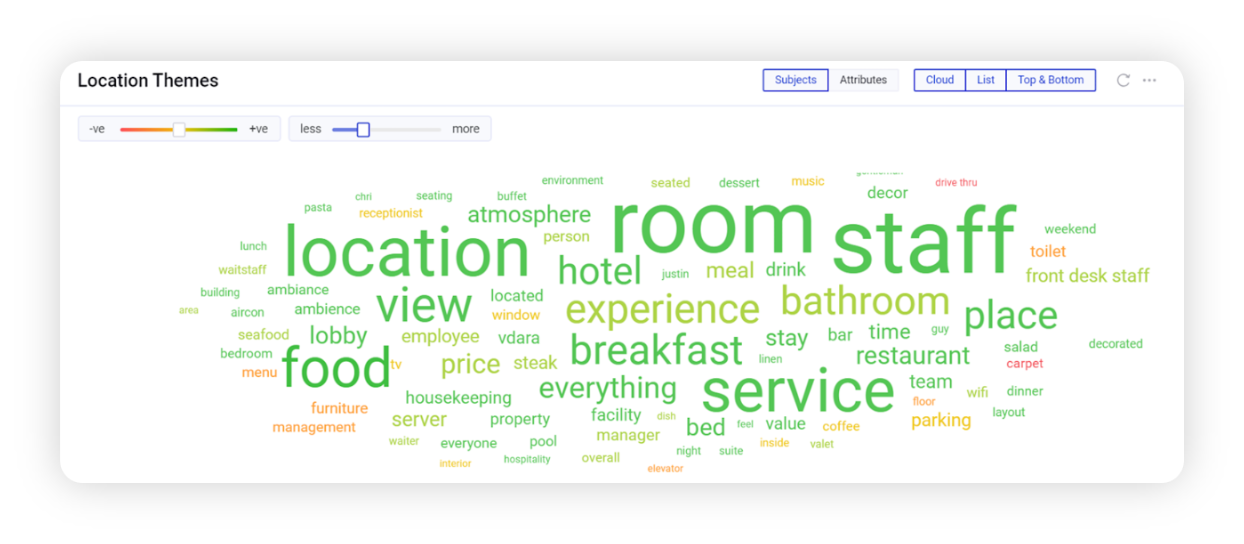
Insights Word Cloud
Going beyond a standard word cloud, this widget provides a deep analysis of customer feedback by positive and negative sentiment. The word cloud data can be altered based on the Subject and Attribute categories.
Subject categories, for example – food, personnel, guest room etc., represent what is being spoken about in the customer reviews.
Attribute categories, for example – quality, price, availability, etc., represent how are the subject categories being spoken about. For each Subject Category, there will be multiple attribute categories.
You can also shift among Cloud (a cloud of words), List (a list of subjects or attributes sorted by grade), and Top & Bottom (a list of top and bottom subjects and attributes sorted by grade) Views.
Users will also see two sliders in the top-left corner of the widget. Use the sentiment slider to narrow the cloud focus towards positive or negative comments. The Less/More slider allows you to change the number of words you see in the cloud.
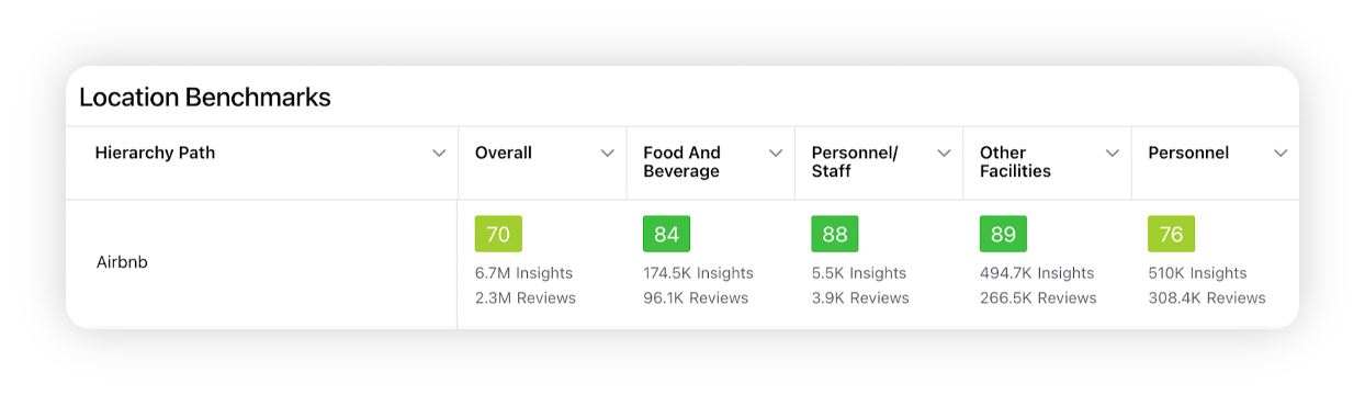
Location Benchmarks
Location Benchmarks table widget allows the users to view Experience Scores associated with different subjects for various locations. To view more details on a location or subject grade, click on its value and drill down.
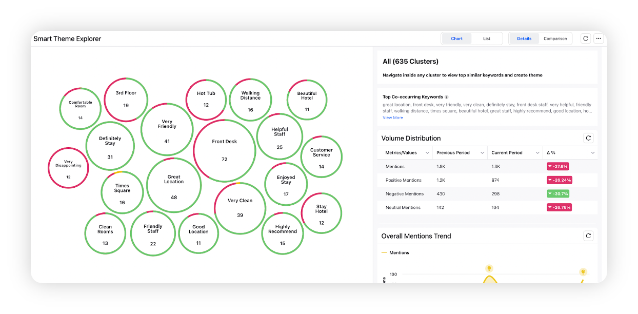
Smart Theme Explorer
Smart Theme Explorer, powered by Sprinklr AI, enables brands to understand their consumers' unmet needs, top trends around their brands, products, and/or categories. It will enable you to discover top themes automatically synthesized from conversations using unsupervised clustering. You can be informed on the "unknowns" – underlying conversations, sentiments, shifts, and trends. The top keywords forming a cluster can be used to create themes to power the existing setup for further analysis. Deep dive into clusters to get more context and find actionable insights.
The following widgets are included in the Categories tab. Scroll through to learn more about each widget, or click a widget title link below to learn more about a specific widget.
Category Performance Analysis
Category Distribution
Category Performance Trends
Top Subjects by Category
Category Benchmarks
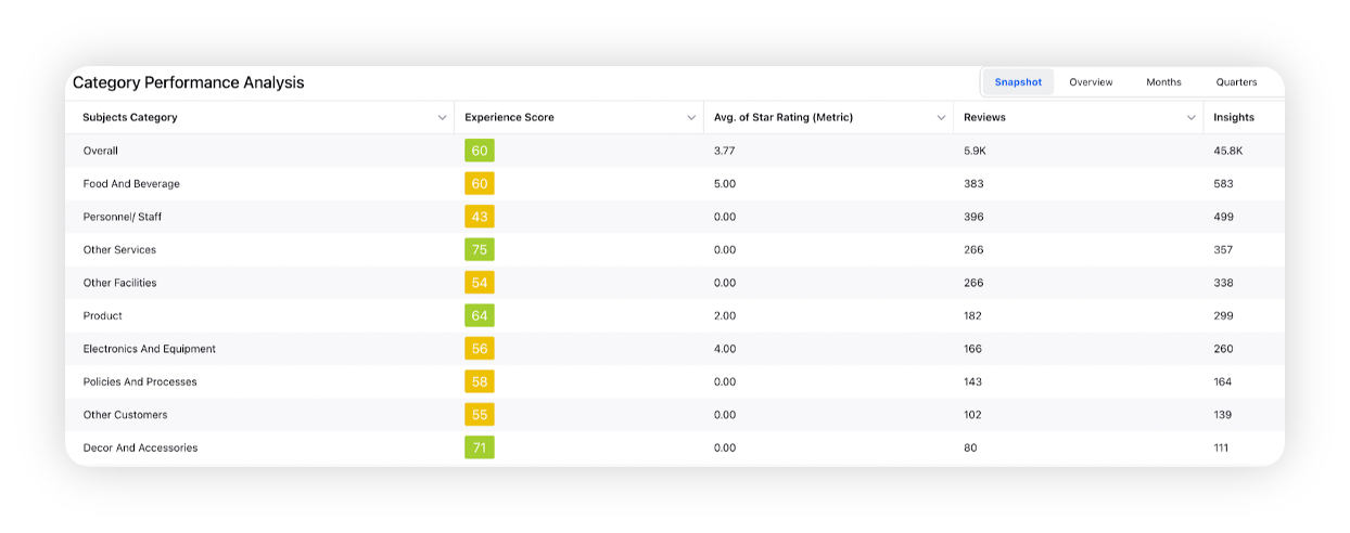
Category Performance Analysis
This table contains industry-specific Intelligence categories, allowing the user to analyze performance in different areas of the business.
To explore an Avg. Star Rating, Number of Reviews or Insights value in more detail, click on the value. Further information will be visible, by drilling down using several options.
Category Distribution
This widget shows a pie chart of reviews in each category of the business. In addition, also select/deselect a category value to show or remove its data from the pie chart.
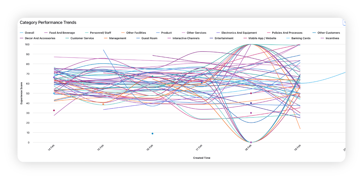
Category Performance Trends
This line chart shows the Experience Score trend over time of the Subject Categories (personnel, guest room, etc.) with the highest volume. Users can also hide/unhide a category by just clicking on its value.
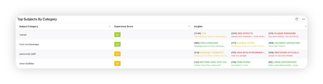
Top Subjects by Category
This table shows the top subjects for each category. Subjects are mentioned in the Insights column on the right, and categories are shown on the left. Users can also view the experience score for each category in the table.
On hovering over a row in the widget, the Drill By icon will appear, through which you can go to Explore Lens menu and drill down the data in the widget further.
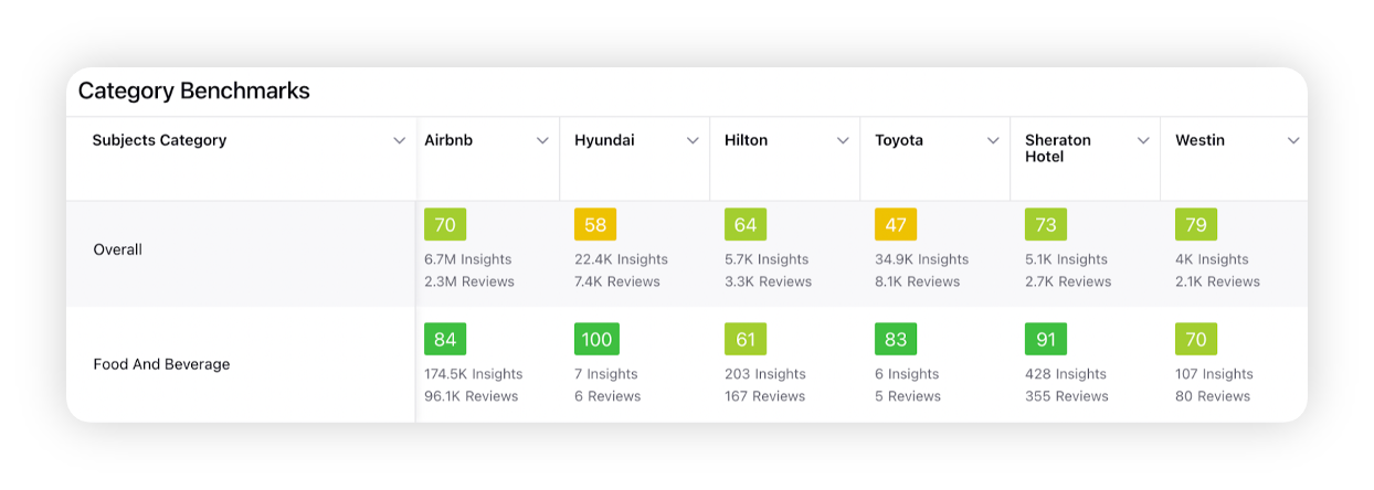
Category Benchmarks
Category Benchmarks table widget allows the users to view Experience scores associated with different subjects and corresponding locations. To view more details on a subject category or grade, just click on its value.
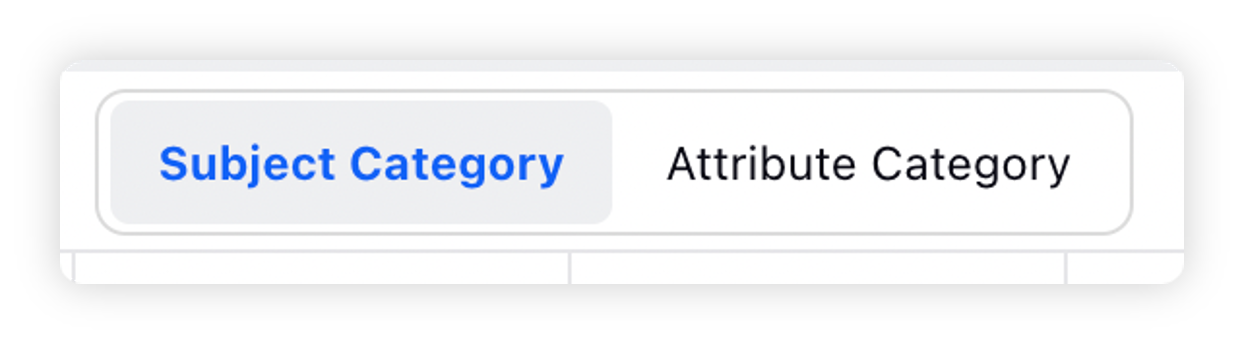
In the top right corner of the widget, you can switch between subject and attribute category to be displayed in the first column of the widget.
The following widgets are included in the Sources tab. Scroll through to learn more about each widget, or click a widget title link below to learn more about a specific widget.
Source Distribution
Source Performance Analysis
Source Performance Trends
Source Benchmarks
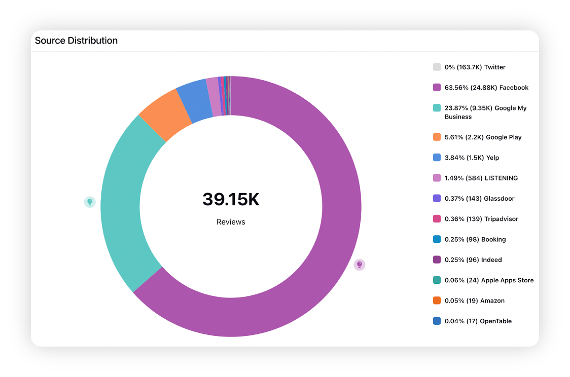
Source Distribution
This pie chart shows the number of reviews based on the source platforms where the reviews were posted. Users can click on a source value to hide/unhide it from the pie chart.
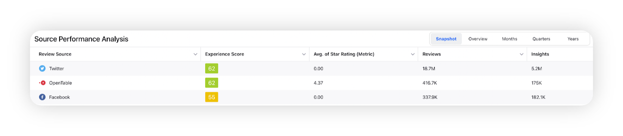
Source Performance Analysis
This table shows a list of sources, along with corresponding experience scores, average star rating, number of reviews and insights. You also have the ability to perform widget level interactions including Snapshot, Overview, Months, Quarters and Years.
On hovering over a row in the widget, the Drill By icon will appear, through which you can drill down the data in the widget further.
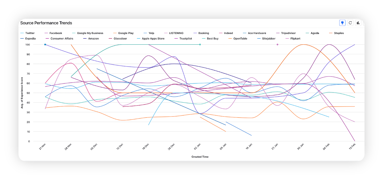
Source Performance Trends
From this trend chart, you can view experience scores of sources over time. Users can also click on a source value to hide/unhide the line chart associated with that source.
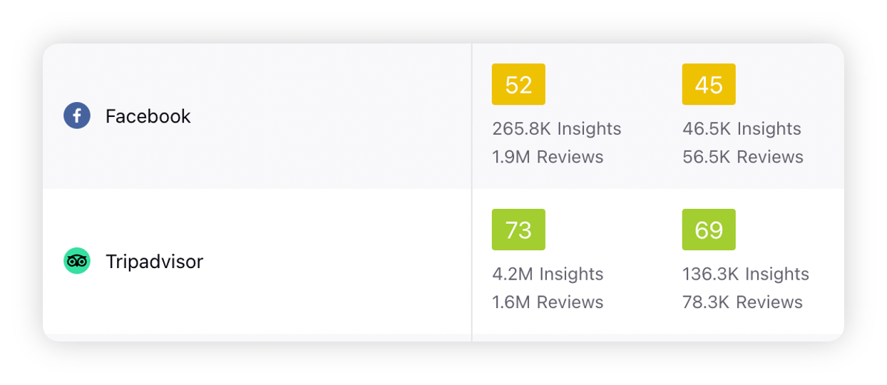
Source Benchmarks
Source Benchmarks table widget allows you to view Experience Scores associated with different sources of reviews and corresponding locations. To view more details on a source or grade, just click on its value.
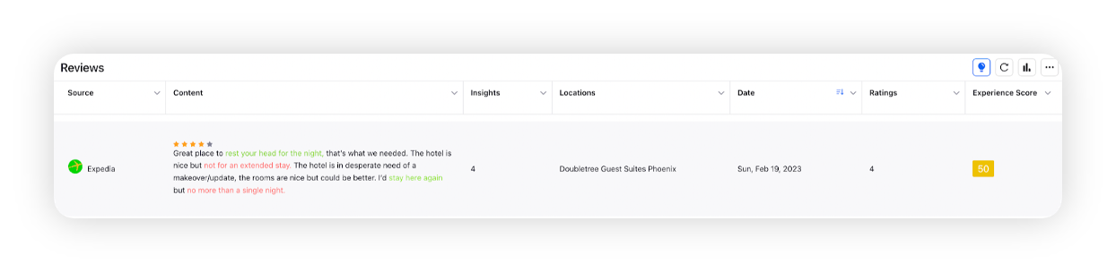
The table widget in the Reviews tab lets you view the total number of reviews, along with the source, content, location, star rating, date and experience score associated with each review. You can also click on a cell to access the drill down menu for more details.
The following widgets are included in the Sources tab –
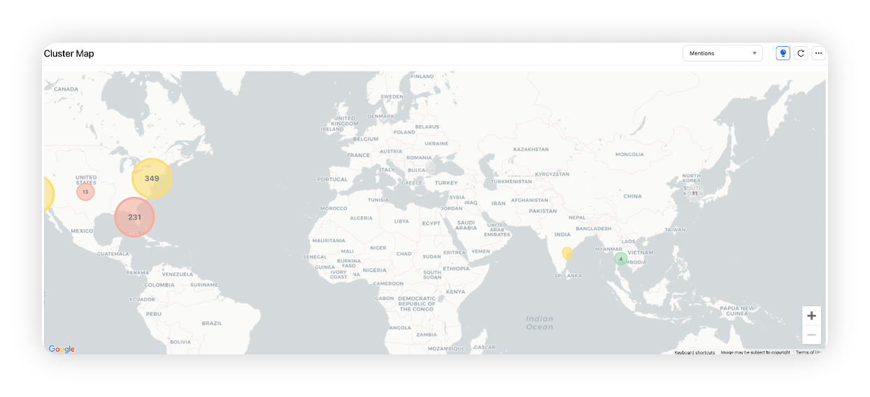
Cluster Map
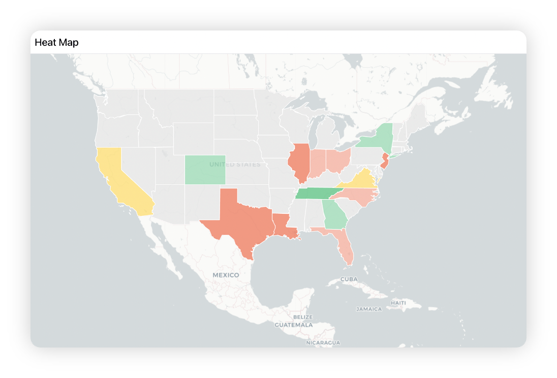
Heat Map
Cluster Map
The Cluster Map widget on a Location Insights dashboard shows a geographical view of all the locations for a brand over the world map. Based on the zoom level and proximity of locations on the map, it forms data clusters whose color and size depend on the overall sentiment and volume of location reviews respectively in that cluster. Zooming or double-clicking on the clusters will split them into multiple small clusters having navigation markers as the last entity where a Navigation Marker denotes the exact coordinates of a business location. Conclusively, through the Cluster Map widget, you can take a glance at all the locations, get relevant insights, and drill down on multiple parameters.
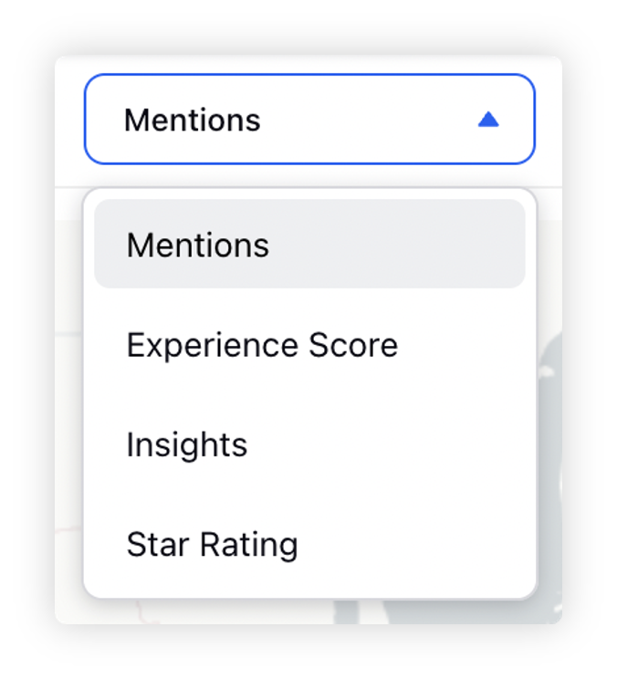
Users can change the metric which they want to see on the cluster map by going to the top right of the map and switching between mentions, experience score, star rating and insights.
Heat Map
Besides Cluster Map visualization, the Location Insights dashboard also provides you with Heat Map visualization that shows a state-wise geographical view of all locations in a country. Based on the overall experience score of AI-generated insights for a particular state, it shows the sentiment color of the state map as Green, Yellow, and Red.
Users can change the metric which they want to see on the heat map by going to the top right of the map and switching between mentions, experience score, insights and star rating.
Refer to this article for more information on Map visualizations in Location Insights – Map Visualization.