Creatives
Updated
Introduction
Creatives are used to style a survey and improve the look and feel of any survey. It helps to design a survey on how a survey should open, placing primary and secondary buttons along with the font, font size and color of the buttons, etc. You can add images to improve the survey content and design. This helps to ensure a better response rate.
Steps to Create Creatives
For creating the creative, it is important to select the creative type:
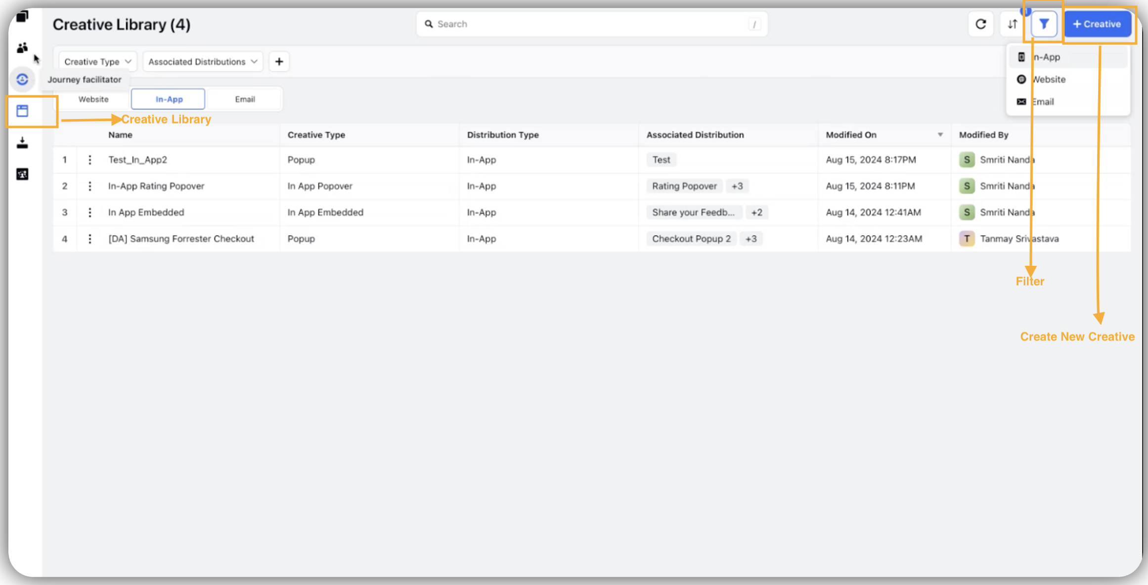
Click Creative.
Select Creative Type.
Click Create New.
Select Creative Type from the In-Apps Survey.
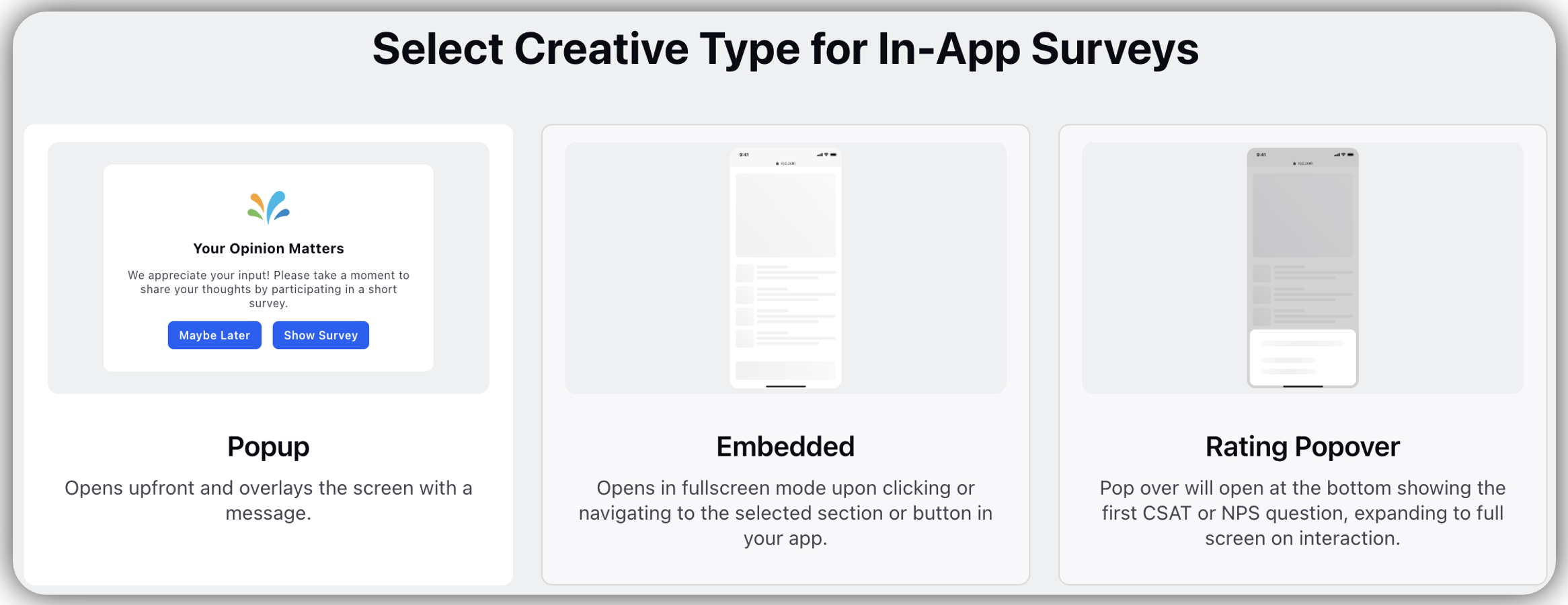
Popup: Popup opens upfront and overlays the screen with a message.
Embedded: Opens in full-screen mode upon clicking or navigating to the selected section or button in your app.
Rating Popover: Popover will open at the bottom, showing the first CSAT or NPS question, expanding to full screen on interaction.
Note: You can change the survey directly to customize the embedded and rating popover. Please refer to the Survey Styling document for more details.
Steps to Create Pop-up Survey
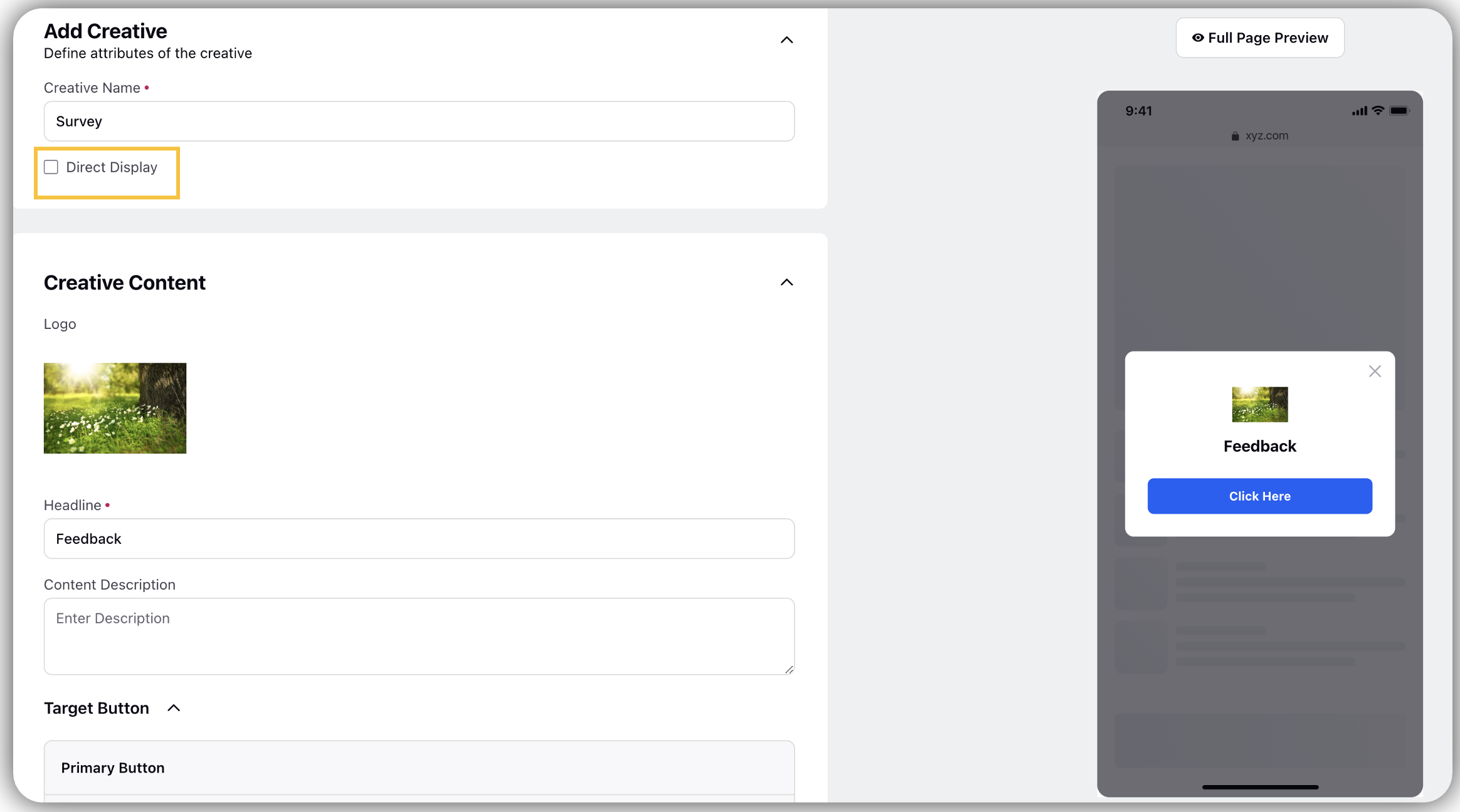
Creative Name: Name the creative.
Direct Display: Check the box to have the creative content displayed directly.
Go to Creative Content:
Upload the Logo: Select from logo from the computer or asset Library.
Headline: Enter the headline of the creative.
Content Description: Add content description.
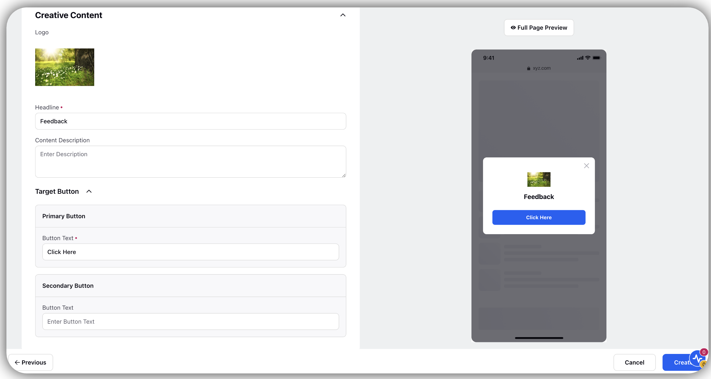
Under the Target Button Section add Primary and Secondary buttons name.
Under Primary Button: Add button name in Button Text.
Under Secondary Button: Add button name in Button Text.
Styling
Learn how to Style a Popup Creative Content
Logo: Under the Logo Section there is provision for sizing and vertical padding.
Size: Slide the bar towards the left or right to increase or decrease the size of the Logo.
Vertical Padding: Slide the bar towards the left or right to increase or decrease the size of the Logo.
Overlay: Under the Overlay section there is a provision for Color, Opacity and Vertical Padding.
Color: Click on the Color section to change the color of the Overlay.
Opacity: Slide the bar towards the left or right to change the opacity.
Vertical Padding: Slide the bar towards the left or right to change the vertical padding.
Popup Display:
Background: Select the background color.
Border: Select border color.
Sides: Slide the bar towards the left or right to increase or decrease the slides of the popup.
Vertical Padding: Slide the bar towards the left or right to increase or decrease the vertical padding.
Opacity: Slide the bar towards the left or right to increase or decrease the opacity.
Radius: Slide the bar towards the left or right to increase or decrease the radius.
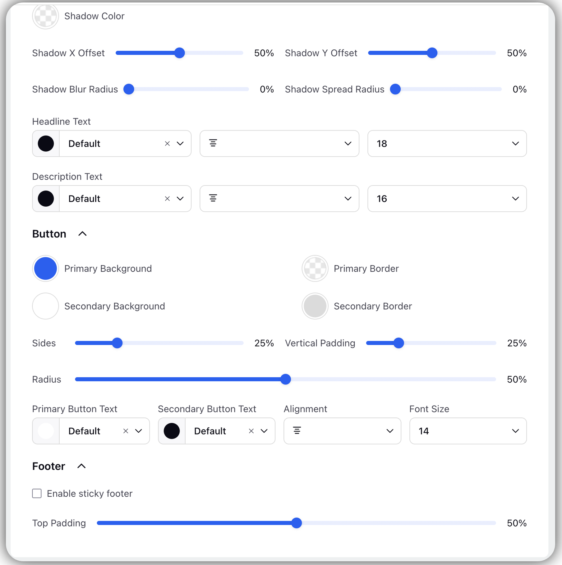
Shadow Color: Select the shadow color.
Shadow X Offset: Slide the bar towards the left or right to set shadow.
Shadow Y Offset: Slide the bar towards the left or right to set shadow.
Shadow Blur Radius: Slide the bar towards the left or right to blur shadow.
Shadow Spread Radius: Slide the bar towards the left or right to increase or decrease the radius of shadow.
Headline Text:
Text Color and Type of Font: Select the text color and font of Headline.
Alignment: Select alignment for the text headline.
Font Size: Select the font size.
Description Text:
Text Color and Type of Font: Select the text color and font of description.
Alignment: Select alignment for the text description
Font Size: Select the font size.
Button: Change the button color background and border color.
Primary Background: Select the Primary background color.
Primary Border: Select the Primary border color.
Secondary Background: Select the Primary background color.
Secondary Border: Select the Secondary background color.
Sides: Slide the bar towards the left or right to increase or decrease the sides of the Button.
Vertical Padding: Slide the bar towards the left or right to increase or decrease the slides of the Vertical Padding.
Radius: Slide the bar towards the left or right to increase or decrease the Radius.
Primary Button Text: Select the font for Primary Button.
Secondary Button Text: Select the font for Secondary Button.
Alignment: Select the alignment of font.
Font Size: Select the font size for both Primary and Secondary Button.
Footer
Enable sticky footer: Check the box.
Top Padding: Slide the bar towards the left or right to adjust the top padding.
Click Create (Create will only create and will not enable).
Note: Preview of the entire content will be visible in the right pane.

Creative Library
Creative Library hosts all the creatives that are created. Multiple surveys can use the creatives from the creative library. Creatives can be created on the creative library and distribution can be viewed from the creative library.
Any Pop-up Creative that is created would also appear in the Creative Library.
Note: In creative library embedded can be seen only once, where as pop-ups can be seen multiple times. Rating popover and Embedded will be shown on the top and they will be by default.
Distribution
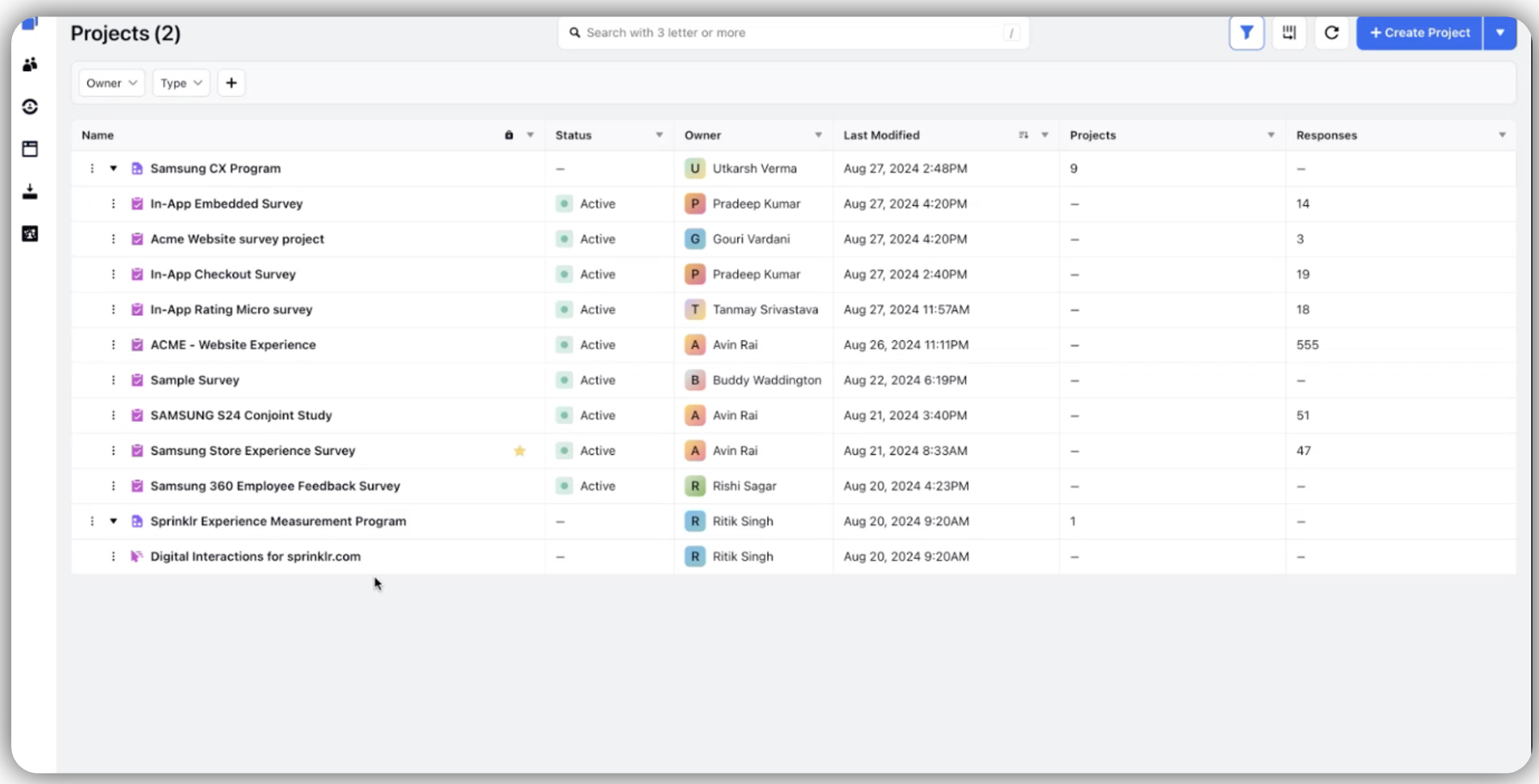
Clicks Create and Enable to access the dashboard.
Click Creative Attached and find the creative that is attached.
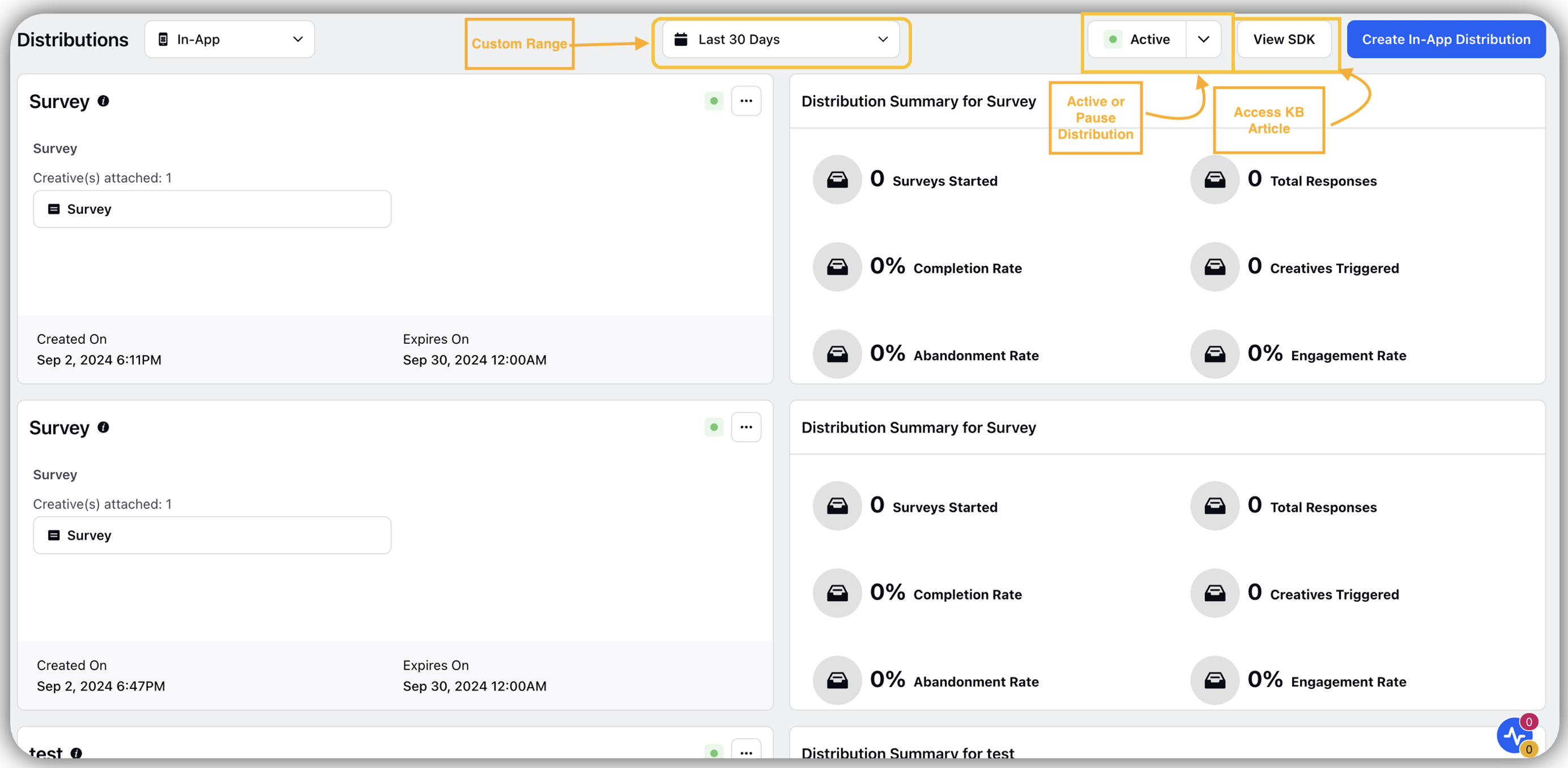
Check Distribution Summary for Creative to find the following details:
Survey Started: Check for surveys started count.
Total Response: Check for total responses.
Completion Rate: Check for % competition rate.
Creatives Triggered: Check for creatives that are triggered.
Abandonment Rate: Check for % abandonment rate.
Engagement Rate: Check for % engagement rate.
Click on Custom Range to filter data.
Click Active or Pause Distribution option to pause the survey or keep the survey active.
Click Pause in the Overview Section to stop all distributions.
Click Dropdown next to Active to pause all In-App Distribution.
Click Pause Distribution by clicking on Vertical Ellipses (3 dots) for pausing a specific distribution.
Click View SDK to look for the Knowledge Base Article.
Note: Pausing will stop the survey or creatives from getting triggered.
