Distributed Home Page Widgets Configuration
Updated
The Distributed site’s homepage widgets can now be easily configured directly from the Sprinklr Space platform. All configuration options are accessible through the Distributed Control Panel (DCP), providing you with full flexibility to customize and manage widgets to suit your needs. In this article, we'll guide you through the process of configuring widgets on the homepage and explain the different widget types available on the platform.
1. Navigation to Distributed Control Panel
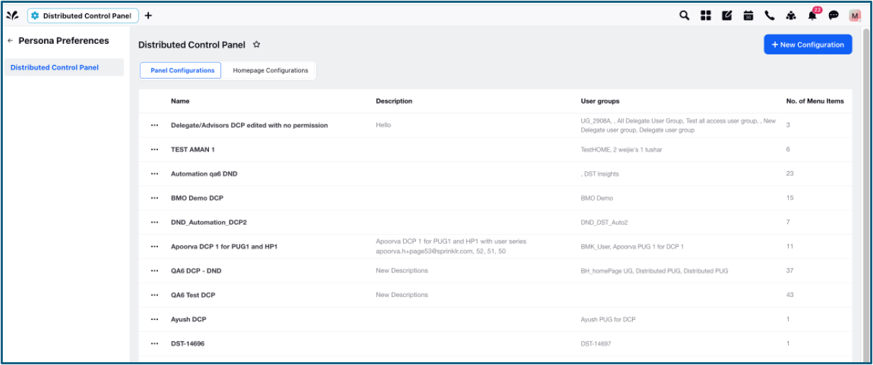
Distributed Control Panel (DCP) can be accessed rom the Sprinklr Space platform. Open a new tab and navigate to All Settings > Persona Preferences > Distributed Control Pane. In the DCP, you will have access to all configuration settings for the homepage and distributed platform. The DCP screen will look like this:
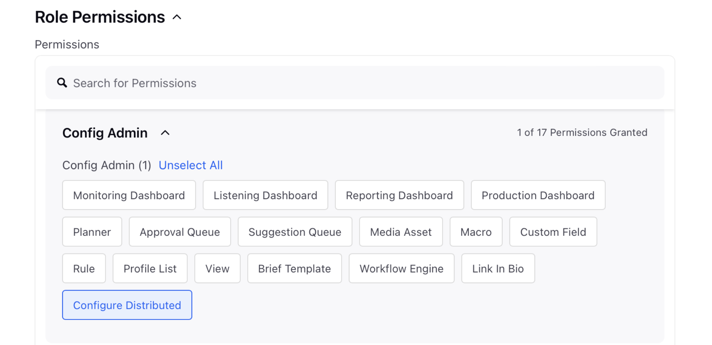
Note: DCP is permission controlled. Enable the Configure Distributed permission within Config Admin under Workspace Roles to access the DCP. This is only applicable to Global Admins and Workspace Admins.
2. Overview of DCP Configuration Tabs
Once you land on DCP, you'll see two options on top to configure the Distributed Platform: Panel Configurations and Homepage Configurations. The Panel Configurations tab will be displayed by default on DCP.
Key Updates in the DCP Screen include:
Search & Refresh: A search bar and a refresh button for quick navigation and data updates are available.
Sorting & Positioning: The Latest created DCP appears at the top of the list. Sorting options are available for Name, Created On, and Last Modified columns.
Column Enhancements:
Serial Numbering is available.
Renamed columns: User Groups → Assigned User Groups, Number of Menu Items → Number of Menus.
Created On and Last Modified columns with sorting are available.
2.1 Panel Configuration (formerly App Configuration)
The first section you’ll encounter in the DCP is Panel Configuration. This is where you manage all the menus and the theme on the distributed site. You can either create a new configuration or edit an existing one.

2.1.1 To Create a New Panel Configuration
Click on New Configuration at the top right.
Fill in the Basic Details, Menu Details, App Properties, Theme, and Platform Links, and click Save.
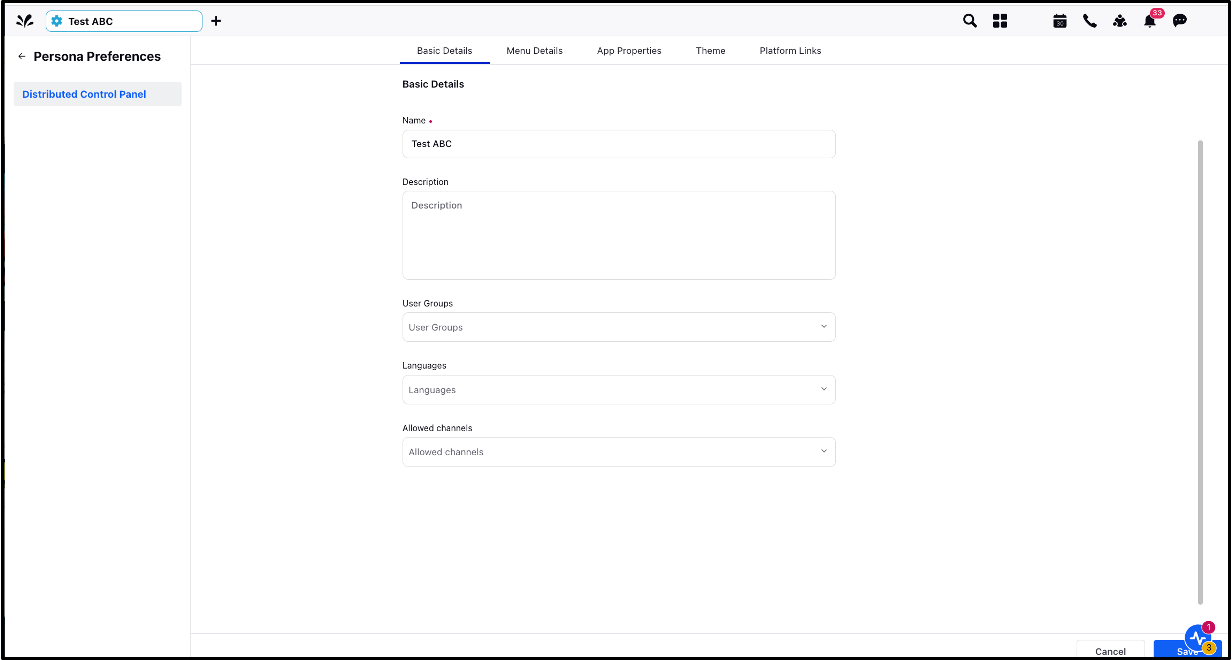
2.1.2 To Edit an Existing Panel Configuration
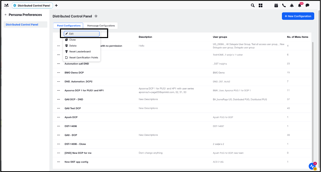
Click on the ellipsis next to the Name field in the Panel Configurations page.
Select Edit.
Modify details in the Basic Details, Menu Details, App Properties, Theme, and Platform Links tabs, then click Save.
Note: Under Menu Details, you can select the Homepage menu item (highlighted in orange below). However, this will only be a placeholder until the homepage is fully configured (i.e., until you add widgets and provide relevant data).
2.1.3 To Clone an Existing Panel Configuration
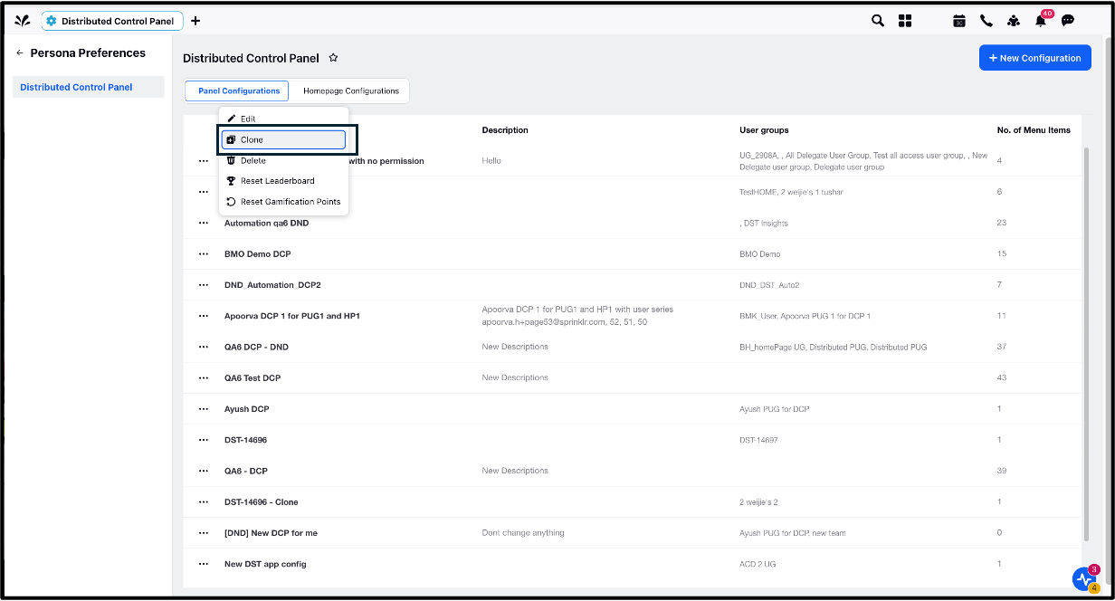
Click on the ellipsis next to the Name field in the Panel Configurations page.
Select Clone.
Enter the name for your cloned Panel Configuration, and click on Save.
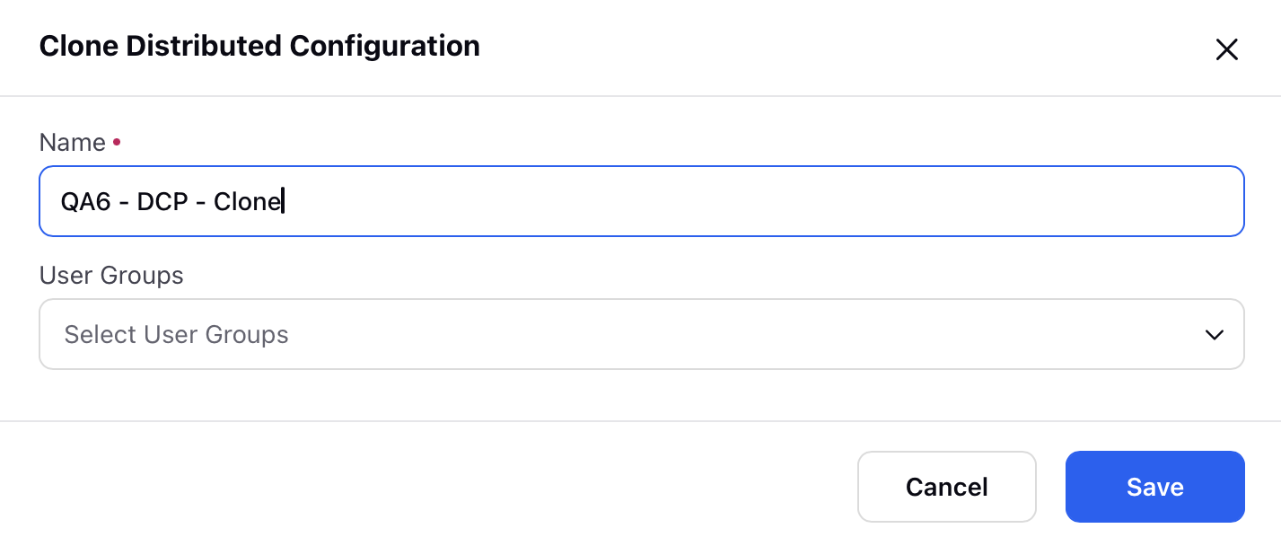
Click Save.
2.2 Homepage Configuration
The second configuration type is for managing Homepages. Here, you can either create a new homepage or edit an existing one. You can also add multiple widgets to customize your homepage that match your business requirements.

Note: Access to this feature is controlled by the dynamic property: DISTRIBUTED_HOMEPAGE_V2_ENABLED. To enable this feature in your environment, reach out to your Success Manager. Alternatively, you can submit a request at tickets@sprinklr.com.
Key Updates in the Homepage Screen include:
A Tooltip displays “Default Homepage” in respective languages (German, Portuguese, Spanish, French, Italian, Dutch).
A Description field is also available.
2.2.1 To Edit an Existing Homepage
Hover over the vertical ellipsis next to the Name field on the Homepage Configurations page to see the available actions. One of the actions is Edit Homepage which lets you edit the entire homepage template.

The other key actions you can perform through this action menu:
Delete: Removes the homepage.
Set as Default: Sets this homepage as the default for all user groups with no assigned homepage (Only one default homepage is allowed).
Edit Properties: Modify the homepage’s Name and assign User Groups to the homepage. After saving, you will land on the Editor screen, where you can drag and drop widgets to configure the homepage layout.
Clone: Creates a copy of the homepage to reuse for a similar layout.
Note: If a user group is already assigned to a homepage, you cannot assign the same user group to another homepage.
2.2.2 To Create a New Homepage
Click on the Create Homepage icon on the top right corner of the Homepage Configurations page.

A new window will open up with basic details such as Name and User Groups. Fill in the details and click Save.
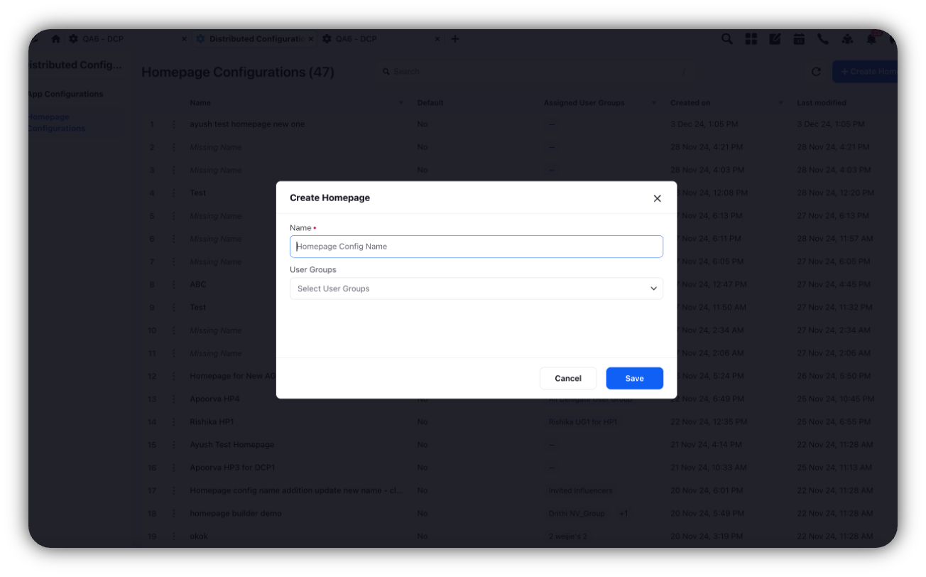
Once Saved, you will be directed to the Editor screen, where you can drag and drop widgets from the Available Widgets panel to configure the homepage.
Click Save once your layout is configured.
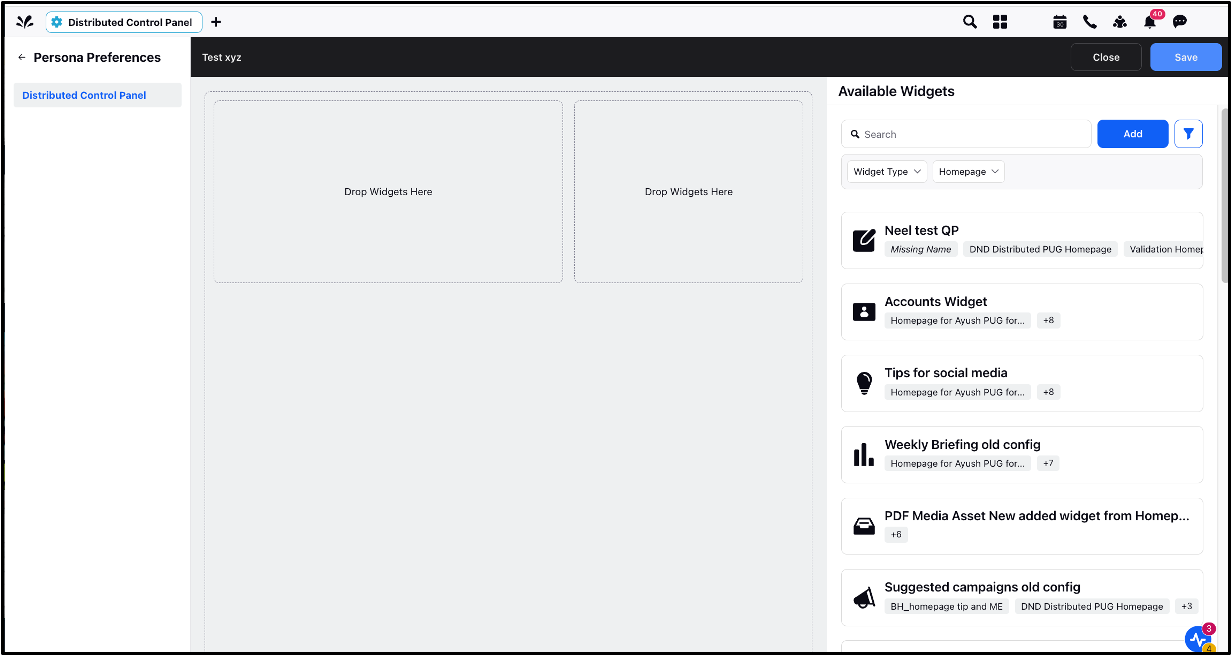
3. Configuring Widgets on the Homepage
3.1 To Filter based on Widget Type
You can filter widgets by their type by selecting Widget Type filter.
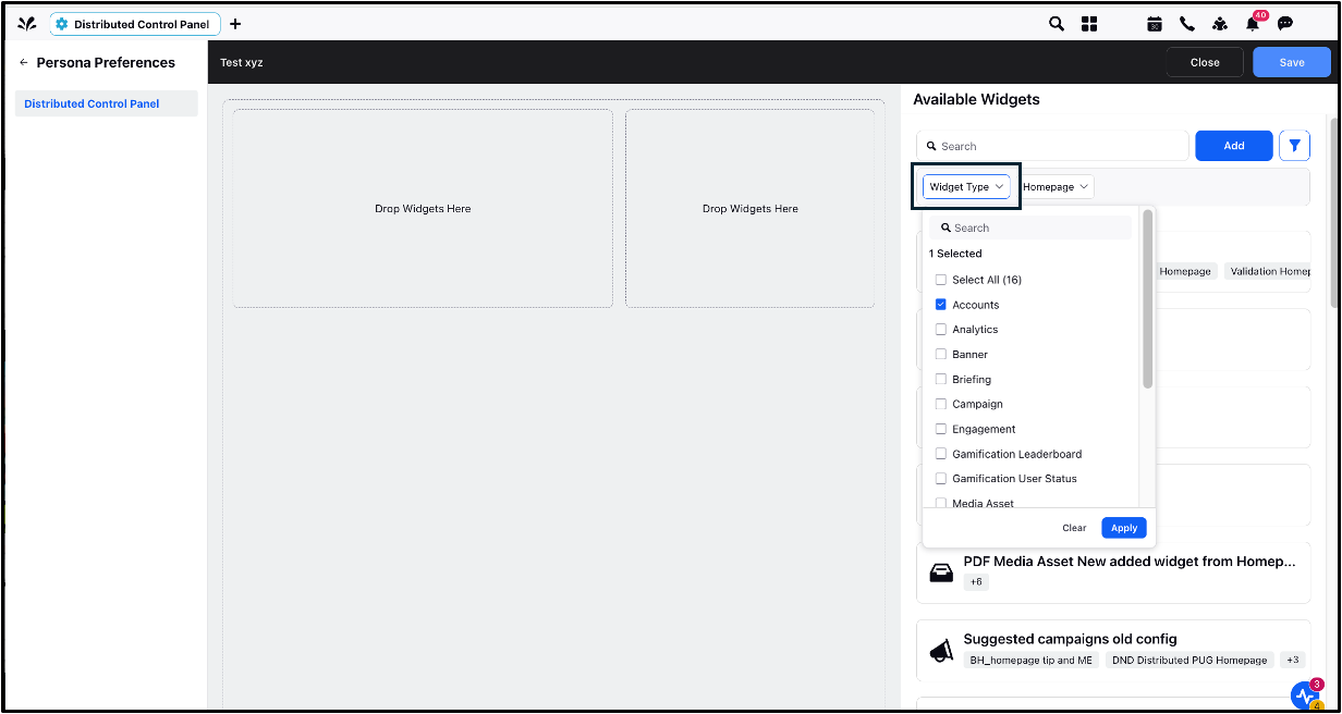
This will display all 16 available widgets. Select the widget you want, and a list of all versions of the widget will appear. Choose the one you like, and drag and drop it, and click Save. The widgets added will appear on your Homepage.
3.2 To Filter Widgets on a Homepage
From the Available Widgets panel, Click Homepage Filter to view the list of Homepages, and use the dropdown to select a homepage. All widgets assigned to that homepage will appear on the right panel.
3.3 To Add a New Widget
Click on Add under the Available Widgets panel to open the Widget Library. The Widget Library contains 12 widget types that can be added to your homepage. Select a widget, fill in the required details, and click Save.
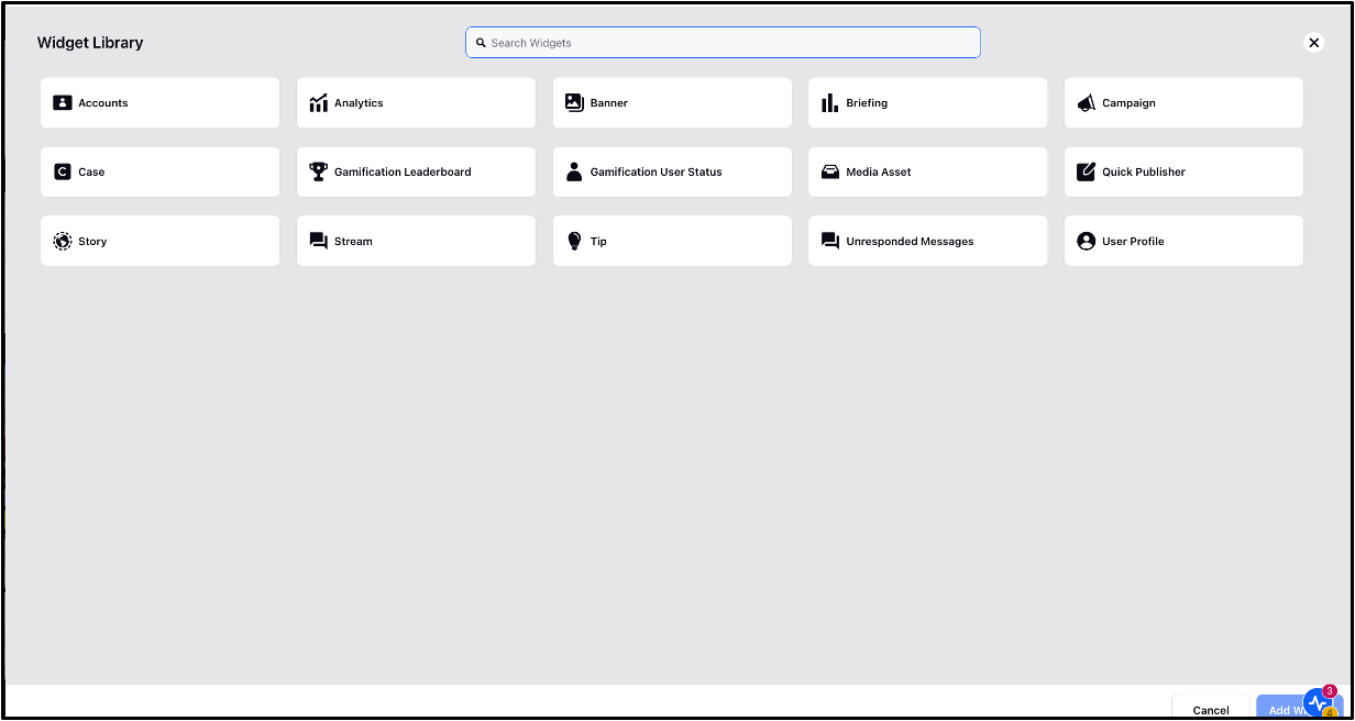
4. Key Widgets and their Configuration Process
4.1 Tip Widget
The Tip widget in the Home Page will help you guide the Distributed Users so that they perform better and bring greater results. It’s only supported in the right column.
To Configure the Tip Widget:
Go to the Available Widgets panel and click Add Widget.
Select Tip widget.
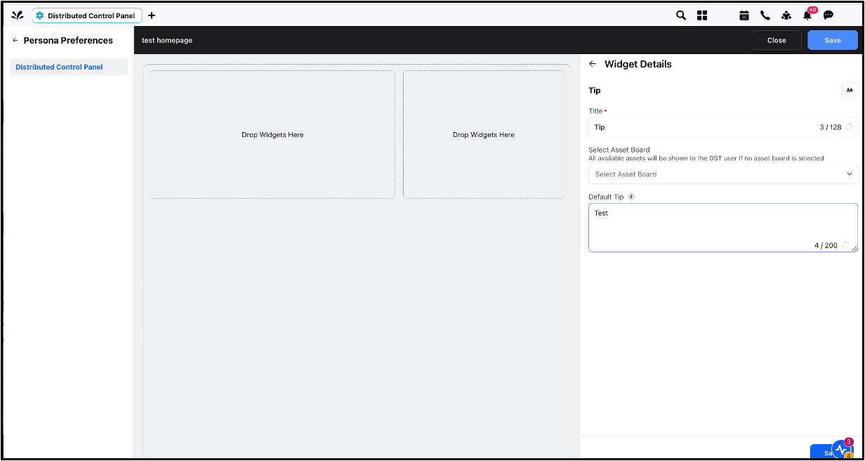
Fill in the following fields:
Select Asset Board: All the text assets of the selected board will appear as tips. When no asset board is selected, then all the available assets will be shown to the user.
Default Tip: Enter a default tip that will be displayed when no specific tip is available.
Click Save.
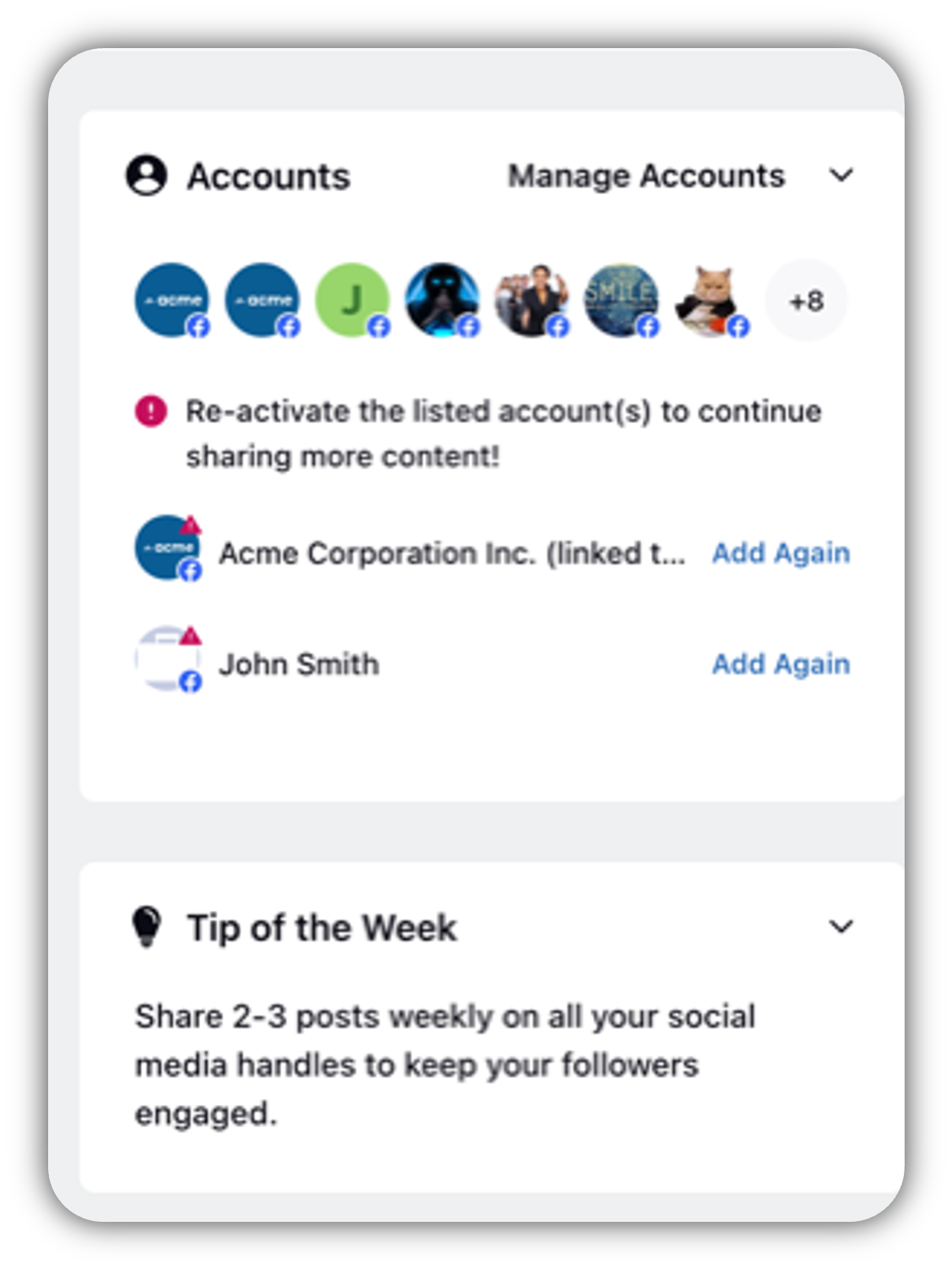
Once the widget is added to the homepage, the below image depicts how it is visible to the Distributed users.
For Localization: Click Edit Translations icon, select the Language, add the respective translation in that language, and click Save.
Note: The localization can be added to all the widgets by clicking on the ‘Edit Translation’ icon.
4.2 Media Asset Widget
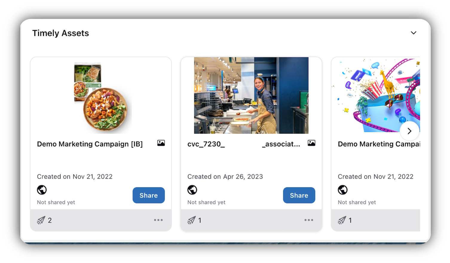
The Media Asset widget makes it extremely easy for the Distributed User to share content. Using this widget, the Admin can suggest assets to the Distributed Users, which will appear on their home page. The distributed user can click on Share to publish the assets, this makes it quick and easy for the Users to publish. The Users can double-click on the asset (image or video) to view the media details in the third pane, they can also play the video in the third pane.
To Configure the Media Asset Widget:
Go to the Available Widgets panel and click Add Widget.
Select Media Asset widget.
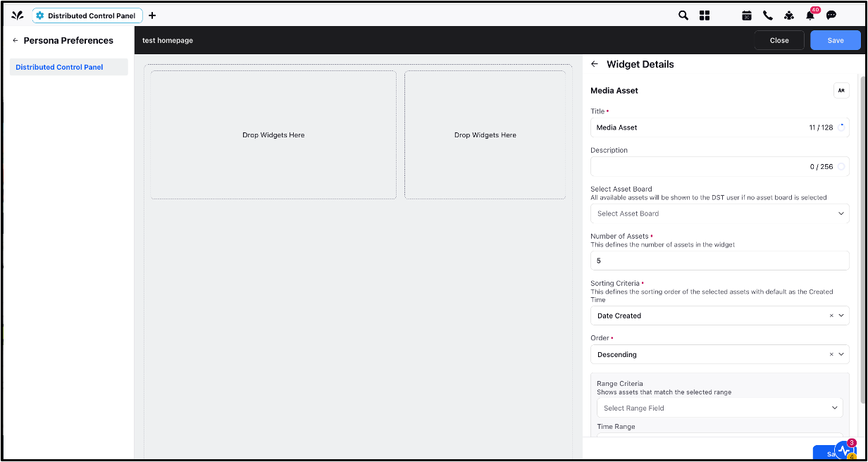
Configure the following fields:
Asset Board: Choose the asset board from which the media items should be displayed. If no asset board is selected, it will fetch all assets the user has permission to.
Number of Assets: Specify the number of assets you want to display for Distributed users.
Sorting Criteria: Select the sorting options from the dropdown menu, which decides the sorting of the assets for DST users that are filtered based on the Range Criteria.
Order: Select Descending or Ascending from the dropdown that will be applied to the sorting criteria.
Range Criteria: This field defines the criteria on which the assets would be filtered to the distributed users.
Time Range: Select the time range on which the Range Criteria has to be applied.
Note: Range Criteria decide what assets to show to the distributed users, and Sorting criteria decide the ordering within those assets shown to the distributed users.
Click Save.
Once the widget is added to the homepage, the below image depicts how it is visible to the Distributed users.
Note: If the asset board is not shared with the distributed users, the content in that asset board will still be visible to the users on the homepage.
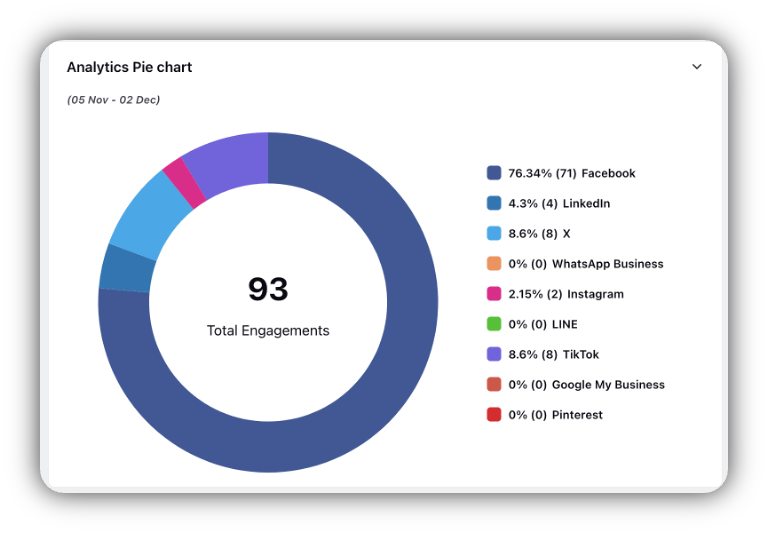
4.3 Analytics Widget
The Analytics widget presents reporting data, typically sourced from dashboards. It allows Distributed Users to access reports relevant to their activities within the Distributed environment. The reporting widgets available to Distributed Users are identical to those found in the Space Reporting environment.
To Configure the Analytics Widget:
Go to the Available Widgets panel and click Add Widget.
Select Analytics.
Fill in the following fields:
Dashboard: Choose the dashboard you wish to report on.
Widget: Select the specific widget within the dashboard.
Time Range: Specify the time range for the report.
Click Save.

Notes:
Make sure the dashboards and widgets are pre-configured in Sprinklr Space Platform before assigning them here.
If the dashboard is not shared with the distributed users, the widget will still be visible to the users on the homepage.
Once the widget is added to the homepage, the below image depicts how it is visible to the Distributed users.
4.4 Unresponded Messages Widget
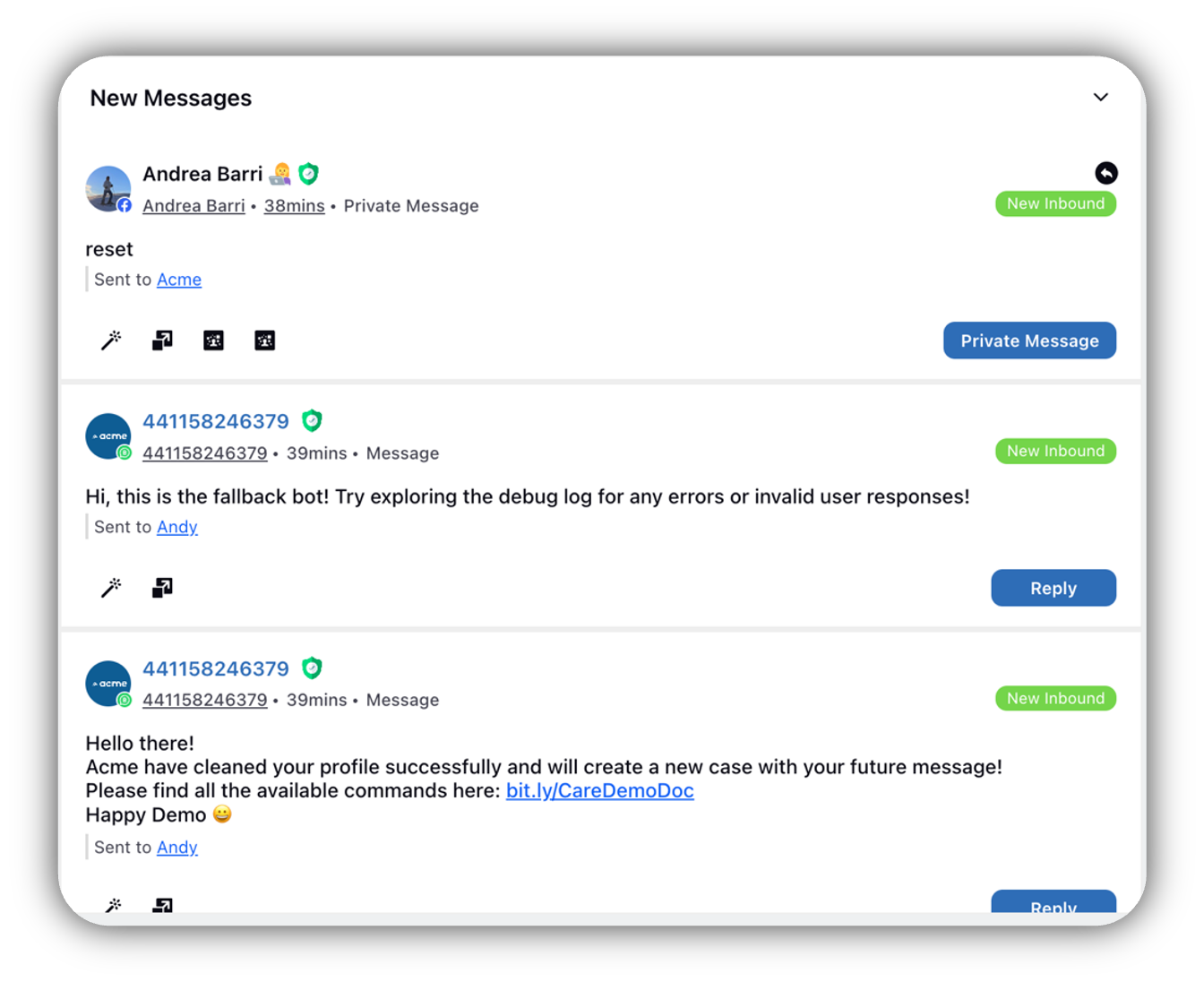
This widget shows all inbound messages or posts that have not been responded to or engaged with. If you have replied to a message, you will see a Replied icon next to the message.
To Configure the Unresponded Messages Widget:
Go to the Available Widgets panel and click Add Widget.
Select Unresponded Messages widget.
Configure the Message Count field (specifying how many Unresponded Messages to display).
Next, select the Channel for which you want to view the unresponded messages.
Click Save.

Once the widget is added to the homepage, the below image depicts how it is visible to the Distributed users.
4.5 Stream Widget
The Stream widget displays real-time or historical data related to messaging streams, such as activity on social media channels. You can also create channel specific streams or Posts that are in approval or that have been published and add them to the homepage to indicate the users to focus majorly on the specific type of posts.
To Configure the Stream Widget:
Go to the Available Widgets panel and click Add Widget.
Select Stream widget.
Configure the following fields:
Message Count: Specify the number of messages to display.
Dashboard: Select the dashboard from which the stream data will be pulled.
Stream: Choose the specific stream within that dashboard, that displays the messages contained within that stream for users.
Click Save.
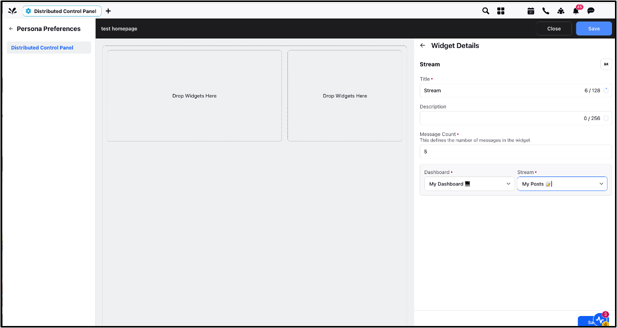
Once the widget is added to the homepage, the below image depicts how it is visible to the Distributed users.
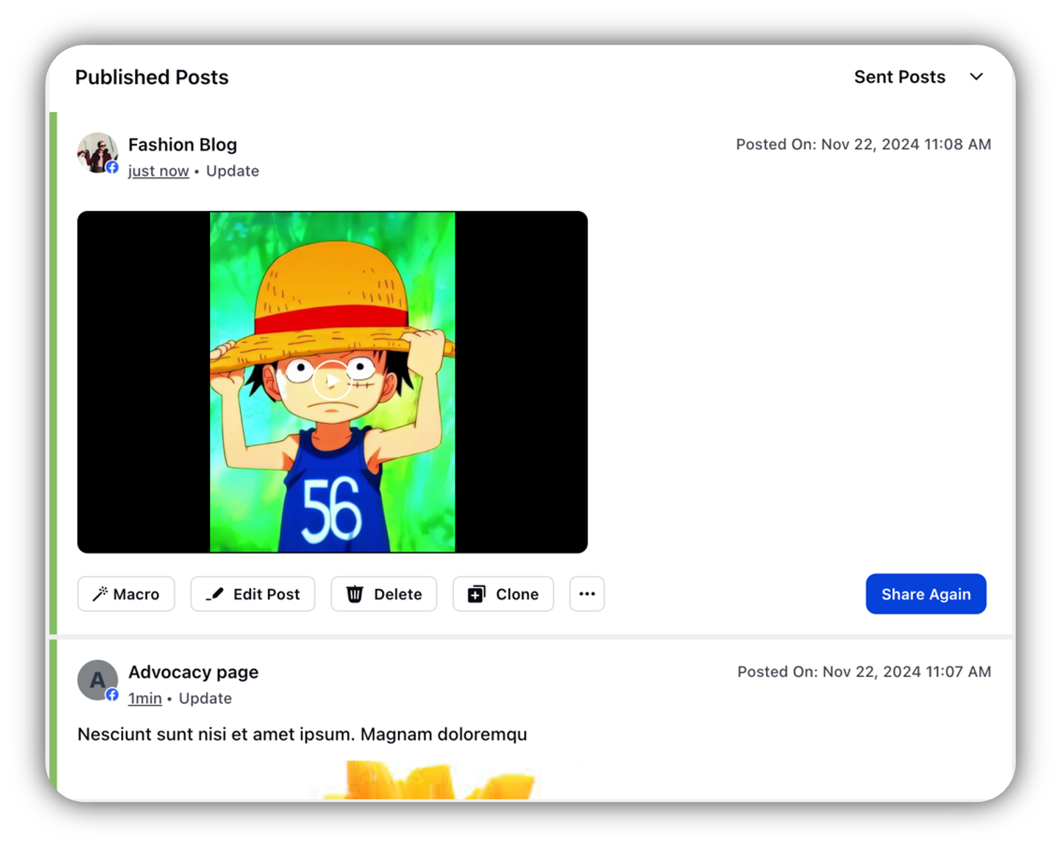
Note: If the dashboard is not shared with the distributed users, the messages will still be visible to the users on the homepage.
4.6 Quick Publisher Widget
The Quick Publisher widget is a shortcut for creating posts on social media or messaging platforms without having to go into the Create Post button on DST. You can also configure channel-specific actions that are frequently used, which will be accessible with a single click.
To Configure the Quick Publisher Widget:
Go to the Available Widgets panel and click Add Widget.
Select Quick Publisher widget.
Configure the following fields:
Label: Enter the label that will appear as the button on the widget.
Type: Choose Media or Template.
Media Tab: This appears only after the Media is selected in the Type field. You can choose the type of media (such as Image Template, Add from DAM and Upload Media) that the DST user should be able to quickly access.
Channel: You can select the channel specific template.
Account Type and Post Type: Select the corresponding account and post type for the specific channel.
Click Save.
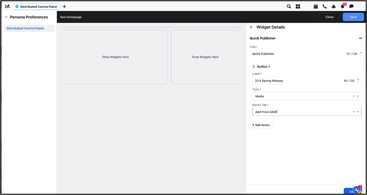
Once the widget is added to the homepage, the below image depicts how it is visible to the Distributed users.

The below table contains the list of options available to configure in the Quick Publisher Widget.
Channel | Account Type | Post Type |
| Facebook Profile | Album; Live Video; Post; Story |
Facebook Page | Album; Live Video; Cross Post Video; Post; Reel; Story | |
Facebook Group | Group Album; Group Live Video; Group Post | |
| User | |
LinkedIn Company | Company | |
Post; Reel; Story; Video; Photo; Carousal | ||
X | X | Post |
YouTube | YouTube | Video |
Google My Business | Google My Business | Alert; Event; Post; Offer; Standard |
Board; Pin; Web | ||
SMS | SMS | Post |
Standard | ||
Lithium
| Lithium | Post |
Lithium Community | Post | |
WhatsApp Business | WhatsApp Business | Post |
Sina Weibo | Sina Weibo | Post |
Audio; Media; News; Photo; Template; Text; Video | ||
Advocacy | Advocacy | Community News; Display Content; Influencer Content; Upload Content |
Viber
| Viber | Contact Card; File; Image; Link; Template; Text; Video |
Viber Service | Services Image; Services Image Text Button; Services Text; Services Text Button | |
Line | Line | Audio; Rich Image; Photo; Template; Text; Video |
TikTok | TikTok Business | Post |
4.7 Briefing Widget
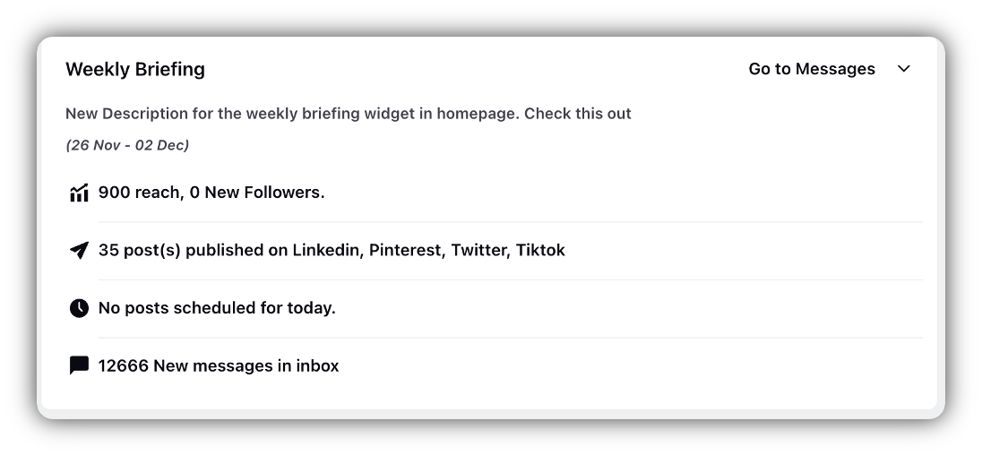
The Briefing widget provides a quick overview of Distributed user’s performance of the messages and published posts, new followers, and other updates for a selected timeframe. These details will give them the insights that they need to better their performance.
To Configure the Briefing Widget:
Go to the Available Widgets panel and click Add Widget.
Select Briefing widget.
Configure the following fields:
Briefing Categories: Select which categories (e.g., reach, followers) to display.
Time Range: Specify the time range for the data.
Inbox New Messages: This appears only when the ‘Inbox New Messages’ category is selected. Count of all the new messages of the selected stream will appear to the DST user.
Click Save.
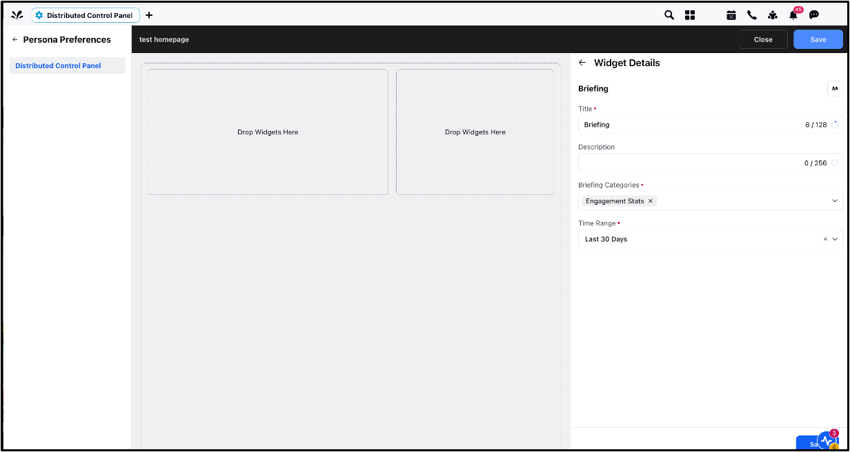
Once the widget is added to the homepage, the below image depicts how it is visible to the Distributed users.
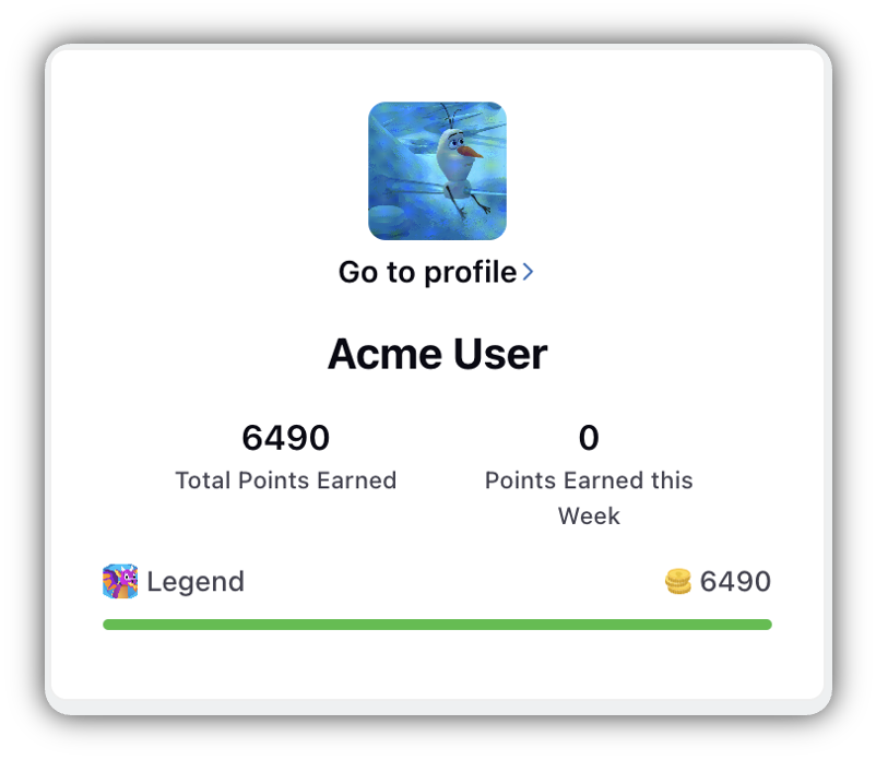
4.8 Gamification User Status Widget
The Gamification User Status widget displays your total points and points earned in a week, but it is only available if the Gamification feature is enabled.
To Configure the Gamification User Status Widget:
No configuration required — the widget will automatically show your points if the Gamification feature is added to the homepage.
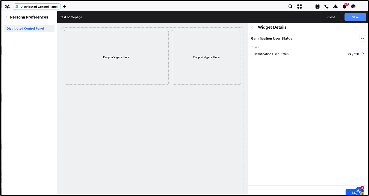
Once the widget is added to the homepage, the below image depicts how it is visible to the Distributed users.
4.9 Gamification Leaderboard Widget
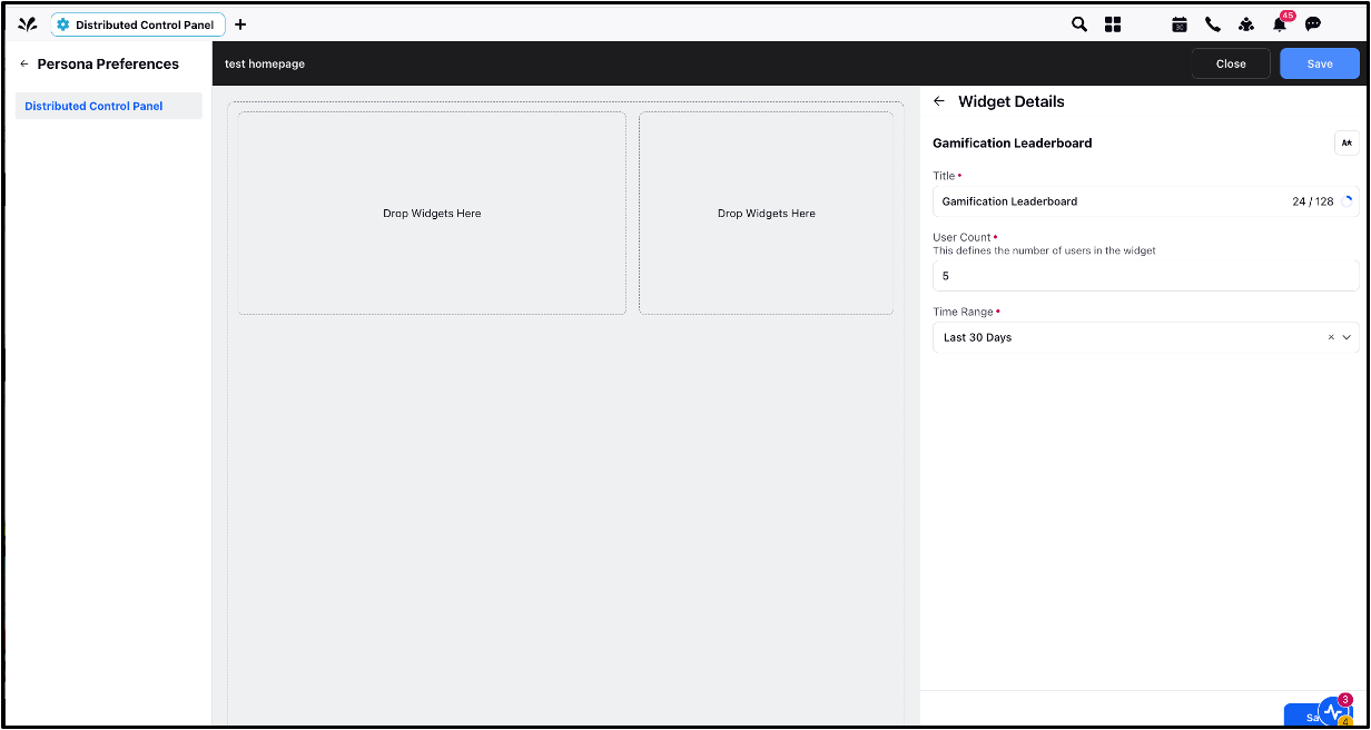
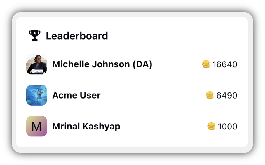
Using Gamification, you can motivate the Distributed Users to get habituated with the environment better. This widget displays the top DST users with the highest gamification points. This is also available only if Gamification feature is enabled.
To Configure the Gamification Leaderboard Widget:
Go to the Available Widgets panel and click Add Widget.
Select Gamification Leaderboard widget.
Configure the following fields:
User Count: Select the number of users in this widget.
Time Range: Specify the time range for which the points have to be calculated.
Click Save.
Once the widget is added to the homepage, the below image depicts how it is visible to the Distributed users.
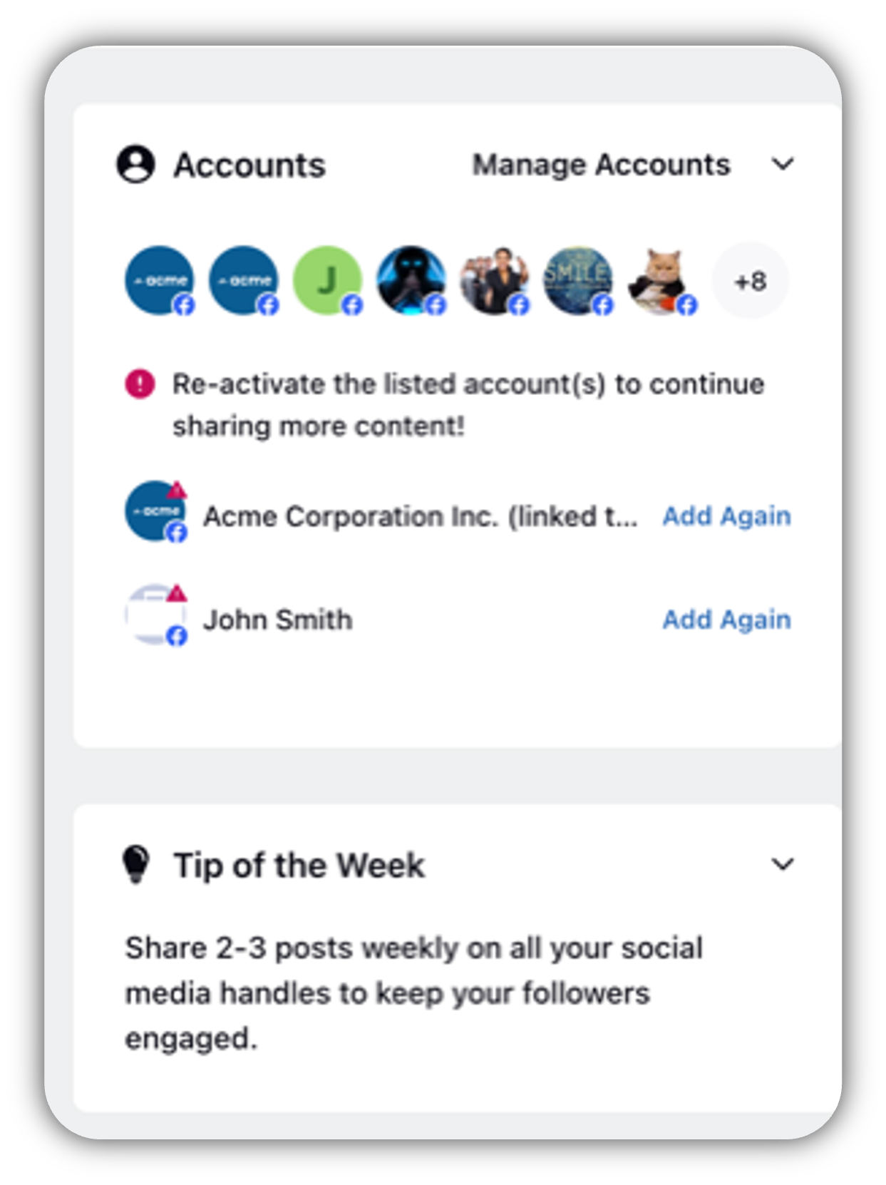
4.10 Accounts Widget
The Accounts widget displays all channel accounts linked to the DST platform. With the help of the Account Summary widget, you can add/re-add/reactivate accounts directly from the home page. Besides, it will give you a comprehensive picture of the added channels. In addition, it will also suggest you to add accounts for channels for which you have added no account. If you click Manage Accounts, you will be directed to the Accounts Settings section where you can make necessary changes to your accounts.
To Configure the Accounts Widget:
No configuration required — Once added to the Homepage by adding the title, this widget simply lists all accounts.
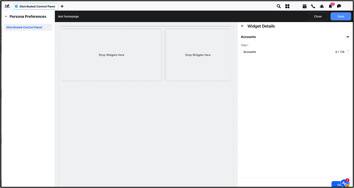
Note: You can click on the + sign next to the Channel name to add the account directly.
Once the widget is added to the homepage, the below image depicts how it is visible to the Distributed users.
4.11 Banner Widget
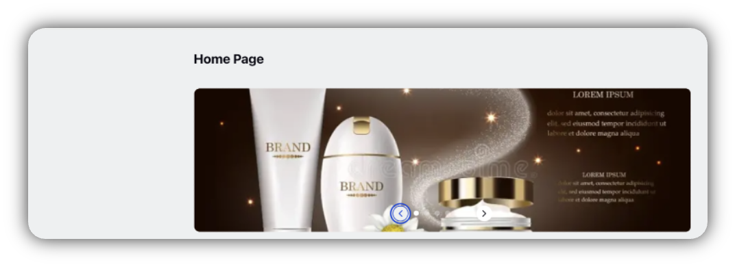
The Banner widget allows you to display images or videos that depict their brand as banners at the top of the homepage.
To Configure the Banner Widget:
Go to the Available Widgets panel and click Add Widget.
Select Banner widget.
Configure the following fields:
Media Type: Choose whether to display Photo, Video, or both.
Upload the media (photo/video) through the Media Uploader.
Redirection Link (Optional): You can also add a redirection link below the Media type to redirect the user to a particular webpage.
Click Save.
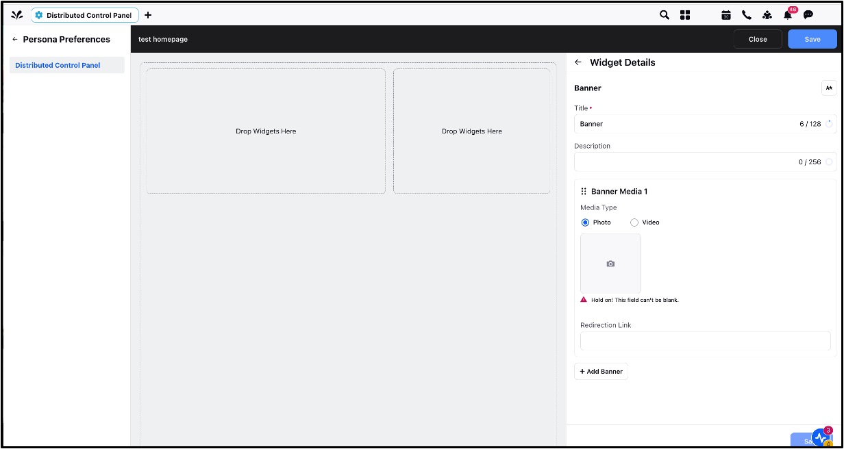
Once the widget is added to the homepage, the below image depicts how it is visible to the Distributed users.
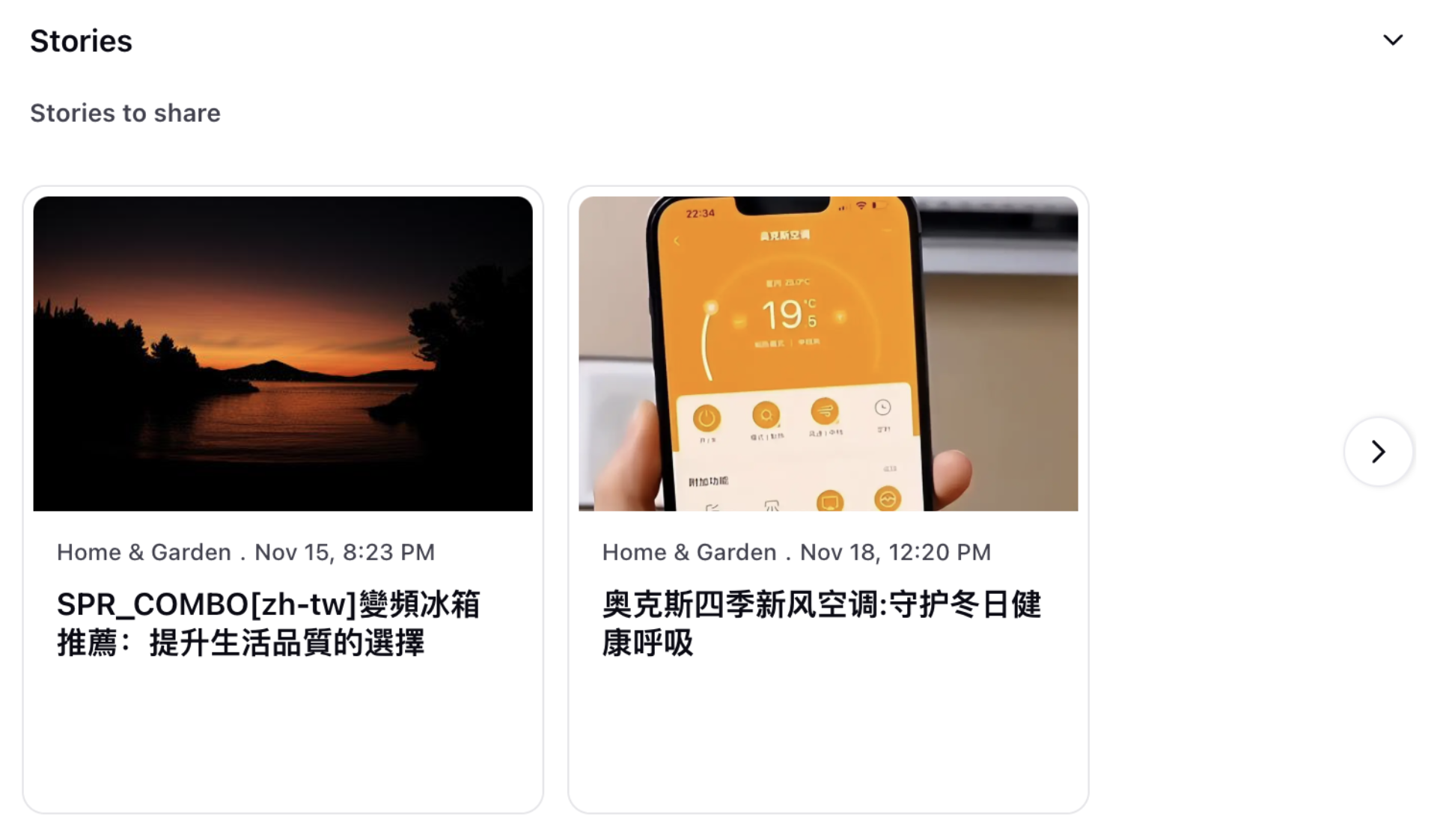
4.12 Story Widget
This widget lets you view and analyze stories from Media Insights across various date ranges. You can use the data to measure PR campaign performance, identify key media outlets and journalists, and enhance brand content.
To Configure the Story Widget:
Go to the Available Widgets panel and click Add Widget.
Select Story widget.
Configure the following fields:
Title: Enter a title for your story widget.
Description: Add a description of your widget to clarify what type of data the widget will display.
Time Range: Specify the time range for which the stories have to be displayed.
Click Save.
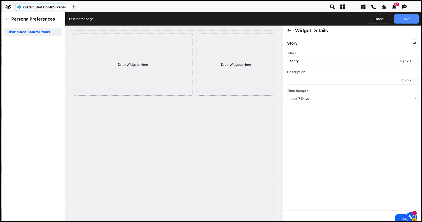
Once the widget is added to the homepage, the below image depicts how it is visible to the Distributed users.
4.13 Campaign Widget
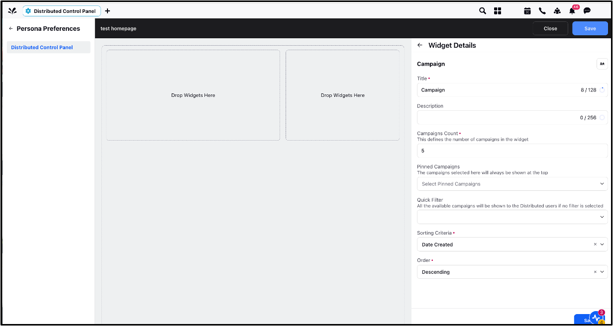
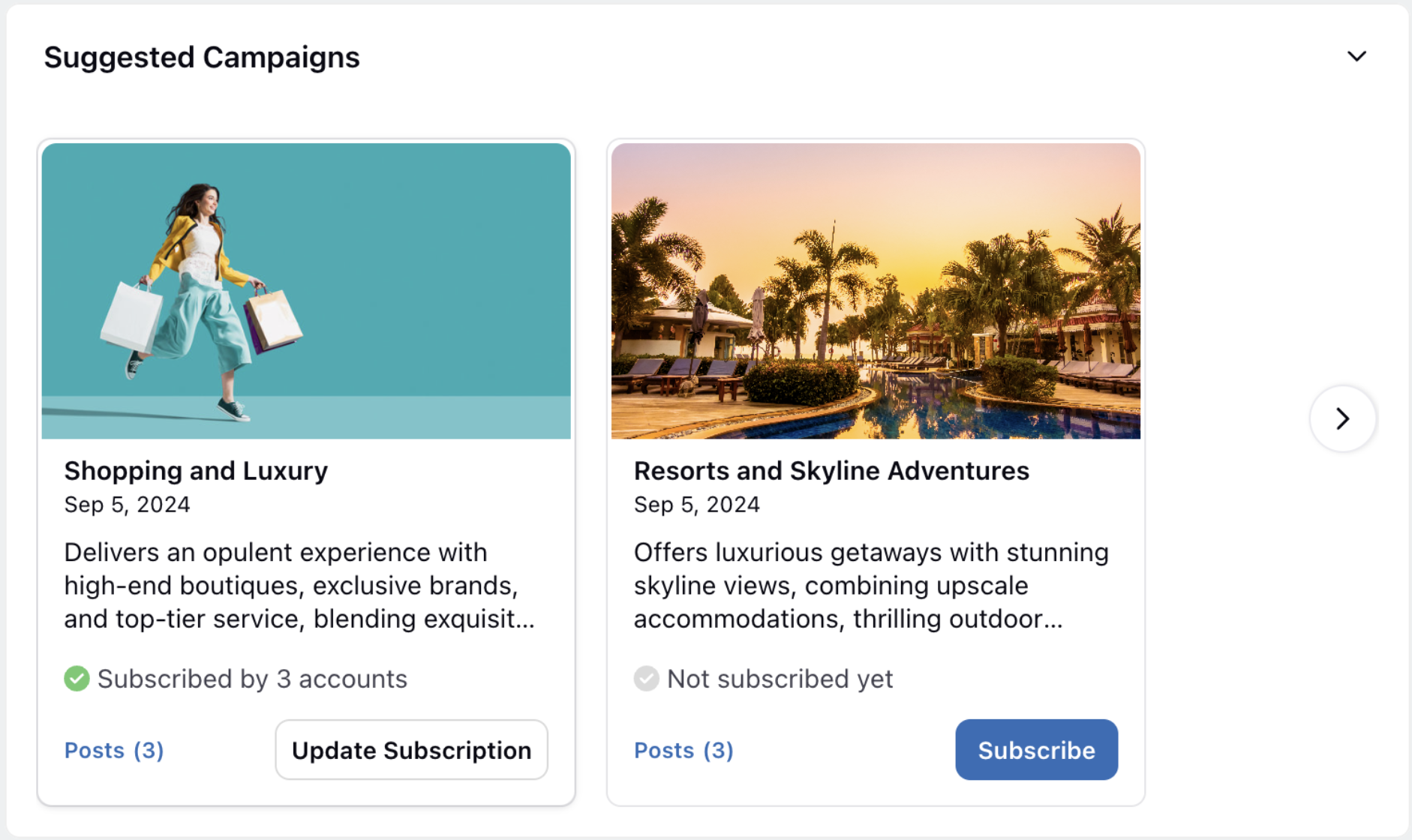
The Campaign widget shows the important campaigns selected by the admin. As an admin, you can choose which campaigns to pin to the Home Page so that Distributed Users can always view them. Use quick filters while configuring the widget to select the campaigns that should appear on the Distributed User’s home page.
To Configure the Campaign Widget:
Go to the Available Widgets panel and click Add Widget.
Select Campaign widget.
Configure the following fields:
Title: Enter a title for your widget.
Description: Add a description of your widget to clarify what type of data the widget will display.
Campaigns Count: Define the number of campaigns you want to display on the widget. You can display upto 15 campaigns.
Pinned Campaigns: Select the campaigns that you want to pin and display at the top of the widget.
Quick Filter: Select a filter to display a specific set of campaigns to users. If no filter is selected, all the available campaigns will be shown.
Sorting Criteria: Select a criteria to sort your campaigns for Distributed Users. You can sort your campaigns by creation date, campaign name, campaign start date, campaign end date and modified date.
Order: Select the order in which you want the campaigns to be displayed in the widget.
Click Save.
Once the widget is added to the homepage, the below image depicts how it is visible to the Distributed users.
4.14 User Profile Widget
The User Profile widget displays the user profile on the homepage and lets Distributed Users navigate directly to their profile. From the profile page, Distributed Users can edit their profile, view their linked account, adjust notification preferences, and more.
To Configure the User Profile Widget:
Go to the Available Widgets panel and click Add Widget.
Select User profile widget.
Enter a name for your user profile widget.
Click Save.

Once the widget is added to the homepage, the below image depicts how it is visible to the Distributed users.

4.15 Case Widget
This widget allows you to display case types as columns, similar to engagement columns.
To Configure the Case Widget:
Go to the Available Widgets panel and click Add Widget.
Select Case widget.
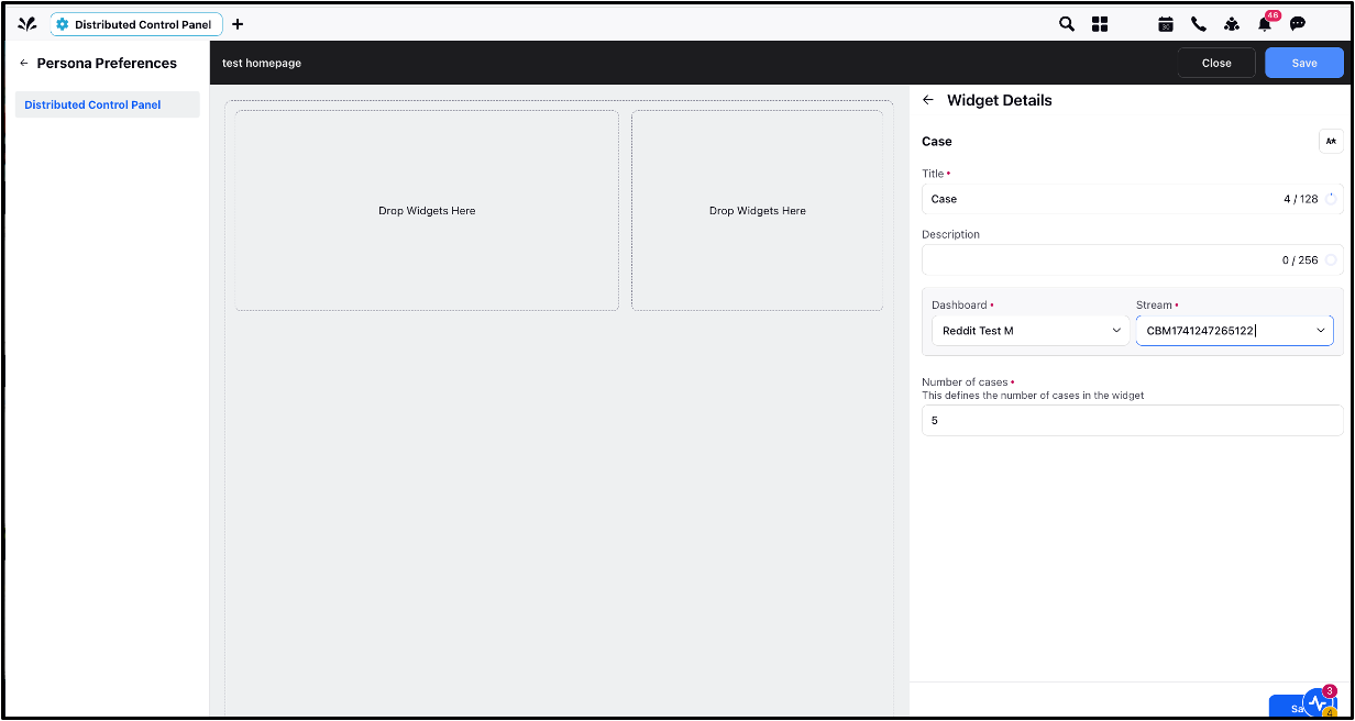
Configure the following fields:
Dashboard: Choose the dashboard that the case data will come from.
Stream: Choose the specific stream for displaying case data (This will work only if the Case type of streams is selected).
Number of Cases: Specify how many cases to display.
Click Save.
Once the widget is added to the homepage, the below image depicts how it is visible to the Distributed users.
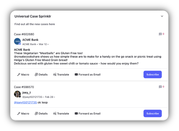
Note: There is a character limit of 50 for widget titles in the homepage configuration.
5. Widget Action Options
You can perform several actions on widgets once they have been added to a homepage.
Here are the options available:
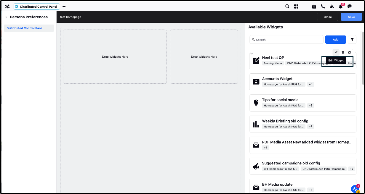
5.1 Edit Widget
Click the Edit icon to modify widget details.
Changes will be reflected in all homepages the widget is assigned to.
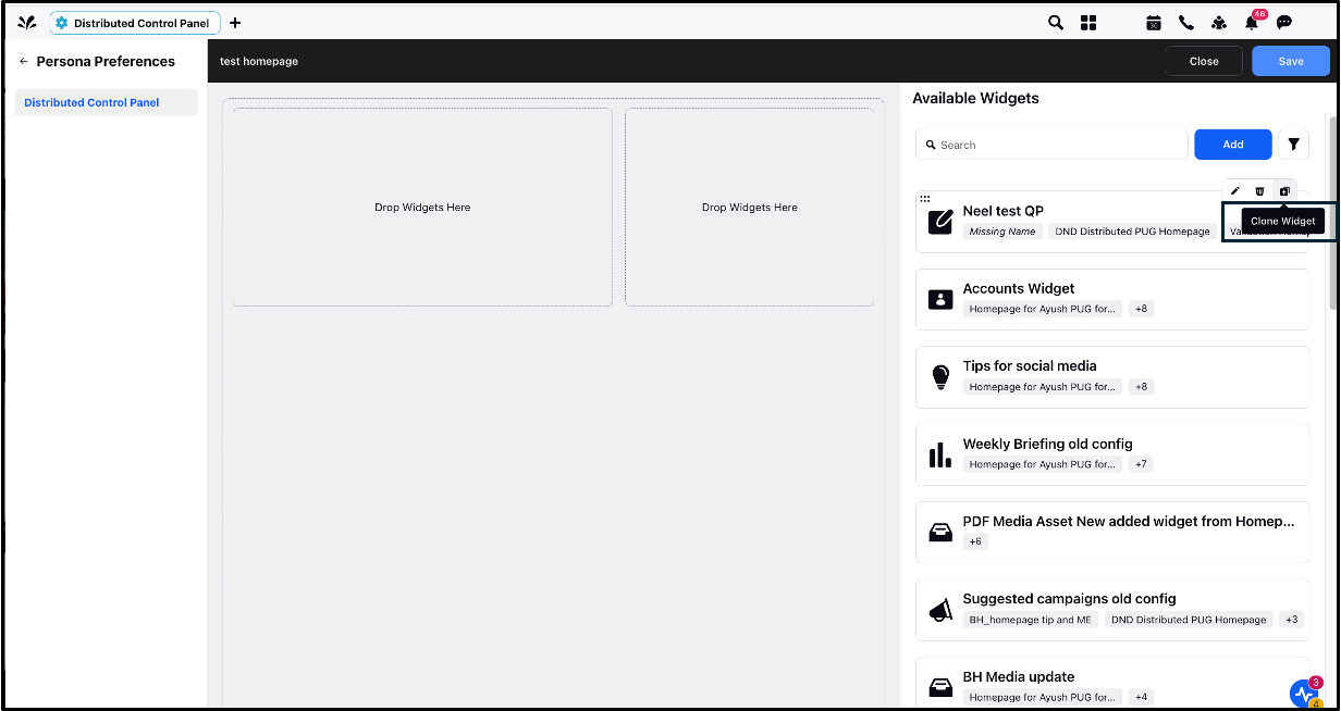
5.2 Clone Widget
Click the Clone icon to duplicate a widget for use.
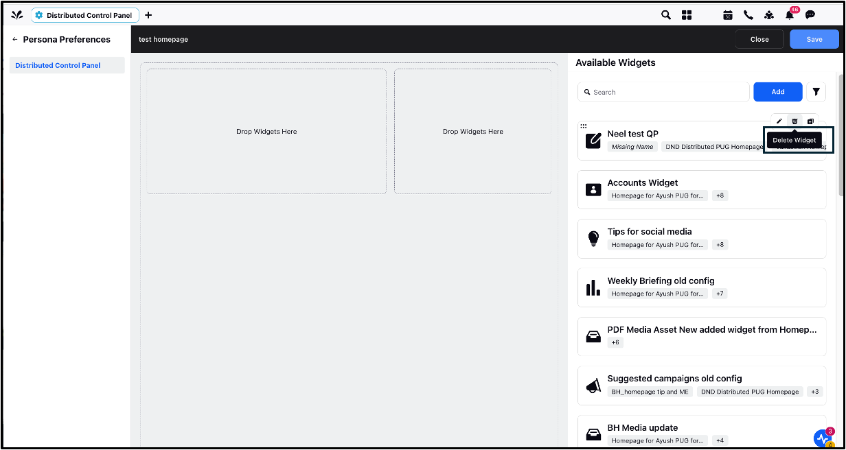
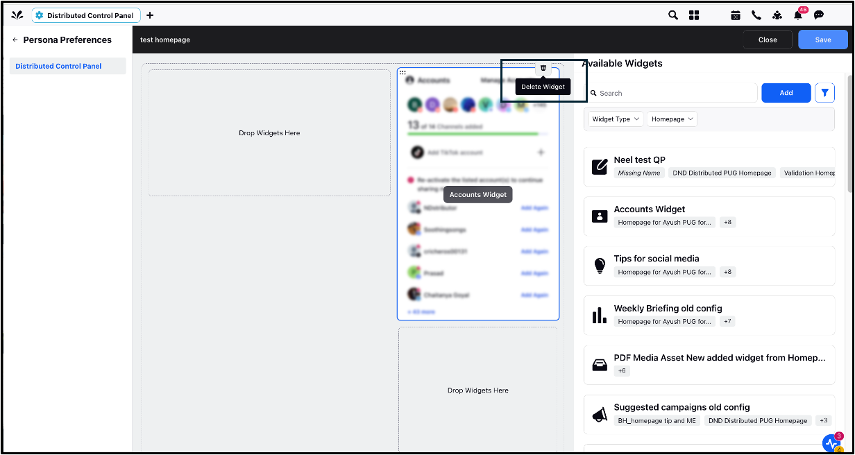
5.3 Delete Widget
Click Delete to remove a widget.
From Available Widgets: This removes the widget entirely from the right-side panel (Available Widgets), making it inaccessible on all homepages it is linked to.
From Template: This removes the widget only from the template (left-side panel of Available Widgets Screen) it’s assigned to, but the widget remains on other homepages it’s associated with.
Note: If needed, you can again drag and drop it from the Available panel. The widget is still visible on the right panel if it is assigned to other homepages.
Widget Types | Actions Supported | Left/Right Column |
Account | All actions | Right |
Analytics | All actions | Left |
Banner | All actions | Left |
Briefing | All actions | Left |
Case | All actions | Left |
Gamification Leaderboard | All actions | Right |
Gamification User Status | All actions | Right |
Media Asset | All actions | Left |
Quick Publisher | All actions | Left |
Stream | All actions | Left |
Tip | All actions | Right |
Unresponded Messages | All actions | Left |
Story | Drag and Drop | Left |
Campaign | Drag and Drop | Left |
User Profile | Drag and Drop | Right |
Social Share | Drag and Drop | Right |
5.4 All Actions: You can create, edit, assign, and unassign from homepages.
5.5 Drag and Drop: You cannot create, edit, or clone the widget. You can only assign and unassign from the homepages.
