Sprinklr Service Reporting Overview
Updated
Sprinklr Service’s Reporting provides real-time and historical insights to enhance customer service operations, enabling data-driven decisions and improved customer satisfaction (CSAT). Access to detailed metrics and Key Performance Indicators (KPIs) enables you to quickly analyze customer-service trends and insights in real time.
Sprinklr Service supports Real-time and Historical reporting to help you stay on top of contact center operations and make informed decisions using real-time data and historical analytics.
Real-time Reporting
Real-time data is available for both agents and contact center leaders through the Agent Persona Home Page and the Supervisor Console, respectively.
For Agents
The Agent Persona Home Page provides contact center agents with a real-time overview of their daily work and performance, with key metrics such as Average Handle Time (AHT), Calls per Agent, and QA Evaluation Score. The home page landing screen is visible to agents after they log in. It consists of various customizable widgets, which include:
Open Cases
Agent Closed Cases
Average Handling Time
Hold Time
Agent Escalated Tickets.
For Supervisors
The Supervisor Console provides contact center leaders with real-time monitoring of contact center operations. The console enables supervisors and managers to efficiently monitor and manage the activities of Agents, Queues, and Campaigns across all channels – voice and digital. Some of the reports available in the Supervisor Console include:
Agent Performance Report: Supervisors can analyze the performance of their agents by viewing data against different metrics like Call Count, Average Call Time, Hold Time, etc. As a unified omni-channel platform, Sprinklr allows supervisors to customize reports for different channels like Voice, Social, Email, and Live Chat.
Agent Status Report: Supervisors can use agent status reports to gather information about the availability of their agents and the time they spent resolving customer queries throughout the day. This helps supervisors to assess the quality and quantity of work done by their agents.
Social Reports: Social Reports provide important case performance reports which can help supervisors
to get deeper insight into case management.Voice Reports: Voice Reports provide important call performance reports which can help supervisors to get deeper insight into voice call management.
Queue Health Reports: Queue Health Reports provide an overall summary of different queues to which the cases/calls are assigned.
Campaign Reports: Campaign Reports provide a summary of the standard reports that comes with the Supervisor Console which can be used to monitor the overall performance of campaigns run by their team.
Historical Reporting Using Care Reporting
While the Agent Persona Home Page and Supervisor Console focus on real-time data, Care Reporting allows you to analyze historical data. Care Reporting is designed to provide a snapshot of your contact center’s operations over particular periods of time – such as the current day, week, month, year, and so on. You can even compare performance over two different time periods using the Compare Mode functionality, such as comparing this week’s performance to last week’s performance.
In this overview of Sprinklr Service’s Care Reporting, you will understand the key reporting concepts to help contact center agents, supervisors, managers, and admins understand how to leverage the various reporting capabilities available. These will include the role of dashboards, widgets, sections, metrics, dimensions, data sources, filters, date ranges, reports, and more.
Key Terms
Following are some of the key terms that are critical to reporting in Sprinklr:
Dashboard: A reporting dashboard is a collection of widgets that contain visualizations of data based on different metrics and dimensions. Dashboards can consist of one or more sections, with each section containing a collection of widgets.
Sections: Sections are distinct areas within the dashboards under which widgets can be created. Each dashboard can have one or more sections, and each section can contain multiple widgets. They are like tabs in other software and help organize the dashboard into manageable parts, making it easier to focus on specific areas of interest.
Widgets: Widgets are visual reporting elements that graphically present information in an organized format for a specific audience and purpose. Widgets are placed inside sections within dashboards.
Metrics: Metrics are measurable values or Key Performance Indicators (KPIs). They can be the total number of cases, Average Handle Time (AHT), Service Level Agreement (SLA), and more. You must select at least one metric when creating a widget.
Dimensions: Dimensions are fields that are used to categorize metrics to further sort or filter metrics in widgets. For example, for the SLA metric, you might choose to view SLA by a particular dimension, such as by Agent, Channel, Queue, or Date.
Filters: Filters are used to provide a focused visualization of data by selecting specific dimensions of interest. They can be applied on a widget, section, dashboard, or user (contextual) level.
Date Range: Date Range can be used to filter the data displayed based on a selected period. Date ranges can be applied on the widget, section, or dashboard level.
Reports: Reports are hidden, behind-the-scenes data objects in Sprinklr that store collections of related data – such as metrics, dimensions, and timestamps. Reports support use cases such as analyzing case volume, SLA Adherence, Agent Occupancy, or use of tools like Macros and Surveys.
Data Sources: In Sprinklr, data is recorded and stored in separate locations called Data Sources, with each data source containing information related to a specific Sprinklr product use case (such as User Login, Message Count, Case SLA, and so on). Data sources determine which metric(s) and dimension(s) are available when
creating widgets.Visualization: Sprinklr Reporting provides multiple visualizations (such as bar charts, pie charts, tables, and so on) that you can use to display data in widgets. You select a visualization when creating a widget.
Reporting Concepts
In Sprinklr Service, reporting is through dashboards, which are divided into sections containing widgets. These widgets display data based on selected metrics and dimensions, providing accurate and up-to-date information. You can tailor dashboards, sections, and widgets to meet specific business needs, ensuring relevant insights for informed decision-making.
Sprinklr offers Standard Dashboards and Custom Dashboards.
Standard Dashboards: Standard Dashboards are pre-built dashboards that have several pre-defined widgets which provide information on industry-standard KPIs. You cannot add widgets to standard dashboards. Some examples of the standard dashboards include SLA, Bot Application Case Level Reporting, Bot Application Intent Level Reporting and more.
Custom Dashboards: Custom Dashboards, as the name suggests, are created by you. Unlike standard dashboards, custom dashboards do not have pre-defined widgets, and you must define and add widgets manually, according to your requirements.
![]() Note:
Note:
Most reporting is generated using Custom Dashboards. Unless otherwise specified, 'dashboards' and 'custom dashboards' are used interchangeably.
Although you cannot add widgets to standard dashboards, you can clone standard dashboards and then edit them.
Filters and Date Ranges can be applied to focus on specific data subsets or time periods, enhancing the clarity and usefulness of the reports. Filters allow you to focus on specific subsets of data, such as a particular product line or geographic region while date ranges enable you to view data for specific time periods, which can be useful for trend analysis, comparing performance over time and much more.
Filters can be applied at the dashboard, section, and widget levels. Widget-level filters, which only affect individual widgets, are available only on custom dashboards. Dashboard-level filters, which affect all widgets on a dashboard, are available on both custom and standard dashboards. For more information, see Reporting Filters.
In the hierarchy of filtering options, widget-level filters have the highest priority, followed by section-level filters and then dashboard-level filters. This means that if a widget-level filter is applied, it will override any section-level or dashboard-level filters for that specific widget. For example, imagine you have a dashboard with multiple sections, each containing several widgets. If you apply a ‘Date Range filter at the widget level to show only last week’s data, this widget will display data from last week, even if broader ‘Date Range’ filters are applied at the section or dashboard levels.
With centralized data across all service channels, you can drill into key metrics to gain an understanding of what's working in your contact center. Real-time data visualization and analysis make it easy to identify trends, patterns, and insights across your customer service operations – allowing you to take actions to improve performance and achieve desired business objectives.
Creating Widgets
When creating or editing a dashboard, you can either select Standard Widgets from the Widget Library or create your own Custom Widgets. Standard widgets are pre-built widgets that have pre-defined metric(s)/dimension(s), whereas custom widgets are created by you. Custom widgets do not have pre-defined metrics/dimensions, and you must define and add them manually according to your requirements.
While the Widget Library provides several Sprinklr Service-related standard widgets, you will generally want to create your own custom widgets to address your organization’s unique reporting needs. For more information, see Widget Configurations.
Sprinklr Reporting also allows you to designate Target Metrics, which will be displayed on a widget graph alongside the actual metrics. Target metrics allow you to compare the actual performance of a metric against a pre-set goal. They are also used to define quantitative measurements for tracking AHT or SLA adherence.
![]() Note: To access the Widget Editor and Library, you must first be assigned with the Widget Editor permission in Reporting permissions. For more information, see Reporting Roles and Permissions.
Note: To access the Widget Editor and Library, you must first be assigned with the Widget Editor permission in Reporting permissions. For more information, see Reporting Roles and Permissions.
Selecting Data Sources
When creating a custom widget for your dashboard, you must select a data source for the widget. The selected data source will determine which metrics and dimensions your widget can access. In Sprinklr Service, you will generally select either Social Analytics or Inbound Analytics data sources for your widgets. The Social Analytics data source is typically used for case-level reporting, while inbound analytics is often used for message-level reporting. For more information on how data sources are used across the various products in Sprinklr, see Different Data Sources.
![]() Note: There is also a data source for Sprinklr Service labeled Voice Analytics that allows you to report on voice-related metrics such as Average Ring Time, Calls Abandoned Within IVR, Agent Average Hold Time, and more. However, most of the metrics and dimensions included in the voice analytics data source are also available in the social analytics data source.
Note: There is also a data source for Sprinklr Service labeled Voice Analytics that allows you to report on voice-related metrics such as Average Ring Time, Calls Abandoned Within IVR, Agent Average Hold Time, and more. However, most of the metrics and dimensions included in the voice analytics data source are also available in the social analytics data source.
Selecting Metrics and Dimensions
Once you have chosen a data source for your widget, you can select one or more metrics to populate the data. You can either choose from standard Sprinklr metrics or create your own Custom Metrics.
Custom metrics allow you to create new metrics from existing standard reporting metrics or even existing custom metrics. These custom metrics are useful for gathering and analyzing data that is not automatically tracked by standard metrics. They provide the flexibility to build metrics that align with industry standards and cater to various business needs. Custom metrics enable you to develop complex and tailored metrics, helping you gain deeper insights into your data.
To create a custom metric, use metrics of your choice and combine them with supported operators/functions using the editor. Learn how to create Cusom Metrics in Reporting.
![]() Note: Ensure that all the metrics/dimensions selected in a widget belong to the same underlying data source. Metrics/dimensions from different data sources are usually not compatible with each other and may not render properly in your widgets. You must perform this check manually using the reports listed in the Sprinklr Service Reports section below, as there is currently no means to restrict the selection of metrics/dimensions from different reports when creating a widget.
Note: Ensure that all the metrics/dimensions selected in a widget belong to the same underlying data source. Metrics/dimensions from different data sources are usually not compatible with each other and may not render properly in your widgets. You must perform this check manually using the reports listed in the Sprinklr Service Reports section below, as there is currently no means to restrict the selection of metrics/dimensions from different reports when creating a widget.
Share Dashboards
Sometimes, you need to share dashboards with users who do not have Sprinklr accounts. You can do this by using the Get External Link option available on any of your reporting dashboards. When you share a dashboard this way, the recipient can access it even without a Sprinklr account. Learn how to externally share a dashboard.
Sprinklr also allows you to automatically export dashboards using the Scheduled Exports functionality. Using this functionality, dashboards can be shared automatically at pre-defined time intervals (for instance, every Monday at 10 AM) to both internal and external users. You can customize your export by selecting the file format, layout, and scheduling details. The supported file formats are PDF, Excel, PNG, PPT, HTML+, CSV, and JSON.
Sprinklr Service Reports
Reports are typically visual documents that graphically present information, making it easy to understand and analyze data. However, in Sprinklr, reports are not visible to users in the same way. Instead, they are hidden database objects that the platform uses behind the scenes to manage and process data. This means that while you won’t see these reports directly, they play a crucial role in how Sprinklr organizes and utilizes information.
Reports are subsets of Data Sources, and they determine which Metrics and dimensions are available for your dashboard when creating widgets. Sprinklr Service stores data in multiple backend reports depending on different use cases. All the major reports are available to plot under Social Analytics or Inbound Analytics data sources. Below is a list of some useful Sprinklr Service reports.
Avaialble Reports in Sprinklr Service
Inbound Case Report: Inbound case report provides metrics and dimensions that govern information about the case-level data from the time the case was opened/created in the system till the time the status of the case is closed. It includes metrics like case count, case message count, case rating, case sentiment, case CSAT, and more. ‘Case Number/Case ID' is the unique identifier of this report.
Inbound Message Report: Inbound message report provides information on inbound messages with metrics such as Sentiment, Message Count, Message ID, Brand Message and more.
Case Macro Usage Report: Case macro usage report is acomprehensive record of all macros applied to cases within the platform. It captures unique data points for each macro application, including the number of times macros were applied, the number of cases where a macro was applied, the number of agents who have used a macro, and more.
Case Processing SLA Report: Case processing SLA report provides data regarding cumulative processing time for cases, as measured by the case processing clock which runs whenever an agent opens a case in the Care Console.
Case SLA Report: Case SLA report measures SLAs related to the case and associated messages. The following actions are recorded in this report:
Brand Response
User Assignment
User Un-assignment
Queue Removal.
User Availability Report: The user availability report allows users to analyze and monitor agent availability and status within a given time range. This report includes a record of every agent login/logout and change in availability status.
Agent Occupancy Report: The agent (user) occupancy report provides data on Agent Occupancy (the amount of time the agent is logged in and actively working on cases). The record generation is based on an occupancy clock trigger that runs every hour, and the time spent in each status during that one hour is recorded.
Voice Report: The voice report provides detailed information for all voice calls (inbound and outbound), helping identify call-related parameters and trends. Each call is associated to a unique conversation ID corresponding to which all the details of that call are stored irrespective of if the call got completed in the IVR or connected to the agent.
Voice Agent Performance Report: The voice agent performance report provides a detailed breakdown of agent activity for all voice calls (inbound and outbound), helping evaluate agent performance. It provides a detailed breakdown of time spent on a call, which includes the time spent talking in the conversation, the time the call was on hold, the time the call rang on the agent’s console, and the time spent filling out the After Call Work (ACW) form.
Assignment Engine Report: The assignment engine report provides detailed queue data such as number of answered/abandoned calls per queue, average waiting time per queue, service level per queue, and more. It creates the record of every call that reaches the queue from IVR. Since this report shows how long it takes for calls to be answered or abandoned, you can determine the customer's wait time, thus improving the Average Speed of Answer (ASA).
Survey Report: The survey report contains all the timestamps and KPIs related to a survey, customer profile information and detailed data of all instances from when the survey was sent to customer to when customer responded and submitted the survey.
![]() Note: When viewing a widget in a reporting dashboard, click the ellipsis (…) icon in the upper-right corner of the widget and select the </> Generate API v2 Payload option to open a window with HTML code. This can be used to view the name of the report associated with the metric(s)/dimension(s) in the widget. The name of the report will be under the “report” tag. For instance, if the metrics/dimensions used in the widget are from the User Availability Report, it will be visible as "report": "USER_AVAILABILITY_REPORT".
Note: When viewing a widget in a reporting dashboard, click the ellipsis (…) icon in the upper-right corner of the widget and select the </> Generate API v2 Payload option to open a window with HTML code. This can be used to view the name of the report associated with the metric(s)/dimension(s) in the widget. The name of the report will be under the “report” tag. For instance, if the metrics/dimensions used in the widget are from the User Availability Report, it will be visible as "report": "USER_AVAILABILITY_REPORT".
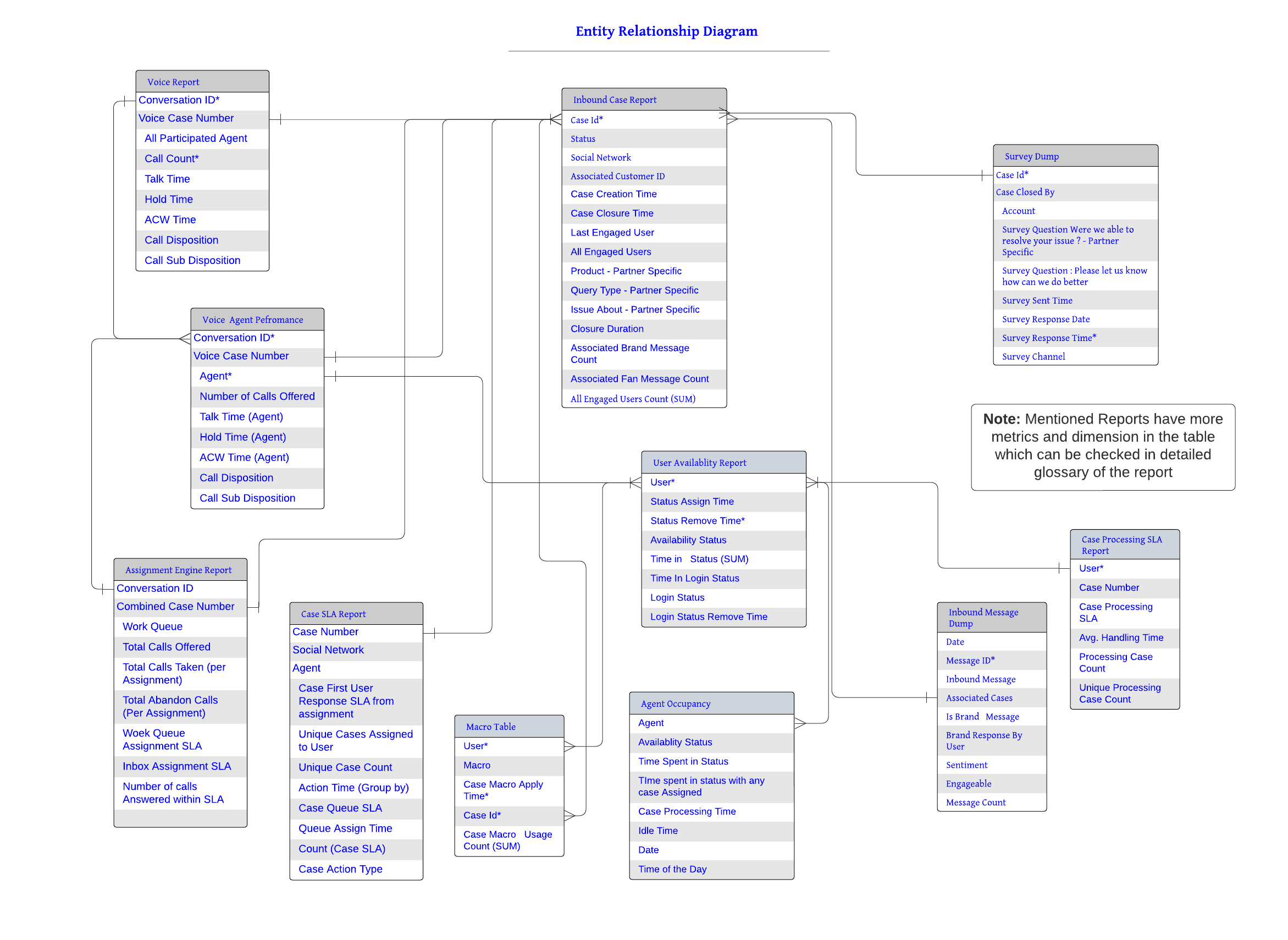
Entity Relationship Diagram
The Entity-Relationship Diagram (ERD) provides an overview of the key Sprinklr Service reports. Data analysts can use this information when trying to perform data joins in Microsoft Excel or external business intelligence tools such as Tableau, based on data exported out of Sprinklr.
For instance, an organization is interested in analyzing SLA response times for all agents involved in the processing of a particular case. However, Sprinklr only provides out-of-box reporting covering the initial response (Agent or Bot) and the last engaged user. For example, if three agents were involved in the case, you would need to perform data analysis outside of Sprinklr. The ERD provided below can be of use in such scenarios.