Reporting Charts
Updated
Sprinklr Reporting provides multiple Visulization Techniques to view the data in a widget. While configuring a widget , Visualization Type has to be selected. This can be modified later by editing the widget.
Term | Description |
Pivot Table | Pivot Table displays multiple dimensions and attribute levels which you can group by in a data set and drill down to analyze deeper sets of data. Whenever a Pivot Table is implemented in a widget or dashboard, it will be available in the external dashboard.
|
Column | Column charts display vertical bars going across the chart horizontally. You can select the values of X-Axis and Y-Axis from the drop-down list. |
Bar | Bar charts show a comparison between different categories. You can select the values of X-Axis and Y-Axis from the drop-down list. |
Pie | Pie charts display data in 'pie-slice' format with varying slice sizes telling you how much of one data element exists. The bigger the slice, the more of that particular data was gathered. You can select the Wedge or Value from the drop-down list. |
Stacked Column | Stacked Column is used to break down and compare parts of a whole. Each bar represents a whole, and segments in the bar represent different parts or categories of that whole. You can select X-Axis, Y-Axis and Series from the drop-down list. |
Stacked Bar | Stacked Bar is used to break down and compare parts of a whole. Each bar represents a whole, and segments in the bar represent different parts or categories of that whole. You can select Y-Axis, X-Axis (X1) and X-Axis (X2) from the drop-down list. |
Line | Line graph displays information as a series of data points connected by straight line segments. You can select X-Axis, Y-Axis and Series from the drop-down list. |
Spline | Spline graph draws a fitted curved line to join the data points. You can select X-Axis, Y-Axis and Series from the drop-down list. |
Area | Area graphs are used to display the development of quantitative values over an interval or time period. They are most commonly used to show trends, rather than convey specific values. |
Area Spline | Area Spline graph is like an area graph but the data points are connected by smooth curves instead of straight lines.
|
Bubble | Bubble Chart is a multi-variable graph. You can use this to compare and show the relationships between labeled/categorized circles, by the use of positioning and proportions. |
Dual Axis | Dual axis chart illustrates the relationship between two different variables. You can plot one metric on each axis by using this chart. |
Combination | You can combine two or more charts to emphasize different kinds of information in a chart. |
Table | Tables work best when the data presentation is used to look up or compare individual values, requires precise values, or values involve multiple units of measure. |
Counter | The counter graph allows you to see how many of a particular event happened in a short amount of time especially when there are gaps between occurrences of events. The Counter widget shows you the reporting data for the previous period as well, where the previous period refers to the equal duration of time as the duration of the current period that falls just before the current period. For example, the previous period with respect to the fourth quarter of the year 2019 would be the third quarter of the year 2019. |
Funnel | Funnel charts are used to represent stages in a sales process and show the amount of potential revenue for each stage. |
Summary Table | The summary table summarizes statistical information about data in a table form. Summary Table shows you the reporting data for the previous period as well, where the previous period refers to the equal duration of time as the duration of the current period that falls just before the current period. For example, the previous period with respect to the fourth quarter of the year 2019 would be the third quarter of the year 2019. |
Post Card | You can view the selected post in postcard format. |
Text | In a text widget, you can add your text and customize the text according to your requirement. |
Title | Title widget helps you to customize your dashboard by adding a title, subtitle and image. |
Grouped Summary | The Grouped summary table summarizes statistical information about a group of data in table form. |
Two Dimensional Table | The two-dimensional table displays metric values with respect to two dimensions where rows represent the one dimension and columns represent another.
|
Counter Summary | The counter summary graph allows you to see multiple events that happened in a short amount of time especially when there are gaps between occurrences of events and supports any given number of metrics. The counter summary widget shows you the reporting data for the previous period as well, where the previous period refers to the equal duration of time as the duration of the current period that falls just before the current period. |
Tree Map | The Tree Map visualization represents hierarchical data in a tree-like structure. It is a data visualization technique that is used to display hierarchical data using nested rectangles and squares. Rectangles and Squares representing data is dynamic and it's width and height will be showing or hiding data accordingly. |
Dual Axis Multiple Metric | Dual axis multiple metrics chart illustrates the relationship between two different variables. You can plot two metrics on each axis by using this chart. |
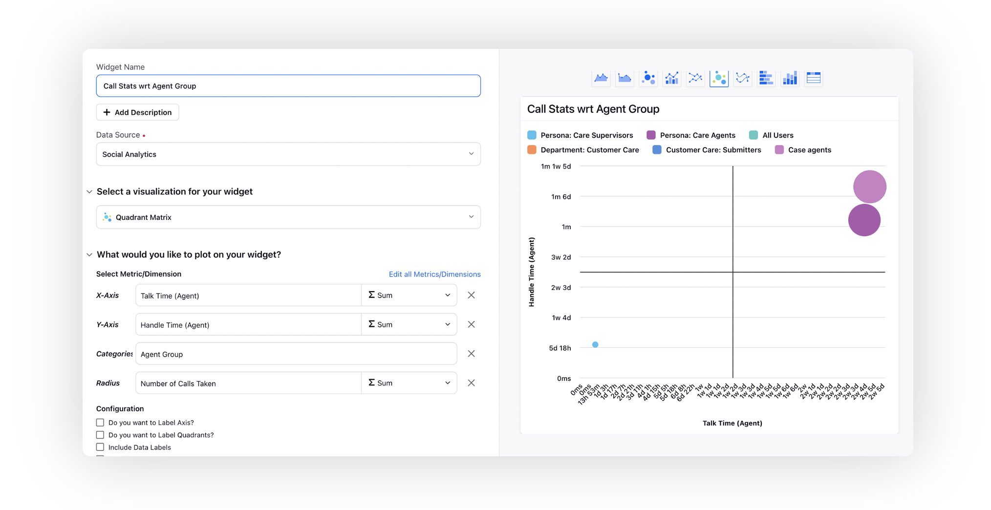
Quadrant Matrix | It allows you to visualize points on a scatter plot in four distinct quadrants, thus making the visualization more readable. You can identify the correlation between different dimensions on the basis of two flexible metrics of your choice.
|
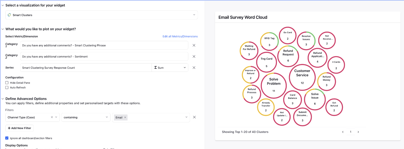
Smart Clusters | Smart Clusters widget, powered by Sprinklr AI, enables brands to understand their consumers' unmet needs, and top trends around their brands, products, and/or categories. It will enable you to discover top themes automatically synthesized from conversations using unsupervised clustering. You can be informed on the unknowns – underlying conversations, sentiments, shifts, and trends. The top keywords forming a cluster can be used to create themes to power the existing setup for further analysis. Deep dive into clusters to get more context and find actionable insights. |
Dynamic Table | Dynamic Table is a new widget introduced in Reporting. In contrast to existing Table widget, which has fixed cell size, in this widget cell size would automatically expand or contract as per the data of the cell. |
Note To optimize the reporting data, you can use the concept of controlling custom fields. With the help of this capability, only relevant values can be mapped to the Controlling Custom Field. Hence, it will restrict values visible inside other custom filters at the dashboard and widget level. This capability is also applicable for widget filter, target metric filter, custom metric filter, and scheduled export filter.
|