Reporting on Insights
Updated
You can generate reports on insights by utilizing Social Analytics and Standard Entity metrics and dimensions. Additionally, you can incorporate custom metrics, created during the configuration of insight groups, to further enhance the depth and specificity of your insights reports.
Standard Entity Glossary
Dimension | Suggested Axis Label | Description |
Insight Id | Insight | This is the insight ID for each system-generated insight. When viewed within the persona view within a table widget, it displays as the insight title, accompanied by indicators representing sentiment and insight type. |
Insight Group Config | Insight Group | This refers to the insight group names configured within Conversational Analytics Governance. |
Metric | Suggested Axis Label | Description | Suggested Aggregation |
Mentions Count | Case Count | This indicates the number of cases associated with each system-generated insight and can be aggregated accordingly. | Sum |
Score | Impact Score | This represents the impact score associated with each system-generated insight and can be aggregated accordingly. | Average |
Insight Create Date | Creation Date | This is the date when the insight was generated by the system. | Weekly |
Social Analytics Glossary
Dimension | Suggested Axis Label | Description |
Case Associated Insights | Insight | This is the insight ID for each system-generated insight. When viewed within the persona view within a table widget, it displays as the insight title, accompanied by indicators representing sentiment and insight type. |
Case Associated Insight Root Causes | Root Cause | This is the Insight Root Cause ID for each system-generated Insight Root Causes. When viewed within the persona view within a table widget it displays as the Insight Root Cause Title. |
Case Number | Insight | The ID number associated to the case. |
Metric | Suggested Axis Label | Description | Suggested Aggregation |
Case Count | Case Count | This indicates the number of cases associated with each system-generated insight and can be aggregated accordingly. | Sum |
Common Widget Samples
Most Impacting Contact Drivers
This widget is created to reveal the most impactful contact drivers within a specified time range. The visualization, presented as a bar chart, provides insights into the contact drivers with the impact scores.
Under the Sprinklr Service tab, click Care Reporting within Analyze.
Choose the desired Reporting Dashboard that you want to share or create a new dashboard. Click Add Widget in the top right corner.
On the Create Custom Widget window, set the Data Source to Standard Entity and Visualization to Bar.
Enablement note:
To learn more about getting the Standard Entity data source enabled, please work with your Success Manager.
Choose Score as the metric for the X-Axis and Contact Driver as the dimension for the Y-Axis. Select the aggregation for the metric as mentioned in the table above.
Optionally, customize the names of metrics and dimensions by selecting Do you want to Label Axis?
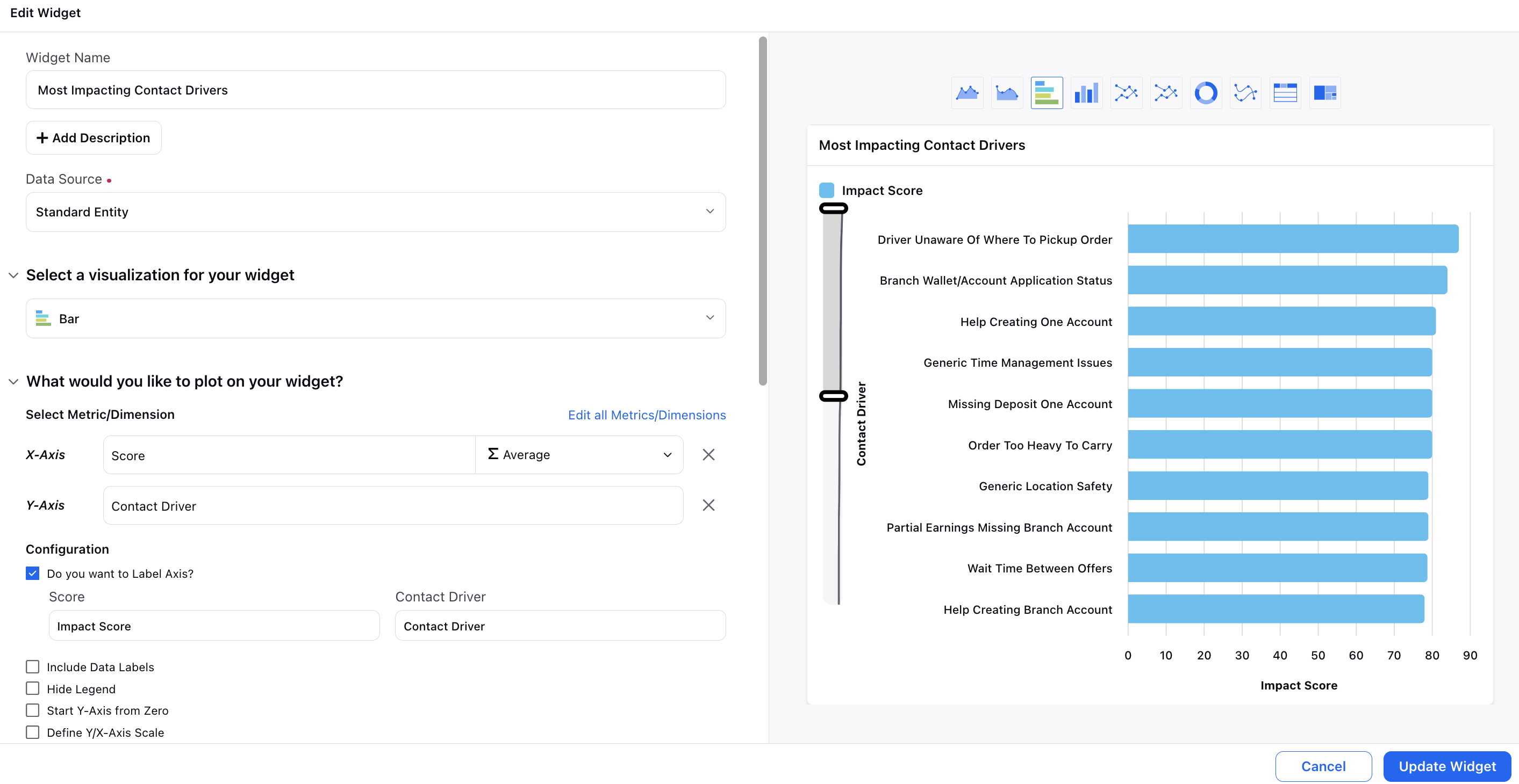
In the Display Options section, you have the option to specify the sorting parameter as the Avg. of Score.

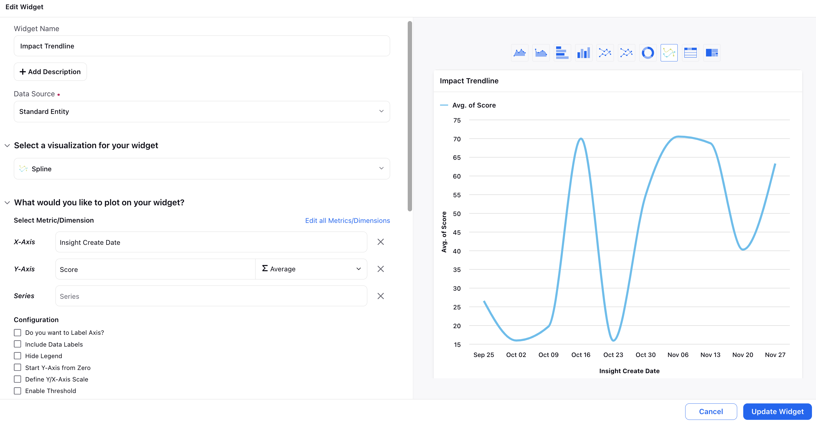
Impact Trendline
In the Impact Trendline widget, you can observe the time frame during which high-impact insights were generated. This widget can be incorporated as a drill-down option for your other widgets.
Set the Data Source to Standard Entity and Visualization to Spline.
Choose Insight Create Date as the dimension for the X-Axis and Score as the metric for the Y-Axis.
Optionally, customize the names of metrics and dimensions by selecting Do you want to Label Axis?
Insight Reporting
Create an Insight Reporting widget to showcase insights with the highest case count, along with their corresponding insight group and impact score. This widget can be incorporated as a drill-down option for your other widgets.
Set the Data Source to Standard Entity and Visualization to Table.
Select Insight ID and Insight Group Config as the dimensions, and Mentions Count and Score as the metrics for the columns.
Optionally, customize the names of metrics and dimensions by selecting Do you want to Label Axis?
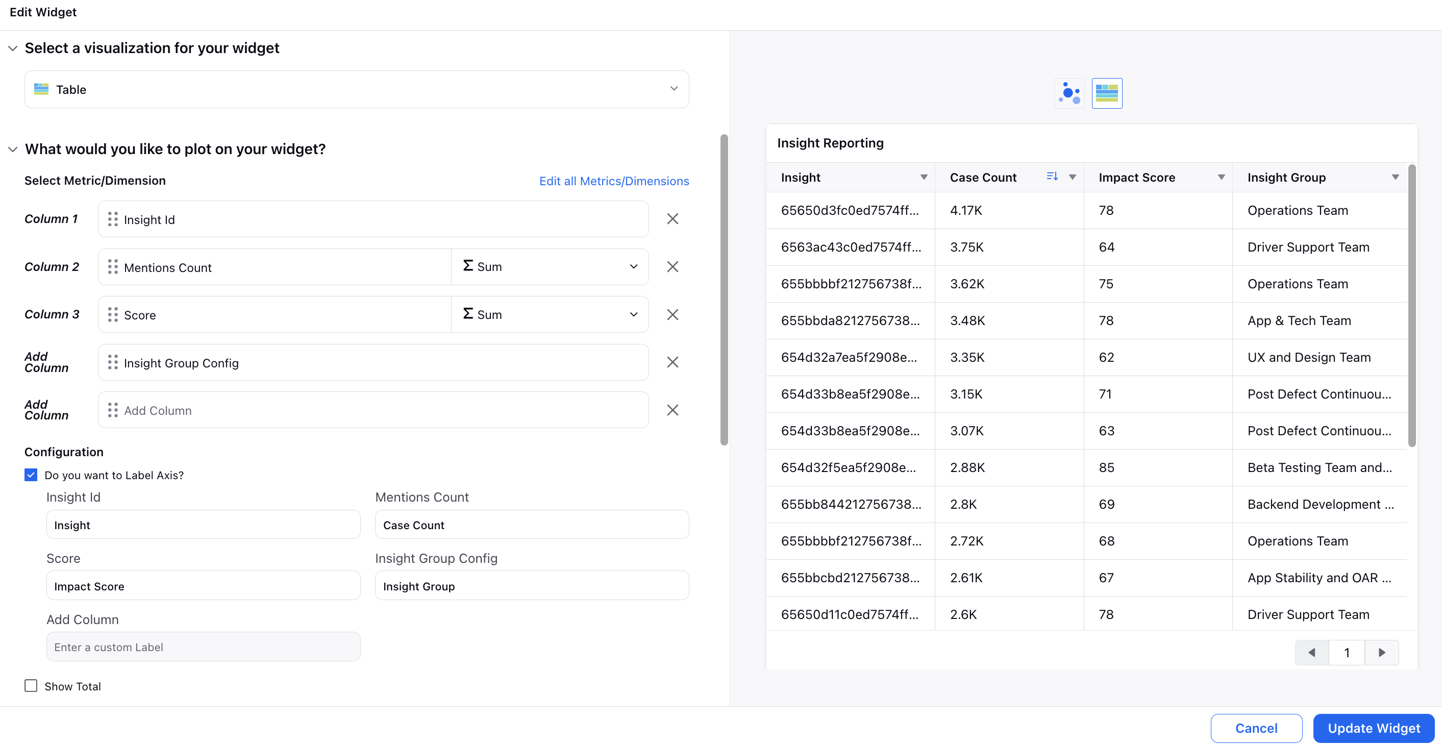
In the Display Options section, you have the option to specify the sorting parameter as the Mentions Count.

![]() Note: It is recommended to include these widgets in your persona view to maximize their utility and enhance your reporting dashboard experience.
Note: It is recommended to include these widgets in your persona view to maximize their utility and enhance your reporting dashboard experience.

For instance, in the persona view, you have the ability to read the entire insight titles. Moreover, you can click on any of the insight titles to open the corresponding insight third pane.
