Column widget
Updated
The Column widget is a type of chart that uses vertical bars or columns to represent the values of a set of data points. Each column represents a category or group of items, and the height of the column indicates the value or frequency of that category.
Column charts are similar to Bar charts but with the bars oriented vertically instead of horizontally. They are often used to display data that has a natural order, such as time periods or a sequence of events.
Column charts are commonly used for data visualization and analysis to show the relative sizes of different categories or groups of data. They are especially useful for comparing the values of multiple categories or groups, as the height of the columns makes it easy to see which categories have higher or lower values.
To Create a Column widget
To plot a Column widget, you can use any existing editable dashboard or create a new one. Refer to this article to learn how to set up a custom dashboard.
Once you have the dashboard where you want to add the visualization widget, follow the steps below –
On the custom dashboard, click Add Widget in the top right corner.

On the widget builder, enter the widget's name.
Select Column as a visualization type for your widget.
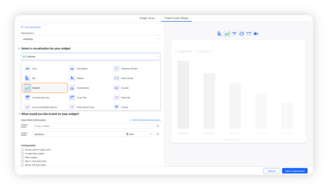
Under the What would you like to plot on your widget section, you will be given the below fields –
X-Axis: Select any desired dimension, for e.g. Created Time
Y-Axis: Select any metric/custom metric to be plotted on Y-axis. Here Mentions will be selected by default, which will be editable.
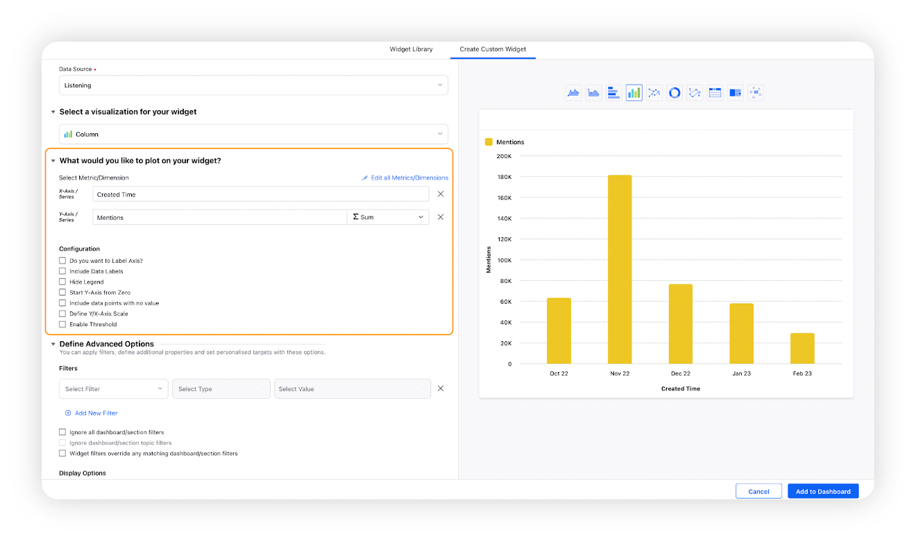
Select the configuration options as desired. For more information, refer to the Configuration Options section below.
Under the Defined Advanced Options section, you can apply filters, define additional properties and set personalized targets with these options.
You will be able to see the total numbers for each column alongside the previously provided bifurcation of numbers. This feature reduces the need for manual calculations in the UI or via Excel exports. Check the box to display totals on the charts as well as in the Excel exports.
Click Add to Dashboard on the bottom right corner to create your new widget.
Configuration options
The configuration options available for the Column widget will work as follows –
Configuration Option | Action |
Do you want to Label Axis? | If you want to add names for your Axis, you can select this configuration option, and then you can enter the desired names as labels. |
Include Data Labels | Selecting this option will include the data labels on the Spline widget. |
Hide Legend | Selecting this option will hide all the legends on the widget. |
Start Y-Axis from Zero | Selecting this option will start the Y-Axis (vertical axis) widget from zero (0). Although the Y-axis will start from zero, sometimes the scale will be shown as negative, catering to the bubble size. |
Include Data points with no value | Selecting this option will include the data points that do not have any value. |
Define Y/X-Axis Scale | You can define the Min & Max of X-Axis and Y-Axis bounds. Also, you can adjust the step size of the X-Axis and Y-Axis to get the best-optimized visualization. For example, you can switch the scale, i.e. for X-Axis → Minimum to Maximum or Maximum to Minimum; and Y-Axis → Minimum to Maximum or Maximum to Minimum depending on the use case, like for SLA Response time – less value means better performer. Therefore, the scale can be changed for reporting purposes catering to all the use cases. For more information, refer to Define Y-axis scale in Widgets |
Enable Threshold | You can define a custom threshold to benchmark the overall data with it.
|
