Dual Axis widget
Updated
The Dual Axis widget is a type of graph that displays two sets of data on the same plot, with each set of data having its own Y-Axis. This allows you to compare two different types of data that have different units of measurement, scales, or ranges. The Dual Axis widget can be customized with different plot types to better visualize the data.
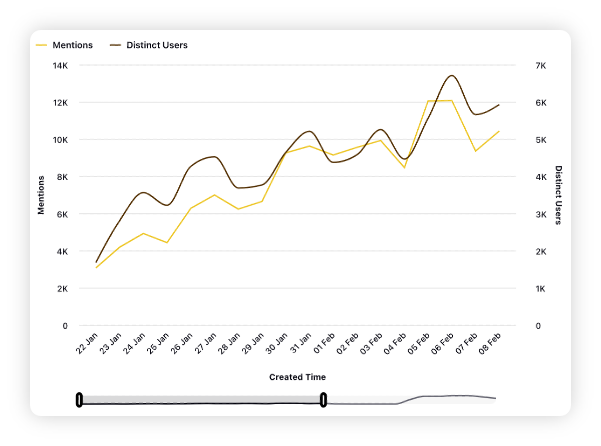
One common example of a Dual Axis plot is a line chart with two Y-Axis. In this type of plot, each line represents a different set of data, and each Y-Axis represents a different scale or unit of measurement. This type of plot can be useful for comparing two variables that have different units, such as Mentions and Distinct Users in this context.
For example, the Dual Axis widget can be used to –
Compare the volume of mentions and sentiment for their brand on social media on the same chart to evaluate the overall perception of their brand
Compare the engagement rate and follower growth rate for their brand's social media profiles on the same chart to determine whether their current social media strategy is effective in growing their audience and increasing engagement
Compare the volume of customer complaints and the response time for resolving these complaints on the same chart to evaluate the effectiveness of their customer support team.
To create a Dual Axis widget
To plot the Dual Axis widget, you can use any existing editable dashboard or create a new one. Refer to this article to learn how to set up a custom dashboard.
Once you have the dashboard where you want to add the visualization widget, follow the steps below –
On the custom dashboard, click Add Widget in the top right corner.

On the widget builder, enter the widget's name.
Select Dual Axis as a visualization type for your widget.
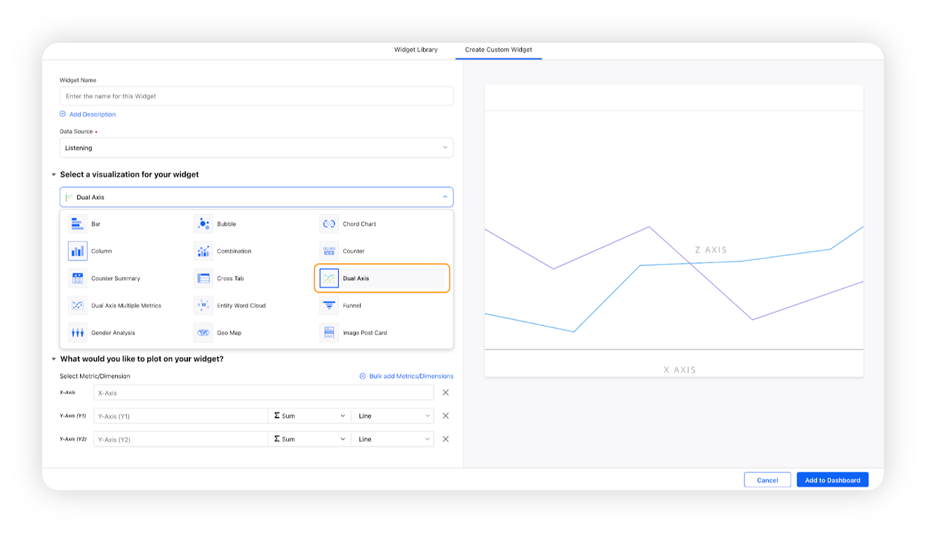
Under the What would you like to plot on your widget section, you will be given below fields –
X-Axis: Select the required dimension to plot it on X-Axis, e.g. Created Time
Y-Axis (Y1): Select any metric/custom metric to be plotted on Y-Axis, e.g. Mentions
Y-Axis (Y2): Select another metric/custom metric to be plotted on Y-Axis, e.g. Distinct Users
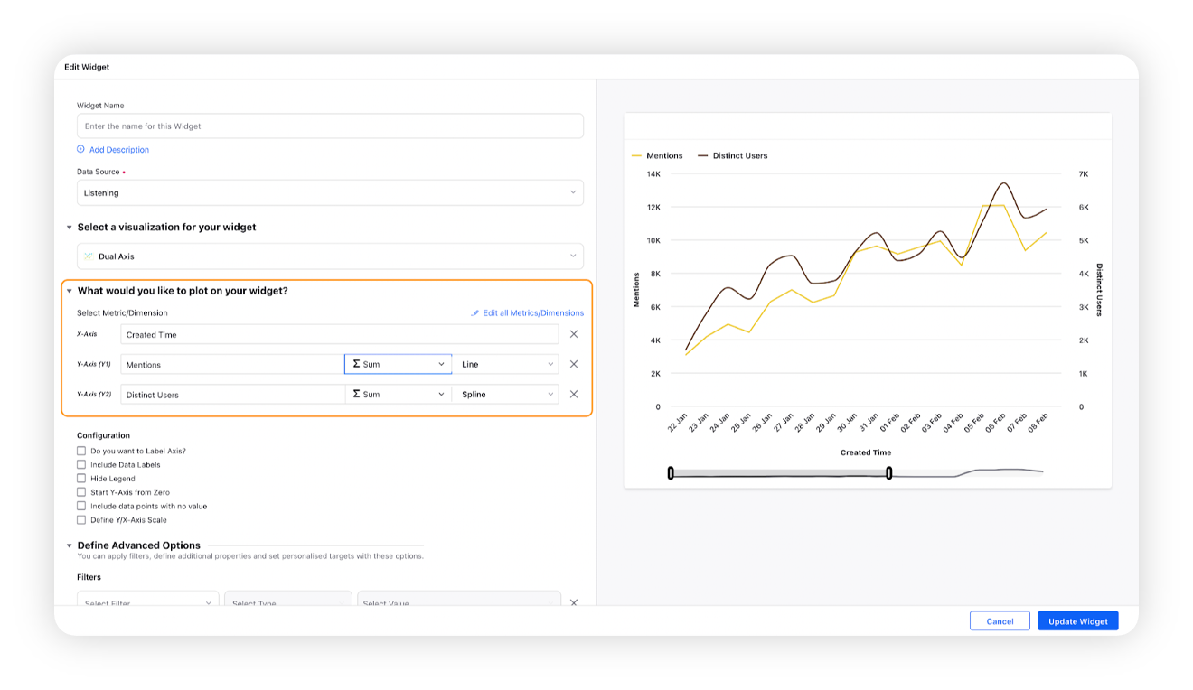
You can select the plot type for Y1 and Y2 Axis. You can choose the chart type from these options – Line, Column, Spline, Area, and Area Spline.
Select the configuration options as desired. For more information, refer to the Configuration options section below.
Under the Defined Advanced Options section, you can apply filters, define additional properties and set personalized targets with these options.
Click Add to Dashboard on the bottom right corner to create your new widget.
Configuration options
The configuration options available for the Dual Axis widget will work as follows –
Configuration Option | Action |
Do you want to Label Axis? | If you want to add names for your Axis, you can select this configuration option, and then you can enter the desired names as labels. |
Include Data Labels | Selecting this option will include the data labels on the Dual Axis widget. |
Hide Legend | Selecting this option will hide all the legends on the widget. |
Start Y-Axis from Zero | Selecting this option will start the Y-Axis (vertical axis) widget from zero (0). Although the Y-axis will start from zero, sometimes the scale will be shown as negative, catering to the bubble size. |
Include Data points with no value | Selecting this option will include the data points that do not have any value. |
Define Y/X-Axis Scale | You can define the Min & Max of X-Axis and Y-Axis bounds. Also, you can adjust the step size of the X-Axis and Y-Axis to get the best-optimized visualization. For more information, refer to Define Y-axis scale in Widgets. |