Quadrant Matrix widget
Updated
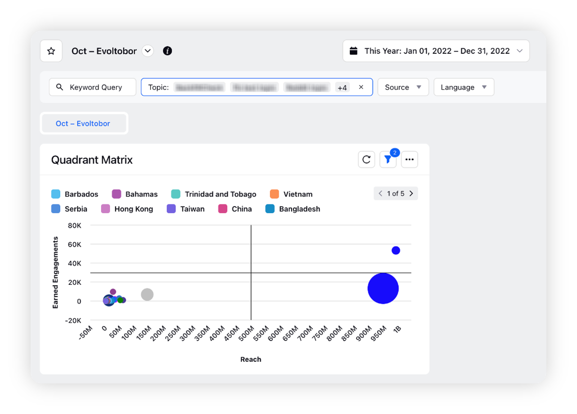
Learn more about the Quadrant Matrix widget and analyze the performance of different categories according to the relationship between any two metrics of choice.
Sprinklr supports a wide range of widgets (aka data visualization types) that can be plotted on any reporting dashboard to view the graphical representation of information and data. Quadrant Matrix is a newly introduced widget type available for the Listening dashboards. It allows you to visualize points on a scatter plot in four distinct quadrants, thus making the visualization more readable and insightful.
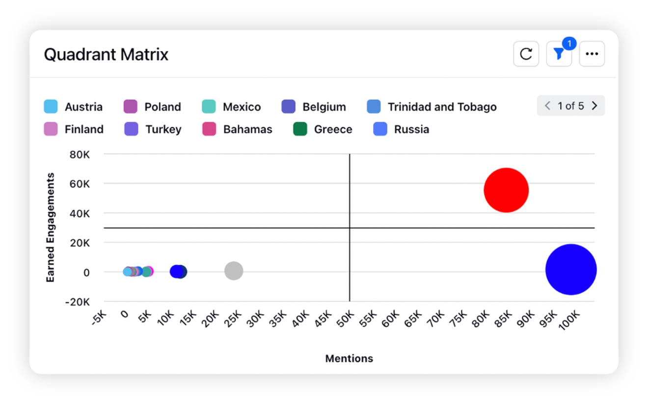
The Quadrant Matrix widget helps to visualize any correlation between the different categories, such as Topic, Theme, or any other dimension, based on two flexible metrics of your choice. For example, a brand wants to measure the performance of different topics, business lines, and categories by analyzing the relationship between any two metrics like Volume & Growth Rate, Ad Spend v/s Reach, etc., to understand the trend of different categories with time.
Use cases
The Quadrant Matrix widget will help Research Analysts, Brand Owners, and Marketing Managers who want to
Monitor the performance of posts and identify the content gaining the most traction. For e.g., by plotting Earned Engagement and Reach.
Identify the correlation between the performance of products based on experience scores, e.g., by plotting Star Rating and Sentiment Score.
Monitor how their competitor's promoted v/s organic content performs and what is the distribution of the content.
To add a Quadrant Matrix widget on a dashboard
The Quadrant Matrix widget can be plotted in any custom Listening dashboard, depending on permissions. To get started, you can use any existing editable dashboard or create a new one. Refer to this article to learn how to create a Listening dashboard.
Once you have the dashboard where you want to add the Quadrant Matrix widget, follow the steps below –
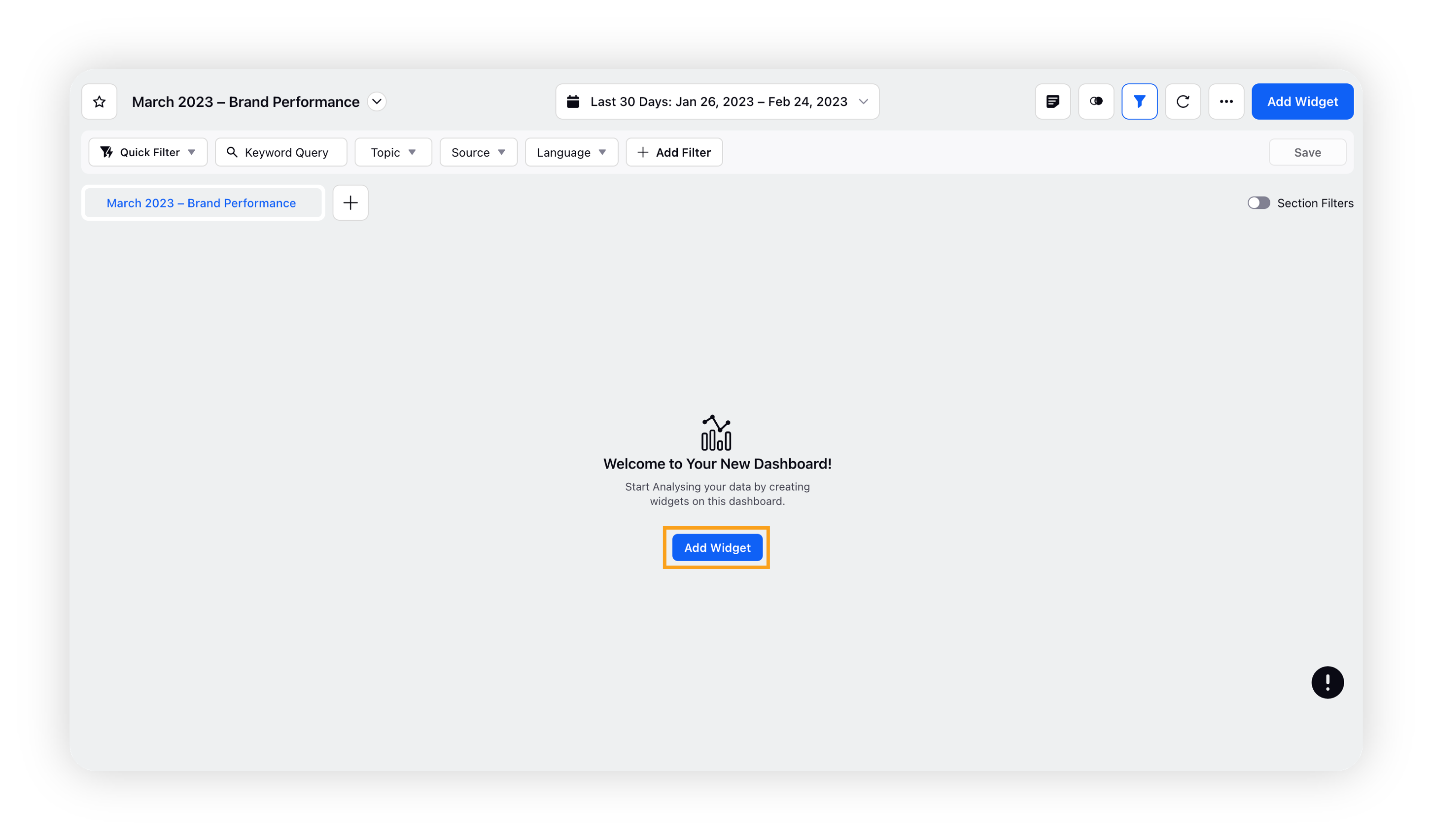
On the custom dashboard, click Add Widget.
On the widget builder, enter the widget’s name.
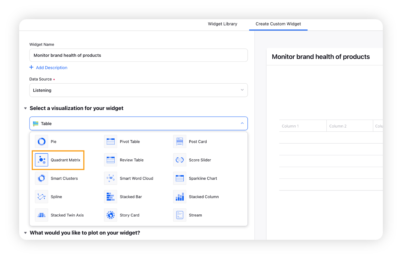
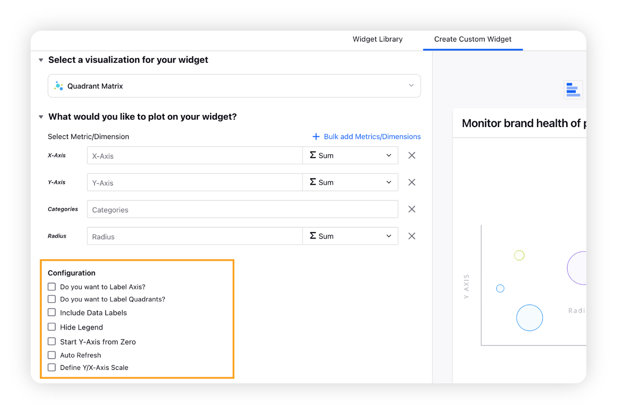
Select Quadrant Matrix as a visualization type for your widget.
Under the "What would you like to plot on your widget?" section, you will be given four flexible fields to plot dimensions and metrics. For example: For a listening-based use case, you can plot the following –
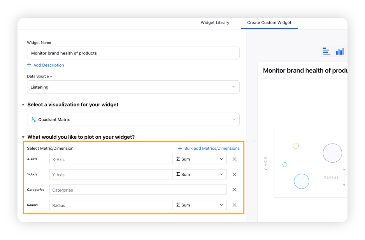
X-Axis: Select the required metric/ custom metric, e.g., Reach
Y-Axis: Select another metric to be plotted on Y-axis, e.g., Engagement
Categories (Dimension): To plot a category/dimension to identify the correlation, such as Topics, Themes, Attributes, Countries, etc.
Radius: Select a metric to govern the radius of the bubbles in the Quadrant Matrix Chart
Select the configuration options as desired. For more information, refer to the Configuration options section below.
Under the "Defined Advanced Options" section, you can apply filters, define additional properties and set personalized targets with these options.
Click Add to Dashboard to add the Quadrant Matrix widget to your Listening dashboard.
Configuration options
The configuration options available for the Quadrant Matrix widget will work as follows –
Configuration Option | Action |
Do you want to Label Axis? | If you want to add names for your Axis, you can select this configuration option and then you can enter the desired names as labels. |
Do you want to Label Quadrants? | If you want to add names for your quadrants (Top Left Quadrant, Top Right Quadrant, Bottom Left Quadrant, and Bottom Right Quadrant), you can select this configuration option and then you can enter the desired names as labels. |
Include Data Labels | Selecting this option will include the data labels on the Quadrant Matrix widget. |
Hide Legend | Selecting this option will hide all the legends on the widget. |
Start Y-Axis from Zero | Selecting this option will start the Y-Axis (vertical axis) of the widget from zero (0). Although the Y-axis will start from zero, sometimes scale will be shown in negative catering to the bubble size. |
Auto Refresh | Selecting this option will enable the auto-refresh mode which means the widget gets refreshed automatically. |
Define Y/X-Axis Scale | You have the option to define the Min & Max of X-Axis and Y-Axis bounds. Also, you can adjust the step size of X-Axis and Y-Axis to get the best optimized visualization. For example, you can switch the scale, i.e. for X-Axis → Minimum to Maximum or Maximum to Minimum; and Y-Axis → Minimum to Maximum or Maximum to Minimum, depending on the use case like for SLA Response time - less value means better performer Therefore, the scale can be changed for reporting purposes catering to all the use cases. |
Note: The "Start Y-Axis from Zero" and "Define Y/X-Axis Scale" configuration cannot be used simultaneously.
Export and Add to Custom Dashboard options
The Quadrant Matrix widget can be exported into different file formats – PDF, PNG, Excel, and CSV.
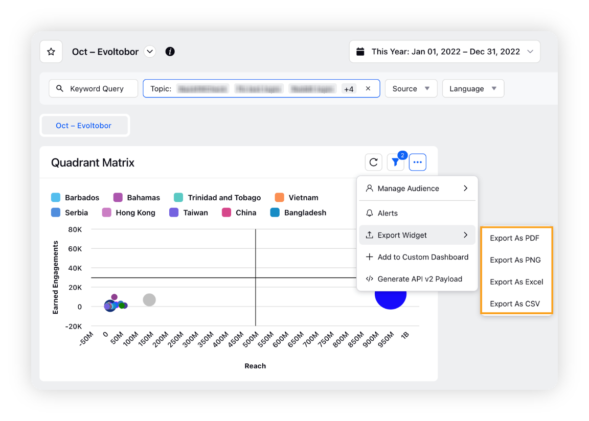
Besides exporting the Quadrant Matrix widget into multiple file formats, you can add it to any custom dashboard.