Topic Analysis widget
Updated
Create a Topic Analysis widget to visualize and drill down on keywords relevant to your brand.
The Topic Analysis widget can help you visualize the distribution of common words and topics used in messages by your brand and your competitors. Topic Analysis widget provides a great way to see the share of conversations – what are the most used topics and most used keywords inside each drillable topic – across various social media platforms.
Use cases
Topic Analysis widget can help Brand Owners, Product Managers, and Marketing Managers who want to -
Understand what their customers think about their products and services. By analyzing the most commonly used topics and keywords, you can identify areas for improvement and make changes to meet customer needs better.
Analyze the most commonly used topics and keywords around your business' industry across social media platforms, and gain insights into industry trends to stay ahead of the curve.
Identify and track any negative sentiment or complaints about their brand by identifying the most common topics and keywords associated with such conversations, allowing you to quickly address any issues and mitigate potential reputational damage.
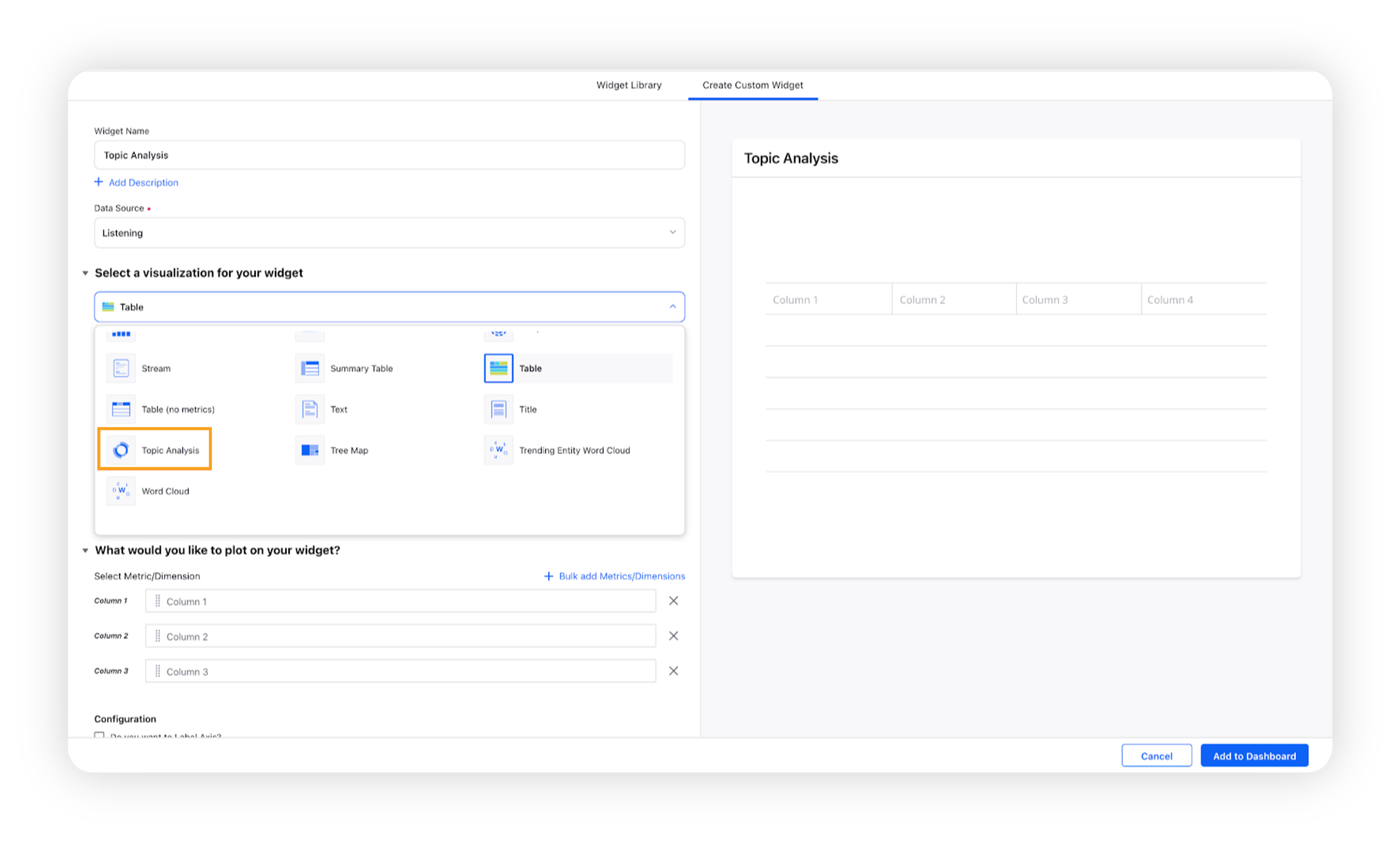
To create a Topic Analysis widget
The Topic Analysis widget can be plotted in any custom Reporting dashboard, depending on permissions. To get started, you can use any existing editable dashboard or create a new one. Refer to this article to learn how to create a Listening dashboard.
Once you have the dashboard where you want to add the visualization widget, follow the steps below –
On the custom dashboard, click Add Widget in the top right corner.

On the widget builder, enter a name for your widget.
Select Topic Analysis as a visualization type for your widget.
A dimension Topic Cluster – Overall and a metric Mentions will be prefilled.
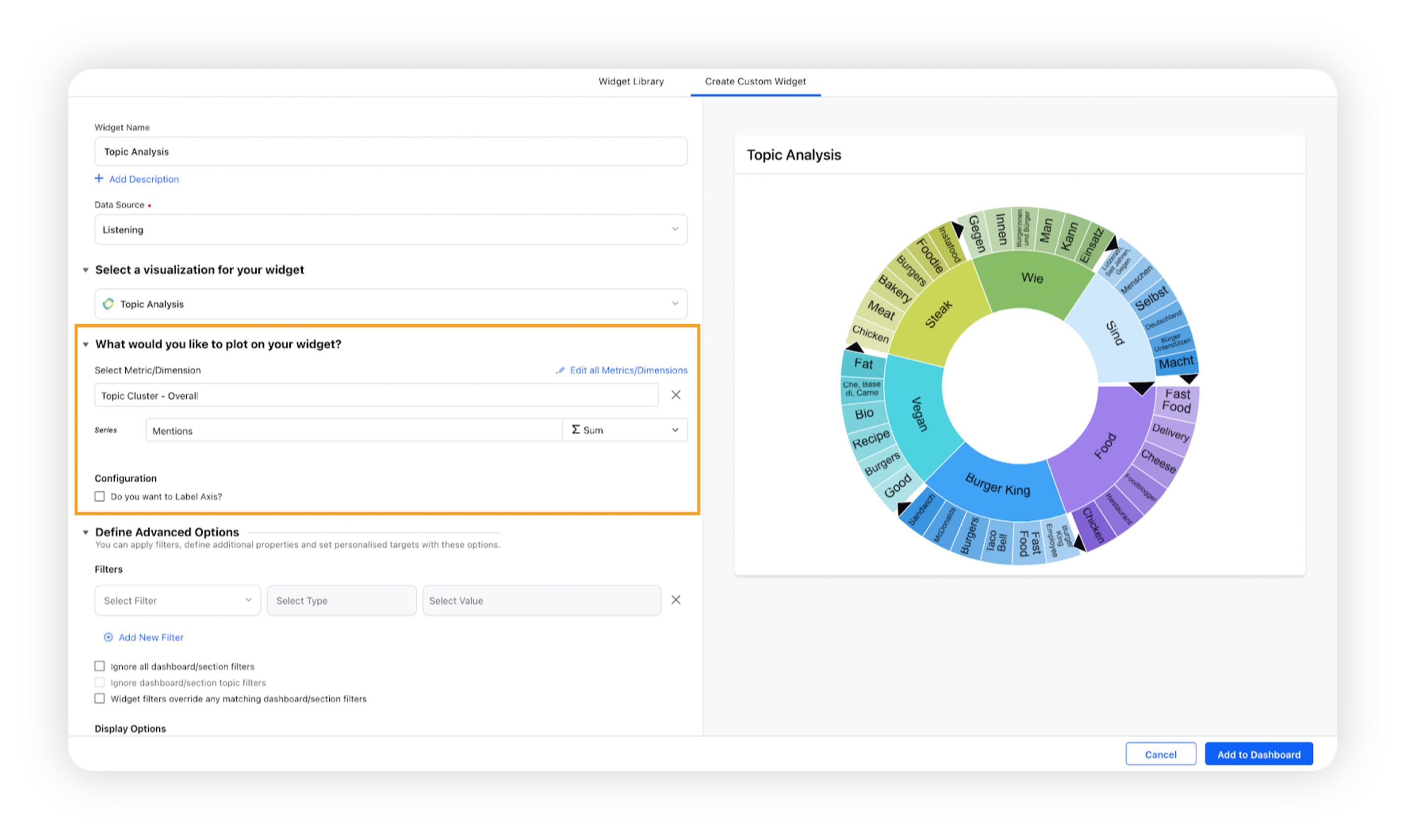
Note: The Series field will be uneditable, whereas you can change the pre-added dimension to any of these – Topic Cluster - Message or Topic Cluster - Title.
Select the configuration options as desired.
Configuration Option
Action
Do you want to Label Axis?
If you want to add names for your Metrics, you can select this configuration option, and then you can enter the desired names as labels.
Under the Defined Advanced Options section, you can apply filters, define additional properties and set personalized targets with these options.
Click Add to Dashboard on the bottom right corner to create your new widget.
Drill down into Topic Analysis widget
Topic Analysis widgets in Sprinklr can display more detailed information on topics through dynamic animations. Where a Topic can be expanded, you will see an arrow within the topic display. Click the arrow to expand or collapse the Topic.
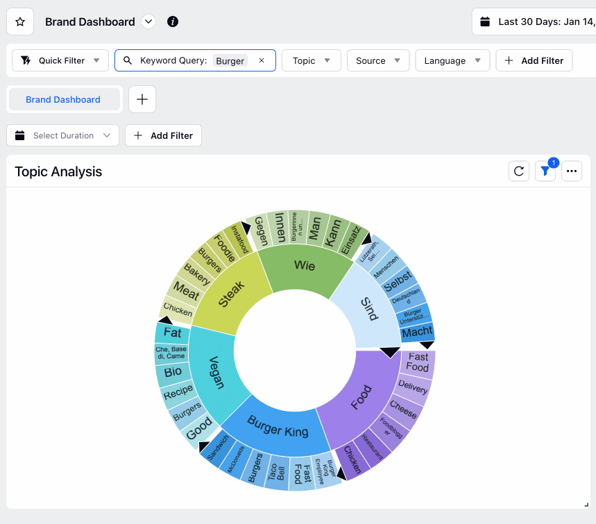
Additionally, you can drill into Topic Analysis data by clicking on a topic and selecting a drill-by dimension.
How does Topic Analysis work?
For generating topic clusters, we take a large sample of messages (randomly selected after applying the given dashboard/widget filters) and perform data hygiene steps like stemming and removal of stop words from these messages. We then identify phrases frequently occurring in the messages (we have an underlying text analysis engine to do that) and then cluster the messages into groups defined by these phrases. As the sample of messages generated is random, the topic cluster might seem different at different moments.
1st Tier/Internal – The most occurring phrase in the data.
2nd Tier/Internal – The most occurring phrase in the individual sections of the 1st tier.