Tree Map Widget
Updated
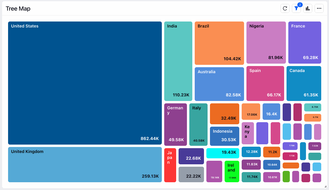
Tree Map is a type of data visualization that displays hierarchical data using nested rectangles or squares. Each rectangle represents a single item or category in the hierarchy, and its size is proportional to a specific metric, such as the item's value or relative size, compared to other items.
The Tree Map widget is a popular tool for data visualization because it allows users to quickly and easily see the relative size and importance of different categories in a hierarchical data set. Users can navigate the hierarchy by clicking on individual rectangles to reveal subcategories.
To add a Tree Map widget
To plot the Tree Map widget, you can use any existing editable dashboard or create a new one. Refer to this article to learn how to set up a Custom Dashboard.
Once you have the dashboard where you want to add the visualization widget, follow the steps below –
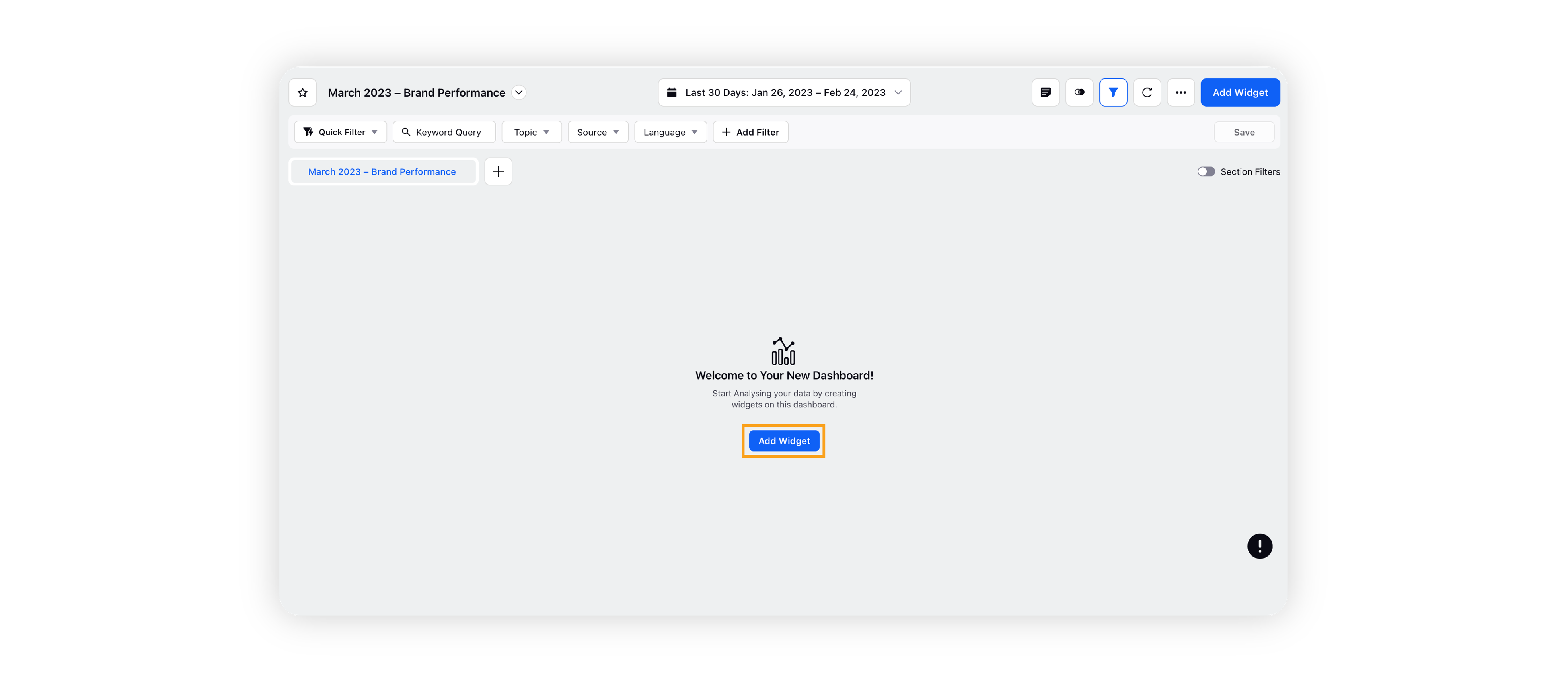
On the custom dashboard, click Add Widget in the top right corner.
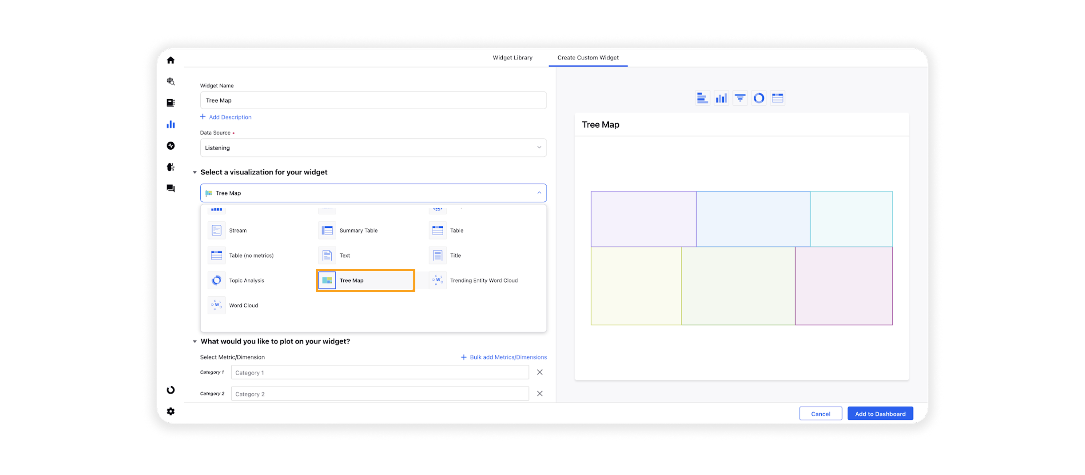
On the widget builder, enter the widget's name and select Listening as Data Source.
Select Tree Map as a visualization type for your Listening widget.
Under the What would you like to plot on your widget? section, you will be given the below fields:
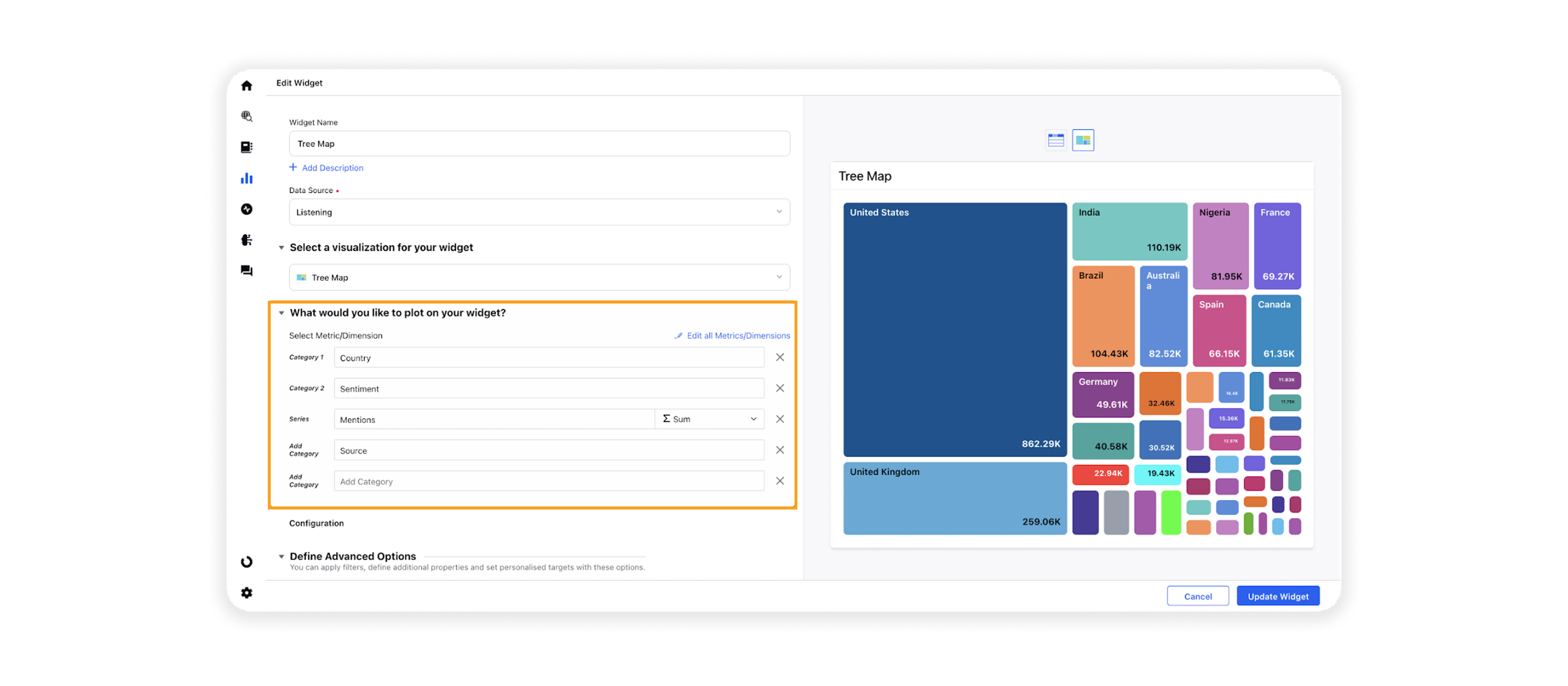
Category 1: Select the required dimension to plot it as the primary dimension, e.g. Country.
Category 2: Select another dimension to plot it as a secondary (sub-category) dimension, e.g. Sentiment. You can choose more sub-categories by adding them in Add Category (e.g. Source).
Series: You can choose any metric to define the proportional size of rectangles and squares, e.g. Mentions.
Under the Defined Advanced Options section, you can apply filters, define additional properties and set personalized targets with these options.
Click Add to Dashboard on the bottom right corner to create your new widget.