Screen Components
Updated
Overview
In a customer-facing guided workflow, you can easily gather input from customers by utilizing various components available on a Screen. These components are designed to collect specific types of information from the user such as text, numbers, radio buttons, picklists, etc. To ensure the accuracy of the data collected, validation rules can be set to verify the user's input.
Each component on the screen should be labeled appropriately to help users understand what information is required. Additionally, each component should be assigned an API name, which is a unique identifier and may be used to fetch user input value in subsequent actions/screens in the workflow. Here are multiple types of components that are available inside a guided workflow screen:
Screen Properties
For every screen added to a Guided Workflow, provide the following screen properties.
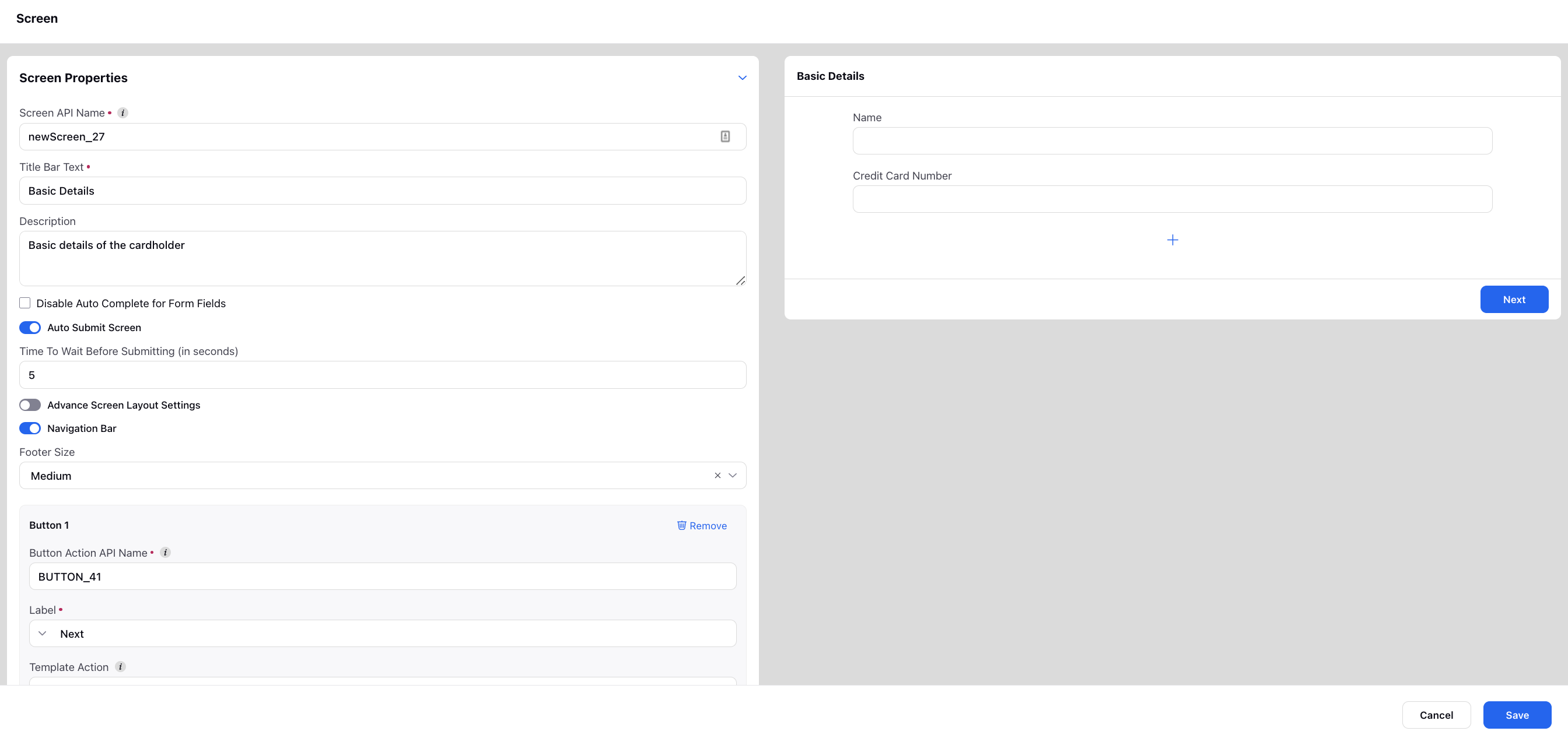
1. Screen API Name: Each screen should be assigned an API name, which is a unique identifier and may be used to fetch user input value in subsequent actions/screens in the workflow.
2. Title Bar Text: Title of the screen visible to users.
3. Description: Optional decription of the screen.
4. Auto Submit Screen: The users will be auto-moved to the next screen after the set time if all the mandatory fields are filled.
5. Advance Screen Layout Settings: Specify the desired spacing value around the body in pixels. Additionally, you can choose to align the content of the form to the top, center, or bottom of the page. You can also adjust the height of the form to either automatically fit the content or set it to full height.
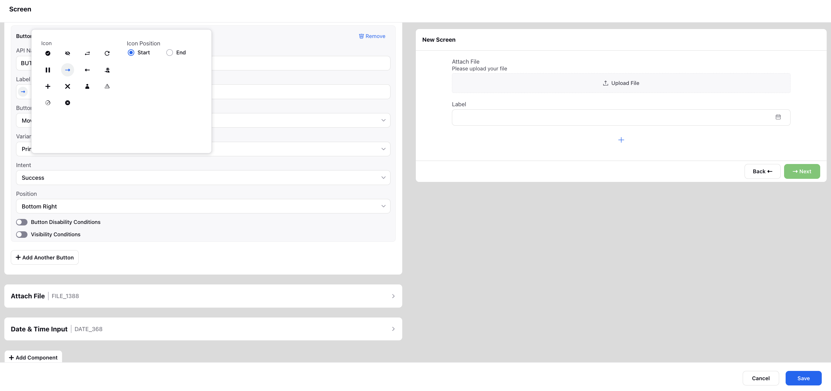
6. Navigation Bar: Add buttons to your screen, i.e., Next Screen Action, Back Screen Action, Close Screen Action and Message Parent Website Action. Using Message Parent Website Action, you can add custom components, e.g., trigger a live chat widget.
Customize the appearance of buttons by selecting the Label, Icon, Icon Position, Button Position, Variant, and Intent.
Once added, you can rearrange the order of buttons by dragging and dropping.
“Button Visibility Conditions” can be set when you want to display a button only when those particular conditions are met.
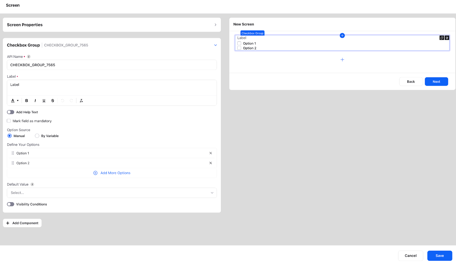
Checkbox and Checkbox Group
While a checkbox component can allow users to only one checkbox at a time, you can map multiple simultaneously through checkbox groups. You can add multiple inputs either manually or you can also resolve them in real-time via a variable. You also have the option to specify disability conditions for the corresponding component, which will disable it for users to fill.
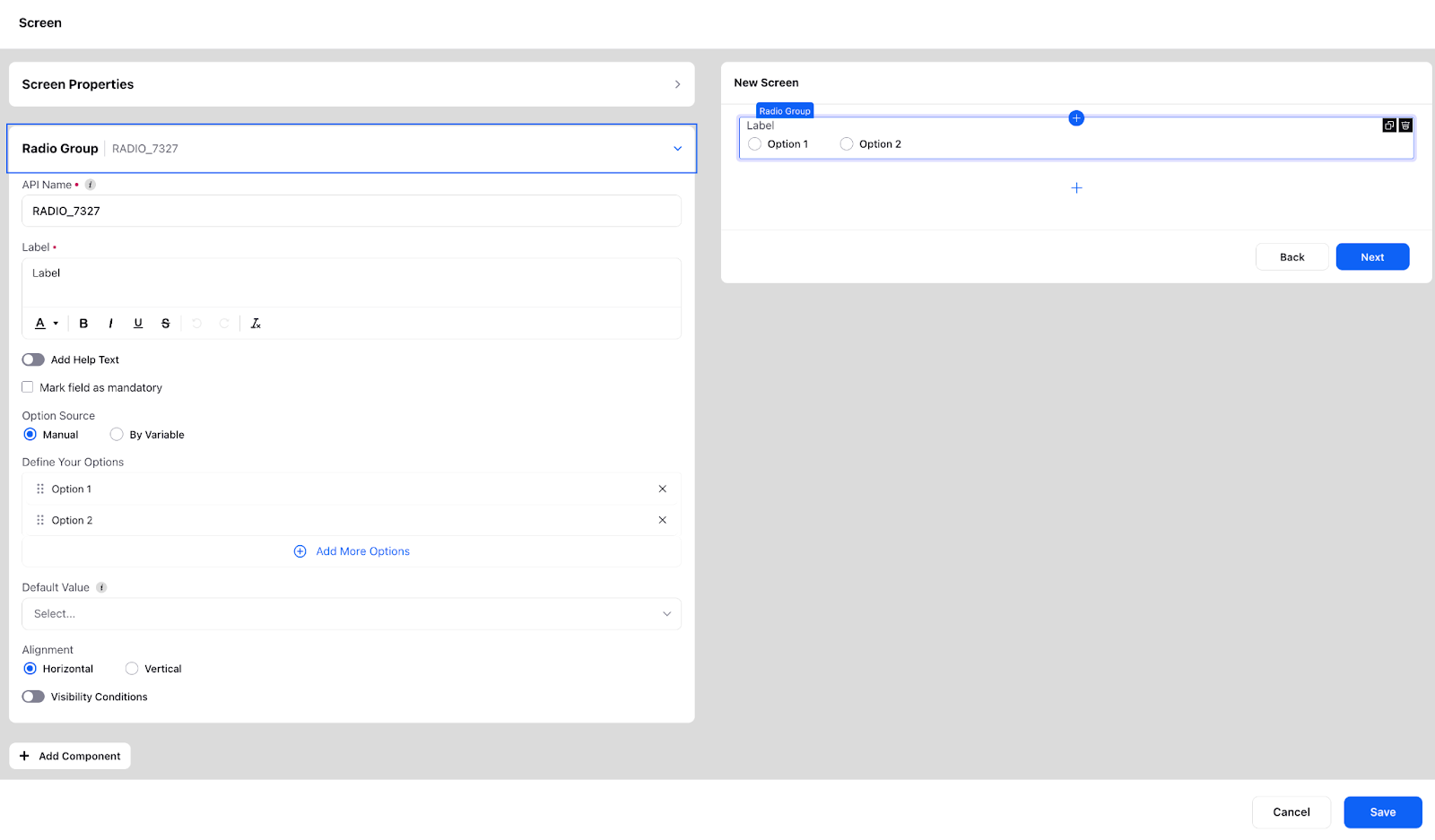
Radio group
Radio buttons can be a useful tool for customers as they allow them to quickly and easily select from a predefined set of options. You can add input options either manually or you can also resolve them at real time via a variable. You also have the option to specify disability conditions for the corresponding component, which will disable it for users to fill.
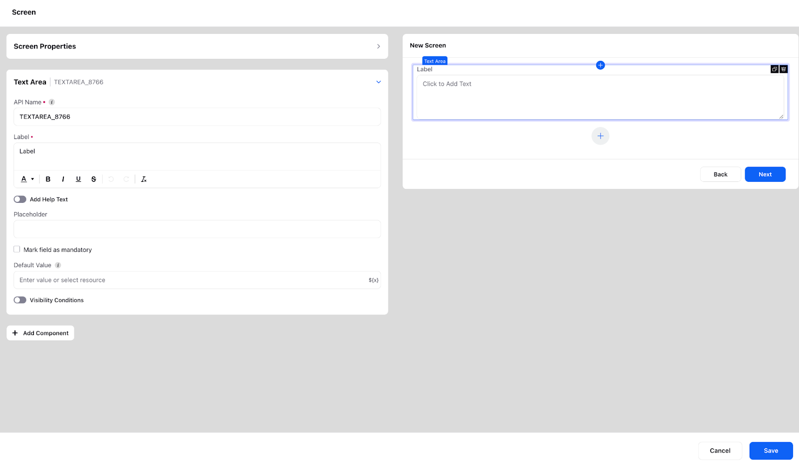
Text input and Text Area
Text input as the name suggests is used to take a text based input from the user that can be stored for future use. You can apply a pattern check as well to ensure that the correct input is taken from the user. Pattern check can be of the form @gmail.com, .com etc.
Text area is similar to text input, the only difference is that pattern check is not supported in text area. It is generally used when you are expecting a paragraph type of a response from the user. You also have the option to specify width, alignment and disability conditions for the corresponding component which will disable it for users to fill.
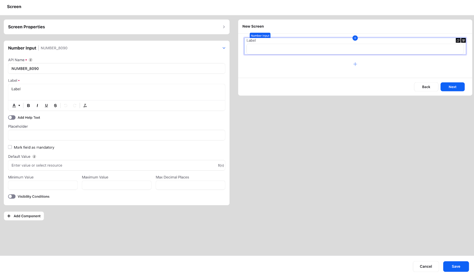
Number Input
Number input as the name suggests is used to input/store numerical information. You can apply the following constraints in the number input:
Minimum Value: If the number entered is less than minimum value an error message will be displayed.
Maximum Value: If the number entered is more than minimum value an error message will be displayed.
Maximum Decimal Places: If the number entered has more decimal places than defined and an error message will be displayed.
You also have the option to specify width, alignment and disability conditions for the corresponding component which will disable it for users to fill.
Email Input
The "Email Input" component in a guided workflow is utilized to capture the email address of a customer. This component provides a designated input field where customers can enter their email address as part of the workflow process.
This is an extension of text input with the additional feature of making the input read only. Making an email input field read-only means that the field can be viewed by the user but cannot be modified or edited. This can be useful in a variety of contexts, such as when displaying a customer's pre-existing email address for reference or verification purposes.
Additionally, making an email input field read-only can also help to protect the customer's privacy and security by preventing unauthorized access or changes to their email address.
You also have the option to specify disability conditions for the corresponding component, which will disable it for users to fill.

Phone Number
As the name suggests this component is used when the user input is a phone number. By default country code support in the Phone input component will be enabled.
1. You can define what will be the default value of the country that will appear to the user when they are using the guided path via “Default Country Code” field
2. You can also define what values will be available in the country code dropdown as well via the “Filter Country Codes” field.

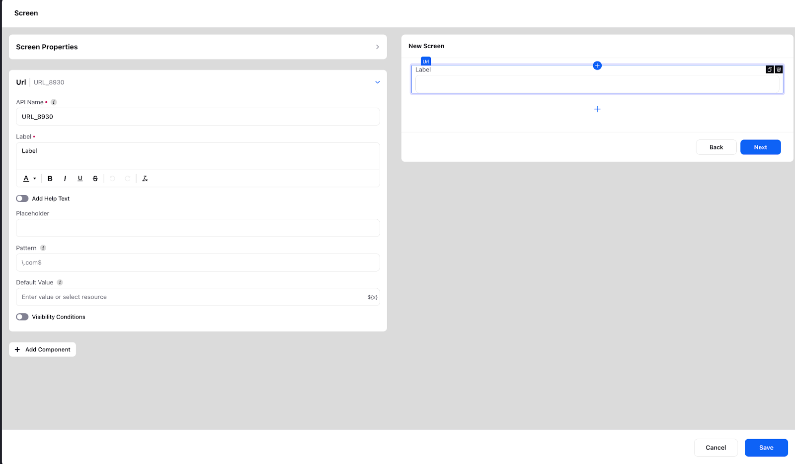
URL
This is an extension of the text input. It also has a pattern for validation of the url and a placeholder to show the end user the expected format of the url. In addition to the basic text input features, the URI Input component also has the following:
1. Pattern validation: The URI Input component has a pattern validation feature that ensures that the user inputs a valid URI. This validation feature helps to prevent invalid or incomplete URIs from being submitted.
2. Placeholder: The URI Input component has a placeholder attribute that shows the expected format of the URI to the end user. The placeholder is a non-editable text that disappears when the user starts typing, giving the user a visual cue of what type of input is expected.
You also have the option to specify disability conditions for the corresponding component, which will disable it for users to fill.
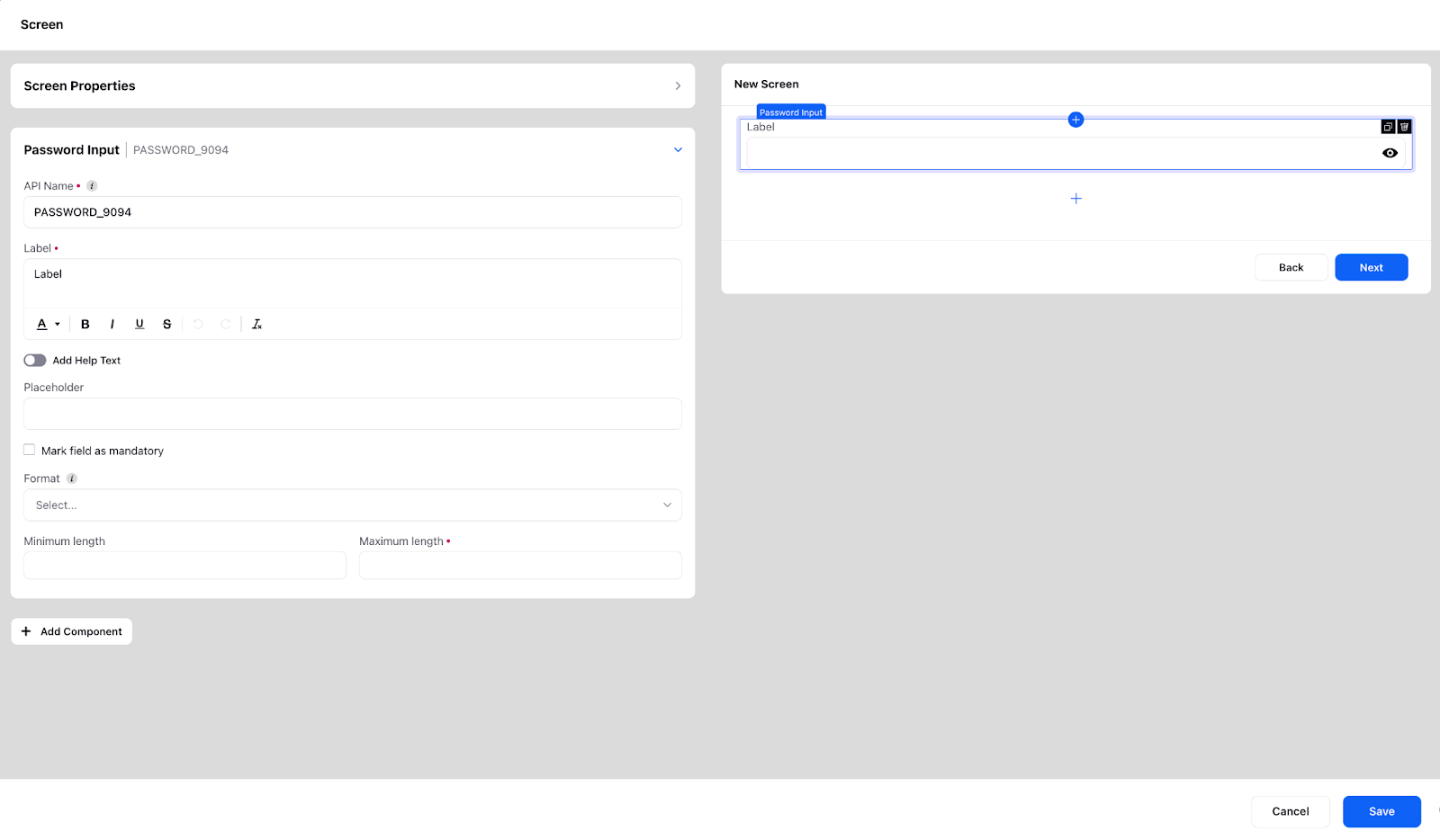
Password Input
This is a feature typically for the customer facing GWs, and it takes in a password to verify the user’s identity. The password while inputting is masked and the eye icon can be used to see the password. You can define the format of the password to be either numeric or alphanumeric with the maximum and minimum length specified. You also have the option to specify width, alignment and disability conditions for the corresponding component which will disable it for users to fill.
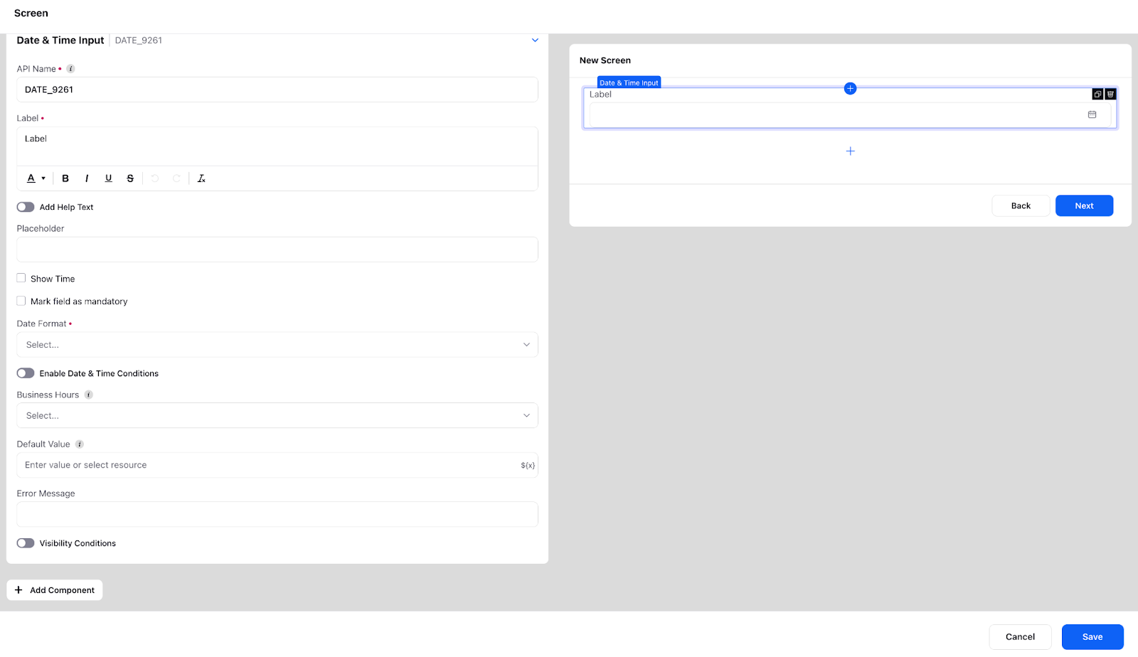
Date and Time Input
The use cases for this component typically includes - scheduling an appointment, delivery date, mentioning the date on which issue occurred while lodging a complaint, purchase date etc.
Date Format: There are a variety of formats available via which you can take the date input for example (dd/mm/yy, dd/mmm/yy etc). You can select these through via the “Date Format” field
Show Time: You can also take time as a input (along with date, month and year) by checking “Show Time” field
Business Hours: There is also an option of selecting the Business hours in the component. If the input by the user is outside the defined business hours then the user will be displayed an error message.
Date and Time Conditions: You can also limit the time range over which the user will have to input. This can be achieved via the “Date and Time Conditions”. If the user inputs outside of the time range an error message will be displayed.
You also have the option to specify disability conditions for the corresponding component, which will disable it for users to fill.
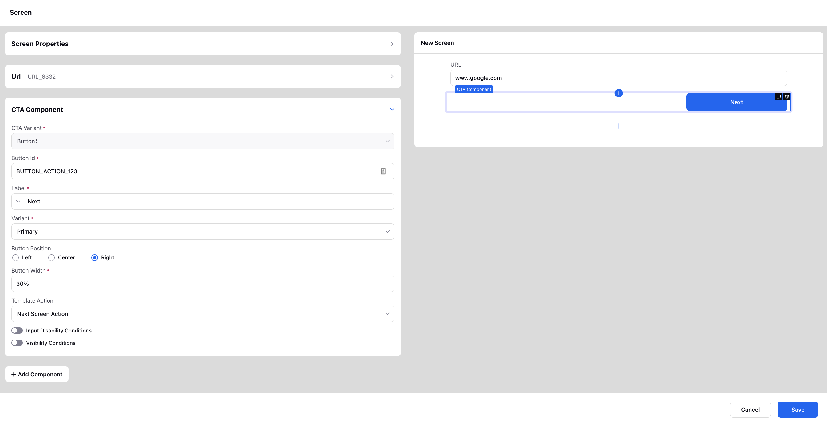
CTA Component
Enhance your screen by incorporating buttons with Next Screen Action, Back Screen Action, and Close Screen Action. Customize the buttons' appearance by selecting the Label, Icon, Icon Position, Button Position, and Variant. Additionally, you have the flexibility to set Visibility Conditions, allowing buttons to be displayed based on specific criteria being met. You also have the option to specify disability conditions for the corresponding component, which will disable it for users to fill.
Description Text
Description Text can be used to simply show a text output on a screen. The font, size, alignment of this text can be customized or links can be added to the text. You can also make the text copiable for the users. Additionally, you can add controlling field for the description text to show information basis the selected row of the table, picklist value, etc. You can also include a resource by inserting relevant placeholders.
Additionally, you can make the individual blocks of text copiable in Care Console, by wrapping the desired content in <div class="gp-copiable-block"> content </div> using the Source Code option.
You have the option to enable Auto Refresh Content and specify a duration in seconds to automatically refresh the description text at the defined interval. This is particularly useful when you have custom fields added in the description that may be updated and you want the refreshed content to reflect any changes in their values.
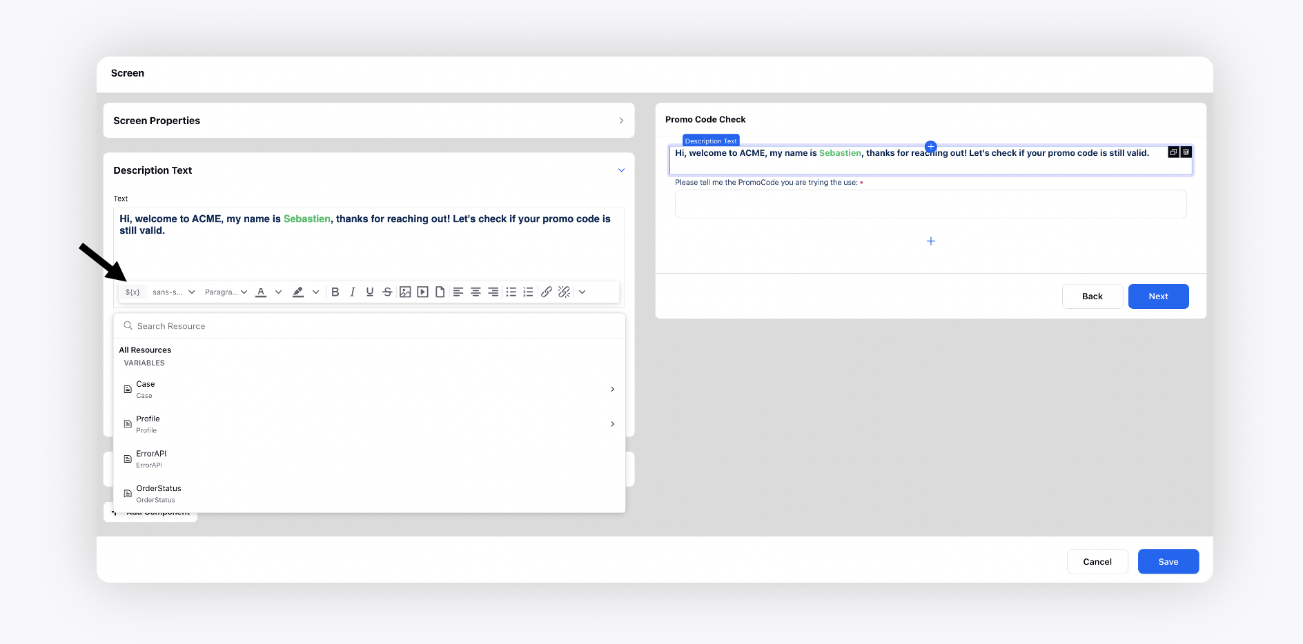
You can also add text assets so that a change in one text asset changes the static data in all the guided workflows.
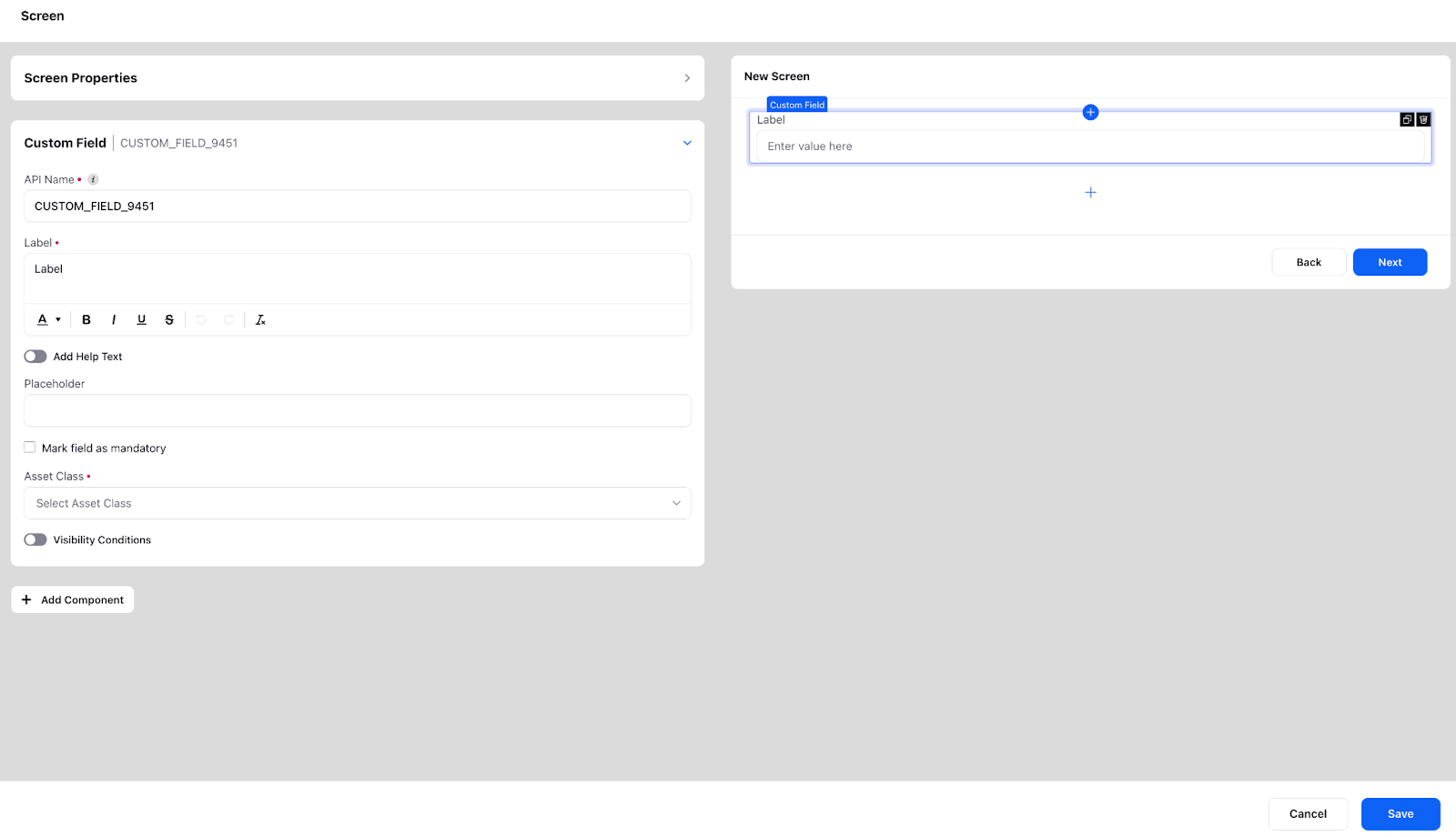
Custom Field
The Custom Field Input component is used to fetch and modify a custom field value. This component can be used if you want to directly update the custom field through the user input. This saves the effort of taking the input in a text or number input and then separately configuring custom field action after the screen. You can update three types of custom fields through this component: Profile, Case and User. This you can select through the “Asset Class” field. Once a particular asset class is selected you can select which custom field you want to update through the user. You also have the option to specify disability conditions for the corresponding component, which will disable it for users to fill.
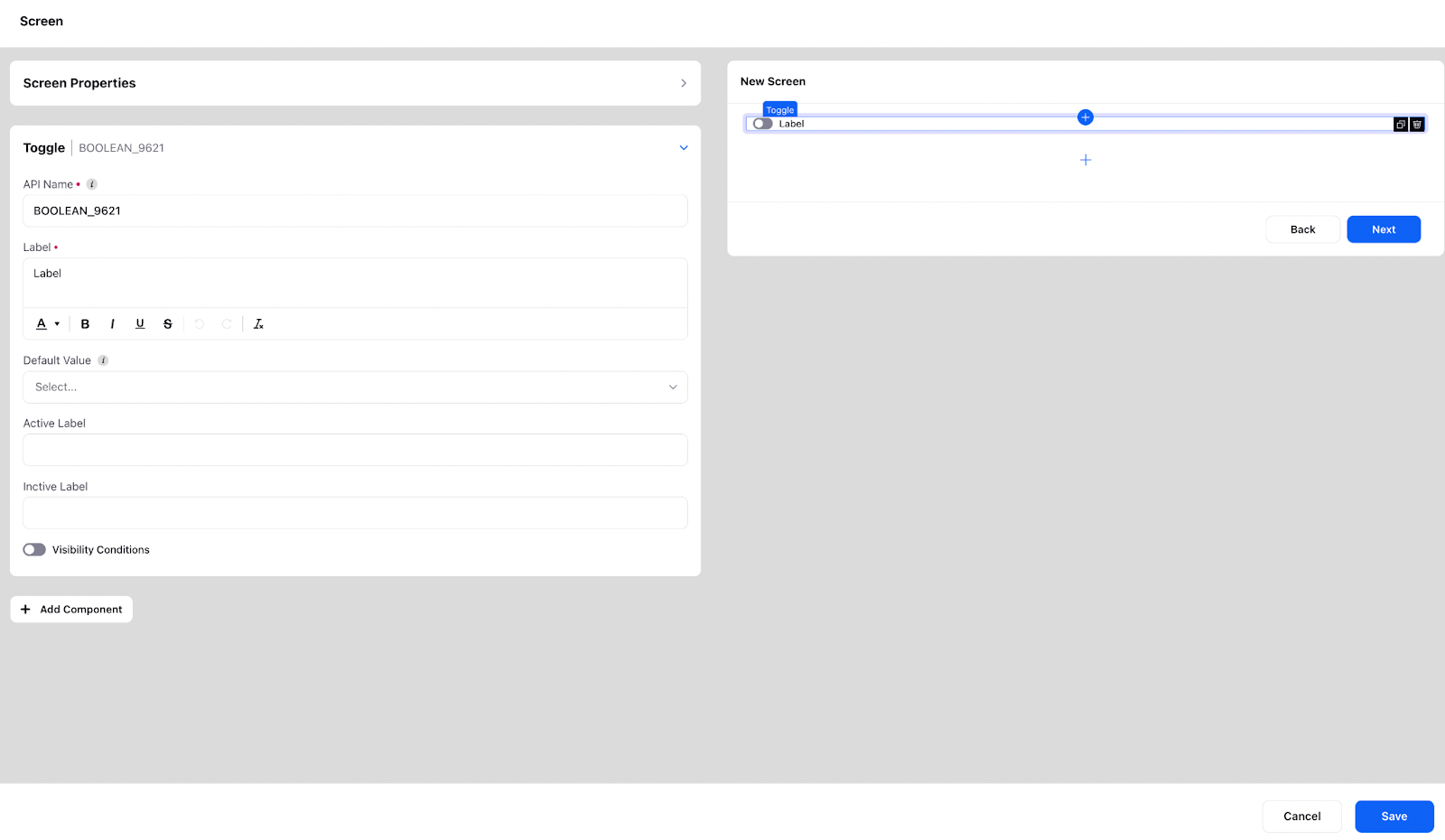
Toggle
Toggle allows users to switch between two states. They are often used to enable or disable a certain feature or option within a workflow. It is basically a switch that can be flipped back and forth to change the state. In a guided workflow, toggle can be used for a variety of purposes, such as:
Enabling or disabling certain features, such as notifications or email updates.
Indicating whether a user prefers to receive information in a certain format, such as text or email.
Specifying whether a user would like to opt-in or opt-out of certain services or programs.
You also have the option to specify disability conditions for the corresponding component, which will disable it for users to fill.
Slider
The slider element allows users to make selections or adjust settings within a continuous range of values. A slider is typically represented by a bar that can be moved left or right, to select a specific value within the range.
In a guided workflow, slider elements can be used for a variety of purposes, such as:
Setting a budget or price range for a product or service.
Selecting a specific date or time within a range.
Setting a preference for a certain level of intensity, such as workout intensity or coffee strength.
In the slider element, the minimum and maximum value can be used to specify the range and the step size can also be set.
You also have the option to specify disability conditions for the corresponding component, which will disable it for users to fill.

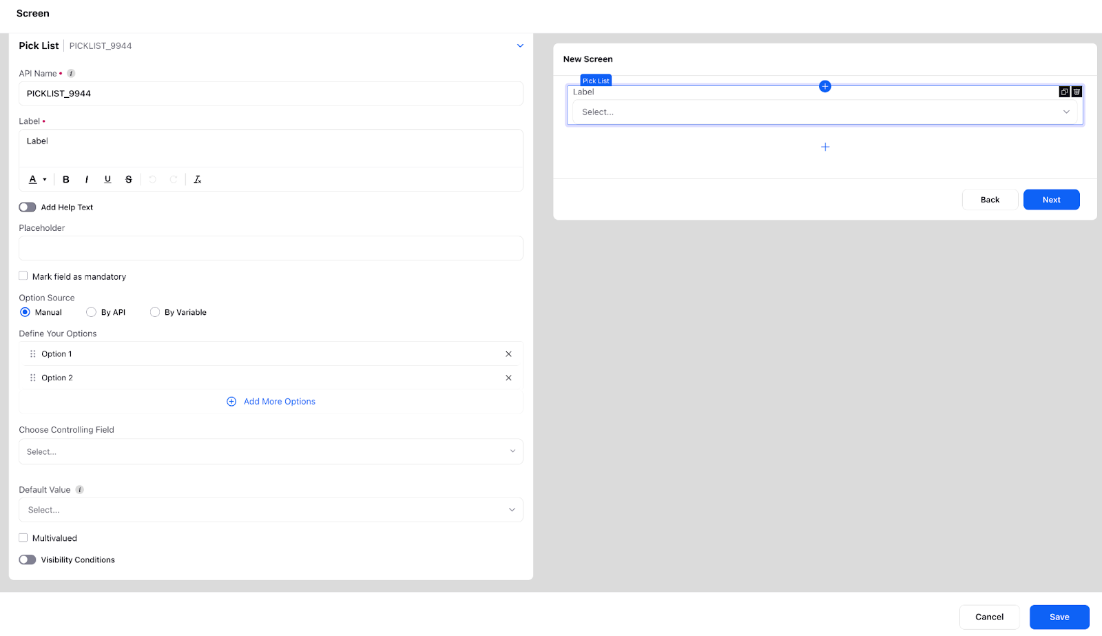
Picklist
A picklist is an input field that facilitates selection of a predefined option from a drop-down menu. It is commonly utilized to represent specific actions or states that are pertinent to the workflow, and can aid in information gathering, decision-making, and process automation. Additionally, picklists can be employed to assign tasks to team members, as well as to set the status of a task or project. It is also possible to define picklists using variables in the format [[‘label’:’abc’,’value’:’abc’]] or through APIs, and to adapt their response to the UI.
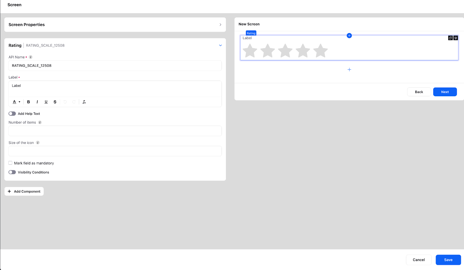
Rating
The rating feature allows users to provide feedback or rate a product, service, or experience using a scale of values, represented by stars.
In a guided workflow, the rating feature can be used for a variety of purposes such as:
Collecting feedback from customers on the quality of a product or service.
Gathering information on customer satisfaction with a purchase or transaction.
Allowing users to rate the overall experience of using an application or website.
Helping users compare the relative quality of different products or services
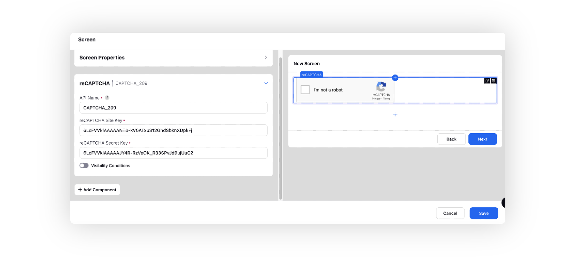
reCAPTCHA
You can add Google reCaptcha as an input component to verify that a human is completing the form or using the website, rather than a bot. If the user fails to complete the reCaptcha, they will not be permitted to advance to the next screen. To add reCaptcha, you will need to provide the site and secret keys.
Attach File
The file attachment feature allows the users to upload or attach files, such as documents, images, or videos, as part of a process or transaction. This feature allows users to provide additional information or data that may be required for the workflow, such as a resume for a job application, or an image of a product for customer support.
In a guided workflow, the file attachment feature can be used for a variety of purposes such as:
Allowing customers to attach proof of purchase for a return or warranty claim.
Enabling users to submit documents or images as part of a registration or application process.
Allowing users to attach photos or videos to a report or feedback form.
Giving users the ability to attach a CV, cover letter, or portfolio for a job application
It also allows us to validate the files and ensure that they are in the correct format. We can also allow single attachment or multiple files.

Dynamic Table
The dynamic table feature allows users to view, sort, filter, or select data in a tabular format, which can be displayed and updated in real-time, as part of a process or transaction. This feature allows users to easily view, manage, and interact with large amounts of data in a clear, organized manner.
In a guided workflow, the dynamic table feature can be used for a variety of purposes such as:
Displaying the results of a search or query in a tabular format.
Showing the status of multiple items or orders in a single view.
Allowing users to edit or update data directly in the table.
Displaying reports or analytics data in a way that is easy to understand and interact with.
Dynamic tables has features such as pagination and filtering. Refer to the article on Solving use-cases with Groovy.

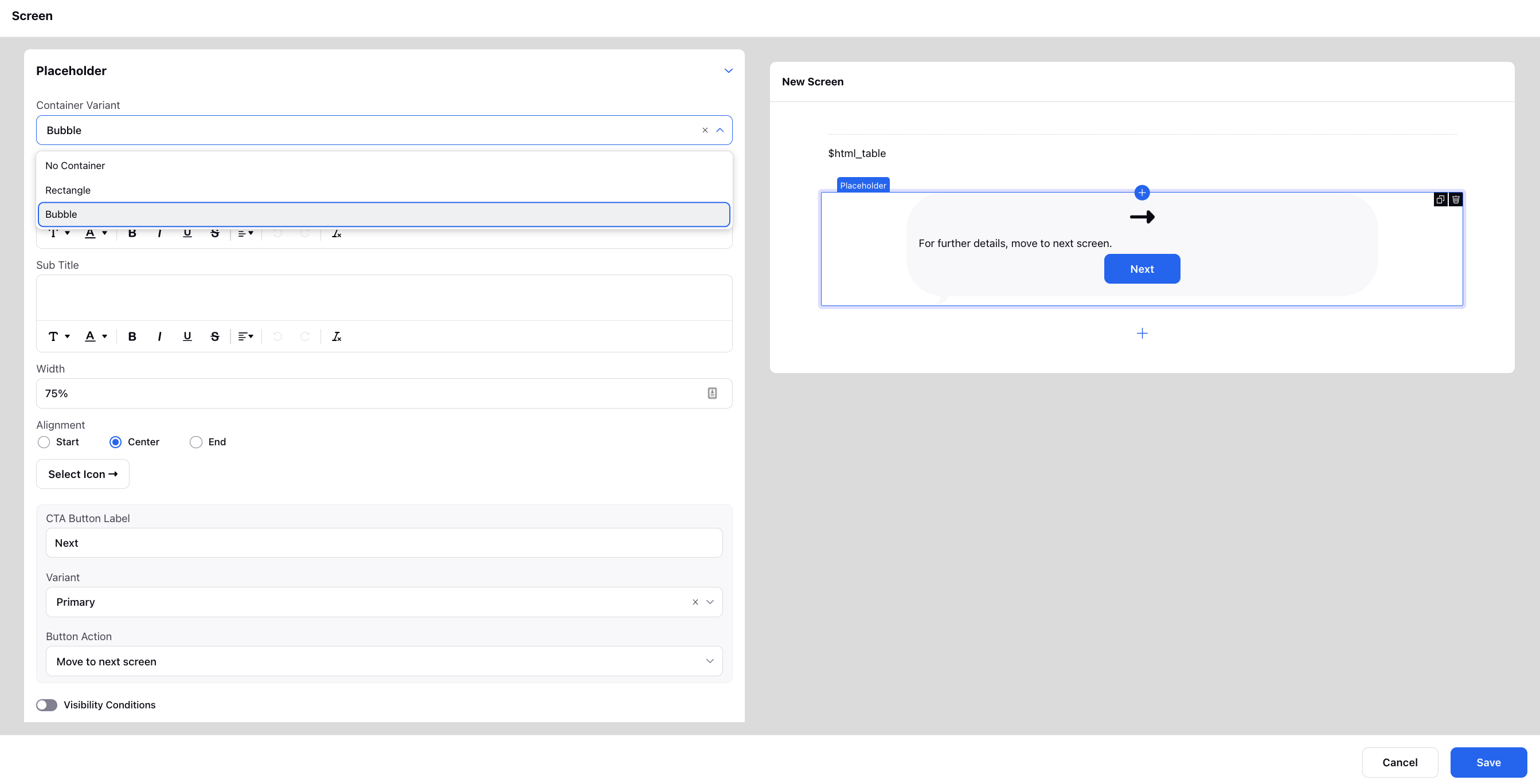
Placeholder
A placeholder with CTA buttons such as Move to next screen, Close screen, Go back to previous screen, and Send payload can be added. You can customize the appearance of buttons by selecting the Label, Icon, Alignment, and Variant.
"Visibility Conditions” can be set when you want to display the placeholder only when those particular conditions are met.
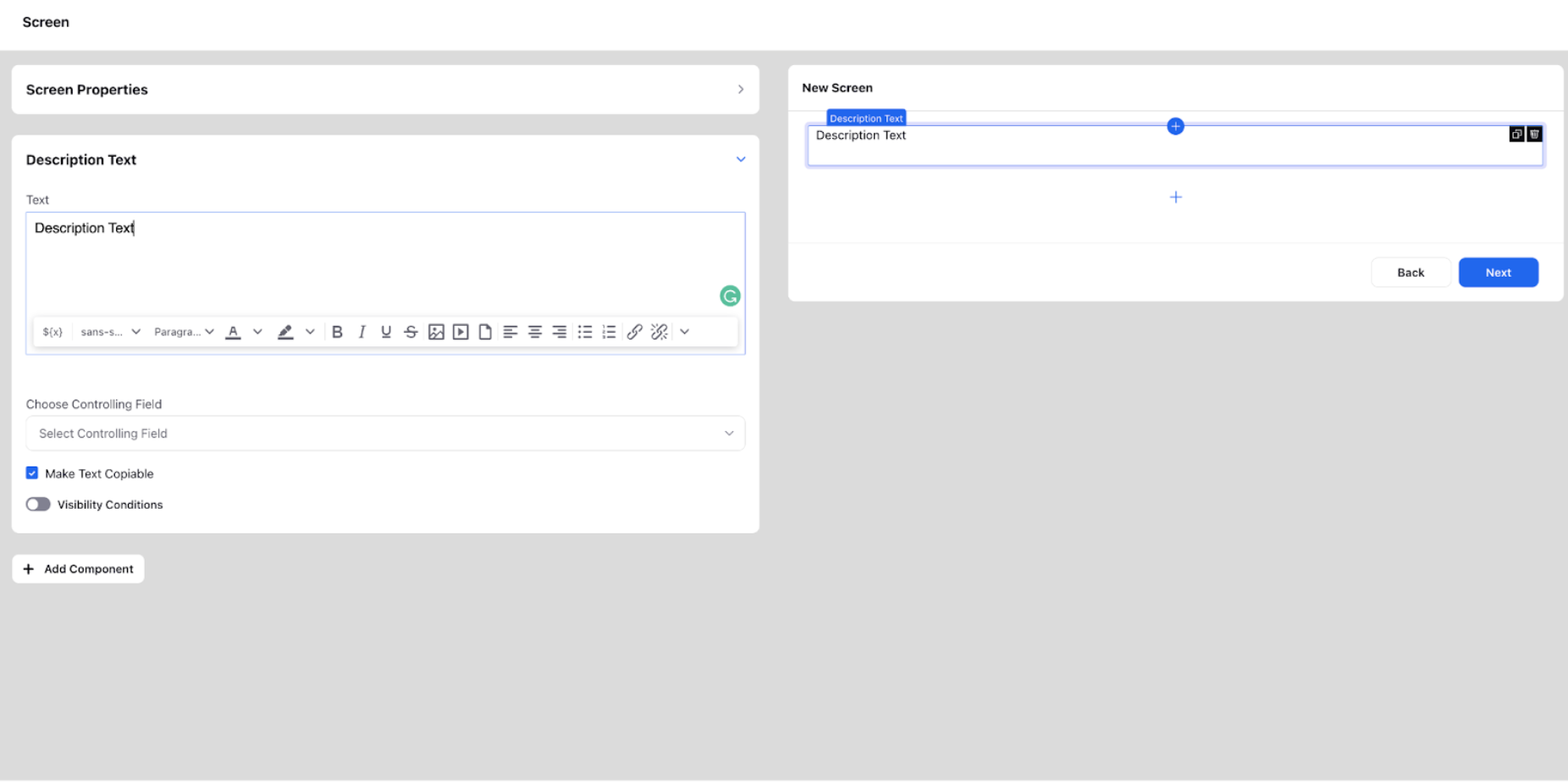
Description Text
Description text is used to convey any type of information to the customer. In a customer-facing GW, it can be used to inform the customer about the features of a certain product, steps to be followed to log a complaint, raise a ticket, etc.
Description text can be made copiable by checking the corresponding option while configuring. You can also add a refresh interval for auto-refreshing the content. There are basic formatting options available (bold, italic, underline, strikethrough, indenting options, highlight, styles, font, size, bullet points, and links). Variables can also be resolved in description text using ${var} or picking directly from the resource picker. If the variable is picked from any above components on the same screen, a controlling field can be used to change the resolved value as and when the value above is changed.
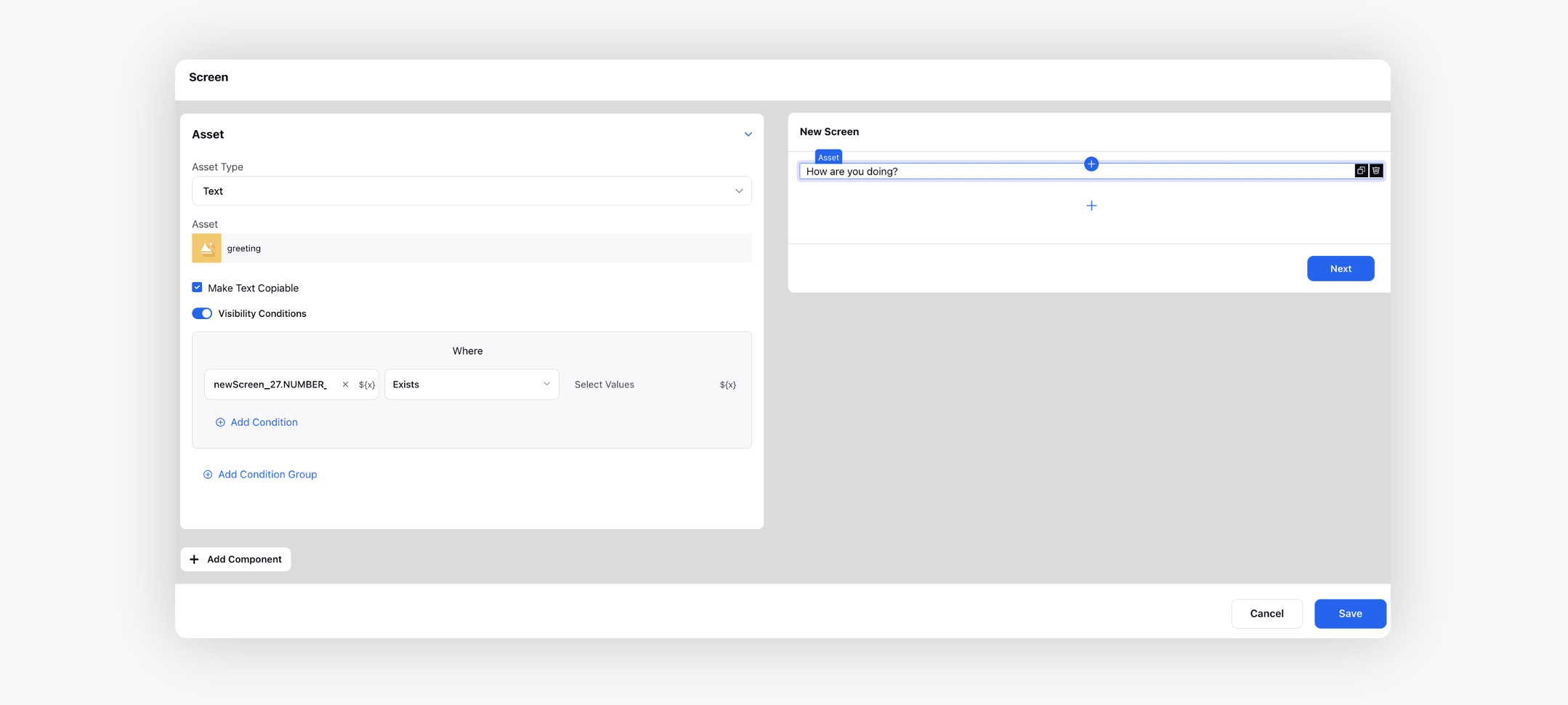
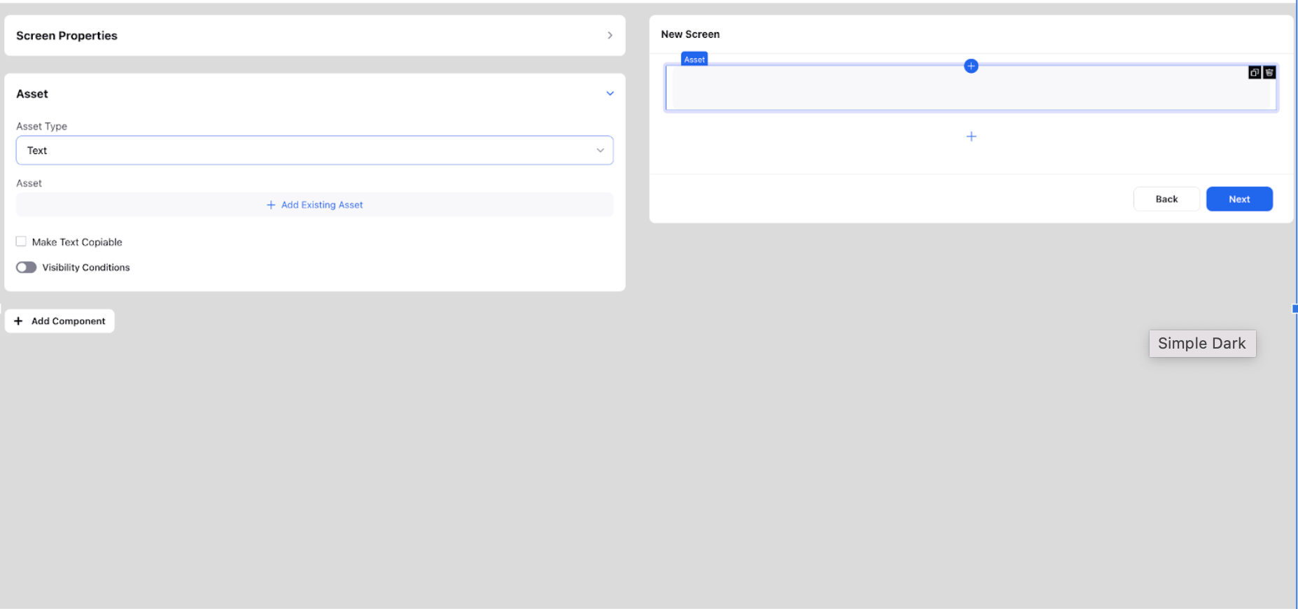
Asset
This is used to insert any text or rich text asset from the DAM. A text asset is a plain text file that contains simple text content, such as a piece of writing or a list of words. It can be easily edited and can be used for a wide range of purposes, such as displaying text on a website or providing dialogue for a video game.
A rich text asset, on the other hand, is a more complex type of text file that includes additional formatting, such as bold or italic text, different font sizes and colors, and images or other multimedia elements. These assets are typically used to create more visually appealing and engaging content, such as articles, blog posts, and marketing materials.
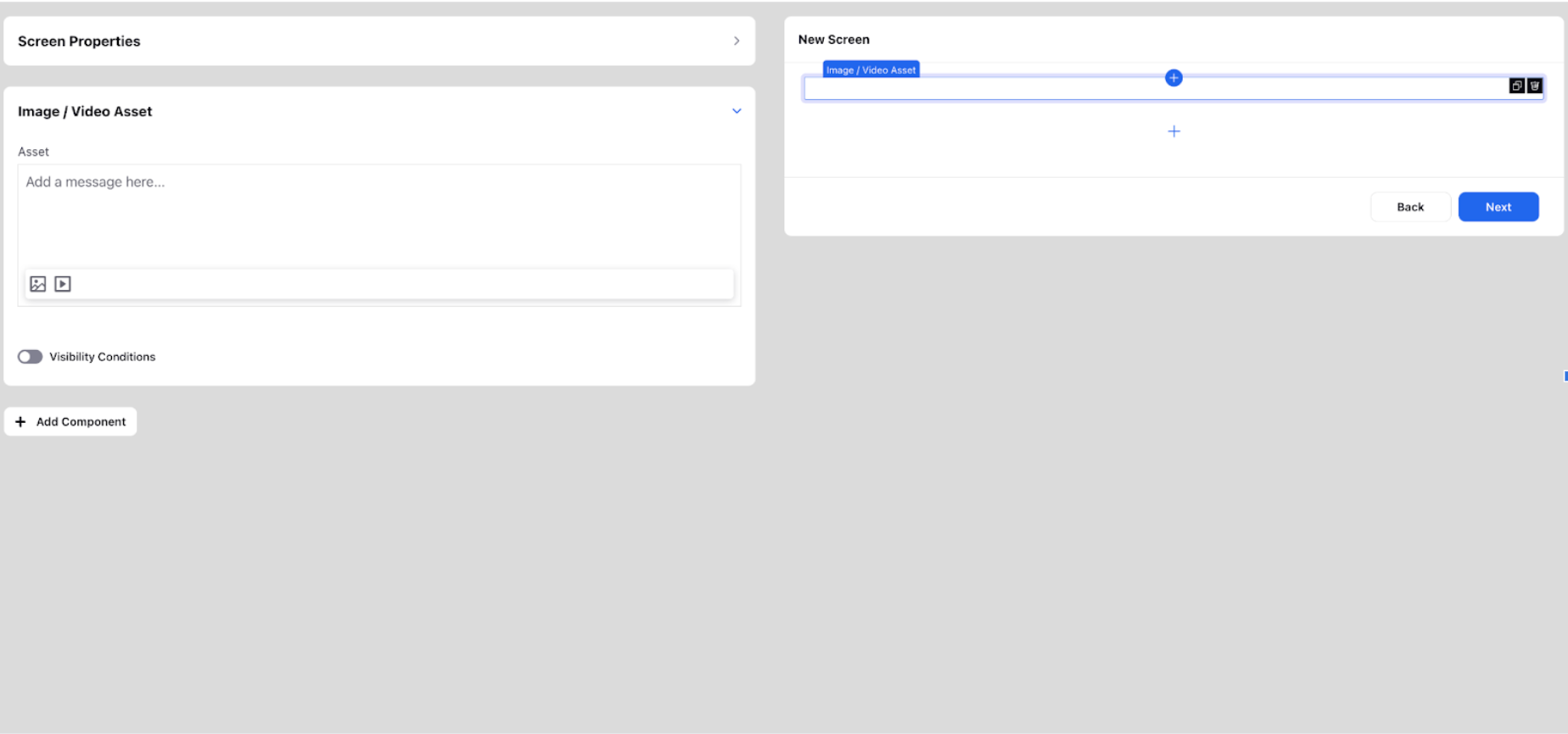
Image/Video Asset
It can be used to insert any image or video asset from the various sources as shown in the image from DAM, UGC, media valet and even upload from your local system.
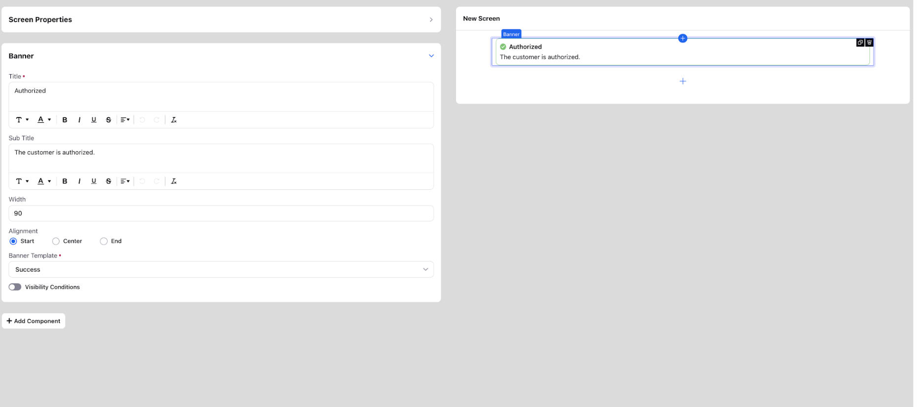
Banner
It is used to insert messages meant for the customers that can be in various template formats such as warning, success, error, disclosure, reminder. According to the template chosen, various symbols are used to indicate the same to the customer. For the banner component, add title, sub title, width, alignment and select the appropriate banner template from Error, Warning, Success, Reminder, and Disclosure. In title and subtitle, you can also add groovy to include case number (${UNIVERSAL_CASE.CASE_NUMBER}), profile ID, etc.
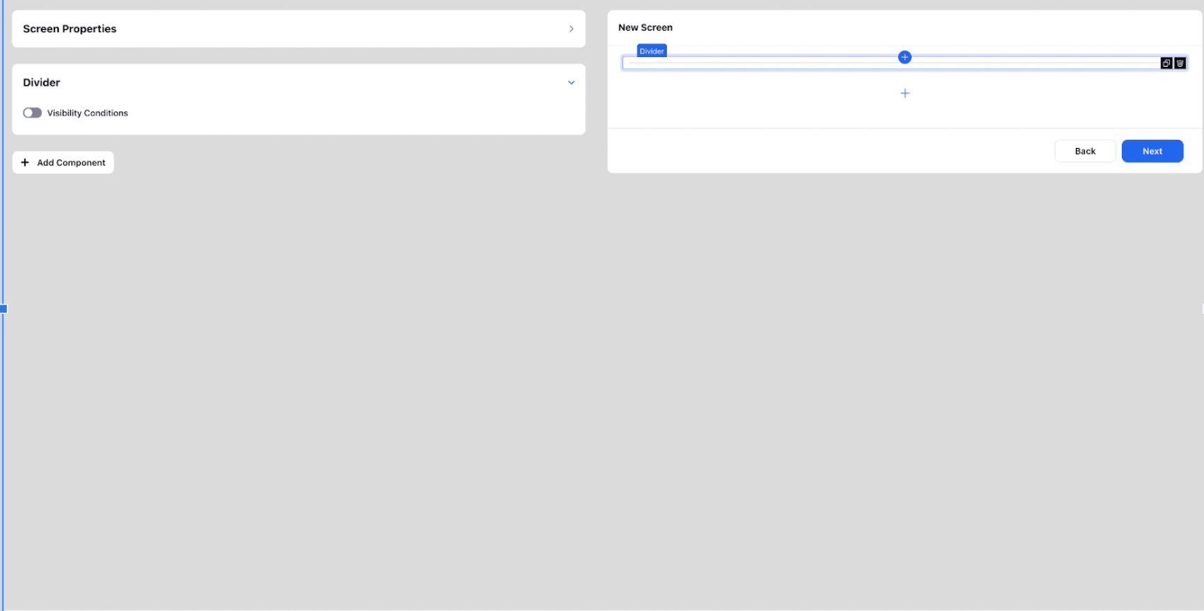
Divider
The "Divider" component is used to insert a visual separator or line between two components, creating a clear distinction or break in the layout.
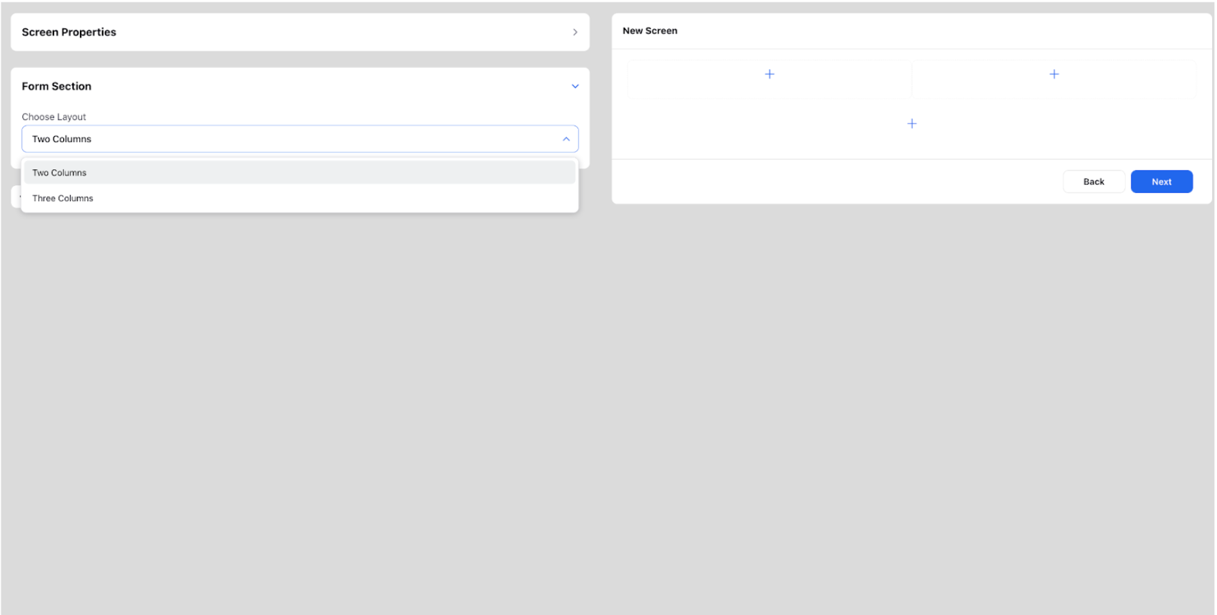
Two Columns and Three Columns
The "Two Columns" and "Three Columns" options allow users to create sections with two or three columns, respectively. These sections provide a structured layout where additional components can be added for content organization.